This is the fifth post in our series on Real-time Data Visualization.
In businesses globally, perhaps the first and most important use of real-time analytics is seen in the IT department. Keeping all servers, and applications up and running at all times is no mean task. IT professionals rely on real-time dashboards day in and day out to help them with their time-sensitive, critical, and complex job of managing a business’s IT infrastructure.
All IT monitoring applications today place dashboards front and center of their user experience. Yet, being an industry with decades of pedigree, some of their dashboards can betray outdated approaches. However, one application that is relatively new in the space, but has still managed to set itself apart from the pack is New Relic. Their progressive approach to application performance is visible from their dashboards, most of which are real-time. In this post, we’ll be looking at New Relic’s real-time dashboards, and learn a few lessons from their approach to solving application performance issues.
The first dashboard we’ll look at is the Overview dashboard. This is the most viewed dashboard, and is the first place a user would look to get a sense of the performance of the application at any time.
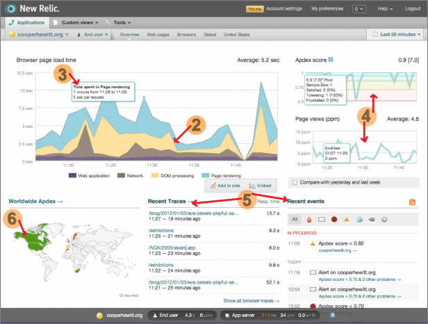


Table of Contents
1. Prioritize information
One glance at the Overview dashboard, and you’ll notice that it’s packed with a lot of information. A closer look shows how all this information is organized by priority. In the top-left corner of the dashboard is the ‘Browser page load time’ section, which is the most vital information for a web application. Just below that is a world map, showing the Apdex, or Application Performance Index, across different countries. Just these two sections of the dashboard are enough to gauge the situation in a few seconds. This is a feature of all successful real-time dashboards, they prioritize all the available information, and show the user the most important information first. Whether it’s their Overview dashboard, or any of the drill-down dashboards, which we’ll look at soon, New Relic sticks to this simple rule.2. Choose the right chart type
The main chart uses a stacked area chart to show 4 different metrics that constitute the overall page load time. This information could have been shown with 4 separate gauges, for example, but that would have made comparing the metrics more difficult. It could have used a stacked column chart, which would better show the total time spent rendering pages. However, that might have made the visual look choppy. It could have used a regular line chart with each line having a unique color, which would have worked fairly well. However, using a stacked area chart most clearly communicates which of the metrics shows most latency. The colors help the user differentiate the four metrics, and decide which needs their attention first. [Related infographic: Selecting the right chart type for your data]3. Use tooltips for accuracy
Hovering over the main chart shows a tooltip with information about the application performance. This tooltip is used to convey the total time spent rendering. This is well thought out as it can be hard to decipher the total value from 4 different data points. However, the most interesting feature of this tooltip is that it corresponds to the tooltips in the other two smaller charts in this dashboard. Moving across the chart updates all 3 tooltips. This makes for an interactive experience, and importantly, enables deeper analysis. This brings us to our next point – context.4. Always show data in context
Looking at the map, and the first chart tells the user what they need to be aware of at any given time. However, looking around at the two smaller charts, the user gets even more signals about the application performance. Given how time-sensitive the information is, and the number of factors involved, taking the time to present real-time data in context can speed up analysis, and save the user a lot of cognitive effort. This method of presenting information in context is used repeatedly and effectively across New Relic’s dashboards.5. Include a string of events to tell the story
While the map, and charts give the user a good understanding of what’s happening, when something’s going wrong, it’s imperative to know what action needs to be taken. A great dashboard gives not just the right signals, but also visibility into the cause or origin of the issue at hand. The Overview dashboard does this with the ‘Recent Traces’ and ‘Recent Events’ sections. These sections give the user clues on what events in the past few minutes could have triggered any issues. This way the user understands not just the ‘what,’ but the even more important ‘why.’ With just this information, the IT professional may have all they need to improve the Apdex. However, New Relic provides many levels of drill-downs in their dashboards for most scenarios which require a lot of poking and prodding around before a solution is found.6. Colors can direct users to critical information
Colors can easily go wrong in a dashboard when overused, or used without purpose. However, when colors correspond to the innate associations we have towards them, they can be very powerful. For example, the world map uses red, green, and yellow to show application performance. Similarly, the chart in the top-right corner shows bands of red, yellow, and green to categorize the Apdex score. Additionally, in the ‘Recent events’ section, events that are ‘Critical’ are marked with a big red dot. New Relic uses colors to draw users’ attention to critical information, and ensures it doesn’t distract the user from their objective of speeding up app performance.