
At FusionCharts, we believe in listening to our customers and helping them to make sense of their data using FusionCharts. In the last couple of months, after speaking with our customers, many requested improvements in text rendering to axis configurations to chart borders were taken up. Hence, the focus of this release was to improve the design aspects of some of our charts, ensuring that they become more dashboard-ready. This was balanced with some critical issues which were affecting the ends users of our customers.
Some features which we covered in this release include:
Table of Contents
Improve the readability of data value text
Often when data values are placed on the plot, then owing to the contrast of the data value text color and plot color, the data value text may not be clearly readable. This problem is highly concerning in stacked charts, area charts, pie charts, and others, where the possibility of placing the data value on the plot is very high.
We tried to solve this problem by introducing a new global boolean attribute called textOutline. By enabling this attribute, a sleek border is created on the text of the data values, helping it stand out by giving a good contrast. The choice of the color of the border of text is smartly determined – generally, it is black or white – black or white crisp border on text outline depending on the plot color.
Most requested feature of being able to place the axes on either side of the canvas is now a reality. This was slightly tricky, but the motivation for fulfilling the needs of the users helped us nail it down.
Axis positions
The position of X-Axis and Y-Axis can now be specified using the xAxisPosition and yAxisPosition attributes. Depending on the type of chart, they take values like top and bottom, or left and right.
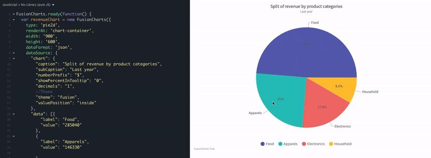
New possibilities in pie and doughnut charts
New features on these fundamental charts include:
- The option of specifying the radius values in percentage. Sleek doughnuts become a possibility with this.
- Flexibility to place the label or value text either on the plot or outside it.
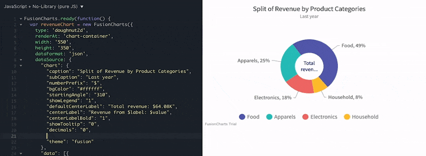
labelPosition and valuePosition attribute to place the labels or values either inside the pie or doughnut segments or outside them. These positions are also possible in the pie or doughnut chart when rotation and slicing are enabled.Area chart border customization
Remember seeing those simple and minimalistic area charts on Google Analytics dashboard? Something like,
Area charts with border on only top of the plot will now be possible. You just need to set drawFullAreaBorder to 0, and you will get a visual like above.
Along with this, you need not specify the border color of the area plot separately. You can just enable the global attribute inheritPlotBorderColor to 1 and the border of the area plot will inherit the color from the plot color.

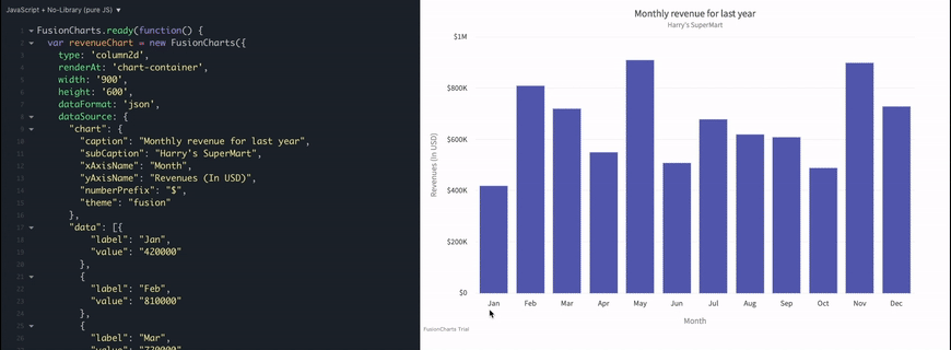
Cosmetic options for Y-Axis values
No more workarounds to manipulate the cosmetic properties of the Y-Axis value texts. There are a bunch of cosmetic attributes now available which can be used to control the display of these values. Be it related to the font, background or border – attributes for all of them are now available and could be a blessing in disguise for users who used to take a longer path to customise them.
Controlling the visibility of value text
Though we can currently use the showValue attribute at individual data point level to control the visibility of value text for the specific data point, there was no mechanism to control the visibility based on encoding size. This led to huge effort at your end to ensure that values for specific data plots, which have substantial impact, show value. Now, we have a couple of more attributes which help hide the values below the thresholds defined against these attributes. Some examples are:
- For column and bar charts – there is a new global attribute called
minPlotHeightForValue. Values will not be visible for any encoding which is lesser than this. - For bubble charts – the new global attribute,
minRadiusForValuecan be used to define the threshold below which values should not be visible for individual bubbles. - For pie and doughnut charts – global attributes
minAngleForLabelandminAngleForValuecan be used to specify the minimum angle of segments above which the label and value should be visible.
The details of critical issues which we solved for our customers and other specifics of the release can be read at – https://www.fusioncharts.com/dev/upgrading/change-log.
Got some suggestions on improving FusionCharts? Do not hesitate to drop an email on [email protected]. I would love to hear your thoughts. Finally, do not forget to subscribe to our newsletter to get the latest news on FusionCharts.
Download the FusionCharts Suite here.
Buy or upgrade here.