
We love the Internet for all the funnies it brings to us. So much so that we had listed out all the funnies we overdose on every day. And the latest one to catch our fancy is the “Go home, you’re drunk” meme. While we go “lol! rofl” at all the memes, we had some “go home, you’re drunk” stories to talk of as well. Stories of charts that got high. Here’s bringing a bunch of Drunk Charts to you from around the web.
I’ve got numbers to prove what I am saying
While we go “lol! rofl” at all the memes, we had some “go home, you’re drunk” stories to talk of as well. Stories of charts that got high. Here’s bringing a bunch of Drunk Charts to you from around the web.
I’ve got numbers to prove what I am saying
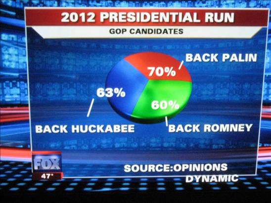 Even at 60% favorability, Romney was no match for Palin’s 70% in the GOP nomination for 2012.
This chart had celebrity status when it first came out.
I told you it’s the same thing
Even at 60% favorability, Romney was no match for Palin’s 70% in the GOP nomination for 2012.
This chart had celebrity status when it first came out.
I told you it’s the same thing
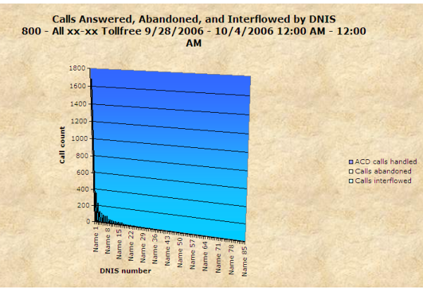 If you could ever italicize a chart, this is how it would end up looking. Or maybe not. The only purpose of this chart is to hide everything it is conveying.
I am so shiny, look at me
If you could ever italicize a chart, this is how it would end up looking. Or maybe not. The only purpose of this chart is to hide everything it is conveying.
I am so shiny, look at me
 This chart is quite clearly meant for higher purposes. Ordinary souls, give it a rest.
I’ll have what he’s having
This chart is quite clearly meant for higher purposes. Ordinary souls, give it a rest.
I’ll have what he’s having
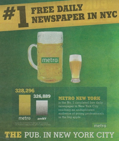 Go get another round. That’s the only way you are going to agree with the premise of the ad.
Got more drunk charts to share? Share them in the comments. Add in a caption, too. We just can’t get enough of them.
Go get another round. That’s the only way you are going to agree with the premise of the ad.
Got more drunk charts to share? Share them in the comments. Add in a caption, too. We just can’t get enough of them.
While we go “lol! rofl” at all the memes, we had some “go home, you’re drunk” stories to talk of as well. Stories of charts that got high. Here’s bringing a bunch of Drunk Charts to you from around the web.
I’ve got numbers to prove what I am saying
Even at 60% favorability, Romney was no match for Palin’s 70% in the GOP nomination for 2012.
This chart had celebrity status when it first came out.
I told you it’s the same thing
(Source – JunkCharts)
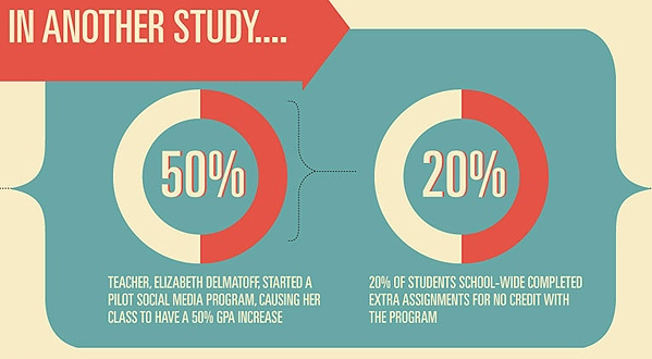
50%=20%. Enough said. The walls are slanted, and the room is closing in on me
If you could ever italicize a chart, this is how it would end up looking. Or maybe not. The only purpose of this chart is to hide everything it is conveying.
I am so shiny, look at me
This chart is quite clearly meant for higher purposes. Ordinary souls, give it a rest.
I’ll have what he’s having
Go get another round. That’s the only way you are going to agree with the premise of the ad.
Got more drunk charts to share? Share them in the comments. Add in a caption, too. We just can’t get enough of them.


fodboldtrøjer børn
July 13, 2018, 9:24 pmI got this web site from my buddy who informed me about this website and now this time I am
browsing this website and reading very informative articles or reviews here.