In this series of blog posts titled ‘Embracing Raphaël’, we’re taking you behind the scenes, giving you a glimpse of the nuts and bolts that power FusionCharts products, sharing our perspective on the technological shift that’s happened in the data visualization industry over the past few years, and how it’s influenced our products.
If you’ve read our ‘Breaking the Ice’ page, or 10th anniversary book, you’d know that we started out as a Flash charting component, pioneering delightful charting for web & enterprise apps about a decade ago. It was a simpler world back when Flash was the only option for rendering interactive charts, and Internet Explorer ruled the roost among browsers. Since then, the charting landscape has undergone tremendous change.
With the move from Flash to JavaScript, which took us by surprise thanks to Apple giving Flash the boot way earlier than anticipated, two underlying technologies surfaced as worthy contenders for creating visualizations in JavaScript – Canvas and SVG. Many have written about the pros and cons of each, and which unique purposes they serve. At the time, Canvas was still very nascent, not supported by IE, and it was clear that we needed to go with SVG. When it came to deciding a rendering method, we weighed our options, and realized it would save us a lot of development time if we borrowed from an existing JavaScript library, than building one ourselves ground-up. We decided to go with one of the then-upcoming JavaScript libraries, HighCharts, customizing it extensively so our users could get the same delight they’re used to from our charts, only this time in JavaScript. The migration was complete in record time of 5 weeks. While it was a great short-term fix to use HighCharts as our renderer, we eventually ran into numerous glitches with rendering for which we’ve had to devise countless hacks, more than compensating for the initial time saved during migration. We knew it wasn’t too long before we’d need to retire HighCharts for a more longterm, comprehensive solution.
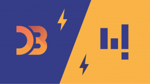
With this decision, the hunt for an underlying visualization platform began yet again, this time reviewing libraries such as D3, and Raphaël. At the end of this search, Raphaël surfaced as the ideal candidate because of how extensible it is, allowing us to easily extend it to handle big data processes in enterprise applications, which in the case of most our customers, is the norm. It allows for extensive cross-browser support, even rendering on IE 6 using VML. To top it all, an added bonus of working with Raphaël is the presence of an active developer community, which made working with it a lot easier than on other platforms. In hindsight, we can confidently say that Raphaël has saved us a ton of development time.
Despite all the strengths of Raphaël, reworking our entire suite of charts, gauges, and maps was never going to be a breeze through. We undertook the mammoth task of rebuilding our products from the ground up, keeping the same delightful looks, and extensive feature list, that our 21,000 customers have grown to admire over the years, but breathing new life into the underlying technology that powers it all. In the process, we’ve ended up with such a customized implementation of Raphaël, that we think you’d love to hear all about the learnings, tips, and tricks we’ve accumulated in the process, which is what we aim to do in this series of blog posts.
This post is an introduction, and is meant to give you some context on the decisions we’ve made in recent times, and how we got to where we are today. Now that we’ve connected the dots, we can move on to the more technical, meaty posts, which we think you’ll totally dig. The upcoming posts would be Raphaël-centric, where we’ll be sharing loads of useful stuff ranging from a bunch of simple hacks like how to do vertical alignment of text, to some widely requested features like physical grouping of elements, and even new ideas like how to make shapes act as disciples, followers, or stalkers. We hope this will give you a deeper appreciation for the underlying workings of our products, and maybe even a different perspective on working with Raphaël. Stay tuned.
Is there anything about Raphaël you’d like to see discussed here?
In this series of blog posts titled ‘Embracing Raphaël’, we’re taking you behind the scenes, giving you a glimpse of the nuts and bolts that power FusionCharts products, sharing our perspective on the technological shift that’s happened in the data visualization industry over the past few years, and how it’s influenced our products.
If you’ve read our ‘Breaking the Ice’ page, or 10th anniversary book, you’d know that we started out as a Flash charting component, pioneering delightful charting for web & enterprise apps about a decade ago. It was a simpler world back when Flash was the only option for rendering interactive charts, and Internet Explorer ruled the roost among browsers. Since then, the charting landscape has undergone tremendous change.
With the move from Flash to JavaScript, which took us by surprise thanks to Apple giving Flash the boot way earlier than anticipated, two underlying technologies surfaced as worthy contenders for creating visualizations in JavaScript – Canvas and SVG. Many have written about the pros and cons of each, and which unique purposes they serve. At the time, Canvas was still very nascent, not supported by IE, and it was clear that we needed to go with SVG. When it came to deciding a rendering method, we weighed our options, and realized it would save us a lot of development time if we borrowed from an existing JavaScript library, than building one ourselves ground-up. We decided to go with one of the then-upcoming JavaScript libraries, HighCharts, customizing it extensively so our users could get the same delight they’re used to from our charts, only this time in JavaScript. The migration was complete in record time of 5 weeks. While it was a great short-term fix to use HighCharts as our renderer, we eventually ran into numerous glitches with rendering for which we’ve had to devise countless hacks, more than compensating for the initial time saved during migration. We knew it wasn’t too long before we’d need to retire HighCharts for a more longterm, comprehensive solution.
With this decision, the hunt for an underlying visualization platform began yet again, this time reviewing libraries such as D3, and Raphaël. At the end of this search, Raphaël surfaced as the ideal candidate because of how extensible it is, allowing us to easily extend it to handle big data processes in enterprise applications, which in the case of most our customers, is the norm. It allows for extensive cross-browser support, even rendering on IE 6 using VML. To top it all, an added bonus of working with Raphaël is the presence of an active developer community, which made working with it a lot easier than on other platforms. In hindsight, we can confidently say that Raphaël has saved us a ton of development time.
Despite all the strengths of Raphaël, reworking our entire suite of charts, gauges, and maps was never going to be a breeze through. We undertook the mammoth task of rebuilding our products from the ground up, keeping the same delightful looks, and extensive feature list, that our 21,000 customers have grown to admire over the years, but breathing new life into the underlying technology that powers it all. In the process, we’ve ended up with such a customized implementation of Raphaël, that we think you’d love to hear all about the learnings, tips, and tricks we’ve accumulated in the process, which is what we aim to do in this series of blog posts.
This post is an introduction, and is meant to give you some context on the decisions we’ve made in recent times, and how we got to where we are today. Now that we’ve connected the dots, we can move on to the more technical, meaty posts, which we think you’ll totally dig. The upcoming posts would be Raphaël-centric, where we’ll be sharing loads of useful stuff ranging from a bunch of simple hacks like how to do vertical alignment of text, to some widely requested features like physical grouping of elements, and even new ideas like how to make shapes act as disciples, followers, or stalkers. We hope this will give you a deeper appreciation for the underlying workings of our products, and maybe even a different perspective on working with Raphaël. Stay tuned.
Is there anything about Raphaël you’d like to see discussed here?
Embracing Raphaël: A Look in the Rearview Mirror
In this series of blog posts titled ‘Embracing Raphaël’, we’re taking you behind the scenes, giving you a glimpse of the nuts and bolts that power FusionCharts products, sharing our perspective on the technological shift that’s happened in the data visualization industry over the past few years, and how it’s influenced our products.
If you’ve read our ‘Breaking the Ice’ page, or 10th anniversary book, you’d know that we started out as a Flash charting component, pioneering delightful charting for web & enterprise apps about a decade ago. It was a simpler world back when Flash was the only option for rendering interactive charts, and Internet Explorer ruled the roost among browsers. Since then, the charting landscape has undergone tremendous change.
With the move from Flash to JavaScript, which took us by surprise thanks to Apple giving Flash the boot way earlier than anticipated, two underlying technologies surfaced as worthy contenders for creating visualizations in JavaScript – Canvas and SVG. Many have written about the pros and cons of each, and which unique purposes they serve. At the time, Canvas was still very nascent, not supported by IE, and it was clear that we needed to go with SVG. When it came to deciding a rendering method, we weighed our options, and realized it would save us a lot of development time if we borrowed from an existing JavaScript library, than building one ourselves ground-up. We decided to go with one of the then-upcoming JavaScript libraries, HighCharts, customizing it extensively so our users could get the same delight they’re used to from our charts, only this time in JavaScript. The migration was complete in record time of 5 weeks. While it was a great short-term fix to use HighCharts as our renderer, we eventually ran into numerous glitches with rendering for which we’ve had to devise countless hacks, more than compensating for the initial time saved during migration. We knew it wasn’t too long before we’d need to retire HighCharts for a more longterm, comprehensive solution.
With this decision, the hunt for an underlying visualization platform began yet again, this time reviewing libraries such as D3, and Raphaël. At the end of this search, Raphaël surfaced as the ideal candidate because of how extensible it is, allowing us to easily extend it to handle big data processes in enterprise applications, which in the case of most our customers, is the norm. It allows for extensive cross-browser support, even rendering on IE 6 using VML. To top it all, an added bonus of working with Raphaël is the presence of an active developer community, which made working with it a lot easier than on other platforms. In hindsight, we can confidently say that Raphaël has saved us a ton of development time.
Despite all the strengths of Raphaël, reworking our entire suite of charts, gauges, and maps was never going to be a breeze through. We undertook the mammoth task of rebuilding our products from the ground up, keeping the same delightful looks, and extensive feature list, that our 21,000 customers have grown to admire over the years, but breathing new life into the underlying technology that powers it all. In the process, we’ve ended up with such a customized implementation of Raphaël, that we think you’d love to hear all about the learnings, tips, and tricks we’ve accumulated in the process, which is what we aim to do in this series of blog posts.
This post is an introduction, and is meant to give you some context on the decisions we’ve made in recent times, and how we got to where we are today. Now that we’ve connected the dots, we can move on to the more technical, meaty posts, which we think you’ll totally dig. The upcoming posts would be Raphaël-centric, where we’ll be sharing loads of useful stuff ranging from a bunch of simple hacks like how to do vertical alignment of text, to some widely requested features like physical grouping of elements, and even new ideas like how to make shapes act as disciples, followers, or stalkers. We hope this will give you a deeper appreciation for the underlying workings of our products, and maybe even a different perspective on working with Raphaël. Stay tuned.
Is there anything about Raphaël you’d like to see discussed here?