This release of FusionTime focused on introducing API events and methods, improving different components (data markers, time markers, standard range selectors, etc), and creating more formatting options in the yAxis. The belief is that these features and possibilities will enable the developers to use the time series charts in innovative ways to solve their use cases.
Some noteworthy developments include:
Table of Contents
New events and methods
A plethora of chart and component specific events and methods have been created and standardised. These events include – chart rendering events like rendered, initialized, resized, and disposed, along with their variants; function specific events like export, print with their variants; time series specific events like selectionChange; and chart component specific events for legend, time navigator, data marker, time marker, reference line, range, etc.
Coverage of methods includes generic chart specific methods like setting chart attributes, adding event listeners, configuring chart states, etc., as well as time specific methods like time selection, binning, etc.

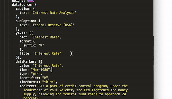
Data marker – pin type; applicable to stock charts
A new type of data marker – pin type, is now available. Users can now take advantage of these markers along with the existing flag type data markers, to categorize the different types of events visually on data plots.
Coverage of data markers has now been extended to stock charts too. It can help stock chart enthusiasts add important events on their data plots.
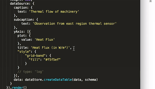
Grid bands on Y-Axis
Grid bands on the Y-Axis eases the understanding of data plots on the chart canvas. When using them with panning behaviour, a user can get an immersive experience of the variation of the values recorded over time. It can be enabled with a simple boolean control and can be coloured according to the brand preference.
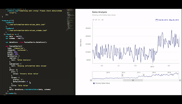
Formatting options on Y-Axis
Expanding the coverage of formatting options on Y-Axis, developers can now access the raw unformatted value, by setting the defaultFormat to 0. By default defaultFormat is 1, and it gets a readable formatted value.
Along with this other formatting options include, prefix, suffix, min, max and round. Using the round attribute, one can control the visibility of values to either the tenth, hundredth, thousandth, etc level, or control the number of decimal places.
Improving FT components
A lot of internal improvements on the behaviour of data markers, time markers, reference zone, standard range selector and custom range selector have also been covered in this release. These were primarily edge cases, like tooltips not showing crisp and directed information for data markers, or time markers overlapping, or touch action on SRS buttons, or reference zone showing data plots falling in its purview. These improvements will ensure that the experience of consuming information from time series charts is better for the users.
Along with the issues mentioned above, quite a few others were also solved. The complete list can be found on the release notes page.
Coming soon 🔥
- Real-time updating charts
Got some suggestions on improving FusionCharts? Do not hesitate to drop an email on [email protected]. I would love to hear your thoughts. Finally, do not forget to subscribe to our newsletter to get the latest news on FusionCharts.
Download FusionTime here.
Buy or upgrade here.