Today’s data digest includes some of the most talked-about, and inspiring stories on data visualization from around the web. A couple of them are about how to use visuals to tell a story with data.
Fritz Kahn was a German scientist who lived during the Nazi era, and is known for his captivating illustrations of the human body. Though expelled from Germany on account of his work, his illustrations continue to inspire people to this day. For example, this powerful visualization illustrates the growth of human hair in a single day, and that it’s long enough to taper around the body of a slim young lady:
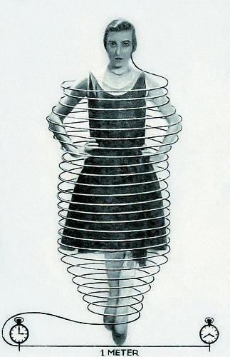
Daily hair growth: the human body produces 100 feet of hair substance every day. If all this growth were to converge into one single hair, that hair would grow by one inch every minute.
In this post, Bill Shander speaks from his experience creating data visualizations for Marketing Communications. He says that ‘If you’re selling straightforward solutions to simple problems, data visualization is probably not worth the money.’ He gives examples of Coke, or Playboy, which aren’t strong candidates for data visualization. On the other hand, he says ‘if you’re selling a complex answer to a complex problem, you should be embracing data visualization with gusto.’ He goes on to give examples from BCG and the World Economic Form, Booz & Company, and others, to show how data visualizations are the ideal way to articulate complex ideas.
Although he uses the umbrella term of data visualization, it’ll help to remember that he’s speaking form a Marketing Communications perspective. Rather than a focus on numbers, and data, the emphasis is on communicating processes, and concepts. The aim is to persuade, rather than inform or educate.
This post from Visual.ly touches on the basics of data viualization, and serves as a reminder if you’ve read some of the classics like Tufte. It starts by describing how a visual information is processed by our eyes and brains, then moves to how visual processing is wired into our basic survival instincts. It then gives examples how powerful visuals can be at communicating with data, giving the example of Anscombe’s Quartet. [Related read:
How to Make Data Visualization Better with Gestalt Laws]
The last feature is from The Society for News Design (SND), which posted about a talk given by Matt Ericson, Deputy Graphics Director, New York Times. He starts his talk saying that what his team does at NYT is to use data to tell stories. The team started out a couple of decades ago by visualizing election data in the form of maps. They gradually advanced to include charts. Today, two thirds of what his team does involves charts and maps. You can watch the entire talk below, it’s an hour long, but worth every minute of your time:
Matt gives many examples of how NYT uses data to tell visual stories. Perhaps the most interesting one compares the speed of 100 meter sprinters over the past 116 years leading up to Usain Bolt’s blitz at the Olympics last year: