Today’s businesses compete on data. Whether it is increasing manufacturing yields, boosting marketing ROI or improving customer satisfaction, businesses want to improve their bottom line using data-driven insights.
A survey conducted by the Aberdeen Group titled Data, Discovery, Action in early 2013 found that more and more enterprise decision makers want or need analytical capability to understand their data well. While performing their tasks in CRM, ERP and other business applications, they are looking for better visibility, better reporting and quicker access to performance metrics. Due to this growing interest in analytical engagement, ISVs are powering their products with information visualization capabilities that will help their users get data-driven insights.
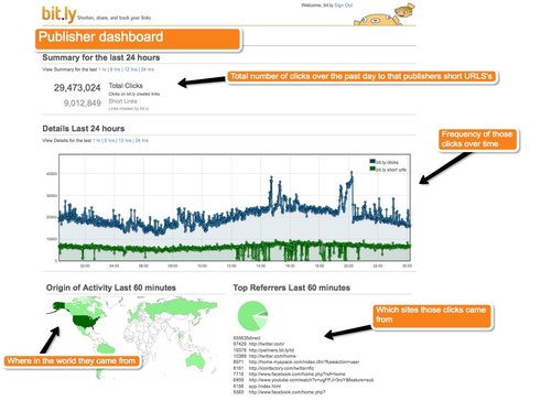 In addition to this, the Pro version also included a dashboard which provided a real-time view of how a given publisher’s content is being distributed across networks like Twitter, Facebook and MySpace and services like email, SMS and instant messenger.
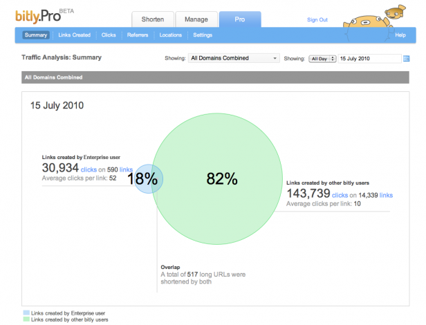 In 2010, it launched its enterprise edition (paid) which among other features had an advanced dashboard which allowed publishers, marketers, e-commerce sites and celebrities measure their social media efforts. Using this dashboard, they could analyze the number of clicks they have driven to a particular story against the overall user engagement. It also allowed them to look at different measures of viral success—the number of times a particular article has been shortened and shared, compared to the aggregate number of clicks it received. Users could also access detailed location and referrer data from the dashboard.
From a free product used to shorten URLs, its paid Enterprise version now boasts of names like The Huffington Post, GE, Ford and Heineken who use it to gain audience insight and benchmark their social media efforts.
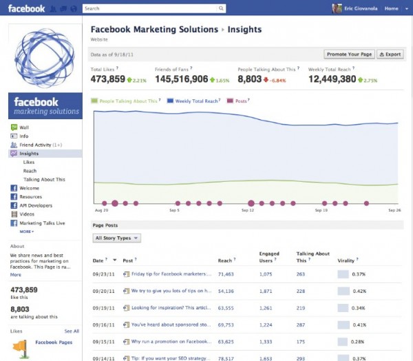 To enable brands to measure their marketing efforts on Facebook, Facebook Insights was launched. It had a dashboard where marketers can monitor their Page’s Likes, Friends of Fans and Weekly Total Reach. It gave marketers insights into some key data points like how many total people have posted something about their Page, how much virality their stories have generated, the demographics of their fans, etc.
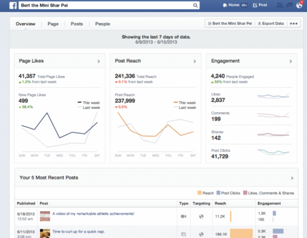 Since then they have been iterating their design from time to time to provide marketers better ways to analyze their data. A June 2013 update includes splitting of data points that were previously rolled in together (like People Talking About Us has been broken down into Likes, Comments, Shares and Clicks) and inclusion of some additional charts making it easier for users to see what kinds of posts— say, those with images, or ones targeted to certain groups—have better engagement than others.
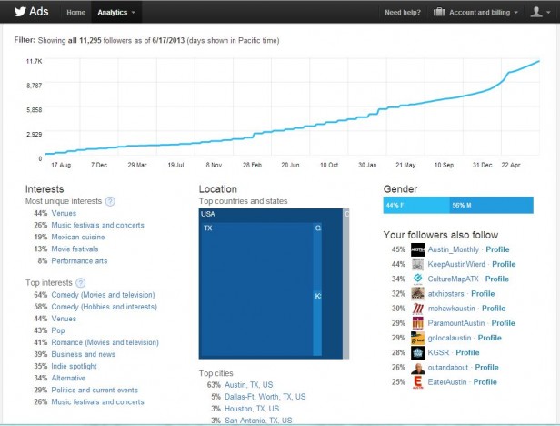 The analytics dashboard, to begin with, provided insight by Tweet and by Followers. Tweet specific stats included number of retweets, favorites and the reach derived from follower sharing. You could also get information about the specific number of clicks on each link. In the follower section, you could see follower growth as well as more demographic data. Metrics include location, unique interests, top interests, gender and other Twitter users that are like you.
The recent update to Twitter’s analytics dashboard includes a Websites section which can be configured to track for a specific domain to show the number of tweets and click-throughs that Twitter is generating for the site as a whole or specific pages.
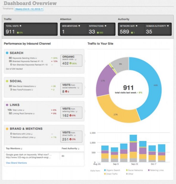 The analytics dashboard provides insights into a company’s search, social and referral traffic. Users can track traffic generated to their website, how many people have been mentioning their company online, the influence of their content, and which of their digital properties is creating more buzz among the customers.
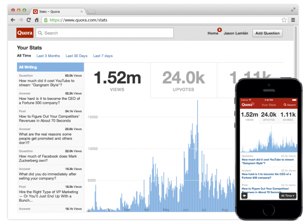 On November 13th, 2013, Quora announced the launch of Stats, a feature that will give Quora users visibility into the distribution of their content. The Stats dashboard brings together many key metrics on one page like Views, Upvotes and Shares. Bodnick, Head of the Business and Community Teams at Quora, said the analytics tool was the most popular request from current users, and that shedding light on traffic and shares may even increase Quora’s readership and encourage people to write more. Though the dashboard is very basic as of now, it will be interesting to watch how its future will pan out.
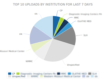 Each Accelarad customer has access to a real-time analytics dashboard, with options for more complex and custom dashboard options based on the subscription level. Using the dashboard, users can select timeframes to quickly review the number of studies shared and received as well as top activity from image viewers. These measurements provide insights into workflow efficiency; for example, administrators can see which physicians and/or hospitals are using the system to view images and determine which doctors might need training.
In addition, users can accurately measure a facility’s number of scans, determine peak times and trends in referral patterns to gauge revenue loss or gain. Moreover, the dashboard demonstrates true ROI by detailing the number of compact discs (CDs) eliminated by transitioning to an electronic online process.
Moreover, the dashboard demonstrates true ROI by detailing the number of compact discs (CDs) eliminated by transitioning to an electronic online process. [Related read:How Real-Time Analytics Works – A Step-by-step Breakdown]
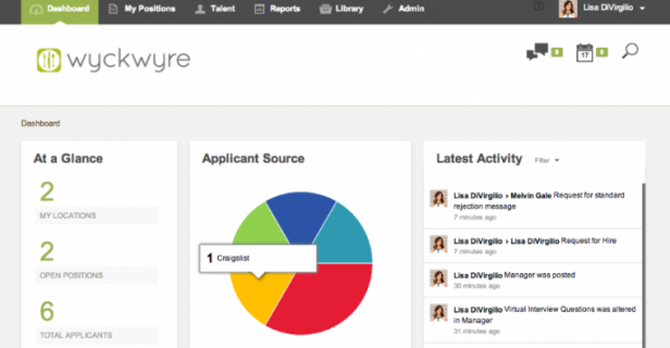 The new features include real-time hiring activity dashboards with live news feeds of hiring managers’ actions, personality assessment integrations, customizable pre-screening per position, actionable data reporting and the ability to add digital on-boarding to the system beginning in January 2014.
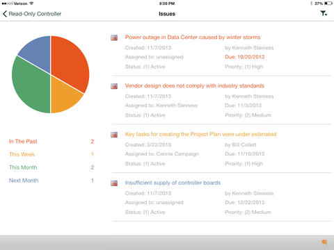 The dashboard includes live tiles for Project, Tasks, Issues, Risks, Documents and Deliverables. Users can access detailed information behind each live tile.
The Project tile shows high level project information about the Finish, Cost, % Work complete, Issues and Risks.The Tasks tile shows detailed information about Slipping Tasks, Missed Deadlines, Tasks that are Due Soon and Starting Soon as well as Over Allocations. The Issues tile shows the SharePoint Issues list for the project.The Risks tile shows the SharePoint Risks list for the project. The Documents tile shows the SharePoint Document Library for the project. The Deliverables tile shows the SharePoint Deliverables list for the project.
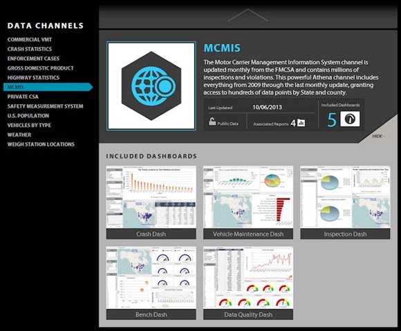 In addition to gathering data from public sources, Vigillo will be working with other industry data sources, such as legal, training and onboard system providers, to capture relevant data from a wide variety of integrated channels, and join them in a cohesive Business Intelligence environment. Initial reports will be presented in a set of about 30 highly customizable dashboards for effectively managing safety, operations, sales, maintenance, fuel purchasing, and driver recruiting and retention, among others.
Table of Contents
10 Products that added Dashboards to Improve their Value Proposition
1. Bit.ly’s Enterprise Version with Advanced Dashboard Features
Launched in 2008, Bit.ly was just a URL shortening service to begin with. In 2009, it announced the launch of its Pro version (which was also free) which allowed publishers to use their custom short domain names to point to pages on their sites. In addition to this, the Pro version also included a dashboard which provided a real-time view of how a given publisher’s content is being distributed across networks like Twitter, Facebook and MySpace and services like email, SMS and instant messenger.
 In 2010, it launched its enterprise edition (paid) which among other features had an advanced dashboard which allowed publishers, marketers, e-commerce sites and celebrities measure their social media efforts. Using this dashboard, they could analyze the number of clicks they have driven to a particular story against the overall user engagement. It also allowed them to look at different measures of viral success—the number of times a particular article has been shortened and shared, compared to the aggregate number of clicks it received. Users could also access detailed location and referrer data from the dashboard.
From a free product used to shorten URLs, its paid Enterprise version now boasts of names like The Huffington Post, GE, Ford and Heineken who use it to gain audience insight and benchmark their social media efforts.
2. Facebook Insights Measuring Brand Page’s Marketing Efforts
 To enable brands to measure their marketing efforts on Facebook, Facebook Insights was launched. It had a dashboard where marketers can monitor their Page’s Likes, Friends of Fans and Weekly Total Reach. It gave marketers insights into some key data points like how many total people have posted something about their Page, how much virality their stories have generated, the demographics of their fans, etc.
 Since then they have been iterating their design from time to time to provide marketers better ways to analyze their data. A June 2013 update includes splitting of data points that were previously rolled in together (like People Talking About Us has been broken down into Likes, Comments, Shares and Clicks) and inclusion of some additional charts making it easier for users to see what kinds of posts— say, those with images, or ones targeted to certain groups—have better engagement than others.
3. The Serendipitous Discovery of Twitter Analytics
When Twitter began gaining prominence in the online social networking and microblogging space, more insight into community data became a constant feature request from marketers. In January 2012, ReadWrite reported that Twitter was planning to unveil a series of new tools in the next few months, including sophisticated analytical tools. And in June 2013, Christopher Penn of Shift Communications while playing with different ad platforms for social networksserendipitously discovered the Twitter Analytics. The analytics dashboard, to begin with, provided insight by Tweet and by Followers. Tweet specific stats included number of retweets, favorites and the reach derived from follower sharing. You could also get information about the specific number of clicks on each link. In the follower section, you could see follower growth as well as more demographic data. Metrics include location, unique interests, top interests, gender and other Twitter users that are like you.
The recent update to Twitter’s analytics dashboard includes a Websites section which can be configured to track for a specific domain to show the number of tweets and click-throughs that Twitter is generating for the site as a whole or specific pages.
4. Moz Analytics Providing More than just SEO
In May 2013, the quintessential SEO software SEOmoz not only changed its name to Moz but also expanded its offering to include an exclusive analytics platform, Moz Analytics. The new platform allowed users to manage all their digital analytics in one place. It was designed to help businesses monitor and measure entire marketing campaigns and find opportunities across multiple online marketing channels. The analytics dashboard provides insights into a company’s search, social and referral traffic. Users can track traffic generated to their website, how many people have been mentioning their company online, the influence of their content, and which of their digital properties is creating more buzz among the customers.
5. Quora’s baby steps into Data Visualization through Stats
The latest social media app to have added a dashboard to their product is Quora, a question-and-answer based social networking site. On November 13th, 2013, Quora announced the launch of Stats, a feature that will give Quora users visibility into the distribution of their content. The Stats dashboard brings together many key metrics on one page like Views, Upvotes and Shares. Bodnick, Head of the Business and Community Teams at Quora, said the analytics tool was the most popular request from current users, and that shedding light on traffic and shares may even increase Quora’s readership and encourage people to write more. Though the dashboard is very basic as of now, it will be interesting to watch how its future will pan out.
6. Accelarad’s Real-time Analytics Dashboard
Founded in 1999, Accelarad is one of the largest medical image exchange. The cloud-based solution makes it simple for health care organizations, physicians and patients to securely view, manage and share medical images and documents online. Answering the needs of the radiology industry which was pushing for deeper analytics and data measurement in its pursuit of better patient health outcomes, Accelarad has included a dashboard and image exchange analytics reporting as part of its latest product update. Each Accelarad customer has access to a real-time analytics dashboard, with options for more complex and custom dashboard options based on the subscription level. Using the dashboard, users can select timeframes to quickly review the number of studies shared and received as well as top activity from image viewers. These measurements provide insights into workflow efficiency; for example, administrators can see which physicians and/or hospitals are using the system to view images and determine which doctors might need training.
In addition, users can accurately measure a facility’s number of scans, determine peak times and trends in referral patterns to gauge revenue loss or gain. Moreover, the dashboard demonstrates true ROI by detailing the number of compact discs (CDs) eliminated by transitioning to an electronic online process.
Moreover, the dashboard demonstrates true ROI by detailing the number of compact discs (CDs) eliminated by transitioning to an electronic online process. [Related read:How Real-Time Analytics Works – A Step-by-step Breakdown]
7. WyckWyre’s V3 simplifying hospitality-specific hiring
Launched in 2010, WyckWyre is a food and hospitality-specific online hiring system. It recently announced the release of its new V3 system, a platform that the company said will give clients a tool that is as simple to use as popular social networks. The new features include real-time hiring activity dashboards with live news feeds of hiring managers’ actions, personality assessment integrations, customizable pre-screening per position, actionable data reporting and the ability to add digital on-boarding to the system beginning in January 2014.
8. Sensei Project Dashboard― for iPad
Sensei Project Solutions specializes in Project and Portfolio Management (PPM) deployments with Microsoft Project, Microsoft Project Server and Microsoft Project Online. On December 3rd, 2013, it announced the official launch of the Sensei Project Dashboard™ App that pulls together Microsoft Project schedule information and SharePoint data to provide a comprehensive and interactive status dashboard for your project. The dashboard includes live tiles for Project, Tasks, Issues, Risks, Documents and Deliverables. Users can access detailed information behind each live tile.
The Project tile shows high level project information about the Finish, Cost, % Work complete, Issues and Risks.The Tasks tile shows detailed information about Slipping Tasks, Missed Deadlines, Tasks that are Due Soon and Starting Soon as well as Over Allocations. The Issues tile shows the SharePoint Issues list for the project.The Risks tile shows the SharePoint Risks list for the project. The Documents tile shows the SharePoint Document Library for the project. The Deliverables tile shows the SharePoint Deliverables list for the project.
9. Carlson Wagonlit Travel’s Meetings Spending Dashboard
On November 19, 2013, Carlson Wagonlit Travel (a global leader specializing in managing business travel and meetings and events) announced the launch of its CWT Meetings & Events Dashboard in Europe. “One thing our clients were asking us for was a holistic view of how they’re spending their money in the meetings and events arena,” said CWT Meetings & Events global senior vice president Floyd Widener. “To do that, we could not stay with our traditional sources of data. Our traditional sources of data for the travel part of the business are the best quality, but that’s air, car and in some cases hotel. We needed to figure out how we could get all the data from those [meetings technology] tools into our repository, marry it with the information coming out of our core business data sources—when we’re issuing tickets and the like—and come up with a dashboard where we could pull that together and report it.” As of now, CWT’s program managers, not the corporate clients themselves, are using the dashboard in Europe to offer a more detailed view of client programs during periodic business reviews. Widener said that CWT by next year will roll out the dashboard to its program managers in the Americas and Asia/Pacific regions to “try to monetize the tool and go to the market and turn it loose with our customer base, so that they can interact with it.” The dashboard works by pulling information on spend from CWT Meetings & Events back office technology system, and consolidates client activity, destination analysis, budget breakdown and hotel spend, to give clients a holistic, 360 degree view of their spend.10. Vigillo’s Greek goddess of Wisdom, Athena
On December 4th, 2013, Vigillo LLC, creators of data mining software products designed to aggregate, organize and deliver complex fleet safety information in an easy-to-read scorecard format, announced its new Athena™ Big Data Business Intelligence platform. Named after the Greek goddess of wisdom, Athena is an open source Big Data solution that gathers data from a wide variety of sources, distills it into understandable information and then presents it in a straightforward format that trucking companies can use to improve a range of operational factors. The web-based solution is accessible through all types of devices and provides data-visualization through interactive dashboards and a report deployment scheduler. “We’re looking at US population statistics, GDP, weather, traffic, highway infrastructure investments, tolls, and more. Our goal is to intelligently answer the question ‘why’ and deliver that answer to anyone, anywhere, any time and in a way they can understand, whether it’s the CFO or safety manager, shipper, driver or insurer. Athena is designed to pull all of trucking’s data into one platform and then publish that wisdom on demand.” In addition to gathering data from public sources, Vigillo will be working with other industry data sources, such as legal, training and onboard system providers, to capture relevant data from a wide variety of integrated channels, and join them in a cohesive Business Intelligence environment. Initial reports will be presented in a set of about 30 highly customizable dashboards for effectively managing safety, operations, sales, maintenance, fuel purchasing, and driver recruiting and retention, among others.
