In the first and second part of this series on personal finance apps with amazing dashboards, we saw how Money Dashboard and Toshl Finance help people manage their budgets and keep track of their expenses and income using a dashboard. However, the entire purpose of budgeting gets defeated if we are unable to plan and save for the future.To help you make the most of your investments, in the concluding part of this series, we are going to coverJemstep, a portfolio manager that is designed to help people have more money for retirement.
Jemstep helps individual investors manage their investments by providing guidance on what to buy, sell or hold for their retirement portfolio.Using proven portfolio modeling methods, Jemstep chalks out a plan to help investors save on fees, reduce taxes and have better outcomes from their portfolio while keeping in mind the appropriate level of risk each user is ready to take.
 The use of labeled icons (icons followed by a crisp 1-2 word description) in the header makes it easier for the user to figure out the information that he will find in the respective pages. (Related read: 10 Emerging Trends in Dashboard Design). A selected tab is shown by a change in color (from gray to blue).
Clicking on the small arrow (below the Portfolio tab) gets you a quick snapshot from all your pages.
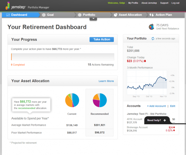
 The dashboard page can be divided into three main parts—Your Progress, Your Asset Allocation and Your Portfolio.
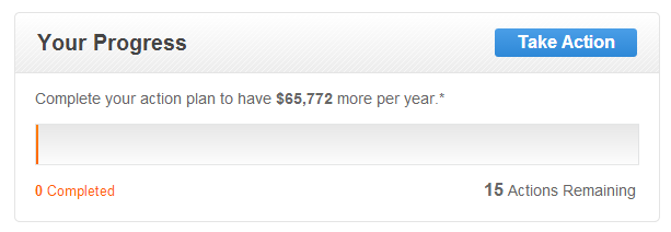 Your Progress section uses a progress bar to indicate where you stand in terms of the recommended action plan. It also indicates how many actions remain before you can meet the recommended plan. A clear call-to-action button (Take Action) takes you to the Action Plan page.
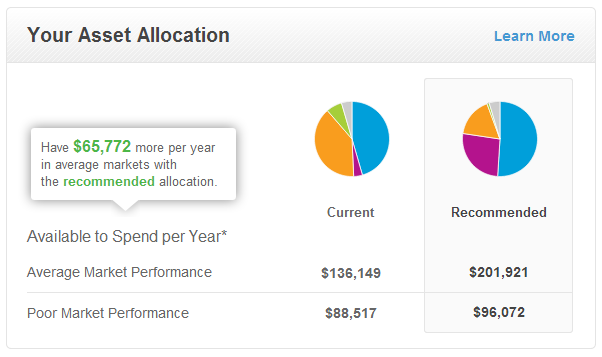 Your Asset Allocation section uses two pie charts to visualize the current and recommended asset allocation and facilitate a comparison between the two.
It also provides a comparison between the current and the recommended allocation in a tabular form in an average market and poor market performance scenarios.
The Learn More links you to the Asset Allocation page.
However, it would have been much easier to compare the current and the recommended allocations using a stacked column chart than a pie chart.
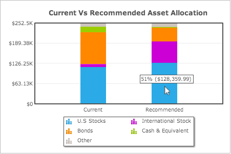 Alternative visualization for the Current Vs Recommended Asset Allocation using FusionCharts Suite XT.
It not only helps you to better understand the composition of current vs recommended allocation but also facilitate an easier comparison between the two. What do you think? (Related read: Selecting the right chart type for your data)
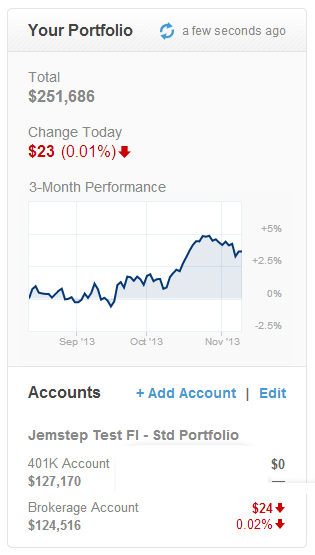 Your Portfolio section gives you information about the total value of your portfolio, the percentage change in the value of your portfolio as on the current date as well as a snapshot of the various accounts that are linked to your Jemstep account with an add/edit option. What catches the attention in this section is the percentage change in portfolio value (brought out by the use of a contrasting color−red to indicate a decline).
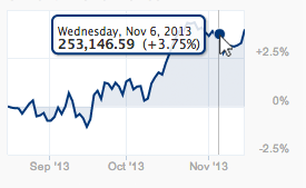 The line chart shows the historical daily performance of accounts linked to Jemstep from the day they were linked and helps to analyze the overall trend. Additional details about each data point are provided in the tooltips.
The Add Account/Edit takes you to the portfolio page.
 In the top right, the dashboard also provides information about the number of days left for the next rebalance ―a process of determining which holdings to sell and which investments to purchase, based on changes in the market, in order to bring the portfolio back to the recommended allocation.Jemstep does this analysis automatically every 3 months for its paid users.
Overall, the Jemstep dashboard page serves a dual purpose. It not only provides a summary of key metrics but also acts as a medium to navigate through the the app.
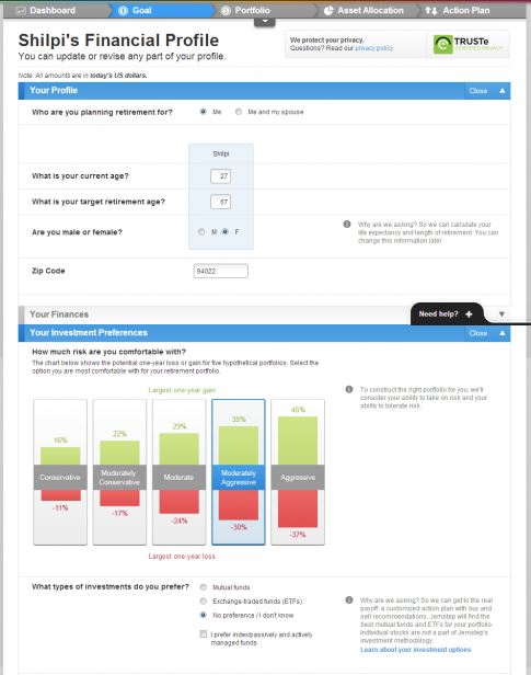 The Goal page is a form where you have to answer some key questions pertaining to your retirement like your age, target retirement age, risk tolerance, etc. The form is neatly grouped under various heads―Your Profile, Your Finances and Your Investment Preferences. Text labels are aligned left helping users figure out the beginning of each line easily. (Remember we discussed the benefits of left justified labels while discussing Toshl’s dashboard?)
Jemstep also provides an explanation adjacent to important labels explaining users why they need the specific information and how will it be used to help them plan out their portfolio. Nice way to build trust amongst its users by removing doubts from their minds and for an investment app, thistrust really matters!
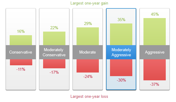 The visualization of the one-year loss or gain for five hypothetical portfolios using column charts helps you to quickly compare the potential loss (red) or gain (green) associated with each type of investment. Based on the amount of risk you are ready to take, you can select from the various options available for your retirement portfolio.
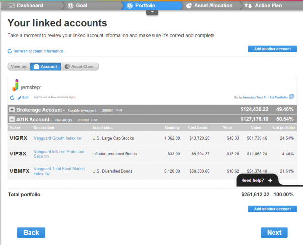 The Portfolio page lets you view the details of all your linked investment accounts at one place. You can view this detail either by account type or asset class by selecting the required tab at the top.
 A process of gradual reveal is followed where you can get more information about a particular account type (or a particular asset class) by clicking on the plus symbol adjacent to each account. You can further drill-down into the details of each asset by clicking on it. Let’s say we click on 401K Account > Vanguard Growth Index Inv. You get the complete details about Vanguard Growth Index Inv including their tax efficiency, performance, risk involved, etc.
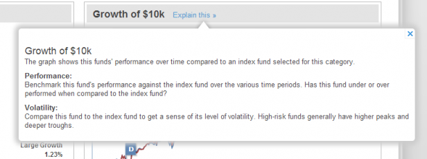
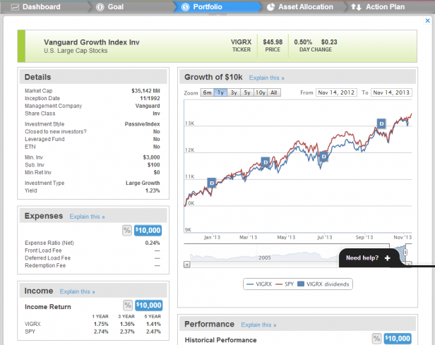 And if you get confused as to what a specific metric signifies, you can click on Explain this link. A pop up opens which explains what that metric means.
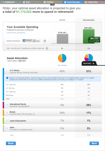 The Asset Allocation page analyzes your current asset allocation and compares it with the Jemstep recommended allocation. At the top is a personalized message stating the additional money (projected) you will have for your retirement if you follow Jemstep’s recommendations. Next is a column chart that compares your available spending for each year in retirement with your current and recommended asset allocation. If you, like me, have difficulty remembering numbers, chances are you would not remember the exact figures here too. For arithmophobics (arithmophobia is the fear of numbers) like us, the column chart comes to our rescue and helps us get an approximate idea of the difference in the money we will have for our retirement with our current and recommended allocations.
 You can get this comparison for both average and poor market scenarios by selecting the appropriate tab.
The Asset Allocation section breaks down your current asset allocation into various asset classes and compares it with the recommended allocation using both pie chart as well as a table. Here too, the stacked column chart would have been a better fit than the pie chart for the data it is trying to visualize.
The table follows a process of gradual level and you can get the details of each asset class by clicking on the plus sign.
 There are information tips throughout this page to inform users why a certain allocation is recommended, how Jemstep’s recommendations work, etc.
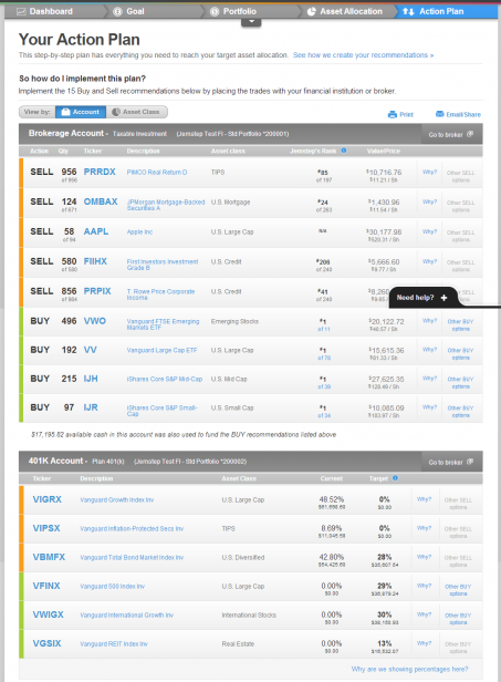 The Action Plan page is the most crucial aspect of the app as it gives a clear step by step plan to reach the target asset allocation by recommending a set of buy and sell options. The difference between sell and buy options in the list is brought out by the use of color markers (orange for sell and green for buy).
 Each of the recommended action is accompanied by a brief explanation (Why?) so that you can understand the logic behind a buy or a sell recommendation.
Here too you can drill into the details of each stock by clicking on it.
 You can directly take a print or email this action plan using the export options at the top. With this action plan in hand, you can then go to your usual brokerage firm to trade, either by yourself or through a representative. Jemstep does not trade on your behalf. It just recommends you a plan and therefore, you do not need to liquidate your accounts at your current brokerage firm in order to take action.

Dashboard
The Dashboard is the default tab. There are 4 other tabs in the header—Goal, Portfolio, Asset Allocation and Action Plan. The dashboard page can be divided into three main parts—Your Progress, Your Asset Allocation and Your Portfolio.
 Your Progress section uses a progress bar to indicate where you stand in terms of the recommended action plan. It also indicates how many actions remain before you can meet the recommended plan. A clear call-to-action button (Take Action) takes you to the Action Plan page.
 Your Asset Allocation section uses two pie charts to visualize the current and recommended asset allocation and facilitate a comparison between the two.
It also provides a comparison between the current and the recommended allocation in a tabular form in an average market and poor market performance scenarios.
The Learn More links you to the Asset Allocation page.
However, it would have been much easier to compare the current and the recommended allocations using a stacked column chart than a pie chart.
 Alternative visualization for the Current Vs Recommended Asset Allocation using FusionCharts Suite XT.
It not only helps you to better understand the composition of current vs recommended allocation but also facilitate an easier comparison between the two. What do you think? (Related read: Selecting the right chart type for your data)
 Your Portfolio section gives you information about the total value of your portfolio, the percentage change in the value of your portfolio as on the current date as well as a snapshot of the various accounts that are linked to your Jemstep account with an add/edit option. What catches the attention in this section is the percentage change in portfolio value (brought out by the use of a contrasting color−red to indicate a decline).
 The line chart shows the historical daily performance of accounts linked to Jemstep from the day they were linked and helps to analyze the overall trend. Additional details about each data point are provided in the tooltips.
The Add Account/Edit takes you to the portfolio page.
 In the top right, the dashboard also provides information about the number of days left for the next rebalance ―a process of determining which holdings to sell and which investments to purchase, based on changes in the market, in order to bring the portfolio back to the recommended allocation.Jemstep does this analysis automatically every 3 months for its paid users.
Overall, the Jemstep dashboard page serves a dual purpose. It not only provides a summary of key metrics but also acts as a medium to navigate through the the app.
Goal
 The Goal page is a form where you have to answer some key questions pertaining to your retirement like your age, target retirement age, risk tolerance, etc. The form is neatly grouped under various heads―Your Profile, Your Finances and Your Investment Preferences. Text labels are aligned left helping users figure out the beginning of each line easily. (Remember we discussed the benefits of left justified labels while discussing Toshl’s dashboard?)
Jemstep also provides an explanation adjacent to important labels explaining users why they need the specific information and how will it be used to help them plan out their portfolio. Nice way to build trust amongst its users by removing doubts from their minds and for an investment app, thistrust really matters!
 The visualization of the one-year loss or gain for five hypothetical portfolios using column charts helps you to quickly compare the potential loss (red) or gain (green) associated with each type of investment. Based on the amount of risk you are ready to take, you can select from the various options available for your retirement portfolio.
Portfolio
 The Portfolio page lets you view the details of all your linked investment accounts at one place. You can view this detail either by account type or asset class by selecting the required tab at the top.
 A process of gradual reveal is followed where you can get more information about a particular account type (or a particular asset class) by clicking on the plus symbol adjacent to each account. You can further drill-down into the details of each asset by clicking on it. Let’s say we click on 401K Account > Vanguard Growth Index Inv. You get the complete details about Vanguard Growth Index Inv including their tax efficiency, performance, risk involved, etc.
 And if you get confused as to what a specific metric signifies, you can click on Explain this link. A pop up opens which explains what that metric means.

Asset Allocation
 The Asset Allocation page analyzes your current asset allocation and compares it with the Jemstep recommended allocation. At the top is a personalized message stating the additional money (projected) you will have for your retirement if you follow Jemstep’s recommendations. Next is a column chart that compares your available spending for each year in retirement with your current and recommended asset allocation. If you, like me, have difficulty remembering numbers, chances are you would not remember the exact figures here too. For arithmophobics (arithmophobia is the fear of numbers) like us, the column chart comes to our rescue and helps us get an approximate idea of the difference in the money we will have for our retirement with our current and recommended allocations.
 You can get this comparison for both average and poor market scenarios by selecting the appropriate tab.
The Asset Allocation section breaks down your current asset allocation into various asset classes and compares it with the recommended allocation using both pie chart as well as a table. Here too, the stacked column chart would have been a better fit than the pie chart for the data it is trying to visualize.
The table follows a process of gradual level and you can get the details of each asset class by clicking on the plus sign.
Action Plan
 The Action Plan page is the most crucial aspect of the app as it gives a clear step by step plan to reach the target asset allocation by recommending a set of buy and sell options. The difference between sell and buy options in the list is brought out by the use of color markers (orange for sell and green for buy).
 Each of the recommended action is accompanied by a brief explanation (Why?) so that you can understand the logic behind a buy or a sell recommendation.
Here too you can drill into the details of each stock by clicking on it.
