How to create an intuitive drill-down interface?

Drill-down charts are widely used in reports and dashboards. They help maximize business information by presenting the data in digestible chunks. However, in a lot of applicatons a majority of of users are unable to reap their benefits completely owing to the unintuive drill-down interface the application has. Haven’t you ever come across a report where you had no idea that the charts could be drilled down into? Or you drilled down multiple levels into the chart only to lose track of where you currently are or where you came from?
Here, we discuss a systematic way to create an intuitive drill-down interface for all your reports and dashboards.
Understand the data thoroughly
What data are you plotting using the drill-down charts? Sales figures? Production figures? Will you allow drill-down from annual figures to quarterly figures, and finally to monthly figures? Or directly from annual to monthly? Or will you be having category-based drill-down like continents to countries?
Having answers to all these questions is essential to create an intuitive drill-down interface and plan the overall layout. It helps understand what chart type is needed at each level and know how many data sets will be displayed at each level.
Understand what chart type is needed at each level Typically, the chart type remains the same at all levels but there are a number of cases where the type of data analysis needed changes from one level to another. For example, you are displaying sales comparison starting with a column chart for comparing the annual sales over 3 years and these columns can be drilled down into for showing the monthly comparison for that year. Now for the monthly comparison, if you want to highlight the overall trend of sales rather than individual figures, you would need a line chart instead of the column chart. Once you know the chart type required at each level, you can plan the layout and the space required accordingly.

Know how many data sets will be displayed at each level With time-based drill-down, you know the exact number of data sets that will be displayed at each level. With category-based drill-down, you need to have a basic idea of the number of data sets. This helps ensure that the space you have allotted for the chart will not be overshot or get cluttered with too many data sets being displayed at the same level.
Clearly indicate the chart has drill-down
While this may sound obvious, it is pretty appalling to see charts where users have no idea that they can drill down into them.
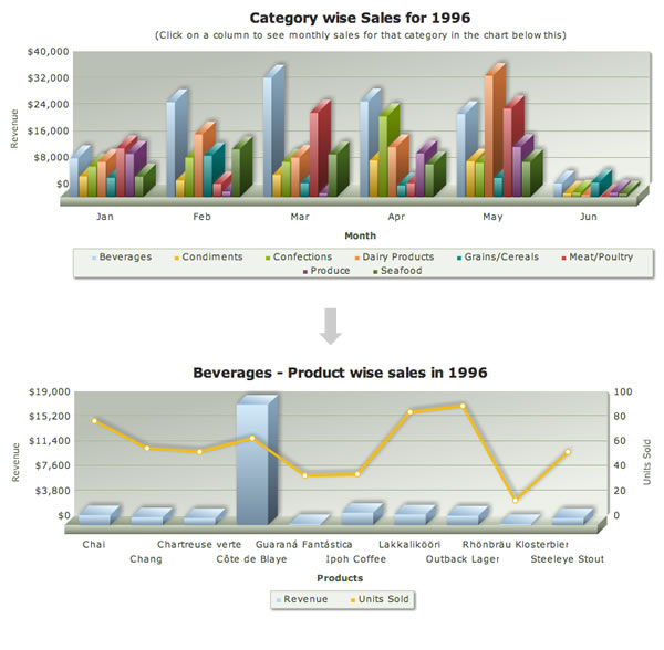
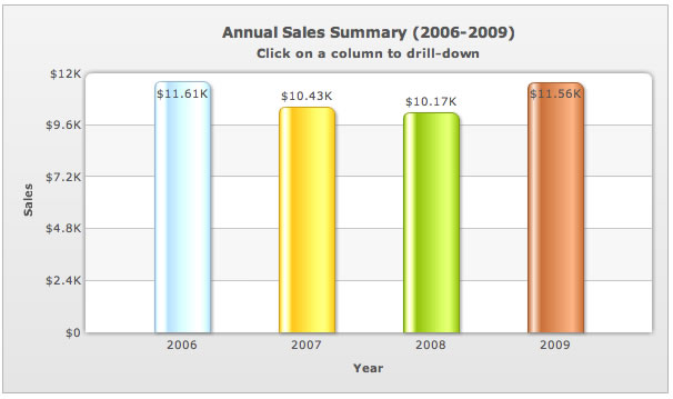
Have a message at the top clearly indicating that you can drill down into the chart – the sub-caption typically works well for this. This could be something as simple as "Click on a column to drill-down" to something more descriptive like "Click on a column to drill-down to monthly sales in the chart below."
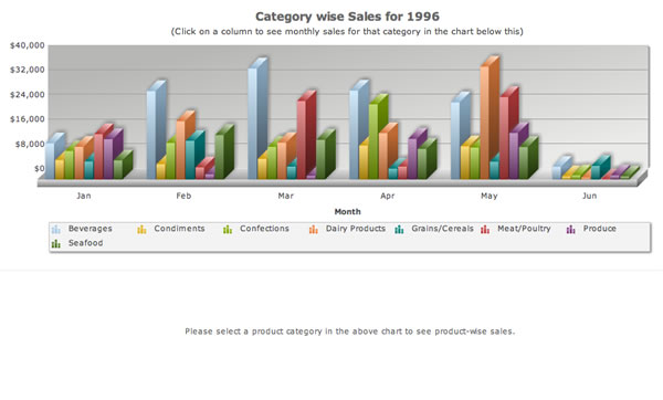
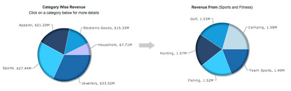
When you have the drill-down charts replacing the parent chart, the message is pretty simple as discussed above. However, if the child chart does not replace the parent chart and is displayed either below the parent chart or on the side, then the message has be to more descriptive to ensure everyone understands it. For example, in a retail dashboard, if you have category-wise sales shown in a chart and the user can click on the category to see a further breakdown below the parent chart, the child chart will need to have a message like: "Please select a product category in the above chart to see product-wise sales."
Use breadcrumb-style captions
Breadcrumbs are a navigation aid used in websites, applications and documents. It helps users keep track of where they are within the website with the ability to jump to any of these locations.
When there is just one drill-down level, it is pretty easy for the user to keep track of where he is but anything more than that becomes a cause of concern for the user, especially when he is deep in his data analysis. That’s where breadcrumb style captions come in.
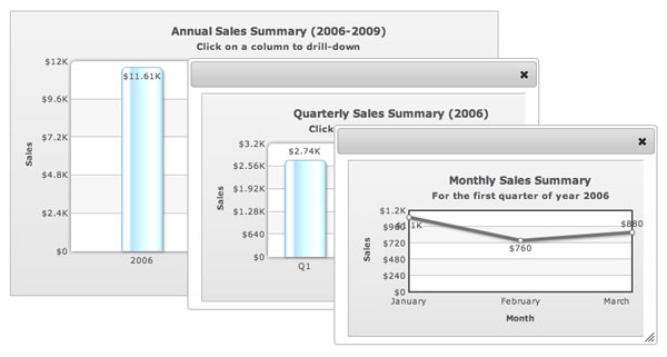
Of course, it is not essential to use a breadcrumb-style caption in its entirety, especially for time-based drill-down. For example if you have a drill-down from 2010 > Q1 > January showing sales figures, then the caption could just say: Sales Figures for January 2010. However, in category-based drill-down, a complete breadcrumb-style caption is the best way to go.
Use the same chart style for all levels
Depending on the kind of data analysis that you need to facilitate at different levels, the chart types could be same or different. If the data analysis that is to be done is the same at all levels, it makes no sense to introduce a new chart type. In either case, it is essential to use the same chart style at all levels – in terms of looks, placement of labels, the number scale used etc.
The idea behind using the same chart style is to build a sense of familiarity with the chart so that there is no discovery phase at every level. The user’s eyes get used to the chart style and he can focus all his energy on interpreting the data itself.


