How to report poor performance and get away with it?

For management executives, the quarterly meeting could be a dream or a nightmare. If you and your department have done well, it is time to thump that chest and declare how you are the best thing since beer. But if your performance figures are not up to the mark, it is time to pick from the 101 reasons to weasel out of a meeting. In this post, I would like to provide some tips on how to get out of that dreaded corporate scenario, using what I will conveniently call dressed-up reporting.
Dressed-up reporting, as you would have guessed, is all about presenting your performance data in a manner to make the drop in performance unidentifiable. Of course, you can’t hide poor performance for long. It is bound to be noticed sooner or later, but isn't it better to be confronted in a closed one-to-one meeting with just your boss than a room full of your peers? Here are some simple tips and tricks that you can use for dressing up your poor performance.
De-emphasize major differences
If you are reporting the monthly sales generated by your team in 2010, chances are you would pick a column chart. However, if the performance in the last couple of months has seen a major drop from the earlier months, using a straightforward column chart would clearly reveal this drop in performance.
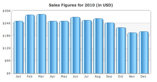
The trick is to increase the upper limit of the chart scale to make the performance drop seem insignificant. To a casual observer, the manipulated chart conveys uniformity and does not, in any way, trigger an alarm.
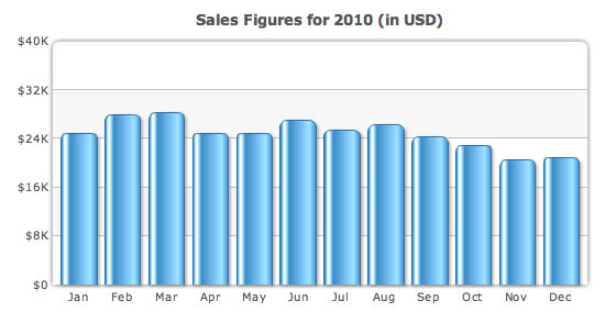
On the other hand, if your figures improved for the last quarter but not as significantly as your boss had expected, you can emphasize this growth by not starting the y-axis at zero. Instead, start it as something like $20K and your small growth would look so much bigger.
Use a wrong different chart type
Just because you have to display the Q4 sales figures does not mean you have to show monthly sales of 2010 in a simple column chart. Assuming the total sales for the last 3 years were lower than the current year's, you can show this in a stacked column chart comparing the sales from 2007-2010 with the figures for each year broken down into quarters.
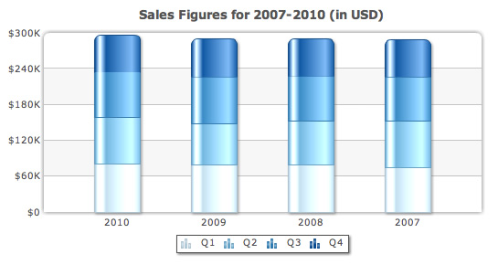
First up, since 2010 as a whole had better sales than the last 3 years, it makes the complete picture look good. Secondly, since we are stacking up quarterly figures one of top of another, it is not easy to figure out that Q4 was pretty poor compared to the earlier quarters in 2010. Thirdly, if your boss had to compare the Q4 sales of the last 4 years, it would be very tough since they do not share a common baseline. In fact, the Q4 figures are $61.5K, $64K, $63.3K and $62.4K for 2010, 2009, 2008 and 2007 respectively which even after a hard look is not comprehensible from the chart. To make this even tougher, we have used progressive shades of blue and not entirely different colors which would have formed individually comparable chunks.
Percentages are your best friend
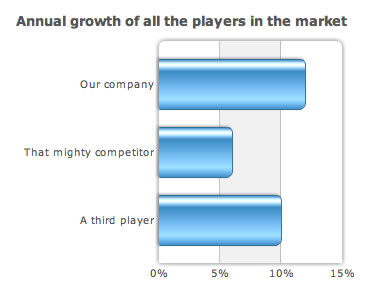
This is one of the most commonly used tricks throughout the industry. If your company only grew from $1M to $1.12M in annual revenue after all the hard work put in by everyone while that mighty competitor soared from $500 million to $530 million, you need to pick the heavy-duty armor...percentages. Show your boss how you had a healthy 12% growth in revenue while your competitor recorded only a small 6% growth.
Stay away from those trendlines
Trendlines are used to provide context to data. In a sales chart, they would typically be used to show the monthly target that had been set for the year.
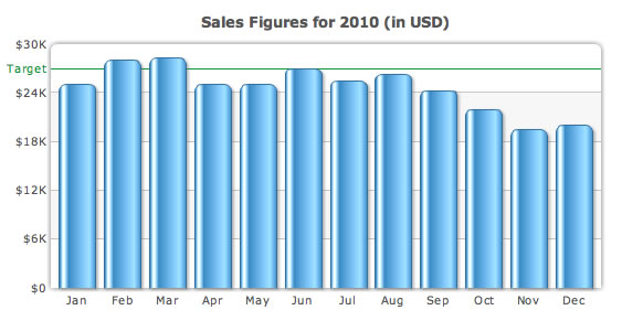
However, using a trendline in a chart where you have clearly not met your targets is outrageously insane. It becomes apparent that you are below your target for almost all your months, particularly in the last quarter. So stay away from the trendlines and do not provide this much-needed meaning to data.
What you can do instead is provide a different context. Last year's sales were lower than the current year's. Why not show the average sales last year with a trendline? The last three years generated lower sales than the current year. Put the average for all three of them put together as a trendline.
Make it all very loud
One of the most basic tricks of dressed up reporting is to take the attention away from the data.
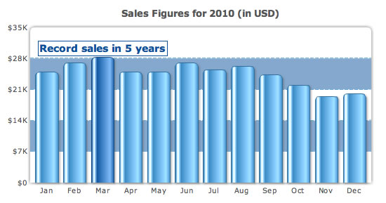
Put in loud colors for background elements like divisional lines. Highlight random data sets, say the highest grossing month, and keep talking about it at length. Put text in different colors, make it bold, put in cliparts...basically do anything you can think of so that nobody can notice the poor performance in the last quarter of 2010.
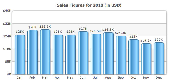
Displaying actual values? You must be nuts.
After doing all the hard of concealing your poor performance, putting in the actual values on the chart would be absolute suicide. Do not ever do it.
Bonus Tip: Ooze with confidence
After carefully dressing up all those charts, if your voice is shaky and your body language weak, you are asking for trouble. You are not doing anything wrong. You are not lying. It's just that you are smarter than your boss and just made some improvisations to your chart. Who doesn't do that? And which boss wouldn't want to have a smart employee? Be calm, be poised, be confident...as if you are about to introduce the iPhone to the world.
Final words
This, if you still haven't realized, is a tongue-in-cheek article. Use these tricks at your own discretion. Of course, if they work for you, do come back and let us know :)


