Usability is a term thrown around a lot these days. And not without good reason. People are getting busier and busier. If they cannot find exactly what they are looking for within seconds, it doesn’t exist for them…no matter whether they are searching for a product on the web, a feature in a tool or information on a website. So in this day and age, your charts just doing the job of converting heaps of data into easily identifiable shapes and patterns doesn’t cut it anymore. They have to present all information clearly and concisely, prioritize information for at-a-glance understanding and remove the possibility of having any ambiguity. In this post, I would like to discuss some quick tips to increase the usability of your chart instantly including descriptive captions, informative tooltips and better label management.
Use descriptive captions
The caption of a chart should completely describe what the chart is about. For example in a marketing heat map chart showing the conversion rate from different marketing mediums, the caption should explicitly be – Conversion rates from different marketing mediums.
The caption should also mention whether the numbers are in millions and the currency in $. In fact, the captions should be so descriptive that the axis labels if used are only left as reinforcements. However, with so many details put in the caption, they might turn out to be a bit too long in some cases. In cases like these, it is a good idea to delegate the units and number scale used to the sub-caption.
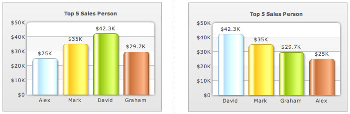
Arrange data in descending/ascending order
If the data is name or category-based, and not time- based, it is a good idea to arrange the data in descending/ascending order.
This is particularly helpful when you have a lot of data sets to display on the chart. With arranged data, it is very easy to find out who your best sales person is, which marketing medium is the best converting one and which state has the best employment rate.
Use slanted labels
When you are using a horizontal chart (column, line, area, waterfall etc) and the labels are long or there are too many of them in a small space, slant them for better readability instead of rotating them.
With the column chart you have the advantage that if the labels are very long, stretching into multiple words, you can use the bar chart instead. Of course, if you have well understood labels like month names, you can skip alternate labels and keep the labels horizontal itself.
Delegate detailed info to tooltips
So you are a hotel. You had a dip in reservations in September because a new hotel opened nearby and then you picked up again in October because you started offering a 25% discount. If this has to be explained in the chart itself to the user of the chart (management in this case), putting all this info on the chart itself would make it very cluttered.
How about putting all of this on the tool tips? Only when the user is interested in getting more info about a data set, he hovers over it and gets all the required information. Your
javascript chart stays clean, yet you have given out all the info.
Dig deeper: Learn how to use multi-line tooltips Add a context to data
Data analysis becomes more meaningful when the data being plotted on the chart is given a context. This is done using trendlines. With the context, it is easy to analyze if the sales figures in the current year are better than last year’s or if the target that had been set is being matched.
Without the trendline, the chart would have just been showing the monthly sales for the year and you would have inferred that Q1 was good for you and Q3 was bad. With a simple trendline added to the chart, you can also infer that the sales achieved for most of the months is below the target and you have not met your annual target.
If the chart has drill-down, say it
If your chart has drill-down from annual to monthly data, monthly to daily data or category-based drill-down (regions to states), clearly mention that at the top of the chart. If you don’t do that, most users will not notice the drill-down and do the analysis only at the macro level.
Dig deeper: Learn how to create an intuitive drill-down interface Which of these tips do you find the most useful? Is there anything else you use for making your charts more usable? Creating interactive
php charts is now easy also. Let us continue the discussion in the comments.
View Comments
Excellent stuff! I'll definitely be using some of these ideas in my current project. Keep 'em coming.