Grid lines are lines drawn in the chart plot area to ‘assist in the visual alignment of data.’ These charts can have vertical grid lines, horizontal grid lines, or both.
Fig. 1: Column chart with horizontal grid linesFig. 2: Bar chart with vertical grid linesFig. 3: Bubble chart with horizontal and vertical grid lines
Many people consider grid lines as a useless carry-over from an age when charts were drawn by hand on grid paper. Back then, they needed additional lines as reference points to plot data accurately. They think that in today’s era of software-generated charts, grid lines have become redundant.
In this post, we’ll walk you through the different scenarios in that grid lines can be useful and how to use them effectively, you may use Data Charts to improve your charts or graphs when creating data visualization.
There are certain scenarios in which grid lines can be useful:
Table of Contents
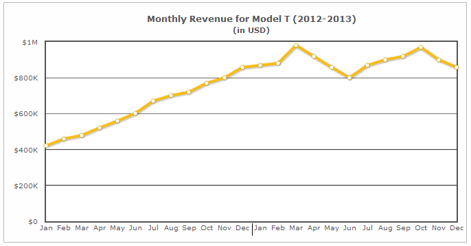
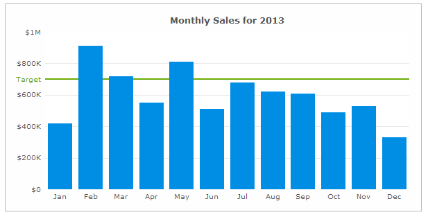
Scenario 1: To Add Precision in Large Graphs
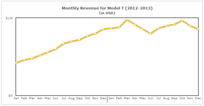
For graphs, where data points are too far from the quantitative axis, it helps when you have grid lines to align the data to the right value.
It would have been difficult to measure the value for December 2013 from this chart had the grid lines not been there.
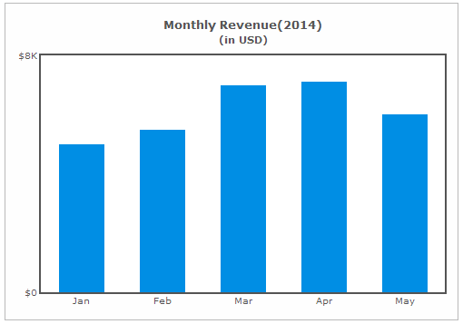
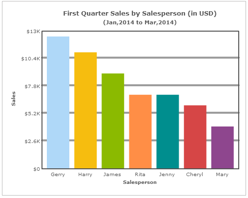
Scenario 2: To Highlight Subtle Differences
Can you detect the difference between the monthly revenues of March and April from the chart below?
Due to their almost similar lengths, it is difficult to find out their difference.
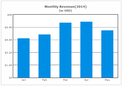
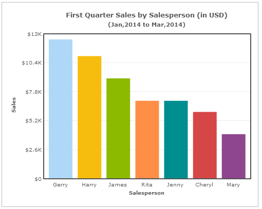
If we redraw the same chart using grid lines, it would be easier to detect their difference.
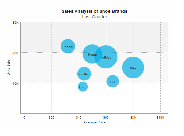
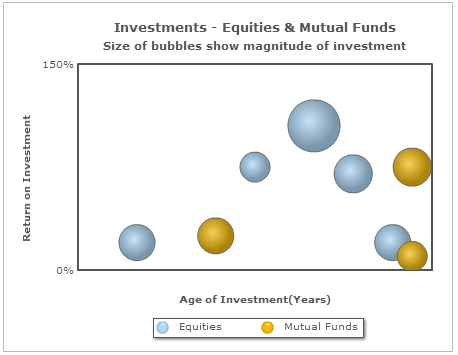
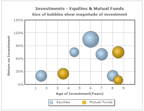
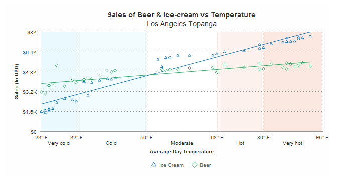
Scenario 3: To Focus on a Specific Area in a Bubble or Scatter Chart
In a bubble or scatter chart, it is difficult to focus on a specific area because data values are scattered.
The grid lines, in this case, divide the graph into sections and help users to focus on a specific section for analysis.
We recommend reading Stephen Few’s article on Grid Lines in Graphs are Rarely Useful to discover other scenarios where grid lines are helpful.
How to Use Grid Lines Effectively
Grid lines can help in interpreting data in certain scenarios. So here are three tips to make them more effective:
Keep Them Subtle
Visually heavy grid lines distract the user from the actual data.
If you are using grid lines in your chart, make sure they are subtle and do not hinder the interpretation of data.
When Adding Trendlines with Grid Lines
A trendline is used to add context to a chart, by helping the user interpret data in relation to some predetermined value. It provides a reference point to compare the measure against a set benchmark.
In the above chart, the Target line is a trendline. When adding a trendline along with grid lines, ensure that the trendline is of a different color. Doing so will make it visually stand out from the other grid lines.
[Related read: How to add trendlines in FusionCharts Suite XT?]
When Adding Regression Lines with Grid Lines
At times, you may be required to plot a regression line to derive a sense of the trend from a scatter plot.
Similar to adding a trendline, ensure that the regression line is of a different color to that of the grid lines. Ideally, the regression line should match the color of the respective data plot. This will make it easier for the user to interpret the data.
Ready to get started building powerful charts featuring grid lines?