Assume you have one second (or even less in real-life scenarios) to tell your story. How will you make your data visualization stand out? By emphasizing every aspect of your visualization!
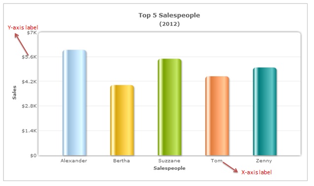
The value associated with a specific point on the chart axes is described by Data Labels.
More than often, we ignore our data labels reducing them to mumbo jumbos. To ensure that our data labels help in taking our story forward, we need to add some delight to them too.
In this post, you’ll learn about 5 quick fixes for ugly X-axis data labels. You can create x-axis data labels using data charts. Continue reading to learn about the 5 quick fixes that you may want to try in the future.
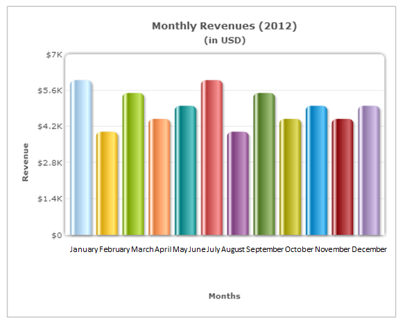
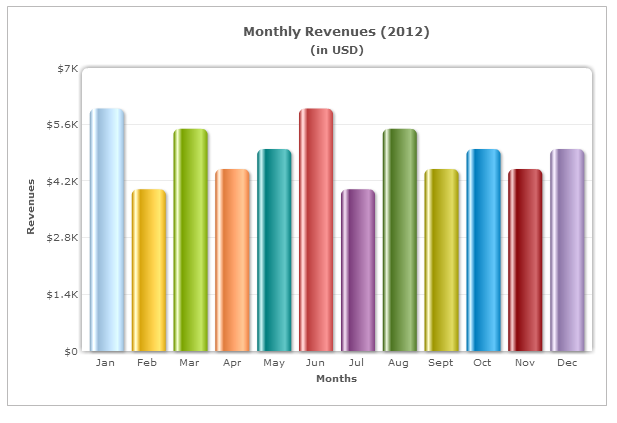
1. Shorten well-known names like names of weekdays and months
Long data labels merge with one another and affect the readability. When your labels are well-known terms, it is best to shorten them.
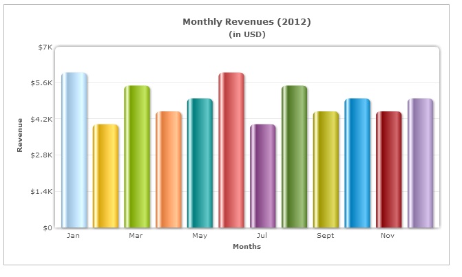
2. Skip alternate labels if you have a series of continuous data like days and months
If your labels are continuous and incremental in nature, you can skip the alternate labels. This will reduce clutter from your chart while still communicating the necessary information.
3. Make the common denominator your X-axis name
Common denominators (common words repeated in all labels like Product A, Product B, Product C) are often found in data labels.
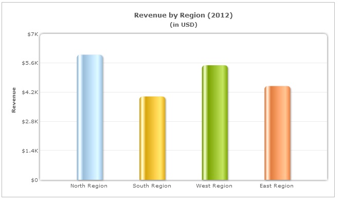
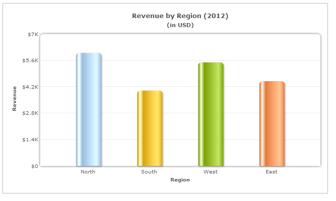
Here the word ‘Region’ appears in all the labels. It is better to make the common denominator, your X-axis name. It reduces unnecessary clutter.
4. A 45⁰ slant is more readable than a 90⁰ rotation
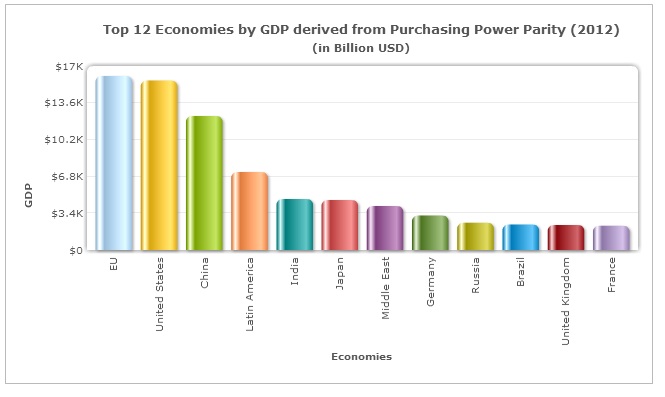
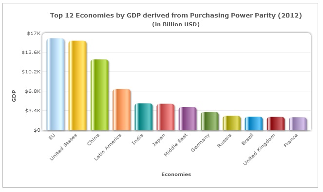
In cases where you can’t shorten your labels, it is better to slant them at 45⁰ angle rather than rotating them to 90⁰.
90⁰ rotated labels are difficult to read (unless, you are intentionally wanting to break a few necks). Make your users’ life a little easy by slanting them at 45⁰; they will thank you for it!
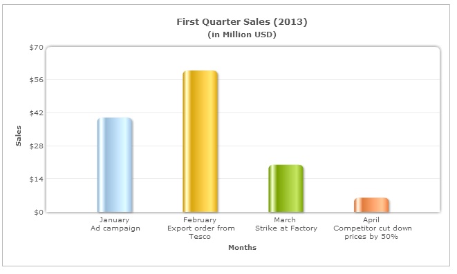
5. Add detailed information at the top of the data plot
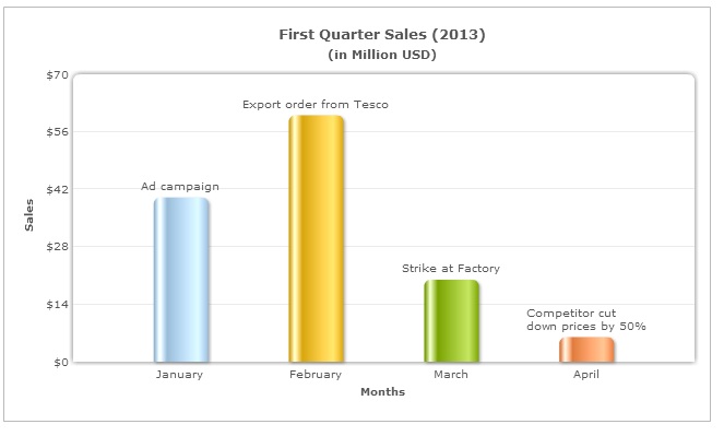
Sometimes you may have to display additional information (eg: the reasons for the drop in sales) about your data plots.
In such scenarios, putting all the information in the data labels will cause an information overload for the user as well as make your chart cluttered.
Shift some of this information to the top of your data plots. This will ensure that your chart remains uncluttered and the user too does not miss out any information.
Using these simple tips you can easily fix your ugly X-axis labels and make them a delight!
FusionCharts Suite XT comes with advanced label management that takes care of your ugly X-axis labels.
Keep watching this space for more tips on delightful charting!
A well-designed dashboard helps users understand complex data quickly, monitor key performance indicators, and make…
Quick Answer: The best commercial chart libraries for Nuxt include FusionCharts, Highcharts, AnyChart, amCharts, ApexCharts,…
Quick Answer To integrate interactive Vue charts into a Vue 3 application, first create a…
If you're looking for the best Vue chart library for interactive data visualization, there isn't…
Modern web applications generate and display more data than ever. They create from business dashboards…
Businesses collect data from multiple sources every day, including sales platforms, marketing tools, customer support…