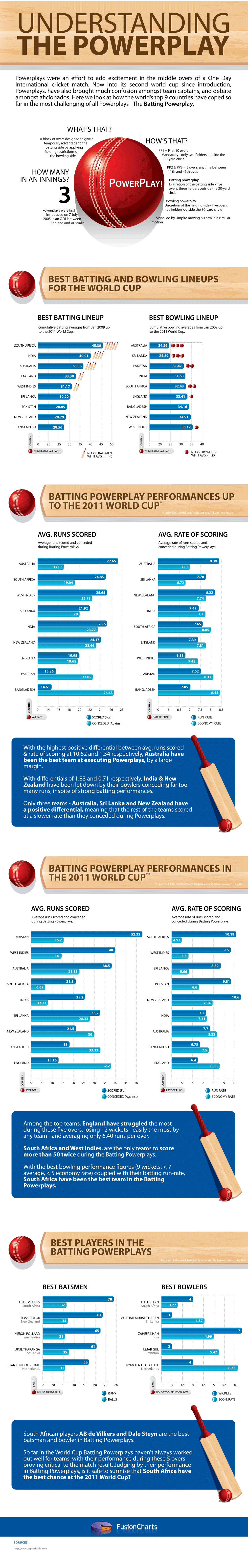
We’re out with a brand new infographic. It’s no secret that the game of Cricket is very much a religion in this part of the world. And with the 2011 Cricket World Cup well under way, there’s little else on people’s mind.
We try to shed light on a phenomenon that is reason for as much confusion as it is for tremendous excitement during each match – the dreaded Powerplays. More specifically, the Batting Powerplays! So far in the 2011 World Cup, Batting Powerplays haven’t always worked out well for teams. Right from struggling to figure out the best time to use them, to making the most of it without disrupting the rhythm of batsmen already used to taking singles in the middle overs, it has often resulted in more damage than good for the batting team.
As our latest infographic focuses on Cricket, it automatically comes with a disclaimer of its own – if you aren’t too much a fan of the game, you are very likely to remain as confused as we were before we sat and tried making sense of it all! But for those die hard fans, our infographic attempts to make sense of how the teams have been faring so far and who comes out on top. Let us know what you think.
You can build complex web applications easily with Angular. But it’s a challenge to present…
JavaScript charts help transform raw data into clear, interactive visualizations that users can easily understand.…
Modern web applications depend on data visualization to transform complex information into clear, actionable insights.…
Data is a big part of modern software. Companies use charts to track sales, monitor…
Every day, businesses get more data than ever before. Looking at endless rows and columns…
Building interactive React charts from scratch can quickly become complicated. It becomes even more challenging…
View Comments
The batting Powerplay was conceived as an asset for the batting team, an aid in the pursuit of fast runs. In the months leading into the World Cup, it began to be a banana skin, with wickets falling as batsmen resorted to rashness during the fielding restrictions. India have slipped spectacularly on it during the tournament, scoring 9 for 154 off 130 balls. During the batting Powerplay, India lost 1 for 32 against England, 4 for 30 against South Africa and 4 for 28 against West Indies, squandering positions of immense strength. Australia haven't mastered it either, making only 4 for 121 off 100 balls. Those five tricky overs could make or break a campaign today.
A very nice piece of informacion