This is part of an ongoing series of charts that are sometimes a little hard to understand – read the first part on waterfalls, bullets, and sparks here.
Candlesticks are central to visualizations in the stock trading business, and legend has it that the underlying principles have been around for centuries now. The Japanese first used technical analysis to predict and control the rice market in the 17th century. While this isn’t the same as the US version, perfected in the early 1900s, the ideas behind the tool remain the same:
- Concrete outcomes (i.e., the price) are more important than influencing factors, like recent news, quarterly earnings, and so on.
- The price encapsulates all the information available on the stock. Someone privy to confidential data and using it to his/her advantage, for example, would have an impact on the price.
- Two elements drive market forces – expectations and emotions (fear and greed). Information conveyed by candlesticks help logical understanding and make us afraid, and we sell or hungry when we buy.
- Price is an indicator of many forces and doesn’t mirror actual value.
- And finally, there is one universal truth. Markets fluctuate.
This is a chart that’s more than just a visual representation of data. It’s a snapshot of dynamic movements, human emotions, and the subtle impact of a thousand transactions.
The Candle, The Wick, and What Makes It Burn
Here is a candlestick snapshot plotting GE’s share price for a particular month (the horizontal X-axis shows the date). And for this walkthrough, we’ll begin at the end and first discuss what exactly is happening, before looking at the chart components.
Day 1: On the first day, the market opens at A – the initial price and closes at B. Across the day, the stock price hits a maximum of C and also falls to D. Since C is greater than D (the upper line is slightly longer than the lower line), the candle is white. This means the overall price has risen from A to B.
Day 2: On the second day, the market opens at E and closes at F. The highest price the stock hit that day is shown by G and the lowest by H. Here, the difference between the length of the two lines is even less, meaning only a slight increase. What’s interesting here is the thin lines on the 2nd are longer than on the first. The market could have been busy, with lots of buying (pushing up the price) and also selling – or some other factor that led to fluctuations. But the two balanced out each other, and the price increased very little.
Day 3: On the third day, the market opens at I and closes at J – reaching a maxing of K and a minimum of L. Here, while the market isn’t too busy, the movement was enough to make the price drop significantly. That, in a nutshell, is how a candlestick works. You could have separate bars for different days, months, or even hours, depending on your needs. Now, let’s explore the different components that make up each candle.
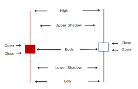
Open – This is the starting price for the stock. For a colored (or burnt) candle, open is on the top and for a white candle, it’d be on the bottom.
High – This is the maximum price hit during the period.
Low – This is the lowest price at which the stock was sold.
Upper and lower shadow – Also called wick, the length shows how much the price managed to bounce back from the highs and lows during the day.
Close – This is the final price at the end of the period, generally market closing. A colored candle closes below the open level, while for a white candle it’s the upper level.
Body – Colored (associated with selling) or white (associated with buying), this shows the difference between start price and end price.
Tips, Tricks, and Reading the Candle
We could write a book on how to read candlestick charts, their unique patterns, and what they might stand for, but still not be cover everything adequately! Because this visualization captures many variables and a range of data, the implications are equally layered and complex. That’s why we’ve selected five insights to get you started:
- A colored bar indicates a dip in price, a result of selling, and white bar shows a rise. The first means the stock isn’t particularly in demand.
- If there is a long upper shadow, the price had increased but didn’t stick.
- If there is a long lower shadow, the price decreased, but the stock managed to bounce back over the course of the day.
- A substantial body shows a significant increase or decrease in price across the day. This could be accompanied by long shadows (indicating a lot of changes that didn’t last until the end of the day) or short ones as well.
- A thin body shows that irrespective of a busy or idle market, the price didn’t change substantially.
You can read more about
candlestick charts here. In the next installation in this series, we’ll pick up the always controversial pie, a chart with which we have a long-standing love/hate relationship. And we’ll compare it to its close cousin, the doughnut. Watch this space and tell us in the comments if there’s any chart type you’d want us to talk about.
Happy Charting!!! 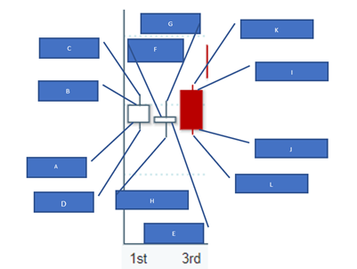
View Comments
I am going to share with you one very simple strategy based on a strong and easily noticeable candlestick pattern. They call it "Lucky Spike". Everyone can learn it, use it and make money with it. There are traders who make a living trading just this pattern. Just check out this ebook I am giving you for free:==> https://www.forexmystery.com?hgd4h84gdh
I like what you guys are up too. Such clever work
and reporting! Keep up the terrific works guys I've you guys
to my blogroll.
Hello, i feel that i saw you visited my blog thus i came
to go back the choose?.I am trying to find issues to
enhance my website!I suppose its good enough to use a few of
your ideas!!
You made some clear points there. I looked on the internet for the issue and found most people
will go along with with your blog.
Peculiar article, just wat I needed.
Hi Dear, are you really visiting this web page on a regular basis, if
so afterward you will definitely take nice know-how.
I conceive you have noted some very interesting points,
appreciate it for the post.
Excellent article. I'm experiencing some of these issues as well..
Everything is very open with a clear clarification of the
challenges. It was definitely informative. Your website
is useful. Many thanks for sharing!
I got this web site from my buddy who shared with me
on the topic of this web site and now this time
I am visiting this site and reading very informative posts
here.