Line and Area Charts
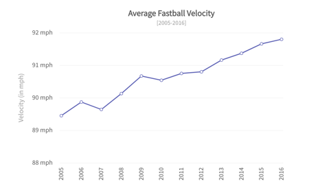
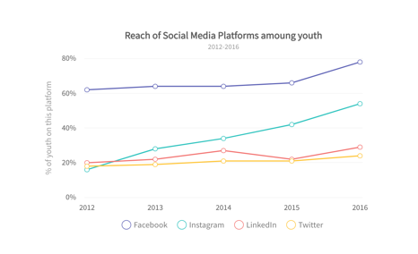
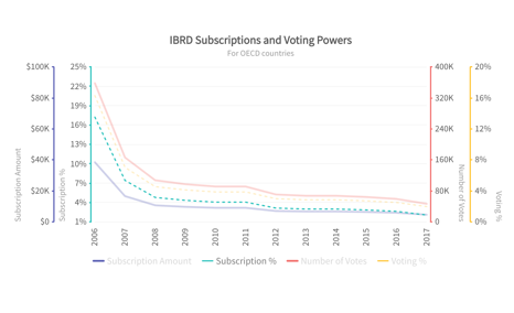
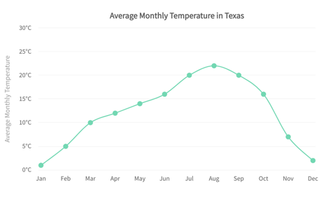
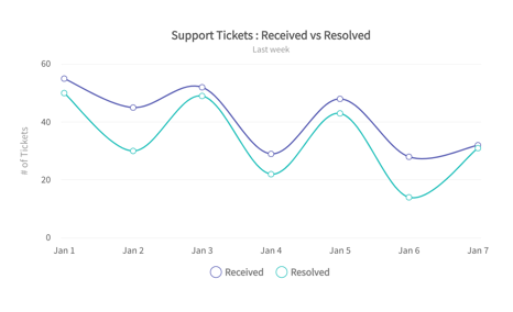
A line chart is used to represent data over a continuous time span. It is generally used to show trend of a measure (or a variable) over time. Data values are plotted as points that are connected using line segments.
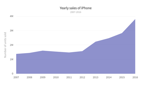
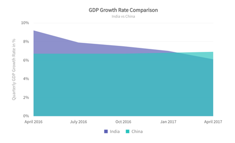
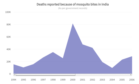
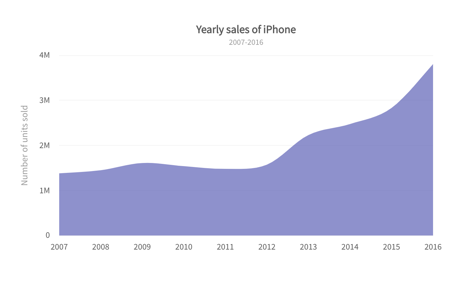
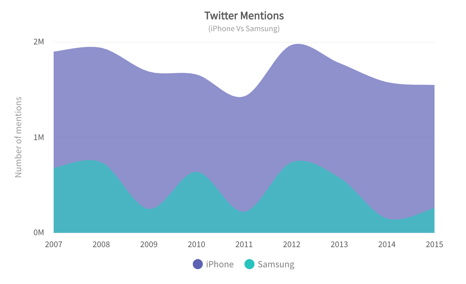
An area chart is like a line chart in terms of how data values are plotted on the chart and connected using line segments. In an area chart, however, the area between the line segments and the x-axis is filled with color.An area chart is a good choice when you want to see volume change over a period of time, without focusing on specific data values. It gives a sense of summation of the quantitative data.
