FusionCharts is a comprehensive
JavaScript charting library. With over 100+ charts and 2000+ maps, extensive documentation, a consistent API, and a range of customization options. FusionCharts is loved by 750,000 developers across the globe. So, in this post, I’ve compiled a list of five facts about which you’re probably unaware. These include
interactive graphs such as round-edged column charts, interactive legends, and the Zoom Line charts pin feature. Test them out and let us know how they look.
Give Your Column Charts the Modern Round-Edged Look
You have surely seen our simple 2D column chart. Simple and elegant, it is one of the most used charts in our entire suite.
What you probably did not know is that you can convert this simple design into a much more modern design, the round-edged column chart, just by setting <chart useRoundEdges=’1′ …>
I like calling it the glass-effect column chart and every time I am using the column chart, I make sure to use this one. With the addition of just a single attribute, you could give your users the feeling that you have put in so much effort to design the chart. Maybe charge some extra money too 🙂
Create Your Number Scales to Make the Chart More Intelligible
If you are plotting race timings, chances are your raw data is in seconds. Imagine having to comprehend figures like 5251s instead of the much more intuitive 1:27:31. The same thing happens with a project timeline chart where the raw data is in hours.
Wouldn’t it be much easier if these numbers could be automatically converted to the more intuitive hours, days, and weeks format? That is exactly what the number scaling capability of FusionCharts does for you, and it takes just three attributes. <chart DefaultNumberScale=’hours’ NumberScaleValue=’24,7,30′ NumberScaleUnit=’days, weeks, months’ …> First up, we just define the default unit in which we are providing the data using DefaultNumberScale=’hours’. Then we get to the job of defining the number scale using NumberScaleValue=’24,7,30′ NumberScaleUnit=’days, weeks, months.’ The number scale implies that 24 hours equals a day, 7 days equals a week, and so on. You just need to be careful when mapping the units in NumberScaleUnit to their respective conversion metrics in NumberScaleValue.
Of course, this is a cruel number scale where I have made all the 24 hours in a day working hours and all 7 days working days. Yours I am sure would be more humane 🙂
Delegate Excess Details From the Caption to the Sub-Caption
As I discussed in a recent post on
making your charts more usable, the chart’s caption should describe what the chart is about. This should also include the duration that the chart represents (for example, Sales figures for 2006-2010) and all units used for the numbers (for example All figures are in millions – USD). However, with so many details, it is pretty common for the caption to outgrow its space. In that case, all you need to do is delegate some of the details to the sub-caption, mostly the duration and units, and you are done.
You just need to define <chart subCaption=’in Percentage’ …> and you are good to do. All the information you wanted to display at the top of the chart is there, and the
javascript graph stays clutter-free.
Hide Entire Data Sets on a Multi-Series, Stacked, or Combination Chart Using the Legend
You would be using a multi-series, stacked, or combination chart when you have multiple data sets to show on your chart. Say you are displaying the revenue your company made for the year through the sale of hardware, software, and services. For a more complete analysis, you have broken down the revenue generated from the domestic and international markets.
What if, for instance, the user wanted to compare the revenue generated from the different segments only for the domestic market? He would have to mentally ignore the columns for the international sales and do his analysis. This is where the interactive legend comes in. You can hide the revenue from the international market for all the segments just by clicking on its icon on the legend.
The user is left with figures only for the domestic market. Makes data analysis so much easier, doesn’t it? And all it takes is a click.
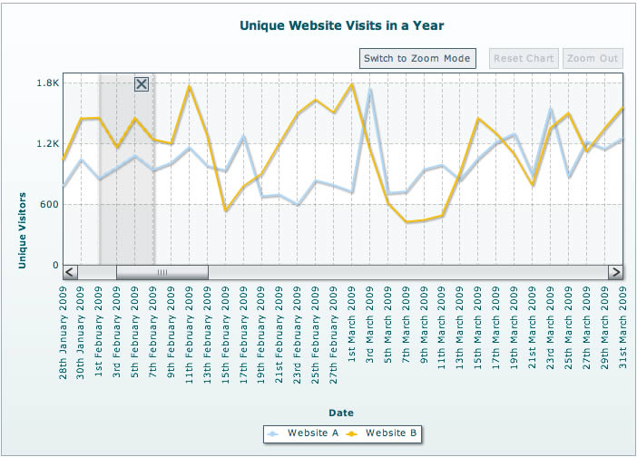
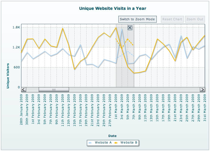
Compare Non-Adjacent Data Sets by Overlaying Them on the Zoom Line Chart
The zoom line chart is exactly what the name indicates. You have a line chart where the user can zoom into any segment of data he wants a microscopic view of. But what you probably didn’t know is the first-of-its-kind pinning capability it offers. Say you are displaying daily visits to your website for an entire year and the user wanted to compare the visits during the first week of February to the first week of March. Since they are not adjacent, the best he can do is use the naked eye for the comparison. In comes the pinning capability. Switch to the pin mode of the chart and select the segment for the first week of February.
Then drag this selection over to the segment for the first week of March. A ghost of the data for the first week of February will be overlaid on the data for the first week of March.
See how easy this makes comparing non-adjacent data, and your user doesn’t have to rely on the naked eye alone to make these comparisons.
[Dig deeper: Learn more about the capabilities of the Zoom Line chart and how to configure them] Which of these capabilities were you previously aware of? Are you using the pin capability already? Is there anything else we aren’t giving enough love to? Let us know in the comments.
View Comments
Some of these features are great, but why is the FusionCharts for Flex version so far behind the others? I would love to be able to do this stuff with my Flex FusionCharts but these features just don't exist. You ask what else you "aren't giving enough love to" - the answer is the Flex version of your product!
Chris- We are in fact working on a new version of FusionCharts for Flex that will support many of the new features from FusionCharts. We will put out dates as soon as we have them confirmed.
Actually, we would love to have this in silverlight and javscript (which you already have, but might be easier with the razor engine)
We are coming out with a new version of our charts in JavaScript which will have most of the features you are looking for. It's coming soon, so do watch out for it :)
Silverlight - as of now, we do not support it.
Two areas i want to bring to your notice.
1) Extending the amount of data(xml string) as dataset are large frequently. 8KB of xml is the limit for good performance(as per documentation).
2) There is no pie chart for multiseries. like for each line in linechart / stackedbar2d generation one pie chart.. (disadvantage - at the end we will have more then one pie chart to show one linechart data.
1) If you are using the dataURI/dataURL method, there is no restriction on the size of data you provide.
2) From what I understand, that doesn't sound very intuitive. Do you have a link/screenshot that could help?
Hi Sanket
Just to make sure that I understood the 8K limitation part on the data(XML) part is that beyond 8kb of xml the charts will not get loaded at all. Just that the charts would load slowly correct.
Please confirm
Hi Srikant,
There is no limit to the file size of the static XML. We've just implemented a Zoom Line chart with the XML being 700KB.
And if the XML is dynamically generated, then file sizes would not be a problem.
Happy charting!
Hi Hrishikesh,
Can we apply zoom to Column3d also?
Hi Ravi,
The zooming interactivity is available only with the specialized Zoom Line chart.
Would you highlight a use-case where zooming could be needed in a Column3D chart?
1. Most of our customers have been asking to provide an option to take the screenshot of the chart directly. when they right click on the chart, they should get an option Copy to clipboard/Take a screeshot sothat they can simply paste in the power points.
2. Fustion charts having the limitation on the Stack charts. It can not plot the stacks in ascending or descending order by its value. Eg: If I want to plot X axis as by vehicle model, and then stack by sales in each region. I want to plot each vehicle model by ascending order by total sales volume(it is available in fusion charts through XML) and then want to plot the stacks in ascending order (it is not available in fusion charts).
Hello again,
1. The issue you mentioned in the first point is solved very beautifully by two things:
a. By using FusionCharts ExportComponent: Using this export feature, you can save a chart exactly the way you wanted - by right-clicking a chart and save it as a JPEG/PNG/PDF. You can read more about client-side exporting in the FusionCharts XT Documentation.
b. Since you wanted the same chart to be present in PowerPoint, try our beta product named oomfo. oomfo is used as an add-in for PowerPoint, and provides you with the same functionality that you've been enjoying with FusionCharts.
2. If the data needs to be plotted in ascending / descending order, then the XML needs to have the data in the same order. The developer has the liberty to sort the data in any way, and then form the XML using the sorted data.
Hope this helps.
Hi,
I need Multi Series Bar with stacked bar in one graph. Waiting for your reply.
Hi Monica,
Do you mean a chart like this -- https://www.fusioncharts.com/demos/gallery/combination-dual-y/chart.asp?id=msstackedcolumn3dlinedy_1 ?
You can browse our stacked chart gallery here - https://www.fusioncharts.com/demos/gallery/#stacked-charts
If none of these are according to what you need, then could we have a screenshot to go by? You can send it to hrishikesh@fusioncharts.com
Need to show the dates in Y-axis instead of putting values in chart, Here actually the requirement is preparing the chart for Planned Vs Actual Dates of work completion.
Plz reply for this whoever having idea for this.........
Hi Ravi,
FusionCharts doesn't accept dates as the plot value, only a numerical value.
For eg:
<set label="marketing" value="05/31/2012" />would be incorrect in FusionCharts data.However, there is a technique that you can use to get what you want.
You could provide a UNIX timestamp of that particular date as value, and provide the actual date as
displayValue.For eg:
<set label="marketing" value="1338492030" displayValue="05/31/2012" toolText="05/31/2012" />You will also need to set
numDivLines="0"andshowYAxisValues="0"Hi,
anybody knows how to embed Fusion Charts in Prezi slides?
FusionCharts cannot be directly embedded in Prezi slides. You would need to export the chart as images using the native export functionality and integrate the saved images in your slides.
Hi Sanket,
I have two queries and purpose is to allocate maximum area for the chart.
1. I want to control the number of rows used for the display of legends. Currently I can specify number of columns for the legends but on rows I don't have any control.
So if there are 10 legends with one column, I want to display only 2 legends in the legend scroll.
2. Can I separate legends from the charts? This is in case I want to display legends on overlay of some external element such as button.
Thanks in advance.
Hi Harish,
1. FusionCharts does not have any controlling attribute for the number of rows in a legend. If you are aware of the total number of legends, you can accordingly set the value for "legendNumColumns" that will display the rows accordingly.
2. You cannot separate the native legend from FusionCharts. But using the annotations you can display an external legend, outside the canvas area.
Hey Sanjukta,
Appreciate your reply.
I will reframe my first question.
1. How can I fix the scroll height of legend as it is eating my chart area?
2. Can we display tooltip on legend?
Thanks in advance.
Hey Harish,
1. FusionCharts currently does not allow to fix the scroll height of the legend. The legend takes up the scroll height based on the chart dimensions and the space availability. This cannot be controlled explicitly.
2. Natively tooltip is not displayed on the legend. However, if the series names are too long with respect to the legend box and starts showing ellipses, the tooltip automatically appears on the truncated labels.
How will I plot a (border)straight line only on x axis to seperate my label and the graph?(using 2d 100% stacked column chart)