Column Charts: A guide for beginners
What is a Column chart?
A column chart is used to compare data values of related categories. It can also be used to compare data over a period. Value of each category is encoded by the length of the column. Since all columns start from the same baseline of zero, it is easy to compare them against each other.
Why do you need a Column Chart?
1. To compare data values of related categories
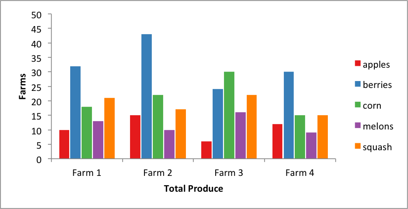
Column charts are most useful to compare different categories by a single measure. Comparisons allow end users to judge how each category is performing relative to the others. By sorting the columns, users can gain a quick understanding of the highest and lowest categories. However be wary that not all data can be sorted, and if forcefully sorted, it comes with some sacrifice in the data. Like, months of a year need to be in sequence to represent itself properly. But, if sorted by the measure, time sequence is lost, which is a major sacrifice.
 detail.") Column Charts are great at comparing related entities- in this case, all the days that Delilah from Leff Communications had Bar Trivia Night with her team - “ The Stonecutters” who usually do pretty awesome. Along with this chart, Delilah has spoken about the best practices of using Column & Bar Charts in great (and really interesting) detail.
Column Charts are great at comparing related entities- in this case, all the days that Delilah from Leff Communications had Bar Trivia Night with her team - “ The Stonecutters” who usually do pretty awesome. Along with this chart, Delilah has spoken about the best practices of using Column & Bar Charts in great (and really interesting) detail.
Whether it’s showing sales performance for different geographies, measuring deaths vs. births for a decade, or identifying which products performed best in which region, the column chart is a great fit if you want to compare how different categories are performing against each other.
2. To see changes in dependent variables over time
Column charts are excellent for mapping data sets over a period of time. Understanding changes happening over a period of time is relatively more natural for the human mind. It’s worth noting that a line chart (the most common type chart for time-series data) can be replaced anytime by a column chart, however the converse isn’t always true.

In this case, the column charts show the percentage of movies coming out in Hollywood from 1980 without women only talking about women. The overall trend line seems promising. Source: Data.World
Business owners want to compare the profits of different divisions over time. Content publishers want to see what sources gave how much traffic over the year, and public bodies want to show development and financial impacts for different units.
3. Compare contributions of different members of a category
Stacked column charts are very helpful in showing the magnitude of how much contribution to the total is coming from the different members of a category (a part-to-whole perspective of the data). All business data needs to get compared, whether it’s for different timelines, geographies, and products, or between multiple members of the same group. Stacked column charts are a straightforward way to see such data.
 Alternatively, by using a % Stacked Column chart, the contribution can be seen as a percentage measure of the total .
4. To Compare negative vs positive values
Column Charts are excellent at comparing values which tend to go into negatives as well as positives. Alternatively, Column charts can also be used to compare performance against an average benchmark or do a deviation analysis.

It is also worth noting that the zero baseline for a column chart should always be maintained. It gives a uniform base for comparison between the entities.
Popular Business Uses of Column Charts
- Comparing performance of business units
 Column Charts can help in looking at each business unit individually as well as in relation to others
- Showing Business & Financial Data
 Column Charts are widely used in creating easy-to-understand representations of high impact business & financial data
- Comparing performance against a target line
 By combining Column charts with target line, businesses can identify which divisions are meeting (or missing) the targets
- Quick view of top/ worst performers
 Column charts are great at sorting data to present a quick and easy understanding of each individual contributor’s performance. Source: Box Office Mojo
- Comparing related groups and individual contributions
 Stacked column charts can help in easily looking at how much each sub-group contributed towards it’s respective main group
 Column Charts can help in looking at each business unit individually as well as in relation to others
 Column Charts are widely used in creating easy-to-understand representations of high impact business & financial data
 By combining Column charts with target line, businesses can identify which divisions are meeting (or missing) the targets
 Column charts are great at sorting data to present a quick and easy understanding of each individual contributor’s performance. Source: Box Office Mojo
 Stacked column charts can help in easily looking at how much each sub-group contributed towards it’s respective main group
Limitations of Column Charts
1. Becomes hard to interpret for large number of entities
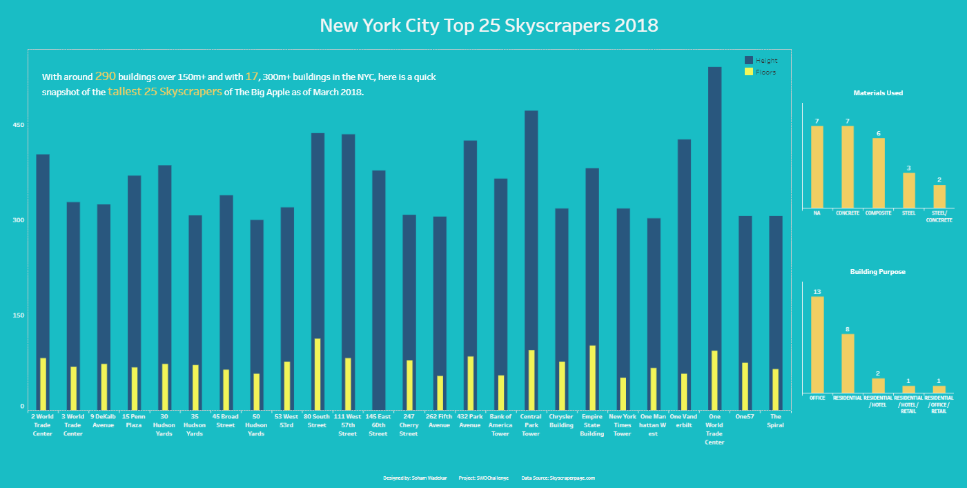
Column charts have limited space along the category axis. So, when your data labels are long, the category axis may look cluttered, making reading labels quite hard. In case of a large number of data points, it is advisable to either use a scrollable column chart to ensure all data is present without compromising on user experience or to strip down the number of data points by using aggregated groups, like “top 20” .

If the text string of name of each column is long, it is difficult to represent/read them. Clutter can be reduced by either slanting or rotating the labels . Data Source : Box Office Mojo
2. Comparisons between stacked segments is hard
Stacked Column Charts are not great at showing how a sub-group compares to a related sub-group in another category. This is because there is no common baseline to measure two sub-groups in one glance. Each sub-group needs to be manually compared with others to find how they are performing against each other.

Vitaly from AnyCharts says “We might also want to ask, “Why did Strategy X undermine the sales of one or another product?” Or, “What was the performance of a product within one strategy in relation to its sales within other strategies?” Great questions, but remember that stacked bar charts are not supposed to answer these or similar questions with that type of detail. Sorry, no superheroes here.”
Best Practices for Column Chart
- Use consistent colors. Select accent colors to highlight meaningful changes.
- Start the y-axis at 0 to accurately reflect the proportionate difference in data.
- The space between the columns should be roughly half of the width of each column.
- When the data is not time based, it is recommended to arrange data in the descending or ascending order.
Variants of Column Chart
1. Grouped Column Charts
Grouped Column Charts are used to plot data for multiple datasets. They are also used to analyze and compare data points grouped in sub-categories. Grouped Column Charts have vertically aligned rectangular bars on one axis with discrete values shown on the other.
Where to use grouped column charts?
- Comparing zonal sales performance (Funnel information like deals closes, lost, and, in pipeline - from multiple geo-locations)
- Comparing revenue generated by different products of an organization across timezones
2. Column Charts with Scrolling
A scroll column chart is used to visualize comparative data or to show change over a period of time. The inclusion of the scroll interactivity allows the users to plot a larger number of data points on one chart (more than can be accommodated in the first view); the scroll facilitates easy navigation through the chart. Having a scroll also helps to keep the chart clutter-free and makes for easy-on-the-eye viewing. The chart has vertically aligned rectangular bars on one axis plotted against discrete values shown on the other. A horizontal scroll bar is rendered at the bottom of the chart, which can be dragged to navigate through the chart.
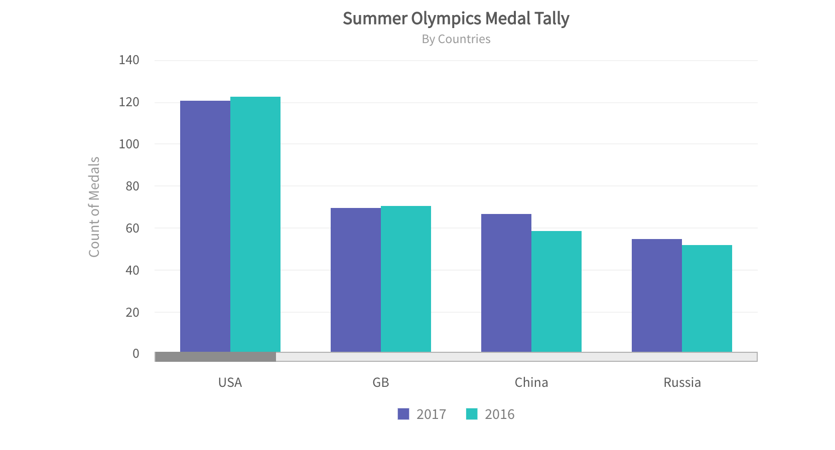
Where to use column charts with scrolling?
- Olympic medal each of 206 participating countries have earned through history - grouped by ‘bronze’, ‘silver’ and ‘gold’.
- Salary paid to all employees (in decreasing order) in the a company with high employee strength
3. Overlapping Column Charts
Overlapping columns can be used to visualize two data sets on a single chart. Similar to a simple column chart, this chart uses vertically aligned rectangular columns on one axis as data plots plotted against the discrete values shown on the other. On one axis, columns compare categories, while on the other they represent a discrete value. The width of the columns for the data series differs which makes the chart easy to compare. Both data sets need to be of the same data type like revenue or cost. Selecting or deselecting legend labels allows a single dataset view or comparison of two data sets simultaneously. Also, Overlapping column charts work great with brushing and linking features.
Where to use overlapping column charts?
- Showcasing Sales Deals that went in the pipeline for the last year vs. those that were closed
- Comparing budgeted VS actual expenses for the last few quarters
Want to add Column charts on your web or mobile app?
Fusionchart’s expansive library lets you build and use insightful & intuitive charts in minutes.
Other related Charts
- Pie Charts
 When we want to see the part-to-whole contributions and if the members are not more than 3-4, then a pie chart can be used. The pie chart comprises of a circle that is divided into sectors, each representing a proportion of the summation of all values in a dataset
- Tree Maps
 In situations where the number of categories is high enough, and we want to easily identify the categories with majority contribution we can use a treemap. A treemap chart is used for analysis of hierarchical data. The chart is visualized using nested 2D rectangles that represent the nodes and leaves of the tree data structure
- Line Charts
 If time is used as a category on the x-axis, one could try a line chart. A line chart is used to represent continuous data over a continuous time span. It is generally used to show trends and relationships in data. Data values are plotted as data points that are connected using line segments.
- Scatter Plots
 The scatter chart shows the relationship between two variables by plotting them using cartesian coordinates. It displays a variable on each axis, marking the intersection of their values on the chart. When there are two numeric parameters, this chart type is the ideal one to determine how one variable impacts the other
- Bubble Charts
 The bubble chart is used to visualize data that is defined by three numeric variables (Both Bar and column charts on the otherhand, are limited to 2 variables only). Typically, this chart is used to compare and depict relationships between variables by means of positioning and proportions of the size of the bubbles/circles. It is also used to analyze patterns and trends in data
- Maps
 When the categories to be compared are geographical regions, maps can also be used to instead of bar or column charts to show and compare data. Check out the live interactive version of this map
 When we want to see the part-to-whole contributions and if the members are not more than 3-4, then a pie chart can be used. The pie chart comprises of a circle that is divided into sectors, each representing a proportion of the summation of all values in a dataset
 In situations where the number of categories is high enough, and we want to easily identify the categories with majority contribution we can use a treemap. A treemap chart is used for analysis of hierarchical data. The chart is visualized using nested 2D rectangles that represent the nodes and leaves of the tree data structure
 The scatter chart shows the relationship between two variables by plotting them using cartesian coordinates. It displays a variable on each axis, marking the intersection of their values on the chart. When there are two numeric parameters, this chart type is the ideal one to determine how one variable impacts the other
 The bubble chart is used to visualize data that is defined by three numeric variables (Both Bar and column charts on the otherhand, are limited to 2 variables only). Typically, this chart is used to compare and depict relationships between variables by means of positioning and proportions of the size of the bubbles/circles. It is also used to analyze patterns and trends in data
 When the categories to be compared are geographical regions, maps can also be used to instead of bar or column charts to show and compare data. Check out the live interactive version of this map
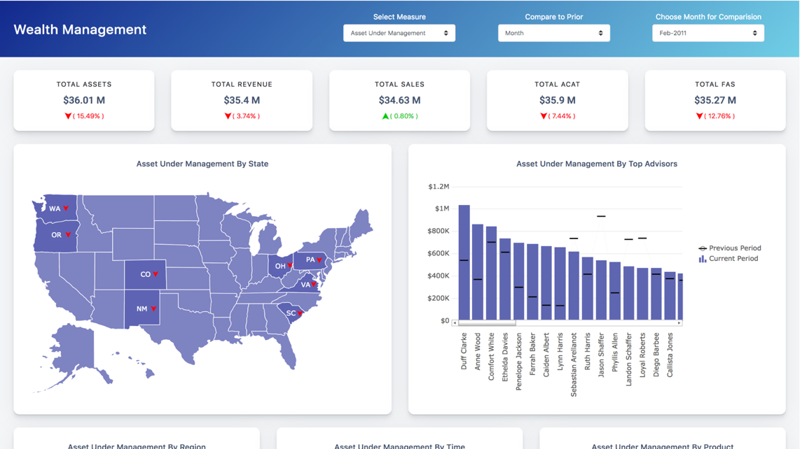
Column Charts in action

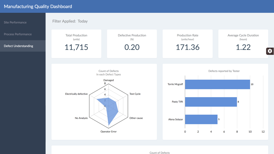 Manufacturing Quality Dashboard
Want to add interactive charts on your web or mobile app?
Fusionchart’s expansive library lets you build and use insightful & intuitive charts in minutes.