


Table of Contents
Introduction
The Python Package Index contains libraries for almost every data visualization requirement, from Pastalog for real-time visualizations of neural network training to Gaze Parser for eye movement research. Some of these libraries are used in a variety of fields. Despite this, many of them are intensely focused on completing a specific task.Here’s a rundown of 11 interdisciplinary Python data visualization libraries that you’ll learn about in this post, from most popular to least popular. Continue reading to learn how to use Data Visualization Tool and Python data visualization libraries to create data visualization charts.
What is a Python Data Visualization Library?
A Python data visualization library is a tool that transforms raw data into visual representations like charts and graphs, aiding in easier comprehension of complex information. It bridges data and insights, enabling users to uncover trends, patterns, and relationships.These libraries offer diverse functions and methods to create various visualizations, catering to different data types and analysis needs. Python data visualization libraries provide flexibility and versatility, from simple line charts to sophisticated heatmaps. By democratizing data analysis, they empower users of all levels to make informed decisions without requiring extensive technical skills.
Top Python Data Visualization Libraries in 2024
Python data visualization scene boasts an array of top-tier libraries catering to diverse needs. Each of Python data visualization libraries has a distinct style, making them stand out. Let’s hop onto the article and learn about different libraries in detail:Matplotlib
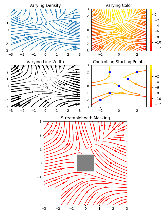
Matplotlob is the first Python data visualization library. Therefore, many other libraries are built on top of Matplotlib and designed to work with the analysis. Python data visualization libraries like pandas and matplotlib are “wrappers” over Matplotlib, allowing access to several Matplotlib methods with less code.
Matplotlib’s versatility allows for visualization types such as:
- Scatter plots
- Bar charts and Histograms
- Line plots
- Pie charts
- Stem plots
- Contour plots
- Quiver plots
- Spectrograms
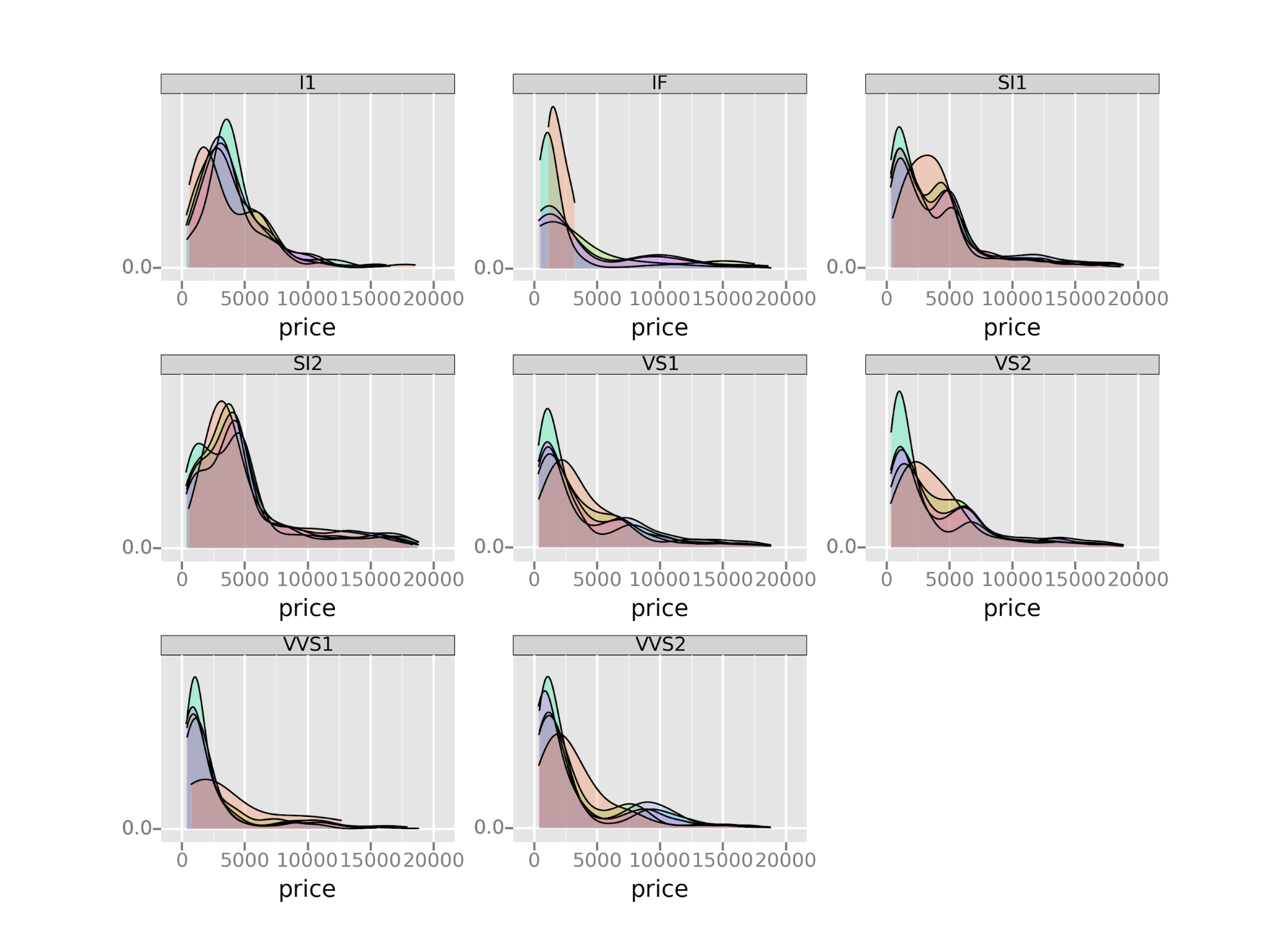
Seaborn

ggplot
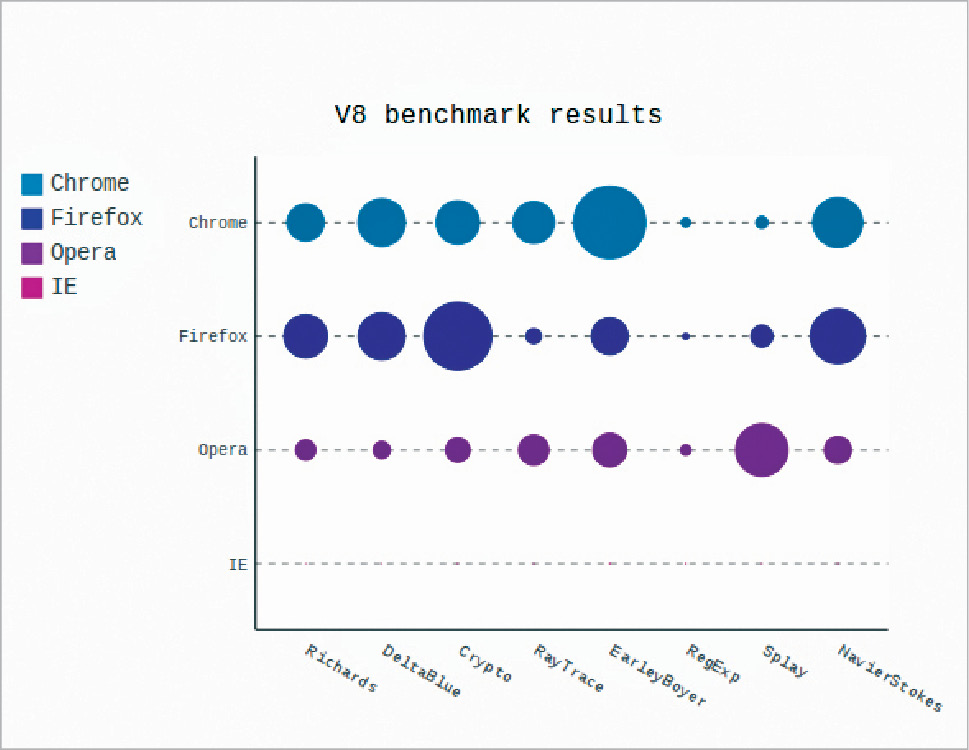
Bokeh
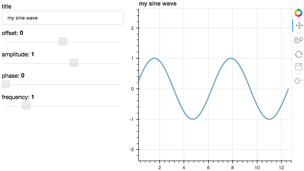
Bokeh has three interfaces with varying degrees of control to accommodate different types of users. The topmost level is for creating charts quickly. It includes methods for building common charts such as bar plots, box plots, and histograms. The middle level allows the user to control the basic building blocks of each chart (for example, the dots in a scatter plot) and has the same specificity as Matplotlib. The bottom level is geared toward developers and software engineers. It has no pre-set defaults and requires the user to define every element of the chart.
Plotly
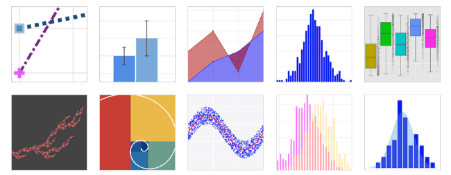
Pygal
It’s easy to create a nice-looking chart with just a few lines of code since each chart type is packaged into a method and the built-in styles are great.
Altair
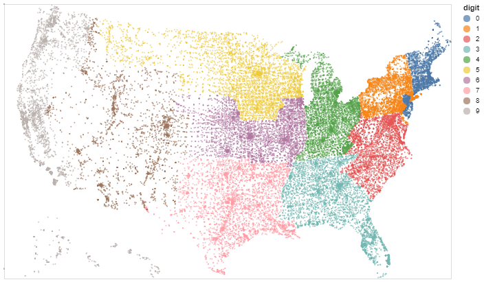
Geoplotlib
Geoplotlib reduces the complexity of designing visualizations by providing a set of in-built tools for the most common tasks such as density visualization, spatial graphs, and shapefiles.
Since most Python data visualization libraries don’t offer maps, it’s good to have a library dedicated to them.
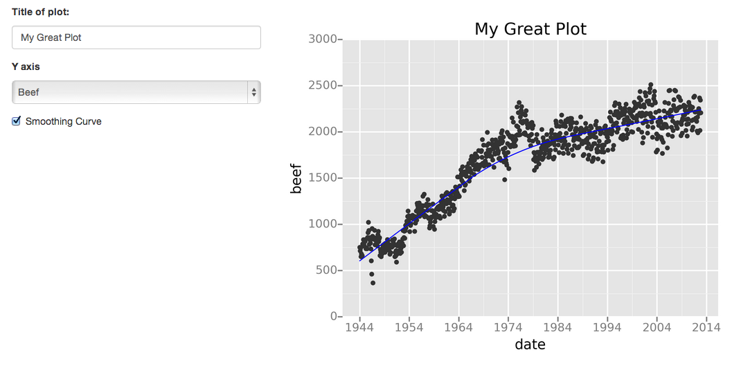
Gleam
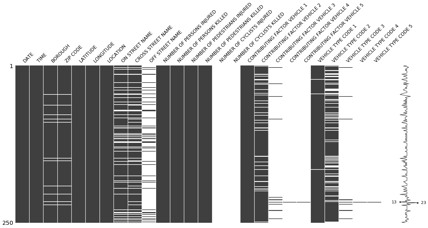
Missingno
Leather
Since this library is relatively new, some of the documentation is still in progress. The charts are pretty basic—but that’s the intention.
There is a wide range of visualization tools, with huge diversity, depending on the focus of the task at hand available for Python. The sheer number of libraries available reflects this fact. It is imperative for the users to bear in mind the differences between the approaches and their implications before zeroing in on a particular approach.
Would you add any other Python data visualization libraries to this list? Please share your favorites in a comment below.
Tips for Choosing the Right Python Data Visualization Library
Choosing the ideal data visualization tool can feel overwhelming. With so many options available, how do you pick the one that best suits your needs? Well, to help you with this, here are several tips you must consider:Types of visualizations
Check if the tool supports the types of charts and plots you need for your data. Ensure the tool offers a variety of chart options to meet your needs. Different visualization tools may excel at different types of charts, so choose accordingly.Input Formats
While looking for the ideal Python data visualization libraries, ensure they can handle the input data formats you use. It should support standard formats like CSV, JSON, and Excel files.Output Formats
Think about the output formats you’ll need for sharing or embedding visualizations. Choose a tool that offers flexibility in output formats to meet your sharing requirements. Prefer tools that allow you to export visualizations to various file formats or offer sharing options for web-based visualizations.Compatibility with Existing Tools
Evaluate how well the tool integrates with your current data analysis and manipulation tools. Seamless integration can streamline your workflow and improve efficiency. Consider tools that complement your existing toolkit.Learning Curve
Consider your experience level and the learning curve associated with different libraries. Choose data visualization libraries that align with your current skill set and allow you to create the visualizations you need efficiently.Some libraries offer simpler interfaces with pre-built functions for standard visualizations, while others offer more flexibility and customization options.
Customization
Assess your need for customization. You must look for tools that offer a wide range of customization options. Some tools prioritize flexibility, allowing users to create highly customized visualizations, while others focus on simplicity and may offer more limited customization.Interactivity and Responsiveness
Consider whether you require interactive visualizations. Some tools excel at creating interactive graphs, while others are more suitable for static visualizations. Select a tool according to your specific needs in this regard.Considering FusionCharts for Your Data Visualization Needs
When choosing the best Python data visualization libraries, FusionCharts shines bright with its incredible features and user-friendly interface. With FusionCharts, you can create your first chart in just 15 minutes without any learning curve, thanks to its consistent API across different chart types. Whether you’re a JavaScript enthusiast or prefer other installation methods like CDN or NPM, FusionCharts offers flexibility to suit your preferences. Handling large datasets is a breeze with FusionCharts, especially with its robust time-series charts capable of effortlessly plotting millions of data points. Additionally, FusionCharts provides a treasure trove of ready-to-use chart examples, industry-specific dashboards, and insightful data stories, all accompanied by source code for hassle-free implementation. Here are a few key features that will help you understand why you should choose FusionCharts for your python libraries for data visualization needs:- Allows you to plot millions of data points on your browser with the help of time navigator feature.
- Provides ease at generating charts on the server side, exporting the dashboard as PDF, and sending reports via email.
- Creates charts that can adapt to different screen sizes
- Charts automatically adapt to touch events
- Engulfed with chart configurations that automatically figure outs that way data is shown
- Eases out complex chart formation with consistent API
Conclusion
Python’s rich array of data visualization libraries offers diverse tools for creating compelling visual narratives. Whether Matplotlib’s versatility or Altair’s elegance, each library brings its strengths. By considering factors such as ease of use, performance, and compatibility, users can select the correct library to unlock the full potential of their data.Ultimately, which Python data visualization libraries you choose for data visualization depends on your requirements and understanding. So, let’s embark on this creative journey, harnessing the power of Python’s data visualization magic to illuminate narratives and spark the imagination.
FAQs
👉 Can Python be used for data visualization?Yes, Python is widely used for data visualization due to its rich ecosystem of libraries and tools specifically designed for creating visual representations of data.
👉 How can one visualize data using Python?
Data can be visualized using Python by leveraging various libraries such as Matplotlib, Seaborn, Plotly, Bokeh, and Altair. These libraries offer functions and methods to create plots, charts, and graphs to represent data visually.
👉 Which are the widely used Python data visualization libraries?Popular Python data visualization libraries include Matplotlib for versatility, Seaborn for simplicity and statistical graphics, Plotly for interactivity and dashboards, Bokeh for web-ready plots, and Altair for declarative syntax. Each offers unique strengths, catering to diverse visualization needs in the Python community.
👉 What to consider while picking up the right Python data visualization library?When choosing python data visualization libraries, consider your needs, ease of use, performance, community support, compatibility, and the learning curve. These considerations will help you select the right library for your requirements and integrate it seamlessly into your workflow.
Get Started With FusionCharts
Master the art of data visualization with Python’s powerful libraries. Explore Matplotlib, Seaborn, and more to create compelling charts and graphs that captivate your audience. Start your journey today!Start exploring python libraries for data visualization today! Click here for a free trial.
Guest Author – Quincy is part of the team at Springboard and is passionate about online learning and strong coffee.