Table of Contents
<html>
   <head>
      <script src="path-to/fusioncharts.js"></script>
      <script src="path-to/fusioncharts.theme.fint.js"></script>
   </head>
</html>
fusioncharts.php file inside the same folder created in the previous step for keeping the script files.<?php
require 'fusioncharts/fusioncharts.php';
?>
autoload.php file that is required for using MongoDB with PHP.<?php
require 'vendor\autoload.php';
?> <?php
$dbconn = new MongoDB\Client;
if(!$dbconn) {
exit("There was an error establishing database connection");
}
?>
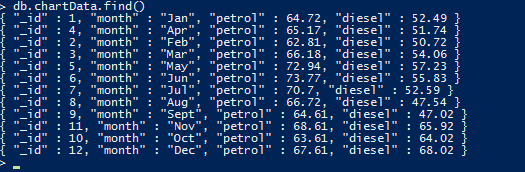
chartData collection in the myProject database which we will be using to render the chart. $db = $dbconn->myProject; $myObj = $db->chartData->find(); //convert MongoCursor into an array $data=iterator_to_array($myObj); // sorting the data asort($data);Next, we will use
$data to hold the data fetched from our database. We will now form an associative JSON array for the chart. FusionCharts accepts both XML and JSON data formats. Since we will be using JSON, we will now append the data (fetched from database in the $data variable) along with FusionCharts chart configuration and parse the end result as an associative JSON array. The PHP code required to append the chart data fetched from the database is given below: if ($data) {
$categoryArray=array();
$dataseries1=array();
$dataseries2=array();
foreach ($data as $dataset) {
array_push($categoryArray, array(
"label" => $dataset["month"]
));
array_push($dataseries1, array(
"value" => $dataset["petrol"]
));
array_push($dataseries2, array(
"value" => $dataset["diesel"]
));
}
$arrData = array(
"chart" => array(
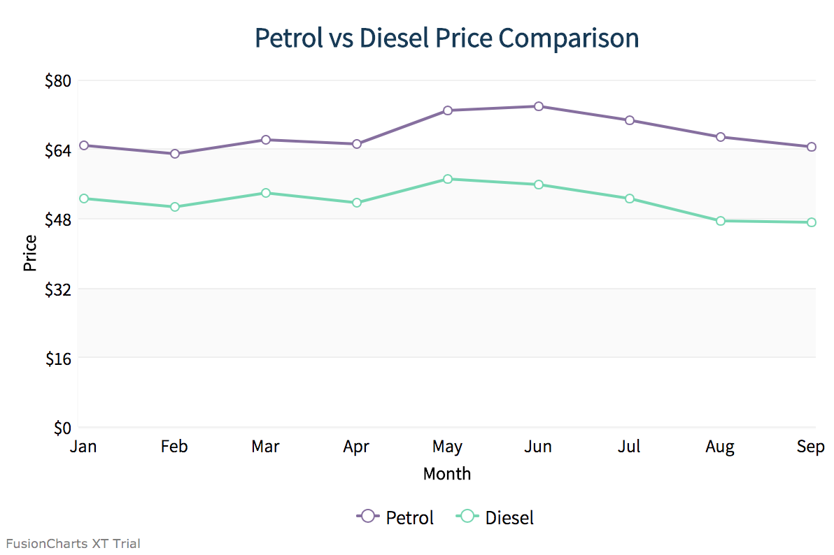
"caption"=> "Comparison of Petrol and Diesel price",
"xAxisname"=>"Month",
"yAxisname"=>"Price",
"numberPrefix"=>"$",
"paletteColors"=> "#876EA1, #72D7B2",
"useplotgradientcolor"=> "0",
"plotBorderAlpha"=> "0",
"bgColor"=> "#FFFFFFF",
"canvasBgColor"=> "#FFFFFF",
"showValues"=> "0",
"showCanvasBorder"=> "0",
"showBorder"=> "0",
"divLineAlpha"=> "40",
"divLineColor"=> "#DCDCDC",
"alternateHGridColor"=> "#DCDCDC",
"alternateHGridAlpha"=> "15",
"labelDisplay"=> "auto",
"baseFont"=> "Assistant",
"baseFontColor"=> "#000000",
"outCnvBaseFont"=> "Assistant",
"outCnvBaseFontColor"=> "#000000",
"baseFontSize"=> "13",
"outCnvBaseFontSize"=> "13",
"labelFontColor"=> "#000000",
"captionFontColor"=> "#153957",
"captionFontBold"=> "1",
"captionFontSize"=> "20",
"subCaptionFontColor"=> "#153957",
"subCaptionfontSize"=> "17",
"subCaptionFontBold"=> "0",
"captionPadding"=> "20",
"valueFontBold"=> "0",
"showAxisLines"=> "1",
"yAxisLineColor"=> "#DCDCDC",
"xAxisLineColor"=> "#DCDCDC",
"xAxisLineAlpha"=> "15",
"yAxisLineAlpha"=> "15",
"toolTipPadding"=> "7",
"toolTipBorderColor"=> "#DCDCDC",
"toolTipBorderThickness"=> "0",
"toolTipBorderRadius"=> "2",
"showShadow"=> "0",
"toolTipBgColor"=> "#153957",
"toolTipBgAlpha"=> "90",
"toolTipColor"=> "#FFFFFF",
"legendBorderAlpha"=> "0",
"legendShadow"=> "0",
"legendItemFontSize"=> "14"
)
);
$arrData["categories"]=array(array("category"=>$categoryArray));
// creating dataset object
$arrData["dataset"] = array(array("seriesName"=> "Petrol_price", "data"=>$dataseries1), array("seriesName"=> "Diesel_price", "data"=>$dataseries2));
$jsonEncodedData = json_encode($arrData);
} Every chart displayed on a web page is rendered within a unique HTML container. We will be using the <div> element for creating the HTML container for our chart. Given below is the code for creating the chart container: <body> <div id="chart-container">Fusion Charts will render here</div> </body>Now that we have the JSON data and chart container in place, we will create the FusionCharts instance and call the
render() method to render the chart. Chart instance includes details needed to render the chart, like the chart type, chart ID, chart dimensions, the HTML container ID, and so on, will be passed to this chart instance. $msChart = new FusionCharts("msline", "demochart", "600", "400", "chart-container", "json", $jsonEncodedData);
$msChart->render();
If you have been closely following the above steps, then you should see a chart like the image shown below: To create pie charts and generate statistical data, you’ll find this list of the best…
To implement FusionCharts in a dynamically resizing flexbox layout, ensure that the chart's dimensions are…
At FusionCharts, we believe in empowering developers and businesses with cutting-edge data visualization tools that…
Ever had a data set that seemed more complicated than a Rubik's cube? You’re not…
We’ve all seen them in textbooks or presentations—those overlapping circles that simplify complex information into…
We’re excited to announce the upcoming release of FusionCharts v4.1—a groundbreaking step forward in the…
View Comments