This is the fourth post in our Data Visualization Spotlight series where we showcase how different organizations are using data visualization and analytics to solve their day to day problems.
What started off as a side project in 2001 is today used by more than 5 million people to create, send, and track email newsletters. From one man startups to Fortune 500 companies, about 6 billion emails get sent every month using MailChimp. With a focus on usability and good design, MailChimp is undeniably one of the world’s most popular email marketing service provider. [Related read: How design is playing a strategic role in today’s software products?]
In an article published in the MailChimp blog, Ben Chestnut, CEO and Co-Founder, MailChimp says that “Every once in a while a MailChimp customer will ask me, “Hey, MailChimp’s been great for keeping in touch with my loyal customers. But is there any way to buy or rent an email list from you guys, so I can promote my business to potential customers in my area?” That’s when I explain to them the perils of purchased emails, and the virtues of organically growing a permission-based list.”
To help users grow their email list more legitimately, MailChimp introduced an app called Wavelength in January 2012.
Table of Contents
Simply put, Wavelength allows users to find publishers like themselves and discover at a high level what other content their readership is engaged with. It unveils clusters within an email list and helps a business understand its audience’s other passions—which can lead to strategic partnerships and inform the content strategy for the business.
John Foreman, Chief Data Scientist, MailChimp was entrusted with the task of digging into millions of email addresses and lists that was part of the MailChimp database and find out patterns and trends from them.
In an article published in the MailChimp blog, Foreman explains how they used Big Data, Mathematics and Visualization to identify clusters in a user’s mailing list.
For example, they looked at the mailing list of a user that sold t-shirts. The main aim was to help him “understand unique pockets of his audience and better target individuals based on their interests.”
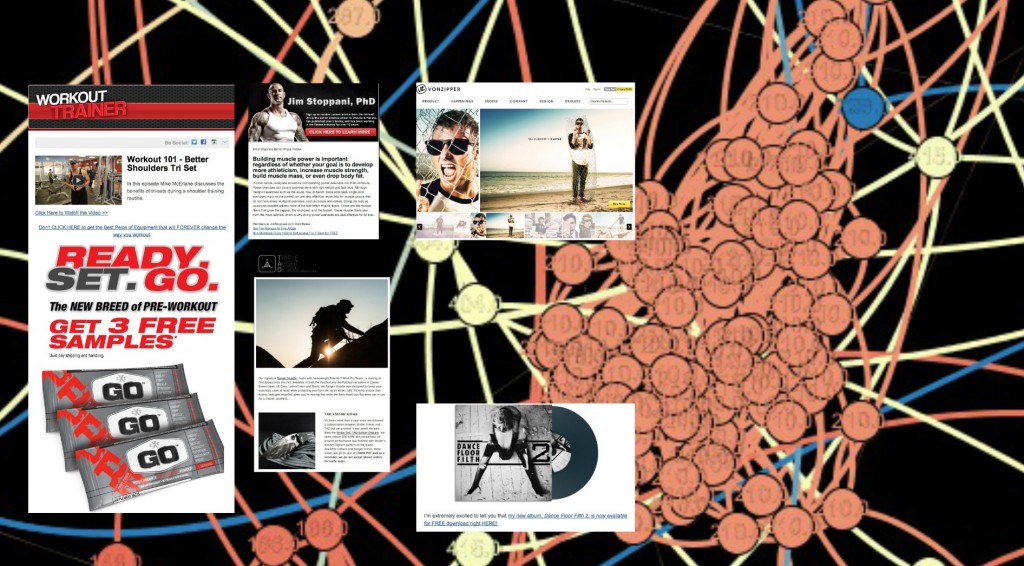
Fig: A high level visualization of a t-shirt seller’s subscriber list. Source:Blog.MailChimp.com
They identified several clusters (subscribers with similar interests).
They tried similar clustering for other users as well.
Wavelength neither helps users send a promotion to another list nor does it provide other lists or email addresses to users. It just shows users screenshots of other newsletters that some of their subscribers read. The goal is to help them contact and partner with those publishers. Ideally, users can link to each other and help each other grow their lists organically.
Users can place ads on the related publisher’s site to attract more subscribers. They can have promotional offers focusing on the specific interest of a cluster. When combined with engagement data, they could also figure out which clusters are more engaged than the list as a whole, and then plan their own content strategy accordingly. The marketing potential of such cluster based segmentation and targeting is enormous.
By visualizing and analyzing relationships within its enormous database, MailChimp aims to equip its users with better ways of targeting and providing relevant content to its subscribers. And more targeted content means better engagement, which often leads to increased brand affinity and increased sign-ups and ultimately more revenue.
In the next post of the Data Visualization Spotlight series, read how Twitter uses data visualization to track its complex workflows.
Reference:
TL;DR A line chart plots data points along an x-axis (time) and y-axis (value), connected…
Bar charts, line charts, column charts- they all look similar, but picking the wrong one…
An area chart has been seen before, perhaps monitoring stock market data, web traffic, or…
Have you ever read a quarterly report of a company, a sports result, or a…
Quick Answer: Choose a JavaScript library based on the charts and interactions your application needs.…
Interactive dashboards have become essential for SaaS applications, business intelligence (BI) platforms, and enterprise software.…