Aurelia is a JavaScript client framework for mobile, desktop and web which helps in developing applications. The application can be a collection of modern javascript modules and with MV architecture it can be used with business logic.
Using Aurelia framework, you can create rich dynamic data-driven UI composition with a two-way data binding feature and integrated test table modules.
In this tutorial, we will learn how you can render charts in Aurelia framework. To render charts using Aurelia framework, we’ll use FusionCharts JavaScript Library.
Table of Contents
Before you start, make sure you have the following components on your local machine:
To render charts in Aurelia framework, refer to the step by step process given below:
Install Aurelia in your local system. Run the following code in the terminal:
npm install aurelia-cli -g
After the installation, create the skeleton of the application. Run the following code in cmd shell to create the skeleton :
au startThe above command will install all the dependencies to run a basic project.
Install FusionCharts library by running the following command on the terminal.
npm install fusioncharts
To know more about how to install FusionCharts via npm check here.
Open the project in a text editor and open aurelia.json file. In this file, search for a prepend array of objects and add node_modules path to it. Refer to the code snippet below:
 "prepend": [
          "node_modules/bluebird/js/browser/bluebird.core.js",
          {
            "path": "node_modules/aurelia-cli/lib/resources/scripts/configure-bluebird-no-long-stacktraces.js",
            "env": "stage & prod"
          },
          {
            "path": "node_modules/aurelia-cli/lib/resources/scripts/configure-bluebird.js",
            "env": "dev"
          },
          "node_modules/requirejs/require.js",
          "node_modules/fusioncharts/fusioncharts.js",
          "node_modules/fusioncharts/fusioncharts.charts.js"
        ]
Import FusionCharts library files in your project. To do this, browse app.js file located inside the src folder of your project and add the following lines to it:
import {FC} from 'node_modules/fusioncharts/fusioncharts.js';
import {Charts} from 'node_modules/fusioncharts/fusioncharts.charts.js';
Now, create a datasource object and place them inside the FusionCharts constructor method. To do so, implement the Aurelia’s attached method of the component lifecycle. To know more about Aurelia’s component life cycle, click here. Refer to the following code snippet.
attached(){
let mydata={
      "chart": {
        "caption": "Size Of Wikipedia",
        "subcaption": "[2007-2017]",
        "pYAxisName": "Article Count",
        "xAxisName": "Years",
        "sYAxisName": "% Increase during preceding year",
        "sNumberSuffix": "%",
        "showvalues": "0",
        "paletteColors": "#247FF3,#f2c500",
        "labeldisplay": "ROTATE",
        "slantlabels": "1",
        "bgColor": "#ffffff",
        "borderAlpha": "20",
        "showcanvasborder": "1",
        "canvasborderalpha": "30",
        "usePlotGradientColor": "0",
        "plotBorderAlpha": "10",
        "placevaluesInside": "0",
        "rotatevalues": "0",
        "valueFontColor": "#000000",
        "plotfillalpha": "90",
        "showLegend": "0",
        "showHoverEffect": "1",
        "xAxisLineColor": "#999999",
        "divlineColor": "#999999",
        "divLineIsDashed": "0",
        "showAlternateHGridColor": "0",
        "anchorBorderHoverThickness": "2",
        "anchorHoverRadius": "5",
        "toolTipColor": "#ffffff",
        "toolTipBorderThickness": "0",
        "toolTipBgColor": "#000000",
        "toolTipBgAlpha": "80",
        "toolTipBorderRadius": "2",
        "toolTipPadding": "5",
        "animation": "1",
        "syaxismaxvalue":"100",
        "legendborderalpha": "20",
        "numdivlines": "10",
        "numVDivLines": "10"
      },
      "categories": [{
        "category": [{
          "label": "2007"
        }, {
          "label": "2008"
        }, {
          "label": "2009"
        }, {
          "label": "2010"
        }, {
          "label": "2011"
        }, {
          "label": "2012"
        }, {
          "label": "2013"
        }, {
          "label": "2014"
        }, {
          "label": "2015"
        }, {
          "label": "2016"
        }, {
          "label": "2017"
        }]
      }],
      "dataset": [{
        "seriesName": "Annual Growth Rate For The English Wikipedia",
        "data": [{
          "value": "1560000"
        }, {
          "value": "2153000"
        }, {
          "value": "2679000"
        }, {
          "value": "3144000"
        }, {
          "value": "3518000"
        }, {
          "value": "3835000"
        }, {
          "value": "4133000"
        }, {
          "value": "4413000"
        }, {
          "value": "4682000"
        }, {
          "value": "5045000"
        }, {
          "value": "5530232"
        }]
      }, {
        "seriesName": "% Of All Wikipedia Articles in English",
        "parentYAxis": "S",
        "renderAs": "line",
        "showValues": "0",
        "data": [{
          "value": "74"
        }, {
          "value": "38"
        }, {
          "value": "24"
        }, {
          "value": "17"
        }, {
          "value": "12"
        }, {
          "value": "9"
        }, {
          "value": "8"
        }, {
          "value": "7"
        }, {
          "value": "6"
        }, {
          "value": "8"
        }, {
          "value": "7"
        }]
      }]
    };

FusionCharts.ready(function () {
        let wikiChart = new FusionCharts({
        type: 'mscombidy2d',
        renderAt: 'chart-container',
        width: '70%',
        height: '400',
        dataFormat: 'json',
        dataSource: mydata
    })
    .render();
});
  }
Following is the entire code present in app.js file:
import {FC} from 'node_modules/fusioncharts/fusioncharts.js';
import {Charts} from 'node_modules/fusioncharts/fusioncharts.charts.js';

export class App {
  constructor() {
    this.message = 'FusionCharts in Aurelia Framework';
}

attached(){
let mydata={
      "chart": {
        "caption": "Size Of Wikipedia",
        "subcaption": "[2007-2017]",
        "pYAxisName": "Article Count",
        "xAxisName": "Years",
        "sYAxisName": "% Increase during preceding year",
        "sNumberSuffix": "%",
        "showvalues": "0",
        "paletteColors": "#247FF3,#f2c500",
        "labeldisplay": "ROTATE",
        "slantlabels": "1",
        "bgColor": "#ffffff",
        "borderAlpha": "20",
        "showcanvasborder": "1",
        "canvasborderalpha": "30",
        "usePlotGradientColor": "0",
        "plotBorderAlpha": "10",
        "placevaluesInside": "0",
        "rotatevalues": "0",
        "valueFontColor": "#000000",
        "plotfillalpha": "90",
        "showLegend": "0",
        "showHoverEffect": "1",
        "xAxisLineColor": "#999999",
        "divlineColor": "#999999",
        "divLineIsDashed": "0",
        "showAlternateHGridColor": "0",
        "anchorBorderHoverThickness": "2",
        "anchorHoverRadius": "5",
        "toolTipColor": "#ffffff",
        "toolTipBorderThickness": "0",
        "toolTipBgColor": "#000000",
        "toolTipBgAlpha": "80",
        "toolTipBorderRadius": "2",
        "toolTipPadding": "5",
        "animation": "1",
        "syaxismaxvalue":"100",
        "legendborderalpha": "20",
        "numdivlines": "10",
        "numVDivLines": "10"
      },
      "categories": [{
        "category": [{
          "label": "2007"
        }, {
          "label": "2008"
        }, {
          "label": "2009"
        }, {
          "label": "2010"
        }, {
          "label": "2011"
        }, {
          "label": "2012"
        }, {
          "label": "2013"
        }, {
          "label": "2014"
        }, {
          "label": "2015"
        }, {
          "label": "2016"
        }, {
          "label": "2017"
        }]
      }],
      "dataset": [{
        "seriesName": "Annual Growth Rate For The English Wikipedia",
        "data": [{
          "value": "1560000"
        }, {
          "value": "2153000"
        }, {
          "value": "2679000"
        }, {
          "value": "3144000"
        }, {
          "value": "3518000"
        }, {
          "value": "3835000"
        }, {
          "value": "4133000"
        }, {
          "value": "4413000"
        }, {
          "value": "4682000"
        }, {
          "value": "5045000"
        }, {
          "value": "5530232"
        }]
      }, {
        "seriesName": "% Of All Wikipedia Articles in English",
        "parentYAxis": "S",
        "renderAs": "line",
        "showValues": "0",
        "data": [{
          "value": "74"
        }, {
          "value": "38"
        }, {
          "value": "24"
        }, {
          "value": "17"
        }, {
          "value": "12"
        }, {
          "value": "9"
        }, {
          "value": "8"
        }, {
          "value": "7"
        }, {
          "value": "6"
        }, {
          "value": "8"
        }, {
          "value": "7"
        }]
      }]
    };

  FusionCharts.ready(function () {
        let wikiChart = new FusionCharts({
        type: 'mscombidy2d',
        renderAt: 'chart-container',
        width: '70%',
        height: '400',
        dataFormat: 'json',
        dataSource: mydata
    })
    .render();
});
  }
}
Now that we have our code in place, let us run the code to see the output.
Run the following command from the shell interface.
au run --watch
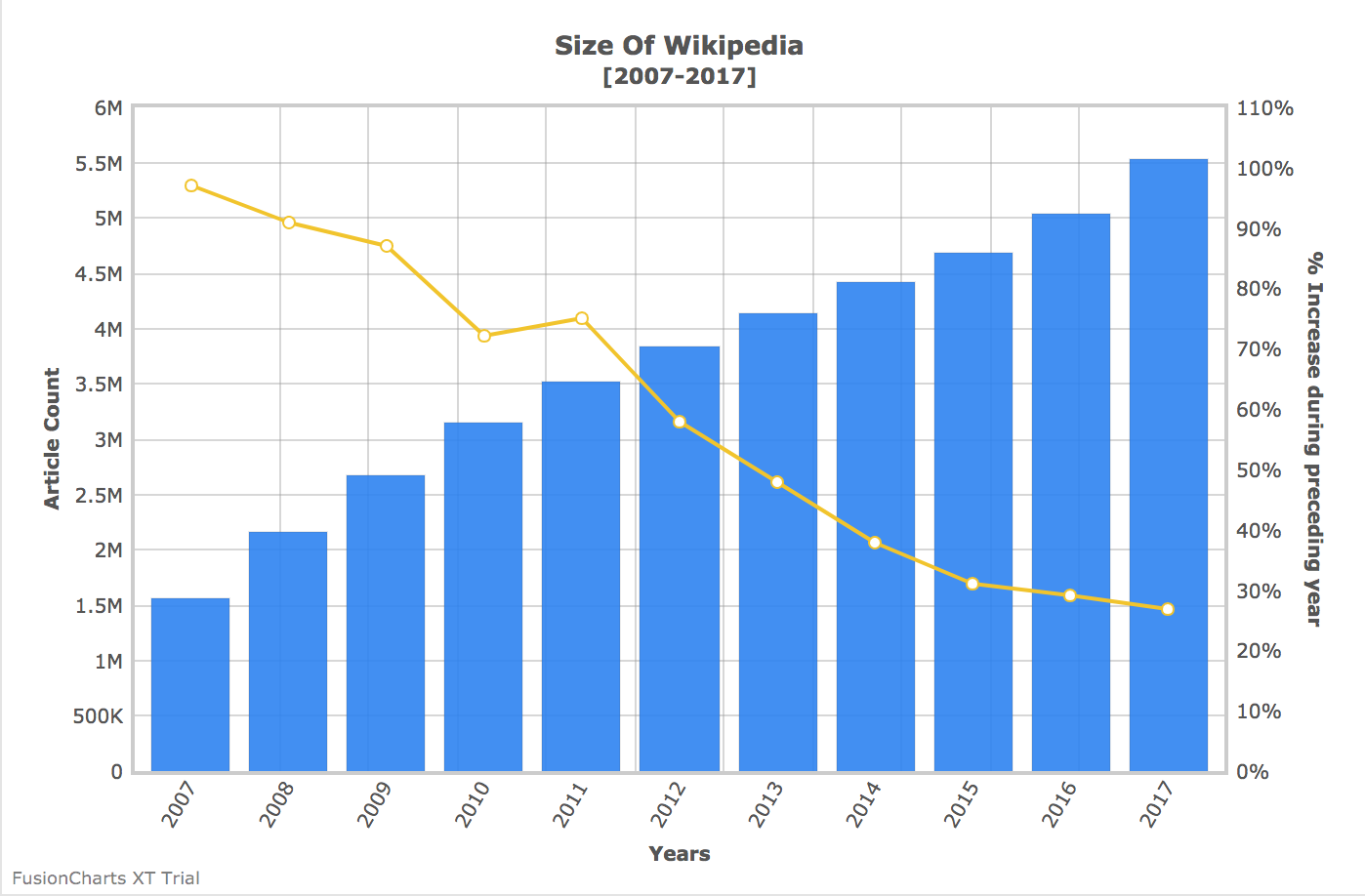
The output should be as shown in the image below:
If you see any errors in your code, you can download the complete source code of the sample project.
A well-designed dashboard helps users understand complex data quickly, monitor key performance indicators, and make…
Quick Answer: The best commercial chart libraries for Nuxt include FusionCharts, Highcharts, AnyChart, amCharts, ApexCharts,…
Quick Answer To integrate interactive Vue charts into a Vue 3 application, first create a…
If you're looking for the best Vue chart library for interactive data visualization, there isn't…
Modern web applications generate and display more data than ever. They create from business dashboards…
Businesses collect data from multiple sources every day, including sales platforms, marketing tools, customer support…
View Comments
good