We had been gone for some time after
getting FusionCharts iPad-ready and sending it to school. But we put the time to good use and are delighted to bring
PowerCharts to you in its most…well…powerful avatar ever – v3.2. Just like FusionCharts v3.2, most of the charts in PowerCharts are now iPad ready with the ability to render them in JavaScript (HTML5). It also introduces five new chart types including the much asked for heat map chart, accepts JSON data and supports
LinkedCharts for creating unlimited levels of drill-down. Read on for the complete picture.
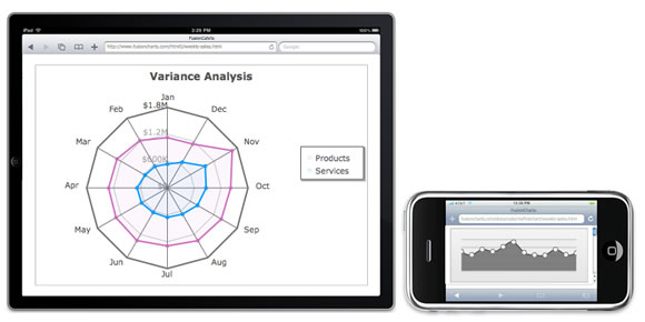
iPad ready with JavaScript (HTML5) support
Starting PowerCharts v3.2, you can render the charts on iPads and iPhones as well using the built-in JavaScript rendering capabilities. Building upon the HighCharts library, the charts rendered by this module are purely JavaScript based and do not need Flash. Then you can choose from automatic fallback, wherein the charts figure out the best mode of rendering (Flash or JavaScript depending on the availability of the Flash player), or display the
charts using JavaScript exclusively.
With this, your charts now have the potential to reach more eyes than ever before. And if you are already using PowerCharts, you just need to replace the old SWF and JS files with the new ones – you don’t need to change a line of code. Complete implementation details on this in our
online documentation.
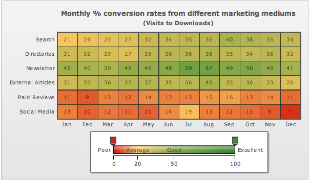
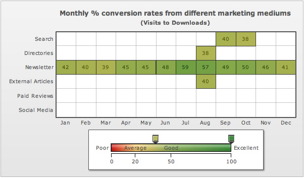
Heat Map Chart
PowerCharts v3.2 also introduces the
heat map chart that makes analysis of stock market investments and marketing metrics a breeze. Display complex data in a tabular format and add colors to make them easier to understand – typically red, yellow and green for poor, average and good respectively.
Now for the little innovation we added to it. Suppose you are deep diving into your marketing data to find out the mediums that gave you a high conversion rate. Just drag the pointers on the gradient scale to the high-conversion range and all the other data sets will disappear. Now you can focus only on the marketing mediums that have converted well for you. Can data interpretation really be easier?
You can also use the heat map to display employee attendance, CPU utilization and company performance comparisons. Owing to their complex nature, they are typically plotted in a table itself making them difficult to comprehend. With the heat map chart at your disposal, color them according to their value, add interactive pointers to the gradient scale and make data analysis a breeze.
Other new chart types
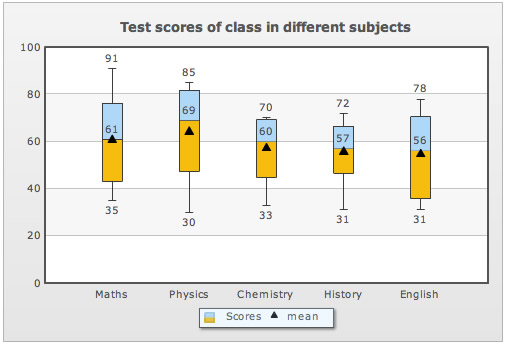
In addition to the heat map chart, PowerCharts v3.2 introduces 4 other chart types – Box and Whisker, Step Line, Error Line and Error Scatter. The
Box and Whisker chart is used to display spread and skewness of a batch of data. Typically considered to be a statistician’s tool, we have made it so simple everyone can use it. Display test scores, employee age, bandwidth usage and even soccer results using it.
The
Step Line Chart, a specialized form of line chart using only vertical and horizontal lines for connecting data points, is used when the data is not continuous in nature but characterized by a jump from one level to another.
The Error Line and
Error Scatter chart, as the names suggest, are conventional line and scatter charts with the ability to show error (or deviation) in data.
Other additions
Just like FusionCharts v3.2, the latest version of PowerCharts also supports
JSON data and
LinkedCharts. With JSON, your data gets lighter and simpler, and works easily with Javascript libraries like
jQuery charts and extJS. With
LinkedCharts, you can create unlimited levels of drill-down with a single data source. And all of this is so simple that you can create all levels of drill-down in minutes. You can check out the complete list of additions we have made to PowerCharts v3.2 in our
version history. As always, we look forward to your feedback. How do you like the charts on the iPad? Where are you using the heat map? Till then, happy charting…err…power charting!