Summers are Getting Hotter
Data Story by FusionCharts
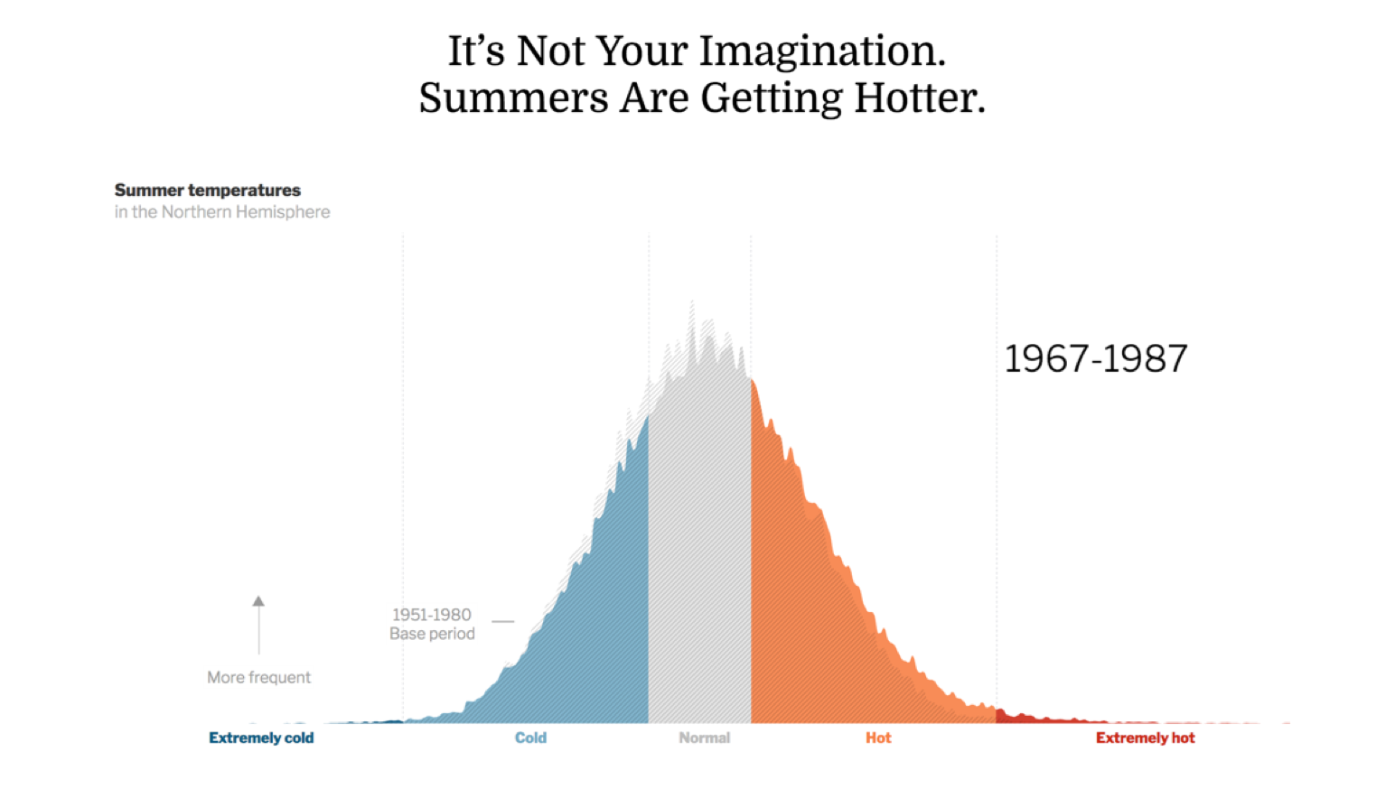
We are all feeling the burn of rising temperatures across the globe and are left wondering whether it’s just our perception! This story visualizes the data of the last 50 years to show how summers are getting hotter in the northern hemisphere. In each decade, the bell curve has moved right, getting closer to the ‘hotter’ zone. Extraordinary summers of the mid twentieth century have now become commonplace. It is no gimmick and should be ringing alarm bells!
This sample dashboard is built using FusionCharts Suite XT, which needs a license for commercial use.
Want to use this Data Story in your projects?
We can plug in your data into our data story templates, or customize the template for your needs, or even build a completely new one. We would love to talk to you!