Over the past two months we’ve been discussing predictive analytics in detail, which has generated a lot of interest from readers. Building on that start, we’re now moving to another series on a related topic – Real-time data visualization.
 ‘Real-time’ has become a buzzword in recent times. Every other product we come across touts its real-time capabilities. When evaluating a new tool for your marketing, sales, or operational needs, you may have considered real-time as a necessary requirement. When reading articles on popular tech blogs, you’ve probably come across the term every other day. Yet, for many, the phrase ‘real-time’ is like a popular stranger that everyone talks about, but a stranger nonetheless. They wish they knew what all the buzz is about, but don’t know where to start. If that’s you, this series will serve as a great starting point in your understanding of what real-time data is all about.
In this series of blog posts, we discuss how businesses are approaching real-time business intelligence in a way that empowers their decisions. We’ll take a look at the various components of a real-time business intelligence system, with an emphasis on the data visualization aspect.
We begin by assessing where we are today, the role big data plays in the functioning of our businesses, and how we got here.
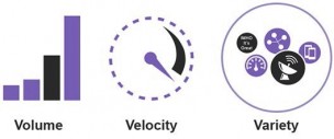 About a decade ago, Gartner ushered in a new era of business intelligence when they drew a contrast between data as we knew it back then, and the way data was headed. They suggested three prominent characteristics of this new type of data called big data – volume, velocity, and variety. Since then, many have tried to add many more V’s like value, veracity, and viability. We’ve also seen some backlash against this ‘wanna V’ syndrome. For our purposes, we’ll stick to the original definition.
When discussing real-time analytics, while none of the three V’s can be left out, velocity is of prime importance. This is because of the speed with which data is captured, stored, processed, and visualized. This velocity is what differentiates real-time analytics from traditional BI systems. The entire cycle from data capture to final action taken on it can happen in a matter of seconds, or even milliseconds.
 ‘Real-time’ has become a buzzword in recent times. Every other product we come across touts its real-time capabilities. When evaluating a new tool for your marketing, sales, or operational needs, you may have considered real-time as a necessary requirement. When reading articles on popular tech blogs, you’ve probably come across the term every other day. Yet, for many, the phrase ‘real-time’ is like a popular stranger that everyone talks about, but a stranger nonetheless. They wish they knew what all the buzz is about, but don’t know where to start. If that’s you, this series will serve as a great starting point in your understanding of what real-time data is all about.
In this series of blog posts, we discuss how businesses are approaching real-time business intelligence in a way that empowers their decisions. We’ll take a look at the various components of a real-time business intelligence system, with an emphasis on the data visualization aspect.
We begin by assessing where we are today, the role big data plays in the functioning of our businesses, and how we got here.
The Three V’s of Big Data
With the explosive growth of data creation in recent years, and the opportunities afforded by big data, the need for real-time business intelligence is growing by the day. IBM estimates that 90% of all the world’s data has been created in the past two years alone. However, while this firehose of data hits us at ever increasing speeds, IDC observes that less than 1% of all available data is analyzed. Businesses face the problem of data, data everywhere, not a second to think. About a decade ago, Gartner ushered in a new era of business intelligence when they drew a contrast between data as we knew it back then, and the way data was headed. They suggested three prominent characteristics of this new type of data called big data – volume, velocity, and variety. Since then, many have tried to add many more V’s like value, veracity, and viability. We’ve also seen some backlash against this ‘wanna V’ syndrome. For our purposes, we’ll stick to the original definition.
When discussing real-time analytics, while none of the three V’s can be left out, velocity is of prime importance. This is because of the speed with which data is captured, stored, processed, and visualized. This velocity is what differentiates real-time analytics from traditional BI systems. The entire cycle from data capture to final action taken on it can happen in a matter of seconds, or even milliseconds.

