It’s Monday Morning. You are already late to office. You have a deadline at 2:30 pm and another at 5 pm. You sit down in front of your computer, all determined to finish your work in time. Suddenly you feel tempted to check your Facebook profile, just for a few minutes you know! In the meantime, you receive an email from your manager asking about the details of a certain project and you get busy replying to it. And Oh F***! it’s already 2 pm and you have not even started your work. Sounds familiar?
Well, RescueTime seems to have the solution to this problem. By helping us understand how we spend our time on the computer, it helps us manage our time better and become more productive.
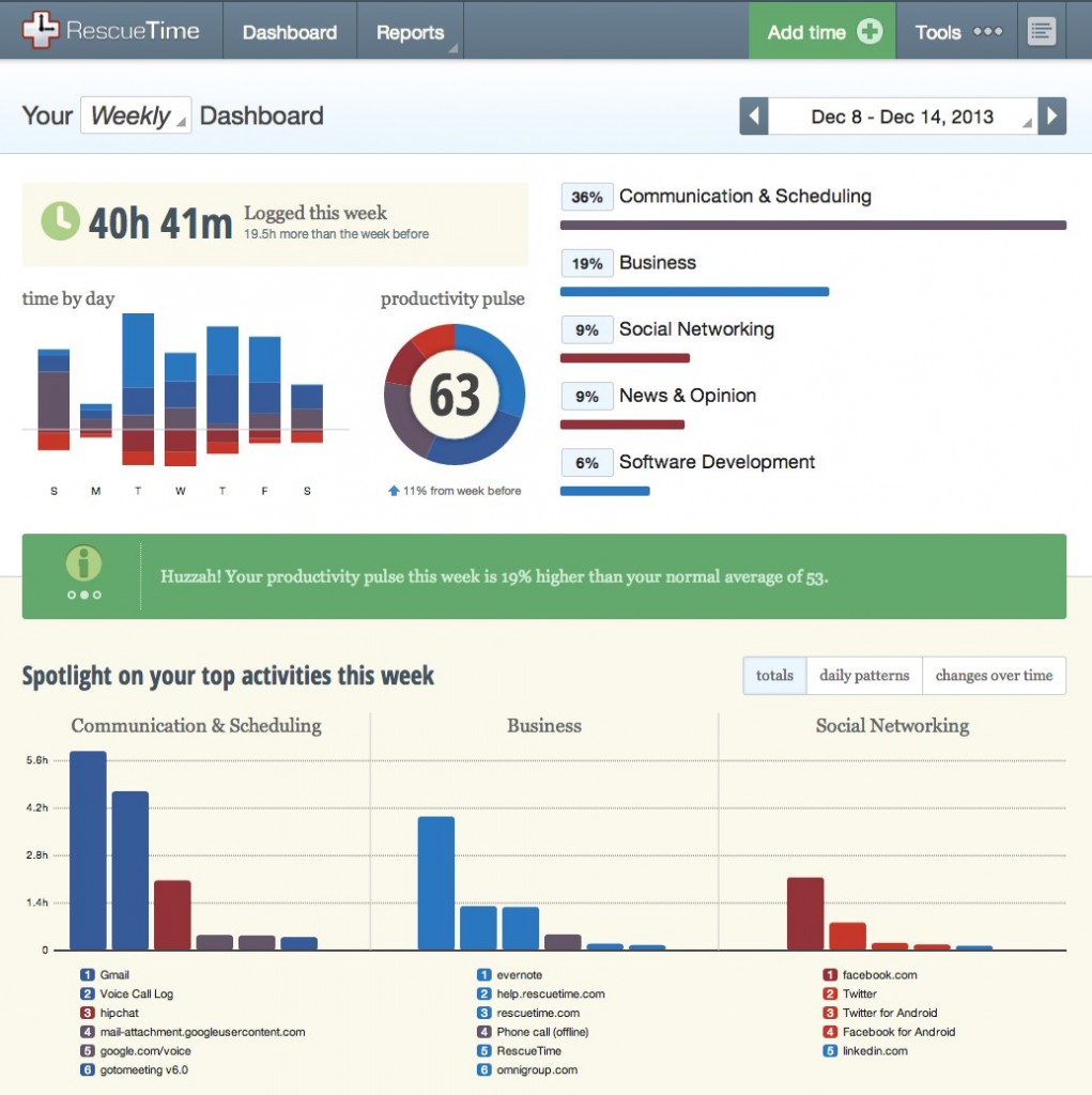
RescueTime runs securely in the background on our computer and mobile devices and records everything that we do on it. Using a dashboard, it then displays the information on the amount of time we spend on various sites, our productive hours, not-so productive hours and so on.

The application also lets us set Goals (eg: spend less than 1 hour on social networking), Alerts (eg: when we spend more than 1 hour replying to emails) and Export our reports in various formats.
I recently caught up with Robby Macdonell, Head of Product Development at RescueTime, to discuss what went into building their dashboard, USP of their dashboard and the future of the data visualization industry. Here are the excerpts from the interview:

Table of Contents
What is RescueTime and how does it solve user problems?
RescueTime is a service that helps people stay productive by better understanding how they spend their time on the computer.
What were the primary reasons behind incorporating a dashboard? How does it help the user perform her job better using RescueTime?
It gives the user a single place to get a high-level sense of how they are spending their time. We offer several more in-depth reports, but we found that most users really wanted to have a single page they could review to get an understanding of their time.
What were the primary build versus buy decisions in your dashboard?
We originally used third party charting components for our dashboard. The charts were an easy way for us to display the basic information we needed without doing too much coding. At the time, Flash was really the only reliable option for interactive charts, and we didn’t have much ActionScript expertise, so writing things from scratch wasn’t really a good option.
We recently redesigned the website and chose to code all of our dashboard components ourselves from scratch. We made this change for two reasons. First, we needed more fine grained control over our charts. Second, browser technologies had progressed to the point that we could use JavaScript and SVG instead of Flash. We’re more comfortable with those technologies, so it was easier to proceed with a custom dashboard.
What is the USP of your dashboard?
Display of how much time a person has spent on the computer in the current day, plus high level breakdowns of which applications and websites most of the time was spent on.
How many major design iterations have you gone through for your dashboard and what were the major changes in the iterations?
We’ve been iterating on our dashboard for several years. Our recent redesign was a complete reimagining, but up until then the changes had been incremental.
Does your premium version have any advanced dashboard features?
Yes. There are two versions of RescueTime. The free version offers a basic understanding of how time is spent on the computer. The premium version offers more detailed visualizations, greater historical perspective, and shows long-term trends over time.
How did adding a dashboard impact your revenue?
We had a dashboard from the beginning, so I can’t really answer this, aside from saying if we got rid of our dashboard I’m sure it would negatively impact our revenue. It’s the main part of our application!
Do you think information dashboards are important in software products?
I think in certain places, yes. More and more, we’re seeing business processes being expressed as streams of data, and it’s really important to understand the flow of that data.
Where do you see the data visualization industry in 2014?
I see a move towards smarter visualizations―displays showing relative changes over time that can point out the interesting signals that you should be paying attention to. I also see notifications and generated insights playing a larger role. As the amount of data we have increases, it becomes difficult to stay on top of it all. The display needs to ease some of this analytical burden from the user by discovering and surfacing anomalies without the user having to dig for them.
If you liked reading this, you may also want to check out the second part of the series where we talk to the CEO of FacileThings to understand the story behind their information dashboard.
Have someone you’d like to see featured in this series? Add them in the comment section below.


