
After extending the design improvements on the fundamental charts in the last release, we created a bunch of new scroll and combination charts (something a lot of our customers requested for) in this release. The new charts and niche design improvements were balanced with some critical issues which were troubling our users.
Some notable developments include:
Table of Contents
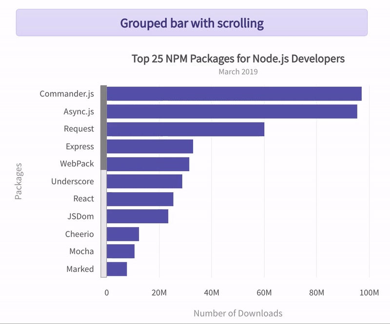
New scroll and combination charts
Scroll support has been added to the bar charts and now we have two new charts – scrollbar2d and scrollstackedbar2d charts. Likewise, scroll support is now available in grouped stacked columns and their variants, which means we now have scrollmsstackedcolumn2d and scrollmsstackedcolumn2dlinedy.
A bunch of combinations of different chart types requested by users are also available now – stackedcolumn2dlinedy, stackedarea2dlinedy, and mscombidy3d.
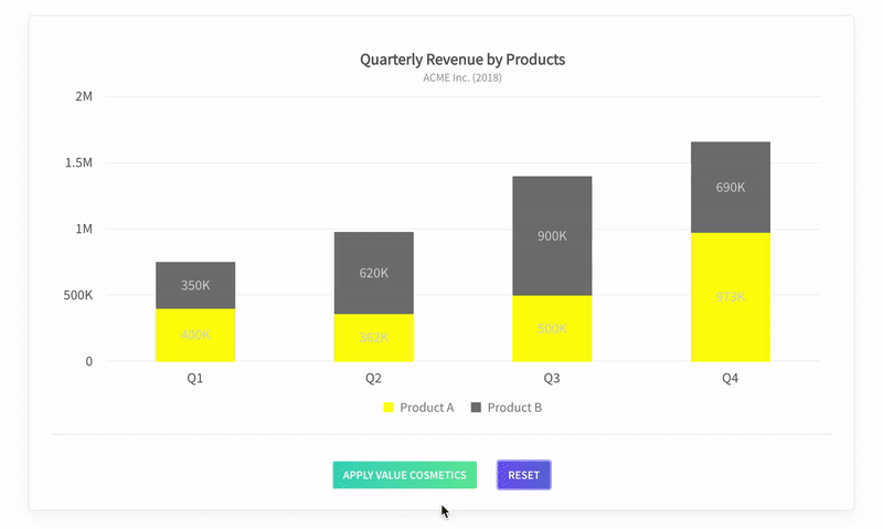
Readability of data values
Extending the readability control of data value texts, we have ensured that major data value cosmetic attributes like valueFontColor, valueBorderColor and valueBgColor can now be configured for either globally across the chart or for a specific data series/data plot. This will ensure that when values are placed on the plots, the readability of the data value texts can be controlled in a better way.
Data plot events will provide info on data plot properties
Cosmetic details of data plots will now be available via data plot events like, dataplotRollOver, dataplotRollOut, dataplotClick, dragStart and dragEnd. Depending on the type of chart, contextual cosmetic properties will be available in the relevant data plot event. For example, in line plots, one can get details about the anchor cosmetics, whereas in pie charts, one can get details about the pie segments. Such information will now be available across all the charts – from fundamental charts like column, line, pie, to complex ones, like candlestick, gauges, heat map, etc.
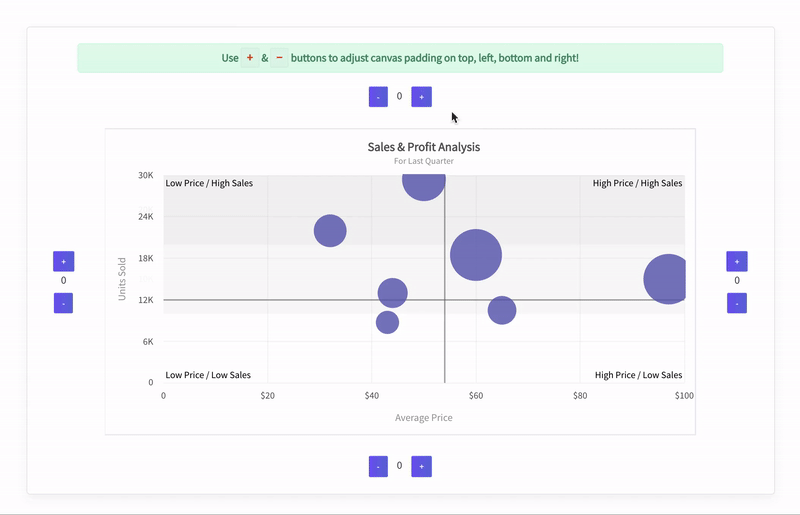
Canvas padding attributes
To better control the white space around the canvas, a bunch of padding attributes are now available – canvasTopPadding, canvasBottomPadding, canvasLeftPadding and canvasRightPadding. These take values in pixels and give control to the developers to ensure that their plots at the edges neither clip nor overlap with other elements. It will also enable the developers to specify sufficient white space around the canvas and offer better aesthetic control.
Improved accessibility
Adhering to the accessibility guidelines, we have reordered the DOM hierarchy of some of our elements. This will ensure that navigation path for people with special abilities to get valuable information from our charts is better. We are congnizant of the difficulties faced by people with special abilities and are committed to ensure that our library adheres with the web accessibility standards.
The details of critical issues which we solved for our customers and other specifics of the release are available in the change log.
Coming soon 🔥
- Sankey diagram
- Chord diagram
- Sunburst chart
Got some suggestions on improving FusionCharts? Do not hesitate to drop an email on [email protected]. I would love to hear your thoughts. Finally, do not forget to subscribe to our newsletter to get the latest news on FusionCharts.
Download the FusionCharts Suite here.
Buy or upgrade here.


