For enterprise organizations and product owners, embedding charting into your software helps bring valuable data closer to those who need it most – customers, end-users, and developers.
Providing data visualization and dashboard tools natively means people have interactive ways to explore key metrics as part of your user experience (UX) instead of having to use a separate program, and can make more data-driven decisions. Embedding the diverse charts and graphs that FusionCharts offers, for example, helps you power your software experience or Web application with stunning, in-built visualizations, and your users don’t have to go elsewhere for it.
But what if some people don’t understand, or can’t use the insights your visualizations present?
The reality is not everyone has the knowledge to be able to act on embedded graphs or charts in the ways you envision – and without guidance or prompting, your new tools may go underutilized.
This is where contextual analytics, a new form of embedded analytics from Yellowfin, comes in.
Table of Contents
Creating Actionable Insights with Contextual Analytics
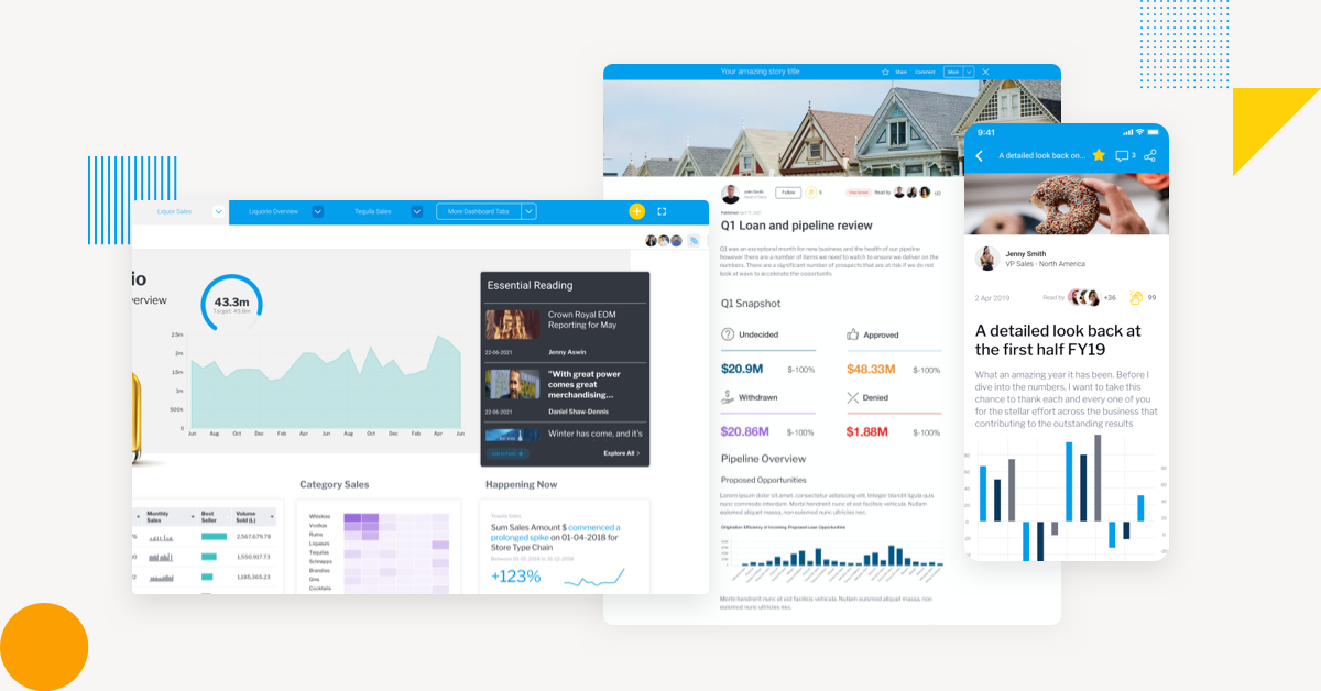
Contextual analytics embeds dashboards and data visualization components directly into the user interface and transaction workflow of your software, rather than as standalone modules.
Charts, metrics and tables seamlessly blend into the core experience of your app, meaning while people use your software as normal for their work, they always have helpful charts and dashboards – and, by extension, data insights – available to assist their next action or decision.
But it is not just the integration of these components into the UX that makes analytics contextual, but how the integration also drives action on the part of the user. Yellowfin uses automation in its many features, such as Assisted Insights, Signals and Stories, to allow users to be able to easily and quickly leverage a range of interactive options when viewing and clicking their embedded charts and graphs – such as auto-generated explanations and comparisons, dynamic alerts to new changes as they occur in real-time, and helpful, related data stories authored by business stakeholders that can provide further context behind the numbers in their graphs and charts.
By merging your embedded data visualization components closer with your application’s transactional environment, you are better ensuring that your product users can gain fast, easy, guided insight into the data they see on-screen (and the new analytics tools you just adopted).
For example:
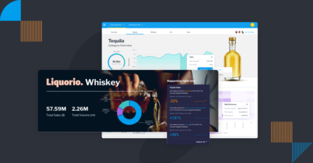
- Inventory managers can instantly see the latest changes in stock, emerging trends in buyer behavior and when to replenish orders in the graphs and charts located in their main UI, without having to switch screens to source such data
- Manufacturing departments can leverage automatic alerts of when key performance indicators are realized, or be prompted to view an unexpected outlier in their chart
- Retail workers can be guided toward analyzing weekly demand forecasts by clicking a chart or graph, and be provided relevant options to act there and then, such as to create shift schedules automatically, rather than having to independently drive that process
Essentially, contextual analytics does more than embed attractive charts or dashboards in your application. It makes it possible to combine your data, visualizations and associated actions together to enable better insights, and organically drive action for your end-users.
Related: The Developer’s Guide to Contextual Analytics
How does Contextual Analytics Bring Action-Based Visualization?
In a previous blog, we explained how using Yellowfin’s embedded BI tools in combination with FusionCharts’ charting toolset can help meet customer demand for more interactivity from their analytics, and better integration of data with their application workflows. In this article, we outline 3 ways Yellowfin’s contextual analytics enhance your existing charts and dashboards, and help transform them from flat visualizations and static metrics to interactive, actionable data points.
1. Immediate answers with Assisted Insights
Getting to the ‘why’ behind a data-set is quite the task. Even with helpful embedded visualizations to summarize key points, most BI tools don’t explain the cause behind changes or trends. This means if your average business user lacks the expertise to perform self-service analysis, they will have to rely on an expert or one of your developers to explain the report’s results for them.
Assisted Insights is a native feature of Yellowfin that uses machine learning and automation to provide instant answers to a user parsing an embedded graph, chart or report, so they can get to the ‘why; without relying on another. From the dashboard, a user can click an element to auto analyze it, choosing either ‘Explain’ for additional context that helps explain the data, or ‘Compare’ to compare multiple values of a dimension across the various fields in the view.
This feature runs smart algorithms over the data to find insights, ranking them according to what is most useful for the user. It automatically generates further data visualizations paired with a narrative that breaks down data points. This helps a user take action right from the same UI, rather than having to switch to another tool or rely on an expert to explain the results for them.
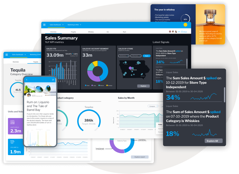
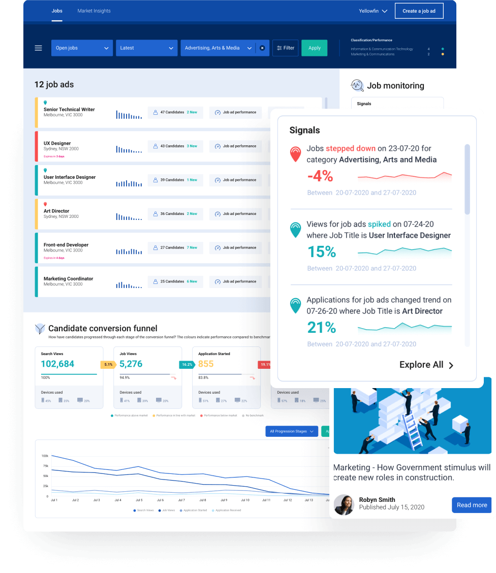
2. Instant alerts with Yellowfin Signals
Yellowfin Signals automates the data discovery process by delivering the what, when and why behind the numbers of an embedded chart or graph, right as your user is exploring your app as normal. Signals uses AI to constantly monitor your data for statistically significant changes, and prompts users with a pop up when something relevant changes in your data – often-times a deeply hidden pattern, trend or outlier that the user isn’t even looking for in their analysis.
This pop up summarizes the changes that have occurred, and when an end-user clicks on each Signal, they can be pointed toward where to look and access further visualization to explain the relevance of the finding – ensuring they can proactively act upon these embedded insights.
Signals work in tandem with Assisted Insights, as when a user clicks on the alert prompt, they can choose to run Assisted Insights’ auto analysis to explain or compare the automated alert in question – further ensuring your embedded charting and dashboards are driving action.
3. Human context with Yellowfin Stories
Data storytelling is key to not just building a data-driven culture, but providing the necessary context for end-users of analytics to take action on embedded data. Sometimes, an automated explanation or alert isn’t enough, which is why having a data story available that explains the story behind the numbers in a chart or graph is helpful.
Yellowfin natively supports data storytelling in its Stories and Present products. Managers, leaders, department heads and influencers can share their knowledge in an in-built, news-like text editor where they can take users through the story behind embedded data insights using text, image and video. You can even embed other reports or visualizations in the Story or Presentation itself, share it throughout the organization, and have it displayed in a scrolling feed within the main UX of the product.
Unlock Contextual, Actionable Visualization with Yellowfin
Yellowfin provides rapid value for enterprise organizations and product teams who wish to drive action and deliver insights from their embedded analytics capabilities. Combined with the stunning, real-time charting capability of FusionCharts, you can create turn-key analytical applications that truly enable data-driven decision-making.
Try Yellowfin on your own data today free for 30 days. Request your free trial today.