Table of Contents
Nike+ FuelBand
Web app dashboard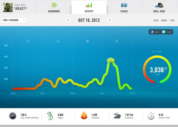
(Image Source: feker.ie)
Mobile app dashboard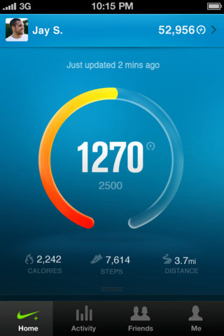
(Image Source: thetechjournal.com)
Our take: It challenges the general notion that a dashboard should always look serious and grim. This dashboard has elements that are considered as bling and oh-so-passé in design. But here, these very elements blend to give a contemporary look. For those of us who unnecessarily break our heads figuring out the latest design fads, maybe it’s time to just do it!Fitbit
Web app dashboard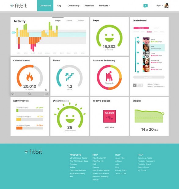
(Image Source: marketingfacts.nl)
Mobile app dashboard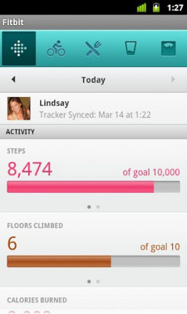
(Image Source: mobileappdeveloper.com.au)
Our take: Fitbit’s dashboard recently got a makeover, and the new look flaunts a tile-based metro design. Bright colors used as accents coupled with smart icons and intelligent use of white space make this dashboard one of our favorites among other web apps.BodyMedia
Web app dashboard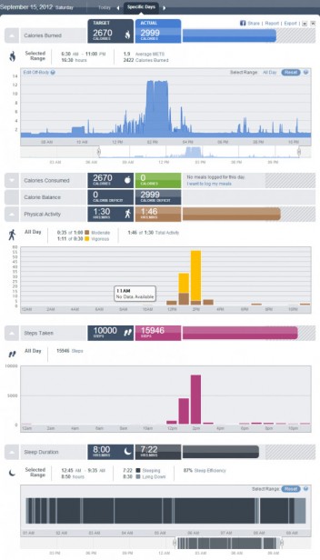
(Image Source: reviews.fitblogger.com)
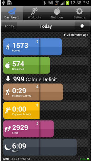
(Image Source: androidpit.com)
Our Take: Good breakdown of metrics and the proper use of charts makes the dashboard comprehensive yet keeps it clutter-free. In the mobile dashboard especially, blocks of color successfully create strong visual interest.MapMyFitness
Web app dashboard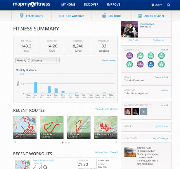
(Image Source: thetechsideoffit.com)
Mobile app dashboard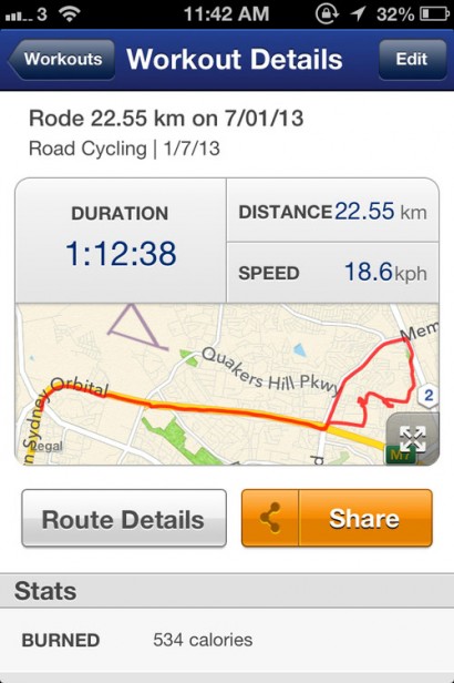
(Image Source: tumblr.com)
Our take: A clean, flat design and good use of white space make this a no-nonsense dashboard! A classic example of “less is more”; few pastel colors with gray gives it a sophisticated look.Digifit
Web app dashboard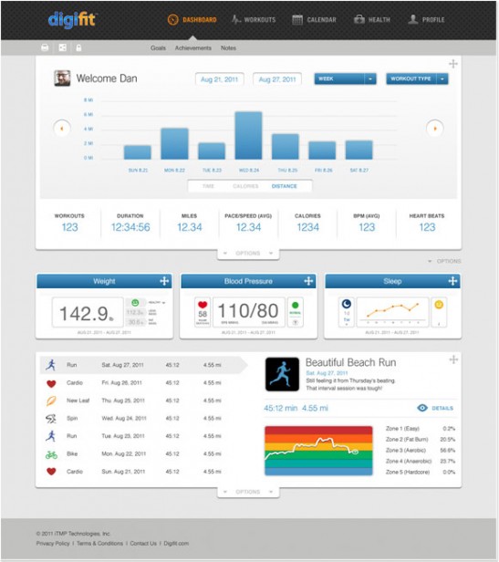
(Image Source: danielcollinsdesign.com)
Mobile app dashboard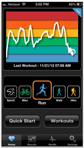
(Image Source: itunes.apple.com)
Our take: Another dashboard uses gray (in the web version) with color accents and clean icons to give it an elegant look. Overall the designs for both web and mobile dashboards work fine, but they should consider doing away with the rainbow background for the javascript chart. The best description is color-coding gone wrong.Runner’s Studio
Web app dashboard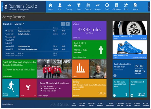
(Image Source: runnersstudio.com)
HealthVault
Web app dashboard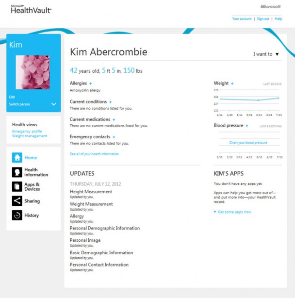
(Image Source: blogs.msdn.com)
Mobile app dashboard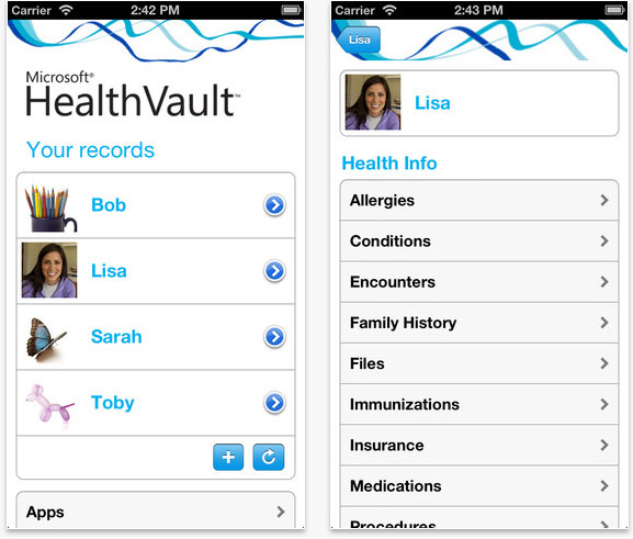
(Image Source: itunes.apple.com)
Our take: When we are talking about metro design, how can we forget Microsoft? Microsoft’s HealthVault is not a fitness app but more of a health and fitness information manager which lets you keep all your (as well as your family’s) medical and fitness details in one place. The designs for both the web and mobile dashboard has been kept minimalistic. The central area of the web dashboard is dedicated to critical stats, and the left panel is used for navigation―an excellent way to keep the user focused on the stats.Fitocracy
Web app dashboard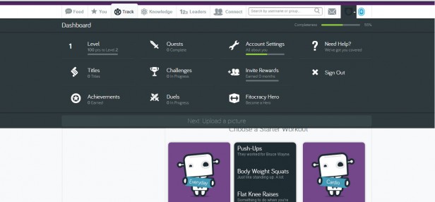
(Image Source: fitocracy.com)
Mobile app dashboard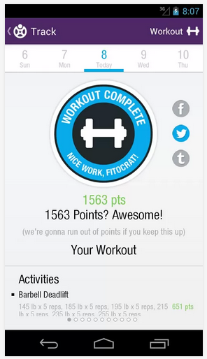
(Image Source: play.google.com)
Our take: Fitocracy uses both gamification and concepts of social networking. What makes its design different from the other dashboards are the Accordion controls which make the different sections expand and collapse as per user needs. Crisp typography, clean icons, and a good choice of color accents give the dashboard an elegant look.Your Shape: Fitness Evolved
Xbox app dashboard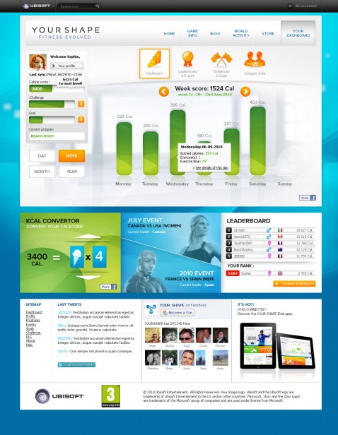
(Image Source: impulsegamer.com)
Mobile app dashboard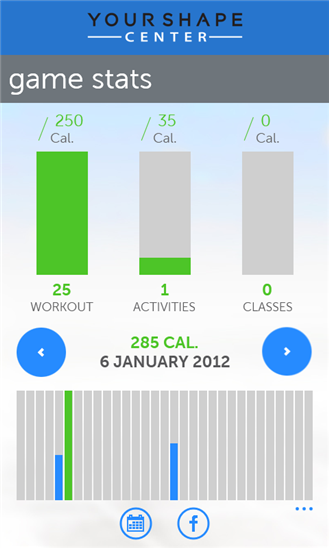
(Image Source: windowsphone.com)
Our take: Another application that successfully uses gamification to lure people into fitness. Available only on Kinect for XBOX 360, Your Shape works on motion detector technology. The color palette uses bold colors like blue, green, and orange and mixes it with subtle shades of gray. Navigation is possible using both the header links as well as the modular blocks. The mobile app makes good use of white space and flattering colors.RunKeeper
Android app dashboard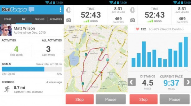
(Image Source: phandroid.com)
iPhone app dashboard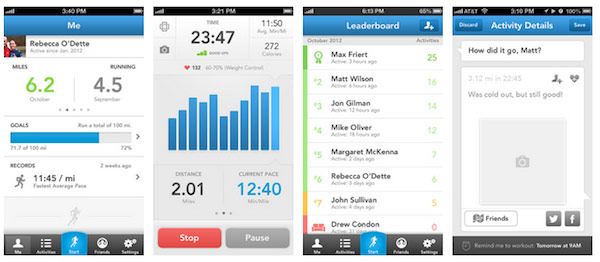
(Image Source: mobileburn.com)
Our take: RunKeeper is a smartphone (Android and iPhone) running app which uses GPS and manual entry to track running, cycling, etc. Recently, it got a makeover, and the above screenshots are how the app dashboards currently look. The UI is clean based on the Holo-theme as introduced in Android 4.0. In the Android app, the header is used for navigation, whereas in the iPhone app, a five icon set spanning the bottom of the screen allows switching between sections. The icons have been labeled with text to avoid any confusion for users. And if all this was not enough to motivate users, there is a female audio voice cue to inform them about their progress and motivate them further. Have you got another fitness dashboard to add to the list? Use the comment section below. Disclaimer: Our take is strictly based on the screenshots that were publicly available on the web. As for a detailed review of the apps, you will have to wait until we start our fitness regime. Keep watching this space for more!


madden nfl 13 xp cheat
August 10, 2013, 10:34 amI’m really inspired along with your writing talents as smartly as with the structure to your weblog. Is this a paid theme or did you modify it yourself? Anyway keep up the excellent high quality writing, it is uncommon to look a nice weblog like this one today..
Shilpi Choudhury
August 10, 2013, 11:08 amThank you for your encouraging words 🙂