
Data visualization is essential for businesses of any type. This is because it helps decision-makers identify and understand current and historical trends. With data visualization, you can make valuable data accessible across your organization. However, data is usually available in the form of raw numbers, and visualizing it isn’t easy unless you’re using a data visualization tool.
A data visualization tool is a great way to display raw data points on easy-to-understand and interpret charts. This, in turn, helps you quickly make sense of your data and draw insights. For example, you can use a data visualization tool to illustrate key performance indicators (KPIs) and other valuable metrics, track profits, sales, etc. However, not all data visualization tools are the same. This is why it’s important to choose an efficient data visualization tool like FusionCharts, which offers all the features your business needs.
In this article, you’ll find 10 key questions about a data visualization tool that can help you decide if it’s the right tool for your needs.
Table of Contents
1. Which Chart and Graph Types Do the Data Visualization Tool Support?
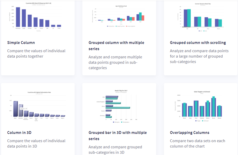
Businesses need different types of charts and graphs to display different types of data. For example, column charts are great for comparing numeric values such as sales and profits. On the other hand, a scatter chart is more useful when you want to understand the relationship between two different variables. That’s why it’s essential to check if the data visualization tool you’re choosing supports all the different types of charts that you might need.
FusionCharts supports more than 100 different types of charts, including column, bar, area, line, and pie charts. It also supports domain-specific charts like Radar/Spider charts and heatmaps, as well as stock charts. That’s not all, FusionCharts also has more than 2000 choropleth maps that cover countries and cities to help you make your reports more insightful.
2. Does the Data Visualization Tool Offer Additional Features To Make The Charts Easy To Understand?
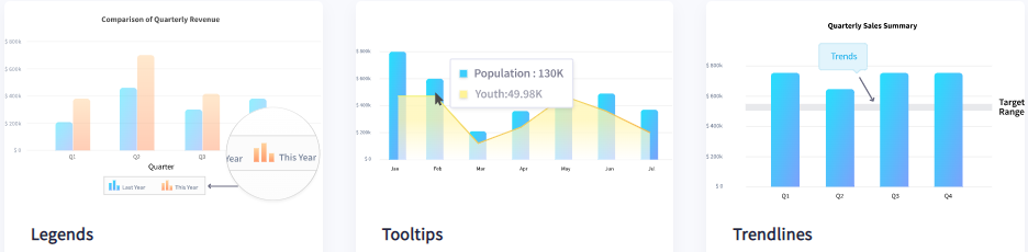
You cannot just plot data on charts and graphs and expect the views to understand it. Rather, you need to add titles and labels, add legends, allow users to switch between numbers/values on the graph, etc., to help them quickly understand the graphs and charts. FusionCharts offers all such features to make your charts even easier to understand and interpret.
With FusionCharts, you can add and edit chart titles, labels, and legends, display numbers in global formats, and also allow users to switch between them and add trend lines to highlight important landmarks within the data. You can even add drill down to charts that allow users to drill down to endless levels to get deeper insights. In addition, you can make informative tooltips to show contextual information about data plots.
3. Does The Data Visualization Tool Allow You To Export Charts In Different Formats?
Sometimes you need to export charts rendered by the data visualization tool into printable PDF files or images. Or you might need the underlying data as spreadsheets. In this case, you need to check which formats you can export before choosing it. FusionCharts lets you export charts and maps in several formats, including images, PDF files, and Excel spreadsheets. You can also customize different aspects of the export process. For example, you can customize the titles displayed in the export menu and name the exported file. You can also choose to export charts either in a batch or individually.
4. Is the Data Visualization Tool Capable of Handling a Large Number of Data Points?
In the business world, you usually have to deal with thousands of data points. This means the data visualization tool you’re using must be capable of processing thousands of data points. With FusionCharts, you can render millions of data points efficiently in a web browser without any performance issues.
5. Can I Make Time Series Charts With The Data Visualization Tool?
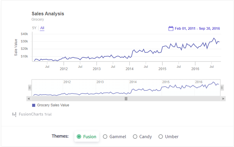
A time-series chart is super useful for displaying data points over time. You can use these charts to quickly identify trends or understand how key metrics change over time. FusionCharts offers powerful time series charts for big data visualizations. Whether you want to visualize thousands of data points off a sensor in your IoT app or you want to display data every millisecond for your financial app, FusionCharts offers everything you want in a time series chart.
6. Is The Data Visualization Tool Easy to Learn and Use?
In today’s fast-paced business world, time is everything. This is why it’s important to choose a data visualization tool that you can learn quickly. FusionCharts is super easy to use and has a very low learning curve. With the FusionCharts data visualization tool, you can create your first chart in under 15 minutes. To make things even easier, FusionCharts also comes with a consistent API across different charts, extensive documentation, and tons of ready-to-use chart examples.
7. Does the Data Visualization Tool Support Real-Time Charts?
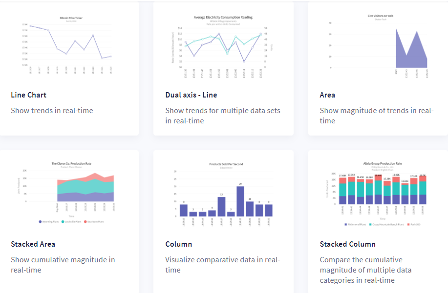
Real-time data visualization is critical to the success of a business. FusionCharts offers data streaming charts or real-time charts that update automatically by fetching data from the server after a specified number of seconds. The best part is that these charts don’t require any page refresh.
8. Does the Data Visualization Tool Support Interactive Charts?
Interactivity is also important because it makes your charts easy to understand and interpret. However, many data visualization tools out there don’t allow you to interact with charts as they only produce static images of charts. FusionCharts, on the other hand, supports all types of user interactions. For example, you can zoom in and out, show and hide data series in column charts, create drag-able charts, see more data points with scroll charts, etc.
9. Which Devices Does the Data Visualization Tool Support?
Another thing to consider when choosing a data visualization tool is whether it allows users to efficiently access charts from any device. For example, viewers should be able to look at the charts, graphs from desktops, laptops, mobile phones, and tablets. FusionCharts is designed to display responsive charts that adapt to different screen sizes, including desktops, laptops, and mobile devices.
10. Does the Data Visualization Tool Offer Plugins?
Most developers use frameworks like Angular and React to speed up the development process so you should look for a data visualization tool like FusionCharts that helps you get started quickly by offering front-end plugins like Angular, Vue, React, Ember, and more, to help you get started quickly. FusionCharts even has several back-end plugins like PHP, Django, and Ruby on Rails.
Ready to create interactive and aesthetically pleasing charts? Start using FusionCharts today and visualize data in the most efficient way.


