
Organizations today collect lots of data, and it’s important to make sense of it by visualizing it. Data visualization is the practice of representing raw data points on charts and graphs. This gives you a clear idea of what your data means and helps identify trends for making key strategic decisions. However, to make aesthetically appealing and effective visualizations, it’s critical to use a good data visualization tool like FusionCharts. A good data visualization tool supports a wide range of charts and graphs for different types of data. Most importantly, it lets you build live charts.
In this article, we’ll show you seven tools to build effective live charts. But, let’s first discuss what live charts are.
What Are Live Charts?
Live Charts, also called real-time or data streaming charts, are a type of charts that update automatically after a specific interval. Hence, these charts show real-time data. These fetch data directly from the server to update themselves, and they don’t need any page refreshers. Live charts ensure you’re using the most up-to-date data in your visualizations, which is critical for effective decision making?
What Are Some of The Top Tools for Building Live Charts?
1. FusionCharts
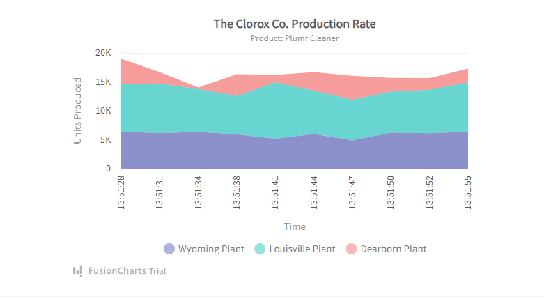
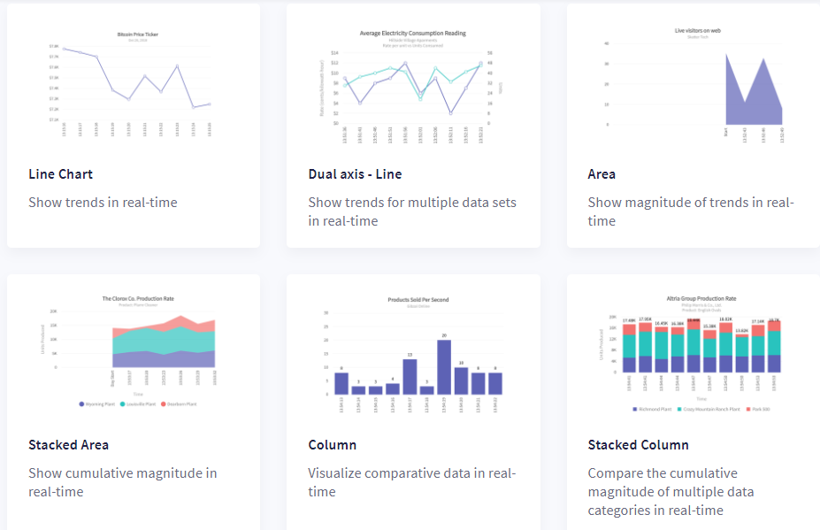
FusionCharts is one of the best JavaScript libraries for building beautiful and functional live charts. It supports six different types of live charts, namely line charts, area charts, column charts, stacked area charts, stacked column charts, and dual Y-axis line charts. FusionCharts allows you to set your desired update interval and refresh interval. In the update interval, the new data is fetched without updating the chart, whereas in the refresh interval, the chart view is updated with the most recent fetched data.
With FusionCharts, you also have control over how and when your live charts with multiple datasets update. You simply need to make a single call to the server to update multiple data values. Additionally, FusionCharts also allows you to create your own customized annotations that automatically update in real-time.
In addition to live charts, FusionCharts support over 100 different types of charts and graphs and more than 2000 choropleth maps, covering countries, counties, and cities.
2. Google Charts
Google Charts is another popular data visualization tool that offers a wide range of charts and graphs. You can also use Google Charts to create live charts to display real-time data on your site. For example, you can set the interval at 10 seconds to update the chart every 10 seconds. Google charts also offer lots of customization options, and you can easily integrate any chart created with Google Charts into your website.
3. Chart.js
Chart.js is an open-source and easy-to-use JavaScript data visualization library that supports eight different chart types. You can also update the charts created with Chart.js in real-time. This means you can create live charts that update as your data changes. Chart.js also supports animation and user interaction. You can also mix and match chart types to clearly show the difference between two datasets.
4. Highcharts
Highcharts is a flexible JavaScript charting library that you can use to build different types of dynamic and interactive visualizations for your website. The data visualization tool offers a variety of chart types, such as bar chart, line chart, pie chart, timeline chart, scatter chart, and more. Highcharts also support live charts.
Highcharts offers two ways to work with a live data feed from the server. If you’re looking for a simpler way to create live charts, you can use the data module with polling (configuration-only). If you want more programmatic control, you can also set up your own data connections and update the charts using API methods.
5. D3.js
D3.js is another simple JavaScript data visualization library that allows you to create different types of charts and graphs in web browser HTML, CSS, and SVG. Although D3 doesn’t have any standard visualization formats, you can use it to create line, bar, or pie charts and many other types of charts and graphs. D3 is super easy to use, and it supports interactive data visualizations. You can also use D3 to create real-time or live charts by fetching the new data from the server at some specified regular intervals.
6. JSCharting
JSCharting is also a JavaScript charting library that allows you to create a wide range of basic and advanced charts, graphs, and maps. These include area charts, line charts, bubble charts, column charts, pie and donut charts, and many more. The data visualization tool offers several interactivity features, such as zoom in/zoom out, show/hide series, etc. JSCharting also lets you build real-time or live charts. It renders live data in real-time and updates your chart continuously to ensure your visualization reflects the most up-to-date data.
7. ZingChart
ZingChart is a JavaScript charting or data visualization library that comes with over 50 built-in chart types and modules that you can easily use for your data visualization projects. From bar, area, and line charts, to stacked, scatter, and pie charts, you can create many different types of visualizations with ZingChart. ZingChart also supports real-time feeds. This means you can create live charts that continuously update in real-time as your data changes/new data comes in. You can either configure the chart to dynamically update as each new value comes in, or you can configure it to update only when there are enough new values.
Which One is The Best Tool to Create Live Charts?
While all the tools we’ve discussed in this article support live charts, FusionCharts leads the pack with its out-of-the-box features. FusionCharts supports tons of different types of charts, graphs, and maps and comes with ready-to-use code. When it comes to live charts, FusionCharts lets you define your desired update interval and refresh interval. Additionally, live charts or data-streaming charts created with FusionCharts fetch data from the server automatically, and they update at a specified interval without needing any page refreshers.
Another great feature of FusionCharts for live charts is that it lets you write your own message logger and alert manager. The message logger allows you to display real-time messages in a specialized chart window. The alert manager helps you define actions based on the data points reaching critical values in pre-defined ranges. FusionCharts also lets you define how and when your live charts with multiple datasets updates.
{
“@context”: “https://schema.org”,
“@type”: “FAQPage”,
“mainEntity”: [{
“@type”: “Question”,
“name”: “What Are Live Charts?”,
“acceptedAnswer”: {
“@type”: “Answer”,
“text”: “Live Charts, also called real-time or data streaming charts, are a type of charts that update automatically after a specific interval. Hence, these charts show real-time data. These fetch data directly from the server to update themselves, and they don’t need any page refreshers. Live charts ensure you’re using the most up-to-date data in your visualizations, which is critical for effective decision making?”
}
},{
“@type”: “Question”,
“name”: “What Are Some of The Top Tools for Building Live Charts?”,
“acceptedAnswer”: {
“@type”: “Answer”,
“text”: “What Are Some of The Top Tools for Building Live Charts?\”,
\”acceptedAnswer\”: {
\”@type\”: \”Answer\”,
\”text\”: \”1. FusionCharts
2. Google Charts
3. Chart.js
4. Highcharts
5. D3.js
6. JSCharting
7. ZingChart”
}
},{
“@type”: “Question”,
“name”: “Which One is The Best Tool to Create Live Charts?”,
“acceptedAnswer”: {
“@type”: “Answer”,
“text”: “While all the tools we’ve discussed in this article support live charts, FusionCharts leads the pack with its out-of-the-box features. FusionCharts supports tons of different types of charts, graphs, and maps and comes with ready-to-use code. When it comes to live charts, FusionCharts lets you define your desired update interval and refresh interval. Additionally, live charts or data-streaming charts created with FusionCharts fetch data from the server automatically, and they update at a specified interval without needing any page refreshers.
Another great feature of FusionCharts for live charts is that it lets you write your own message logger and alert manager. The message logger allows you to display real-time messages in a specialized chart window. The alert manager helps you define actions based on the data points reaching critical values in pre-defined ranges. FusionCharts also lets you define how and when your live charts with multiple datasets updates.”
}
}]
}


