
Data visualization frameworks are popular throughout the internet for many reasons. Firstly, displaying data on web pages is an everyday use case across many niches. Secondly, users expect the data visualizations to be appealing, interactive, and intelligent. Therefore, developers rely on robust tools to create and showcase their visualizations.
There are many options on the market for data visualization frameworks. One of the most popular ones is tech mammoth Google’s web service Google Charts. It is offered along with a collection of other web services and tools on their Google Developers portal. While favored for its ease-of-use and range of visualizations, many developers still end up searching for a viable Google Charts alternative.
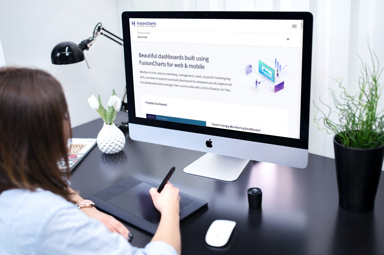
Thankfully, you have various other frameworks to help you build fantastic data visualizations, apart from Google Charts. Since data visualization has become increasingly popular, many options have entered the market. For example, you can give a smart and intelligently developed data visualization framework like FusionCharts a try. It comes with a sprawling range of data visualizations and is thoroughly customizable for your needs.
This article explains why choosing the right data visualization framework is crucial and what you should look for in a Google Charts alternative.
Table of Contents
Why Does The Choice Of Data Visualization Framework Matter?

Building the right front-end for a website takes significant time and effort. It requires taking important design choices and development decisions that will determine the whole user experience. Therefore, front-end developers are particular about the frameworks for their web projects. They want options that can satisfy all requirements and are dependable.
When it comes to including data visualizations into their websites, developers don’t rush to choose the right framework for the job. Professionals know that devoting time to finding the right fit is worth the effort. Some of the main advantages that you experience when you select a robust data visualization framework are given below:
- Improved Development Velocity: A hastily chosen data visualization framework can slow your work down. With the right one, your development will stay efficient, if not better.
- Better User Experience: The right framework offers all the options to make your visualizations more interactive. Such visualizations engage the users better and make for a memorable user experience.
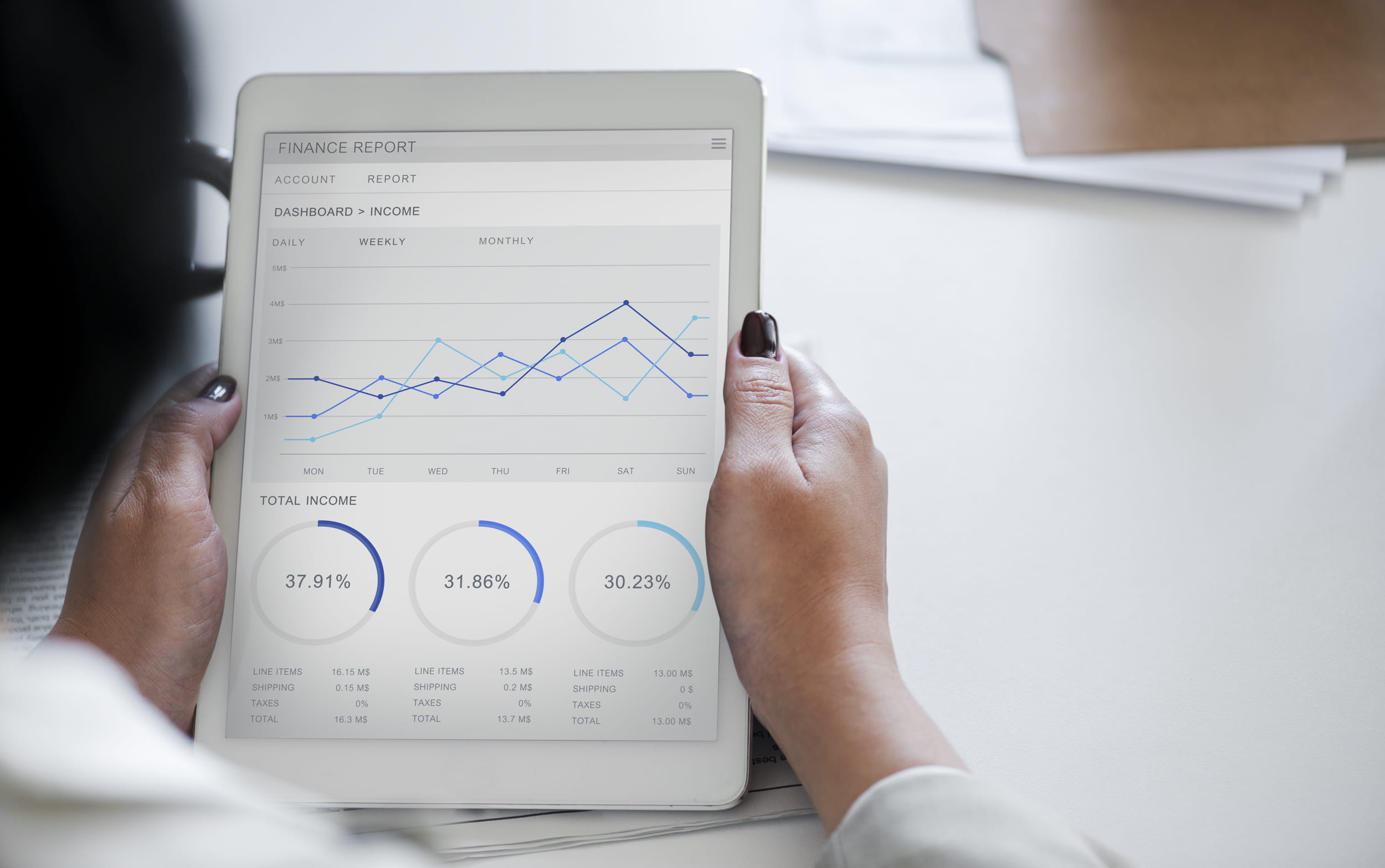
- Data Insights Conveyed More Concretely: Quality data visualizations focus on effectively communicating essential insights. The right framework ensures that your visualization does precisely that.
- More Vibrant Front-end: The result of the right data visualization will add to your front-end rather than ruining it. It will make appealing charts and maps that add more visual flair to the website’s aesthetics.
Not all data visualization frameworks on the market can deliver such advantages. Most developers choose Google Charts since it comes from a massively popular technology corporation. However, even this option has limitations in range and customizability. Therefore, most developers seek a reliable and feature-packed Google Charts alternative.
What Features An Ideal Google Charts Alternative Have?
Does Strong Visual Rendering Matter?
One of the most prominent aspects you need to ensure is the outcome of your data visualization framework. The visualizations need to be eye-catching yet not congested with color and information. It needs to strike a balance between the two aspects and render optimally based on the nature of the visualization.
You have to go through the rendered examples in the framework’s documentation and see if they match your website’s front-end aesthetic. There needs to be a correspondence between themes and design elements. Ensuring such aspects means ensuring that your visualizations won’t look out of place and that your users will understand the insights you are communicating.
Should It Be Easy To Learn & Use?
Since you are looking for a Google Charts alternative and exploring all the options, you must have decided to devote time to learning the framework. Therefore, the right data visualization won’t have a steep learning curve. After all, projects often have deadlines associated with them, and you need an option that you can immediately start working with.
To ensure this aspect, go through the framework’s documentation and given examples. The right framework will have information efficiently communicated and taught. Additionally, the framework needs to come with pre-developed examples that you can play with and learn from. Such aspects will help you learn and start developing with the data visualization framework in no time.
Does It Need To Have Extensive Options Of Visualizations?
There is no such thing as a visualization that can communicate every data insight. Therefore, you have thousands of visualizations to choose from and display your insights through. The right framework will offer you a sprawling collection of visualizations so that you can select the appropriate one.
Even if you aren’t sure which one to use, such an extensive library makes it easier to find a suitable visualization through trial and error. The framework documentation can give you a list of all the visualizations it supports. Read through it and see if there are diverse options. Choose a framework that supports making the visualizations interactive as well.
Would It Require Robust Data Handling Abilities?
Our modern data needs are significantly complex, and so are the corresponding data visualizations. Tools now have to work with millions of data points for analysis, and websites have to display the insights these data points come with. The suitable Google Charts alternative will have to support all levels of complex data quantities.
Should It Be Thoroughly Customizable?
The right data visualization framework needs to focus on offering extensive customizability. After all, every project is unique, and a single framework cannot possibly accommodate all possibilities out-of-the-box. Therefore, it needs to provide you with the option to tweak its characteristics to go well with your overall design.
The methods and API of the Google Charts alternative will show you how much of its details you can control. Some aspects you should expect to be customizable are:
- themes
- size of visualization
- annotations
- captions
You have to ensure that the framework offers you the ability to define these characteristics as you require.
Should It Come With Trustworthy Support Options?
Even if frameworks come with documentation that thoroughly covers each aspect, you could need assistance during the learning process. Alternatively, your projects may have bugs that you caught and that need solving. For such scenarios, the framework needs to provide a reliable support system to reach out to when you need to seek help.
Read through the framework’s policies and what sort of support system they will provide. Ideally, the makers should be proactive in supplying help through multiple platforms. Additionally, the Google Charts alternative needs to have a reliable update roadmap so you can develop accordingly and save your visualizations from getting obsolete.
How Can FusionCharts Be The Google Charts Alternative You Need?
FusionCharts offers you the ultimate data visualization experience that you can build right into your front-end. You have the choice of thousands of maps and interactive charts for your complex data needs. These visualizations can handle everything you throw at them, from small datasets to big data collections. With FusionCharts, your users experience robust data visualizations that convey your insights perfectly.
Since it comes with a simple developer interface, you experience a seamless visualization journey. Additionally, your charts and maps are highly configurable and customizable. You can also create extensive dashboards filled with appealing visualizations. With FusionCharts, communicating vital data insights is easier than ever.
Do you want our interactive and responsive charts, extensive documentation, consistent API, and cross-browser support? Start your next great dashboard here!


