
Every day we create a staggering 2.5 quintillion bytes of data [1] worldwide. The numbers are enormous and growing. The availability of so much raw information is reason enough for any individual or organization to start leveraging data to identify future prospects, find new opportunities, understand current trends and plan ahead. Stepping up your data visualization game should be one of your first steps towards gaining key insights and turning raw numbers into knowledge. FusionCharts can help you do exactly that.
FusionCharts is a graphing and charting library. It helps you create meaningful, effective, and powerful data presentations. To get you started, we put together a step-by-step guide to show how can generate your first set of data charts using the FusionCharts library. It is easier than you think. For example here is a single HTML file that displays the data using a bar chart, line chart, and map. Open the HTML file in a web browser and you will see this:
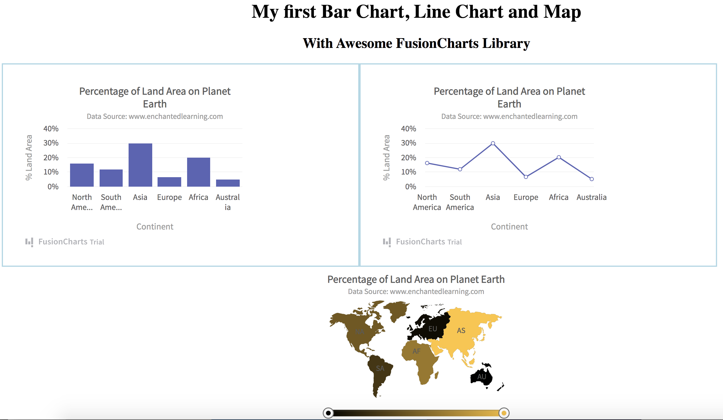
Table of Contents
Step 0: Create an HTML File
Want to make your own? First, create a new HTML file and name it ‘my_chart.html’. In the ‘head’ section of the HTML file add the following style and headings. The style section renders components side by side.
<title>FusionCharts</title>
<style>
.chart-container {
    width: 40%;
    float:  left;
    padding: 20px;
    border: 2px solid lightblue;
}
</style>

<center><h1>My first Bar Chart, Line Chart and Map</h1></center>
<center><h2>With Awesome FusionCharts Library</h2></center>
Step 1: Import Libraries
Once you have your HTML file, you need the FusionCharts core library and the Fusion theme. You can directly import them by adding the following code to the header of the HTML file.
<!-- Include fusioncharts core library -->
<script type="text/javascript" src="https://cdn.fusioncharts.com/fusioncharts/latest/fusioncharts.js"></script>
<!-- Include fusion theme -->
<script type="text/javascript" src="https://cdn.fusioncharts.com/fusioncharts/latest/themes/fusioncharts.theme.fusion.js"></script>
Step 2: Put Together your Data
For this example, we’ll use a simple dataset of the percentage of land area occupied by various continents [2]. FusionCharts requires this data as a JSON or XML object. We’ll use JSON in this example.
In the HTML header, add the following script as ‘text/javascript’ using the <script> tag. For the data, all you need is the id, label, and value of individual data points, which are continents in this case.
const continentData = [
    {
      id: "NA",
      label: "North America",
      value: "16.3",
      showLabel: "1"

    },
    {
      id: "SA",
      label: "South America",
      value: "12.0",
      showLabel: "1"
    },
    {
      id: "AS",
      label: "Asia",
      value: "30.0",
      showLabel: "1"
    },
    {
      id: "EU",
      label: "Europe",
      value: "6.7",
      showLabel: "1"
    },
    {
      id: "AF",
      label: "Africa",
      value: "20.3",
      showLabel: "1"
    },
    {
      id: "AU",
      label: "Australia",
      value: "5.2",
      showLabel: "1"
    }
  ];
Step 3: Specify The Chart Configuration
To specify the chart configuration, we’ll use a JSON object. For now, we’ll leave the keys ‘type’ and ‘renderAt’ blank. The ‘type’ key specifies the type of chart and ‘renderAt’ specifies the HTML container, where you display the chart.
In the chart configuration, it is important to place a value in the ‘data’ key, which specifies the actual data you will plot. Here is the chart configuration JSON:
var chartConfig = {
    type: "",
    renderAt: "",
    dataFormat: "json",
    dataSource: {
      chart: {
        caption: "Percentage of Land Area on Planet Earth",
        subCaption: "Data Source: www.enchantedlearning.com",
        xAxisName: "Continent",
        yAxisName: "% Land Area",
        numberSuffix: "%",
        theme: "fusion"

      },
      data: continentData
    }
Step 4a: Create Your First Bar Chart
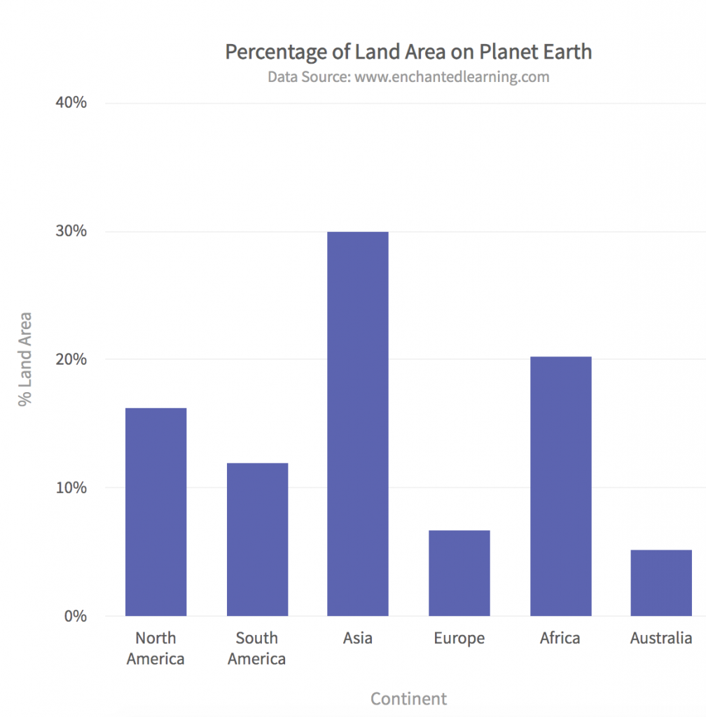
To create a bar chart, we need to specify the type as ‘column2d’ in the chartConfig JSON object. We also need to add a container to display the chart in. Create a div tag for this chart with the id ‘bar-chart-container’ in the body of the HTML file.
Here is the Javascript code for rendering the bar chart:
function renderBar(){
    	chartConfig.type = 'column2d';
        chartConfig.renderAt = 'bar-chart-container';
    	var fusioncharts = new FusionCharts(chartConfig);
    	fusioncharts.render();
    }
FusionCharts.ready(renderBar);
In the body of the HTML file specify the corresponding div tag as:
<div class="chart-container" id="bar-chart-container">FusionCharts XT will load here!</div>Note, we have added the class as ‘chart-container’ for formatting two charts side by side. This is optional.
Step 4b: Create Your First Line Chart
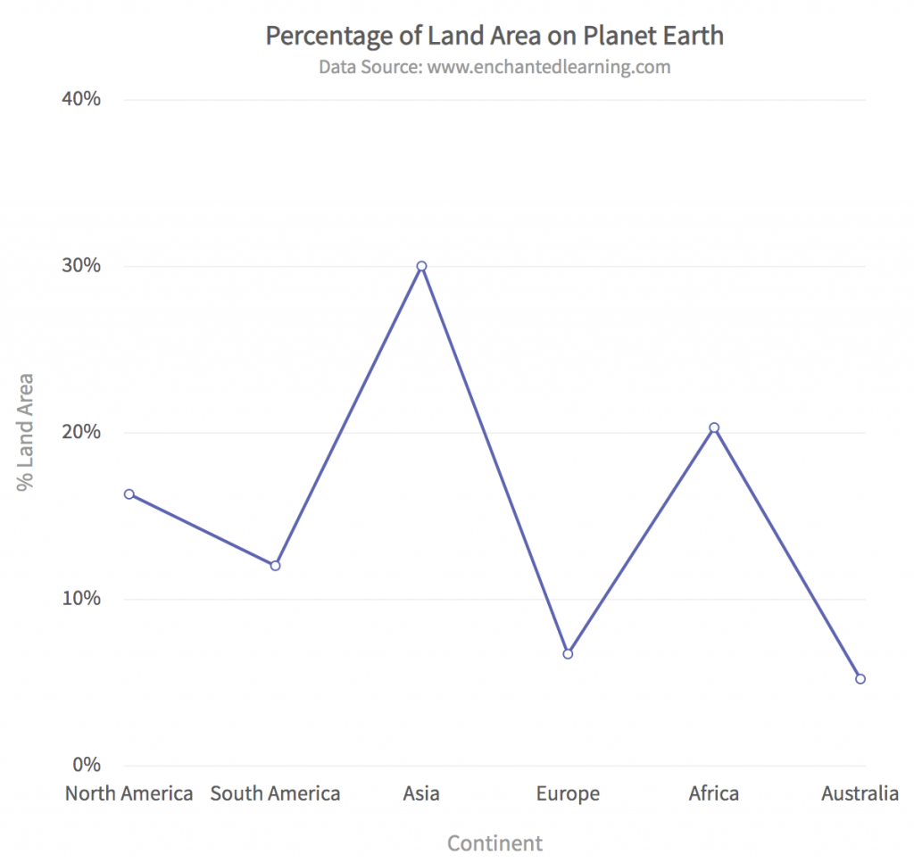
The ‘type’ for a line chart is ‘line’. Add the following Javascript to the HTML file:
function renderLine(){
    	chartConfig.type = 'line';
        chartConfig.renderAt = 'line-chart-container';
    	var fusioncharts = new FusionCharts(chartConfig);
    	fusioncharts.render();
    }
FusionCharts.ready(renderLine)
The corresponding div tag in the HTML file is:
<div class="chart-container" id="line-chart-container">FusionCharts XT will load here!</div>Step 4c: Create Your First Map
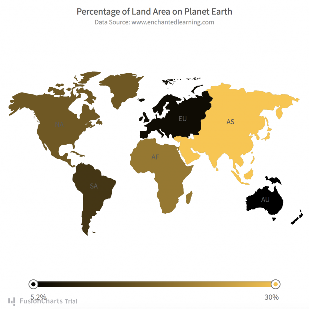
Specify the ‘world’ type for your map. Add the following Javascript code in the HTML file:
function renderMap(){
        chartConfig.type = 'world';
        chartConfig.renderAt = 'map-container';
        var fusioncharts = new FusionCharts(chartConfig);
        fusioncharts.render();
    }
FusionCharts.ready(renderMap);
Also, add the following div tag to the body of the HTML file:
<center> <div id="map-container">FusionCharts XT will load here!</div> </center>You can explore more map options and map types to customize various features.
Consolidated Code
That’s it! We just created a bar chart, line chart, and map using 4 very simple steps. The consistent APIs allow us to create different types of charts and maps without much effort. Here is the entire consolidated code that you can paste into an HTML file and display in your web browser.
<html>
<head>
<title>FusionCharts</title>
<style>
.chart-container {
    width: 40%;
    float:  left;
    padding: 20px;
    border: 2px solid lightblue;
}
</style>

<center><h1>My first Bar Chart, Line Chart and Map</h1></center>
<center><h2>With Awesome FusionCharts Library</h2></center>
<!-- Include fusioncharts core library -->
<script type="text/javascript" src="https://cdn.fusioncharts.com/fusioncharts/latest/fusioncharts.js"></script>
<!-- Include fusion theme -->
<script type="text/javascript" src="https://cdn.fusioncharts.com/fusioncharts/latest/themes/fusioncharts.theme.fusion.js"></script>


<script type="text/javascript">

    // Specify data
    const continentData = [
    {
      id: "NA",
      label: "North America",
      value: "16.3",
      showLabel: "1"

    },
    {
      id: "SA",
      label: "South America",
      value: "12.0",
      showLabel: "1"
    },
    {
      id: "AS",
      label: "Asia",
      value: "30.0",
      showLabel: "1"
    },
    {
      id: "EU",
      label: "Europe",
      value: "6.7",
      showLabel: "1"
    },
    {
      id: "AF",
      label: "Africa",
      value: "20.3",
      showLabel: "1"
    },
    {
      id: "AU",
      label: "Australia",
      value: "5.2",
      showLabel: "1"
    }
  ];

  var chartConfig = {
    type: "",
    renderAt: "",
    dataFormat: "json",
    dataSource: {
      chart: {
        caption: "Percentage of Land Area on Planet Earth",
        subCaption: "Data Source: www.enchantedlearning.com",
        xAxisName: "Continent",
        yAxisName: "% Land Area",
        numberSuffix: "%",
        theme: "fusion"

      },
      // Connect the data
      data: continentData
    }
  };

    function renderBar(){
    	chartConfig.type = 'column2d';
        chartConfig.renderAt = 'bar-chart-container';
    	var fusioncharts = new FusionCharts(chartConfig);
    	fusioncharts.render();
    }

    function renderLine(){
    	chartConfig.type = 'line';
        chartConfig.renderAt = 'line-chart-container';
    	var fusioncharts = new FusionCharts(chartConfig);
    	fusioncharts.render();
    }

    function renderMap(){
        chartConfig.type = 'world';
        chartConfig.renderAt = 'map-container';
        var fusioncharts = new FusionCharts(chartConfig);
        fusioncharts.render();
    }

    FusionCharts.ready(renderBar);
    FusionCharts.ready(renderLine)
    FusionCharts.ready(renderMap);

</script>

</head>
<body>
<!-- Add all the containers -->
<div class="chart-container" id="bar-chart-container">FusionCharts XT will load here!</div>
<div class="chart-container" id="line-chart-container">FusionCharts XT will load here!</div>
<center> <div id="map-container">FusionCharts XT will load here!</div> </center>
</body>
</html>
Where Can I Explore More FusionCharts Features?
FusionCharts is a beautiful charting and graphing library. There are over 100+ charts, graphs, and gauges along with 2000+ choropleth maps that offer stunning and awesome visualizations. The best thing is that FusionCharts APIs are extremely easy to call from your choice of development framework including Javascript, Svelte, jQuery, React, Django, Ruby on Rails, and more.
Explore FusionCharts Suite XT and download your free trial today.
[1] https://www.domo.com/learn/data-never-sleeps-5?aid=ogsm072517_1&sf100871281=1
[2] https://www.enchantedlearning.com/geography/continents/Land.shtml


