In today’s competitive world, it’s essential for businesses to track financial key performance indicators (KPIs) in real-time and make strategic decisions based on hard data. This is where financial dashboards come in handy. In fact, financial dashboards play a crucial role in the success of any business.
If you’re looking for an efficient tool to build financial dashboards for your organization, you need FusionCharts. In this article, we’ll introduce some of the key financial dashboards offered by FusionCharts and show you why FusionCharts is the best option for creating your next dashboards. But first, let’s discuss what exactly a financial dashboard is.
Table of Contents
What is a Financial Dashboard?
A financial dashboard provides a visual representation of financial data in the form of graphs and charts. This means you can use financial dashboards to track and analyze the financial KPIs of an organization in real-time. Because of this, dashboards help CEOs and managers gain valuable insights into their businesses. Financial dashboards also help businesses understand long-term trends. Managers can then make decisions to meet and exceed financial goals.
All in all, financial dashboards provide a comprehensive view of valuable data from an organization’s different departments such as accounting, marketing, sales, and human resources.
However, creating a good financial dashboard involves several factors. Firstly, a financial dashboard should be visually appealing and easy to understand and interpret. Secondly, it should be customizable – you should be able to add titles, labels, axes, and annotations. Lastly, financial dashboards should have real-time data visualizations. FusionCharts is a beautiful data visualization library that offers all these features as well as many other useful features to make your financial dashboard even better.
What are the Key Components of the Financial Dashboard?
A financial dashboard should have visual representations of all the financial KPIs. To make your dashboard even better, you can create a separate chart or graph for each key parameter and place the related metrics in different charts next to each other. However, you should place all the parameters that you want to compare on the same chart. Additionally, it’s best to add important summaries and aggregate values at the top. Not to mention, you should ensure key parameters such as net profit or sales are prominent on the dashboard.
FusionCharts lets you create clean and meaningful financial dashboards quickly and allows you to define more than one data source for your dashboard. Because of this, dashboards built with FusionCharts are easy to understand and well-designed.
Which Financial Dashboards Can I Build With FusionCharts?
FusionCharts offers more than 100 different types of charts and more than 2000 maps that you can choose from for your financial dashboard. In addition, FusionCharts has several different types of pre-built financial dashboards for different use cases. Some of the most commonly used financial dashboards include Wealth Management Dashboard and Investment Portfolio Dashboard.
Wealth Management Dashboard
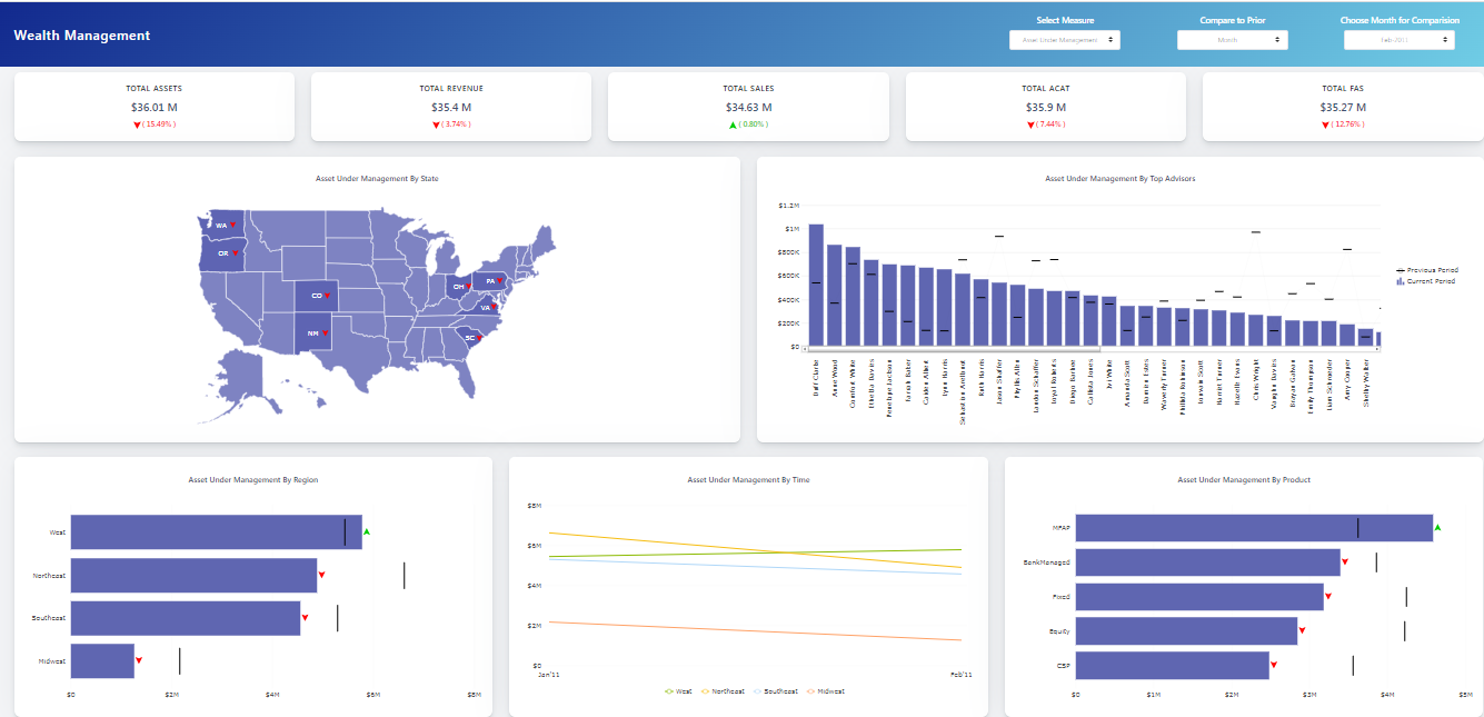
This dashboard helps businesses track the distribution and performance of their financial assets. Businesses can also track key metrics, such as revenue, sales, new net money, and more. This dashboard is an efficient way for businesses to better manage their wealth.
With this dashboard you can:
- Track the distribution of assets by region, state, product, etc.
- Analyze the performance of a particular state, region, financial advisor, etc.
- Compare the performance and growth over a month, a quarter, or a year.
Investment Portfolio Dashboard
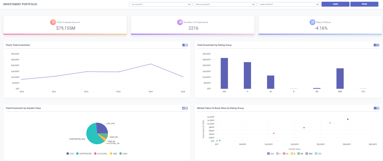
This is another easy-to-use but super-useful financial dashboard by FusionCharts. With this exploratory dashboard, you can instantly analyze your investment distribution and rate of return as well as the portfolio risk associated with your investments and take action accordingly.
With this dashboard you can:
- Explore your investments by different asset classes, countries, and rating groups
- Monitor the rate of return, investment amount, and number of investments
- See trends in your yearly total investment
- Track the distribution of asset class by market value and profit
Can I Customize Financial Dashboards with FusionCharts?
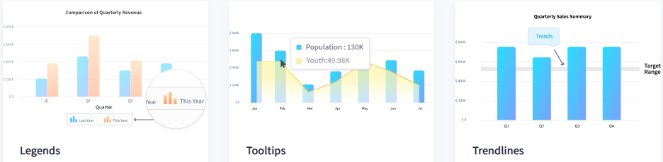
FusionCharts offers several customization options to allow you to create charts that viewers can easily understand and interpret. You can add labels, axis labels, titles, and trend lines to highlight important landmarks within your data. You can also add annotations and legends to the charts on your financial dashboard. Finally, you can allow users to switch between values on the chart or drill down to endless levels to get deeper insights. FusionCharts even allows you to arrange charts on your financial dashboard column-wise or row-wise to create a more organized and clean look.
Can I Create Interactive Charts For My Financial Dashboard?
Interactivity is an essential element for creating easy-to-understand and easy to interpret charts. That’s why FusionCharts supports different types of user interactions. For example, you can zoom in and out, show and hide data series in column charts, see more data points with scroll charts, create drag-able charts. In addition, FusionCharts also offers an interactive legend, which allows you to show/hide, slice in/slice out, or fade in/fade out the data plots. You can use interactive legend when you want to focus on one part of the data.
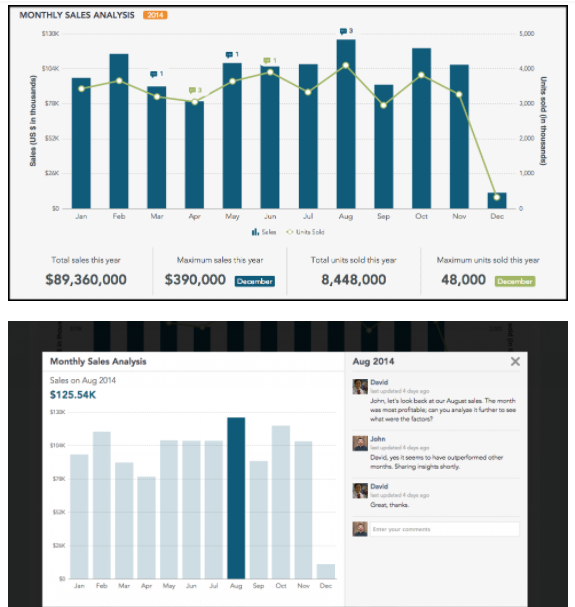
Can Different Users Collaborate on a Financial Dashboard?
Allowing users to collaborate and share their input on a financial dashboard is an essential feature. That’s why FusionCharts offers a collaboration dashboard, which allows multiple viewers/users to add comments on the charts or graphs. This way, they don’t have to leave the dashboard to share their ideas and opinions or ask any questions.