Behind the scenes of dashboard design is a series of interviews with Product Managers, Developers and Designers of software products with kick-ass information dashboards to help you get an insider’s view into their making. This is the second part of the series.
So much to do and so little time, this is a feeling which plagues all of us at some time or the other. This feeling worsens as tasks get added to our to-do list.
 In 2002, David Allen introduced a groundbreaking work-life management concept called Getting Things Done or GTD in his book of the same title. The core idea behind GTD is that if we externally record our planned tasks and projects and then break them down into actionable items, it would help us focus our attention on taking actions on those tasks instead of just mulling over them.
FacileThings uses this GTD principle and marries it with technology to give us a self-management app that aims to give time back to us. The entire process of FacileThings is made up of five stages in true GTD style: We (1) collect things that command our attention, (2) process what to do about them, and (3) organize the results, which we (4) review to decide what’s the next thing to (5) do.
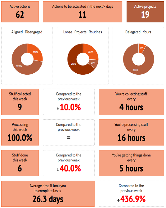 I recently spoke to Francisco Sáez, CEO of FacileThings, on how he went around building the FacileThings dashboard, what were his design considerations and where does he see the data visualization industry in 2014. Here are the excerpts from the interview:


 In 2002, David Allen introduced a groundbreaking work-life management concept called Getting Things Done or GTD in his book of the same title. The core idea behind GTD is that if we externally record our planned tasks and projects and then break them down into actionable items, it would help us focus our attention on taking actions on those tasks instead of just mulling over them.
FacileThings uses this GTD principle and marries it with technology to give us a self-management app that aims to give time back to us. The entire process of FacileThings is made up of five stages in true GTD style: We (1) collect things that command our attention, (2) process what to do about them, and (3) organize the results, which we (4) review to decide what’s the next thing to (5) do.
 I recently spoke to Francisco Sáez, CEO of FacileThings, on how he went around building the FacileThings dashboard, what were his design considerations and where does he see the data visualization industry in 2014. Here are the excerpts from the interview:

Table of Contents
What is FacileThings?
FacileThings is a personal management system based 100% on the GTD methodology. We not only provide a tool for managing projects and tasks but also try to guide and educate our users to understand a philosophy that can reduce stress in their lives by making them more organized.
The Analytics dashboard is a recent addition to your product. Prior to this, how did your users track their results?
We didn’t have a dashboard before. Users were able to track their projects and tasks, but they had to see every single project or list to do that. And, of course, they could not compare performances or see percentage data, only the amount of pending tasks, done tasks, etc. were displayed.What were the primary reasons behind incorporating a dashboard? How does the dashboard help the user perform his job better using FacileThings?
Well, personal productivity is a matter of habits, and it’s difficult to build new habits. Many people are very eager when they start to use a personal organization tool but after some time they are unable to stick to the necessary habits and they leave. We believe that it is easier to maintain the new habits if you get constant feedback on how you’re doing. And a dashboard can help provide that constant feedback and can be a great source of motivation. Also, if you already have the habits, measurement is the first step that leads to control and eventually to improvement. Having objective data, not just feelings, allows people to see when and where they are wavering, and help them make better decisions.
How did you go about building the dashboard? Did you use any 3rd party component or built it from scratch?
We built it from scratch but used a third party charting component to display the pie, line and bar charts.What were your considerations before zeroing in on the 3rd party component?
It had to be easy to integrate with Ruby on Rails, very light, customizable and HTML5 compatible.What were your primary UI/UX considerations while building the dashboard?
We wanted it to be above all else useful, clear and easily understandable. Simplicity over interactions and display of only essential information so that the user can find the dashboard useful and doesn’t get overwhelmed by a bunch of data.