Interactive dashboards have become essential for SaaS applications, business intelligence (BI) platforms, and enterprise software. Instead of viewing static reports, users expect to explore data through filtering, drill-down analysis, tooltips, and real-time updates.
The data visualization library you choose directly affects your application’s performance, scalability, developer experience, and long-term maintenance. While many libraries can render charts, not all are designed for interactive dashboards or enterprise workloads. Choosing the wrong one can result in costly migrations as requirements evolve.
This guide explains what a data visualization library is, the features to look for when building interactive dashboards, and how today’s leading JavaScript charting libraries compare. You’ll also learn how to choose the best solution for your project.
Table of Contents
TL;DR
- A data visualization library helps developers build interactive charts, graphs, maps, and dashboard components without creating visualizations from scratch.
- The best library depends on your project. Evaluate chart types, interactivity, performance, framework support, accessibility, documentation, licensing, and long-term maintenance.
- Open-source libraries like Chart.js, D3.js, and Apache ECharts offer flexibility, while commercial libraries provide enterprise features, professional support, and predictable release cycles.
- For enterprise dashboards, look for capabilities such as time-series charts, drill-down, exporting, responsive layouts, accessibility, and official React, Vue, and Angular integrations.
- FusionCharts is a strong choice for enterprise applications thanks to its 100+ chart types, specialized visualizations, mature documentation, accessibility features, and commercial support.
What Is a Data Visualization Library?
A data visualization library is a software library that converts data into visual components such as charts, graphs, maps, gauges, and other interactive visualizations. Instead of building these components from scratch, developers use libraries to create responsive, customizable, and interactive dashboards more efficiently.
Chart Library vs. Data Visualization Library
A chart library primarily focuses on common chart types like bar, line, pie, and scatter charts. A data visualization library typically offers a broader range of visualizations, including maps, Gantt charts, heatmaps, time-series charts, and dashboard components. While the terms are often used interchangeably, visualization libraries generally support more complex analytical use cases.
Interactive vs. Static Visualizations
Static charts display information without user interaction. Interactive visualizations allow users to zoom, filter, drill down, hover for details, and explore data dynamically, making them the preferred choice for modern dashboards and analytics applications.
Data Visualization Libraries vs. Dashboard Platforms
A data visualization library provides developers with visualization components that can be embedded into custom applications. A dashboard platform is a complete analytics solution that includes features such as data connections, reporting, and dashboard management in addition to visualization.
Popular data visualization libraries include FusionCharts, Highcharts, Apache ECharts, Chart.js, and D3.js, each offering different strengths depending on your project requirements.
Why Interactive Dashboards Need More Than Basic Charts
Modern dashboards do more than display charts. They help users explore and analyze data. Choosing a library with strong interactive capabilities improves usability and reduces development effort.
Key features to look for include:
- Drill-down: Navigate from summary metrics to detailed data.
- Zoom and pan: Explore large datasets without losing context.
- Rich tooltips: Display additional information on demand.
- Cross-filtering: Update multiple charts based on user selections.
- Responsive layouts: Deliver a consistent experience across desktop and mobile devices.
- Real-time updates: Visualize live data efficiently.
- Exporting: Download charts as images, PDFs, or other formats for reporting.
- Accessibility: Support keyboard navigation, screen readers, and accessible color palettes.
- Performance: Render large datasets smoothly while maintaining responsive interactions.
These capabilities are what separate a basic charting solution from a data visualization library built for interactive dashboards. A library that combines rich interactivity, strong performance, and broad framework support is better equipped to handle the needs of modern web applications.
What Makes the Best Data Visualization Library?
The best data visualization library depends on your application’s requirements, but several factors consistently distinguish mature libraries from basic charting tools. When evaluating your options, consider the following criteria.
Rich Collection of Chart Types
Different use cases require different visualizations. While most libraries support common charts like bar, line, and pie charts, more advanced dashboards may also need time-series charts, heatmaps, treemaps, funnel charts, Gantt charts, gauges, or geographic maps.
Choosing a library with a broad selection of chart types reduces the need to introduce multiple visualization libraries as your application grows.
Interactive Capabilities
Interactive dashboards should help users explore data rather than simply view it. Look for features such as drill-down, zooming, panning, tooltips, cross-filtering, annotations, and real-time updates. These capabilities improve usability and make it easier for users to identify trends and investigate anomalies.
Performance with Large Datasets
As dashboards become more data-intensive, rendering performance becomes increasingly important. A well-designed library should handle large datasets efficiently while maintaining smooth interactions, responsive updates, and reasonable memory usage across modern browsers.
Framework Integrations
Most modern web applications are built with frontend frameworks, so native integrations can significantly simplify development.
Look for support for popular technologies such as:
- React
- Vue
- Angular
- TypeScript
- Next.js
- Nuxt
Official wrappers, framework-specific documentation, and active maintenance help reduce integration effort and keep projects aligned with the latest framework releases.
Customization and Theming
Every application has its own design system. A good data visualization library should provide flexible customization options, including colors, typography, animations, layouts, labels, and themes, allowing charts to match your application’s branding and user experience.
Accessibility
Accessible charts make dashboards usable for a wider audience. Features such as keyboard navigation, screen reader support, descriptive labels, and sufficient color contrast help organizations build inclusive applications and meet accessibility standards.
Exporting and Printing
Many business users need to share dashboard insights outside the application. Built-in exporting options for formats such as PNG, JPEG, SVG, and PDF make it easier to generate reports, presentations, and printable documents without additional tools.
Documentation and Developer Experience
Comprehensive documentation, practical examples, API references, and active community support can significantly reduce development time. A library with clear guides, framework-specific tutorials, and well-maintained documentation is generally easier to learn and maintain.
Licensing and Long-Term Costs
Open-source libraries can reduce upfront costs, while commercial libraries often provide professional support, regular updates, and enterprise-focused features. Rather than comparing license prices alone, consider the total cost of ownership, including development time, maintenance, support, and future scalability. A library that meets your long-term requirements can be more cost-effective than switching platforms later.
Best Data Visualization Libraries for Interactive Dashboards
There is no single best data visualization library for every project. The right choice depends on your application’s complexity, required chart types, framework, licensing preferences, and long-term maintenance needs. The comparison below highlights some of the most popular JavaScript data visualization libraries for building interactive dashboards.
| Library | Best For | Open Source / Commercial | Framework Support | Interactive Features | Enterprise Features | Learning Curve |
|---|---|---|---|---|---|---|
| FusionCharts | Enterprise dashboards and business applications | Commercial | React, Angular, Vue, TypeScript, Next.js, Nuxt | Excellent | Excellent | Easy–Medium |
| Highcharts | Business dashboards and reporting | Commercial (free for non-commercial use) | React, Angular, Vue | Excellent | Excellent | Medium |
| Apache ECharts | Interactive dashboards and large datasets | Open Source | React, Angular, Vue | Excellent | Good | Medium |
| Chart.js | Lightweight charts and simple dashboards | Open Source | React, Vue, Angular (community wrappers) | Good | Basic | Easy |
| D3.js | Fully custom visualizations | Open Source | JavaScript (framework agnostic) | Excellent | Depends on implementation | Advanced |
| Plotly.js | Scientific and analytical visualizations | Open Source + Commercial | React, Angular, Vue | Excellent | Good | Medium |
| AnyChart | Business reporting and dashboards | Commercial | React, Angular, Vue | Excellent | Excellent | Medium |
| amCharts | Interactive web applications | Commercial (free with attribution) | React, Angular, Vue | Excellent | Good | Medium |
FusionCharts
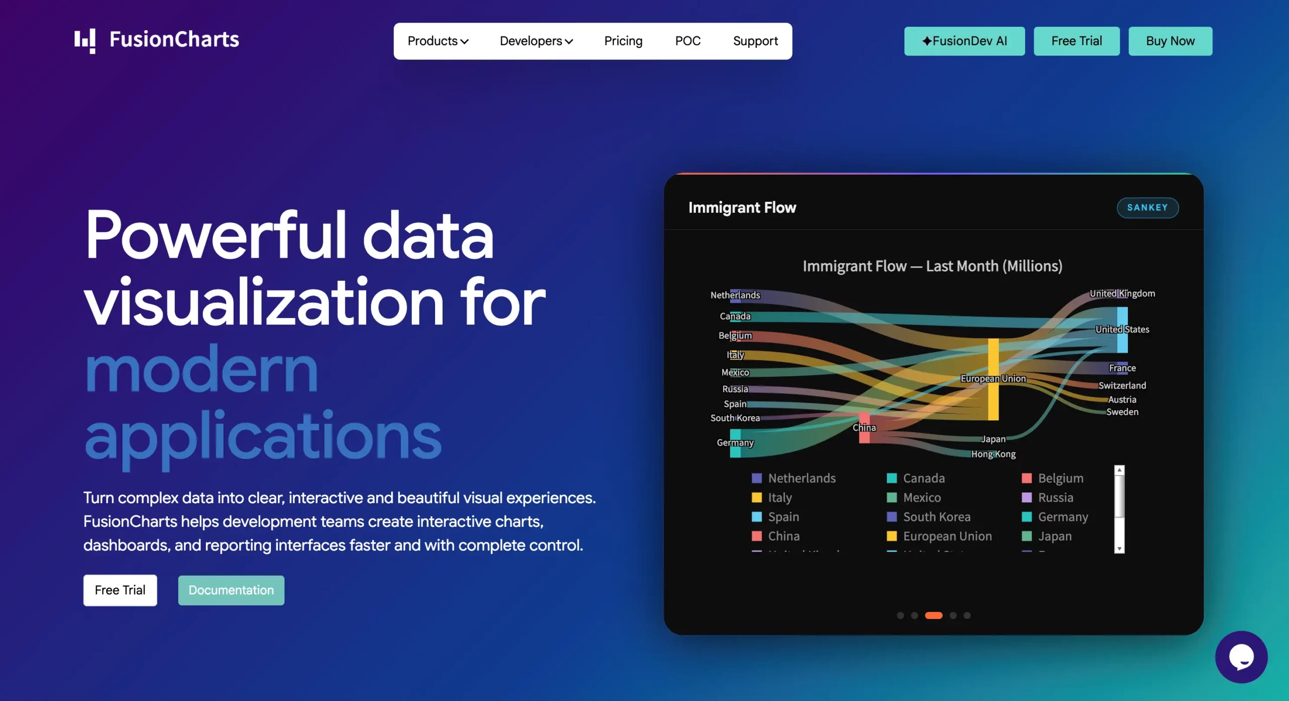
FusionCharts is designed for building enterprise-grade dashboards and reporting applications. It includes 100+ chart types along with specialized visualizations such as time-series charts, Gantt charts, geographic maps, gauges, and KPI widgets. Built-in exporting, accessibility support, responsive rendering, mature documentation, and commercial support make it a strong choice for business intelligence platforms and large-scale SaaS applications.
Highcharts
Highcharts is a mature commercial library known for its polished visualizations and extensive customization options. It offers a wide variety of chart types, responsive rendering, exporting capabilities, and official integrations with popular JavaScript frameworks, making it well suited for business applications.
Apache ECharts
Apache ECharts is a powerful open-source library that excels at creating highly interactive dashboards. It performs well with large datasets and includes advanced features such as data zooming, animations, and geographic visualizations. Its open-source license makes it an attractive option for many enterprise projects.
Chart.js
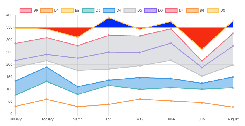
Chart.js is a lightweight library that focuses on simplicity and ease of use. It supports the most common chart types with a clean API, making it a good choice for small to medium-sized applications. However, organizations requiring advanced dashboard components or specialized visualizations may eventually need additional libraries.
D3.js
D3.js provides one of the highest levels of customization available. Rather than supplying predefined charts, it gives developers low-level control over SVG, Canvas, and data transformations, making it ideal for unique or highly customized visualizations. The trade-off is a steeper learning curve and longer development time.
Plotly.js
Plotly.js is popular for scientific computing, engineering, and analytical applications. It offers interactive charts, 3D visualizations, statistical plots, and strong integration with Python ecosystems, making it a good option for teams working across both web development and data science.
AnyChart
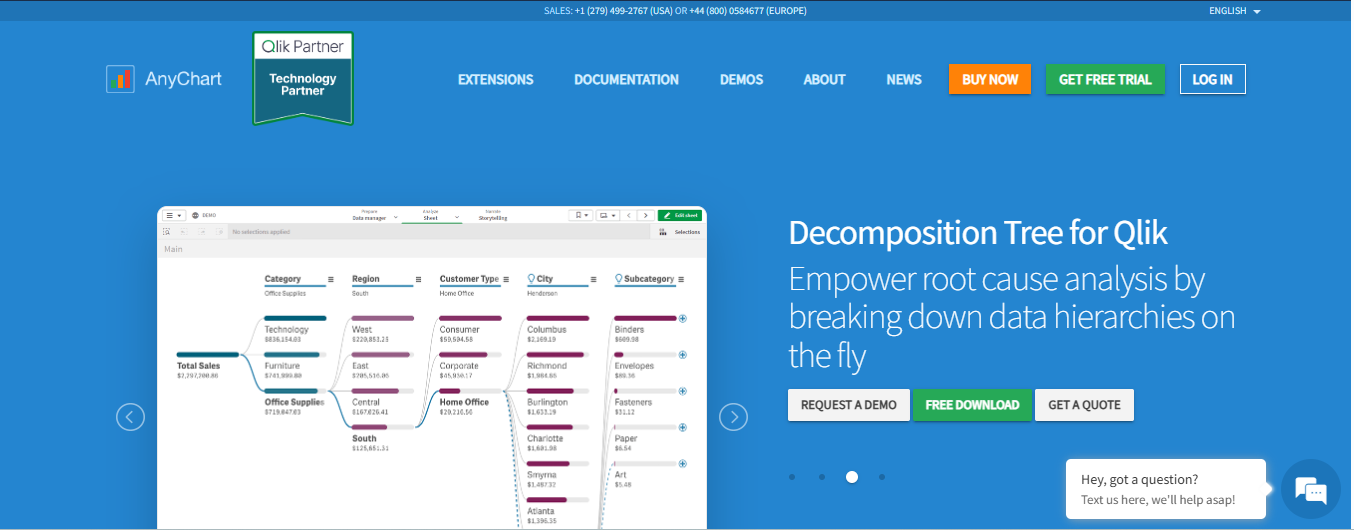
AnyChart is a commercial JavaScript charting library focused on business reporting and dashboards. It includes a comprehensive collection of chart types, mapping capabilities, stock charts, and Gantt charts, along with framework integrations and enterprise-oriented features.
amCharts
amCharts provides modern interactive charts with extensive customization and animation capabilities. It supports a wide range of chart types and integrates well with major JavaScript frameworks. Its commercial licensing and rich feature set make it suitable for professional dashboard applications.
Summary: If you need maximum customization, D3.js is difficult to beat. For lightweight projects, Chart.js offers a simple developer experience. Apache ECharts provides a capable open-source solution for interactive dashboards, while commercial libraries such as FusionCharts, Highcharts, AnyChart, and amCharts offer broader enterprise features, professional support, and mature ecosystems for production applications.
Where to Download Popular Data Visualization Libraries
Most JavaScript data visualization libraries are available through multiple distribution channels. The most common options include:
- npm – The preferred package manager for modern JavaScript projects. Most libraries can be installed using npm, Yarn, or pnpm and integrated into React, Vue, Angular, and other frameworks.
- GitHub – Many libraries maintain public repositories where developers can browse the source code, report issues, and review release notes.
- Official websites – Commercial and open-source libraries typically provide documentation, installation guides, API references, examples, and licensing information through their official websites.
Whenever possible, rely on the official documentation instead of third-party tutorials. Official guides are more likely to reflect the latest APIs, supported framework versions, installation steps, and best practices, helping you avoid outdated examples or deprecated features.
Commercial vs. Open-Source Data Visualization Libraries
Both open-source and commercial data visualization libraries can power modern dashboards. The right choice depends on your project’s budget, support requirements, and long-term maintenance strategy.
| Feature | Open Source Libraries | Commercial Libraries |
|---|---|---|
| Upfront cost | Usually free | Paid license |
| Source code | Usually available | Usually proprietary |
| Support | Community-driven | Vendor support and SLAs |
| Documentation | Varies by project | Typically comprehensive |
| Updates | Community-maintained | Regular vendor releases |
| Enterprise features | May require additional work | Often included |
| Long-term stability | Depends on community activity | Backed by commercial investment |
Open-Source Libraries
Open-source libraries such as Apache ECharts, Chart.js, and D3.js are attractive because they have no licensing fee and offer significant flexibility. They are an excellent choice for many personal, startup, and commercial projects.
However, organizations should also consider factors such as community support, release cadence, documentation quality, and long-term maintenance. Some open-source licenses also include requirements or restrictions that should be reviewed before commercial deployment.
Commercial Libraries
Commercial libraries typically provide professional support, service-level agreements (SLAs), comprehensive documentation, and predictable release cycles. These benefits can reduce development risk for organizations building customer-facing products or business-critical dashboards.
Libraries such as FusionCharts, Highcharts, AnyChart, and amCharts also include enterprise-focused features and dedicated vendor support, making them suitable for teams that value long-term stability and faster issue resolution.
Affordable Data Visualization Libraries for Startups
Startups often focus on minimizing upfront costs, making open-source libraries an appealing option. However, the lowest licensing cost does not always result in the lowest overall project cost.
When evaluating a data visualization library, consider the total cost of ownership, including:
- Development and implementation time
- Time-to-market
- Ongoing maintenance
- Documentation and support availability
- Future scalability as your application grows
For simple dashboards with standard charts, an open-source library may provide everything you need. As products evolve, however, requirements often expand to include advanced visualizations, accessibility, exporting, responsive dashboards, and enterprise support.
Choosing a library that can scale with your product may reduce future migration costs and shorten development cycles. Whether you select an open-source or commercial solution, the best investment is the one that meets your current requirements while supporting your application’s long-term growth.
Why Customer Support Matters for Enterprise Dashboard Projects
Features are important, but so is the ecosystem behind a data visualization library. For enterprise applications that may be maintained for years, reliable support can reduce downtime, accelerate development, and lower long-term costs.
When evaluating a library, consider the following:
- Documentation: Clear installation guides, API references, and framework-specific examples help developers get started and solve problems more quickly.
- Ticket support: Dedicated technical support can be invaluable when troubleshooting production issues or implementing advanced features.
- Bug fixes: Regular maintenance and timely bug fixes help ensure compatibility with modern browsers and JavaScript frameworks.
- Release cadence: An actively maintained library is more likely to support new framework versions, security updates, and evolving web standards.
- Long-term maintenance: Stable releases and a predictable roadmap reduce the risk of relying on outdated or abandoned software.
- Enterprise onboarding: Commercial vendors may also provide onboarding assistance, implementation guidance, and training for development teams.
For organizations building business-critical dashboards, support and maintenance can be just as important as the library’s feature set.
Which Data Visualization Library Should You Choose?
The best data visualization library depends on your project’s goals, technical requirements, and available resources.
| If you need... | Consider... |
|---|---|
| Maximum customization and complete control | D3.js |
| Lightweight charts with a simple API | Chart.js |
| Enterprise dashboards with rich built-in features | FusionCharts |
| A powerful open-source solution for interactive dashboards | Apache ECharts |
| Scientific and analytical visualizations | Plotly.js |
| Business reporting with extensive customization | Highcharts |
| Advanced commercial dashboard components | AnyChart or amCharts |
If you’re building an enterprise dashboard or SaaS application, prioritize factors such as scalability, accessibility, framework support, documentation, and long-term maintenance—not just the number of chart types or the initial learning curve.
Conclusion
There is no universal “best” data visualization library. The right choice depends on your project’s complexity, dashboard requirements, preferred frameworks, licensing needs, and long-term support expectations.
Open-source libraries such as Chart.js, D3.js, Apache ECharts, and Plotly offer excellent capabilities for many use cases, while commercial libraries provide additional benefits such as professional support, enterprise features, and predictable maintenance.
If you’re building interactive dashboards for business intelligence, reporting, or enterprise SaaS applications, FusionCharts is a strong option thanks to its extensive collection of chart types, specialized visualizations such as time-series charts, Gantt charts, and maps, built-in exporting and accessibility features, mature documentation, and commercial support.
Ultimately, choose the library that best aligns with your application’s current requirements while providing the flexibility to scale as your dashboard evolves.
Ready to get started? Explore the FusionCharts documentation, try the free evaluation version, and start building interactive data visualizations for your next application.
Frequently Asked Questions
What is the best data visualization library for interactive dashboards?
There is no single best data visualization library for every project. The right choice depends on your requirements. For enterprise dashboards, libraries such as FusionCharts, Highcharts, and Apache ECharts provide rich interactive features and scalability. For highly customized visualizations, D3.js is a popular choice, while Chart.js is well suited for simpler applications.
Which JavaScript data visualization library is easiest to use?
Chart.js is widely regarded as one of the easiest JavaScript data visualization libraries because of its simple API and straightforward setup. FusionCharts and Highcharts also offer a gentle learning curve thanks to comprehensive documentation, extensive examples, and framework-specific integrations.
Is D3.js better than FusionCharts?
Neither library is universally better—they serve different purposes. D3.js offers maximum flexibility and is ideal for creating highly customized visualizations from scratch. FusionCharts provides a large collection of production-ready charts, dashboards, maps, and enterprise features, allowing developers to build interactive business applications more quickly.
What is the best React data visualization library?
Popular React data visualization libraries include FusionCharts, Apache ECharts, Highcharts, Chart.js, and Plotly, all of which provide React integrations. The best option depends on your application’s complexity, performance requirements, and the types of visualizations you need.
Can I use a Python data visualization library in web dashboards?
Yes, but Python libraries such as Matplotlib, Seaborn, and Bokeh are primarily designed for data analysis and scientific computing. For interactive web dashboards built with React, Angular, or Vue, JavaScript data visualization libraries generally provide a better user experience and easier frontend integration.
Which data visualization library supports Vue and Angular?
Most leading JavaScript data visualization libraries support Vue and Angular through official or community-maintained integrations. FusionCharts, Highcharts, Apache ECharts, Plotly, AnyChart, and amCharts all provide framework support for building modern dashboard applications.
Are commercial chart libraries worth paying for?
They can be, especially for enterprise applications. Commercial libraries often include professional support, comprehensive documentation, regular updates, accessibility features, and enterprise-focused capabilities that can reduce development time and long-term maintenance costs.
Which library handles real-time dashboards best?
Several libraries support real-time dashboards, including FusionCharts, Apache ECharts, Highcharts, and Plotly. The best choice depends on factors such as dataset size, update frequency, required interactivity, and your application’s overall architecture.