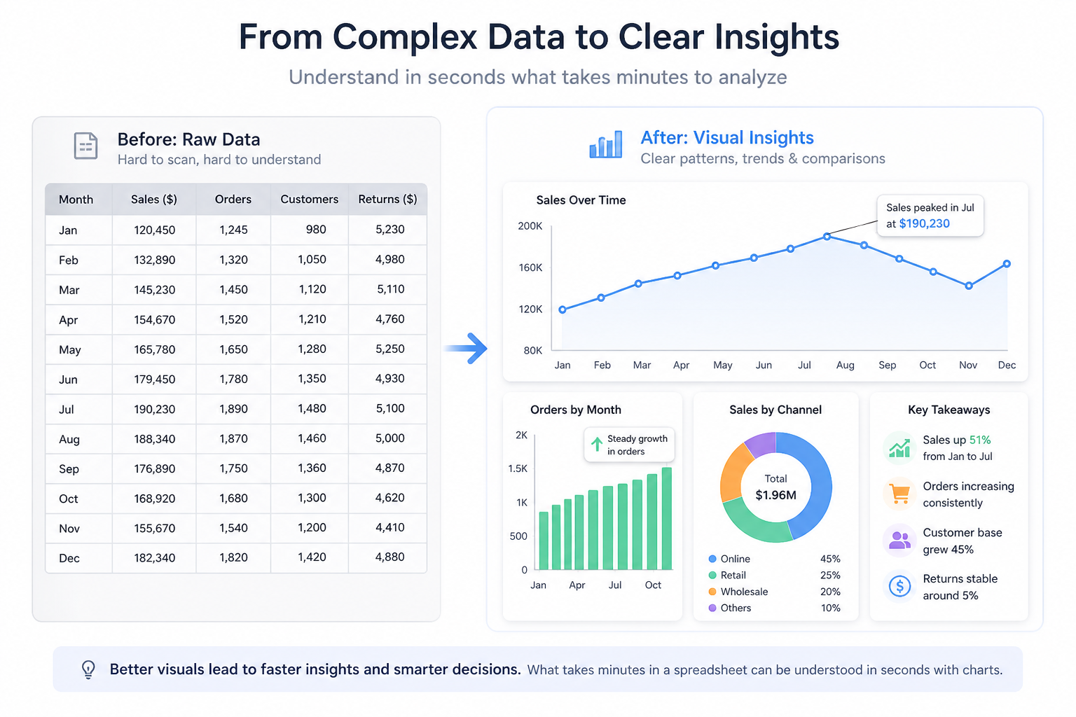
Data is everywhere today; inside dashboards, reports, apps, and analytics tools. But raw data on its own isn’t easy to understand. Numbers in tables can quickly become overwhelming. It’s hard to spot trends, compare values, or make decisions based solely on the numbers.
That’s where data visualization comes in. By turning data into charts and graphs, you can make complex information simple, clear, and actionable. This is exactly what a JavaScript charting library helps you do in modern web applications.
In this guide, you’ll learn what a JavaScript charting library is, how it works, and why it’s essential for building interactive dashboards, analytics platforms, and data-driven web apps. It’s designed for developers, product managers, and anyone creating modern web applications.
Table of Contents
Key Takeaways
- A JavaScript charting library helps transform raw data into clear, interactive visualizations for web applications.
- It simplifies complex data, improves user experience, and enables faster, data-driven decision-making.
- These libraries work by combining data input, configuration, rendering, and built-in interactivity.
- Choosing the right chart type and features is essential for creating meaningful and effective visualizations.
- Solutions like FusionCharts make it easier to build scalable, high-performance charts for modern dashboards and apps.
What is a JavaScript Charting Library?
A JavaScript charting library is a tool that helps you turn raw data into visual charts directly in a web browser. Instead of manually drawing charts, you can use these libraries to quickly create clear, interactive data visualizations for your web apps.
At a high level, JavaScript charting libraries fall into two categories:
- High-level libraries (e.g., FusionCharts, Chart.js) provide ready-to-use chart components with simple configuration, making them ideal for fast development.
- Low-level libraries (e.g., D3.js) offer more control over visuals and behavior but require more code and effort to build charts from scratch.
This pre-built collection of codes handles everything needed to display charts, data processing, styling, animations, and user interactions. You simply provide your data (usually in formats like arrays or JSON), configure how you want it to look, and the library renders the chart for you.
These JavaScript data visualization libraries convert numerical or structured data into visual formats that are much easier to understand at a glance. This makes them essential for dashboards, analytics tools, reporting systems, and any data-driven web app.
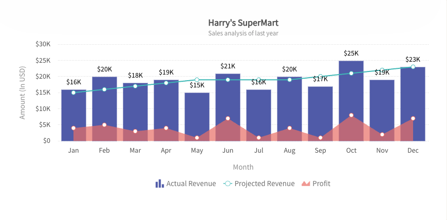
Some of the most common chart types you can create include:
- Bar charts → compare values across categories
- Line charts → show trends over time
- Pie charts → represent proportions or percentages
- Area charts → display cumulative data trends
- Scatter plots → reveal relationships between variables
By using a JavaScript charting library, developers can focus more on building features and less on handling the complexity of data visualization from scratch.
Why Use a JavaScript Charting Library?
You can use these JavaScript data visualization libraries to transform complex raw data into simple and interactive stories quickly. You don’t have to build every graphical element from scratch.
These JavaScript libraries handle the difficult part of it such as axis scale calculation, responsive layout creation, etc.
Let’s explore more why developers and businesses rely on these charting libraries for their dashboards:
Simplifies Complex Data
Instead of scanning rows of numbers, users can instantly see patterns, trends, and comparisons through charts. What might take minutes to analyze in a spreadsheet can be understood in seconds with a well-designed visualization.
Improves User Experience
Modern users expect clean, interactive interfaces. Charts make applications feel more intuitive and engaging, especially in dashboards or analytics tools where data is the main focus.
Saves Development Time
Building charts from scratch is time-consuming and complex. A charting library gives you ready-to-use components. So, you can focus on your application logic instead of worrying about rendering visuals, animations, or responsiveness.
Enables Interactivity
These JS charting libraries come with built-in out-of-the-box interaction features. Features such as hover tooltips, zooming, filtering, a dynamic legend, and drill-down views allow users to explore data on their own. This transforms charts from static visuals into dynamic experiences.
Drives Better Decision-Making
At a business level, clear data visualization leads to better decisions. Whether it’s tracking sales performance, monitoring user behavior, or analyzing financial trends, charts help teams quickly identify insights and take action with confidence.
In short, a JavaScript charting library doesn’t just make data look better. It makes it more useful, more accessible, and far more impactful.
How Do JavaScript Charting Libraries Work?
At a high level, a JavaScript charting library takes your data and turns it into a visual chart. You don’t have to handle all the complex drawing logic yourself. The process is surprisingly simple when you break it down into four main steps:
1. Input your data
Everything starts with your data. This can come from different sources, such as APIs, databases, or static files. Most libraries accept data in common formats like arrays or JSON, making it easy to plug in real-time or stored data.
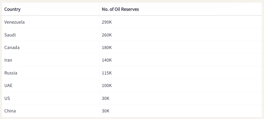
Converted data from tabular form to JSON:
// Preparing the chart data
const chartData = [
  {
    label: "Venezuela",
    value: "290"
  },
  {
    label: "Saudi",
    value: "260"
  },
  {
    label: "Canada",
    value: "180"
  },
  {
    label: "Iran",
    value: "140"
  },
  {
    label: "Russia",
    value: "115"
  },
  {
    label: "UAE",
    value: "100"
  },
  {
    label: "US",
    value: "30"
  },
  {
    label: "China",
    value: "30"
  }
];
2. Configure the chart
Next, you define how the chart should look and behave. This includes:
- Choosing the chart type (bar, line, pie, etc.)
- Setting labels and axes
- Customizing colors, fonts, and styles
- Enabling features like tooltips or animations
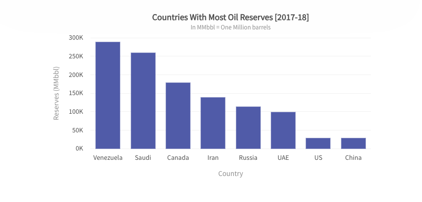
You can create a JSON object to store the chart configurations as follows:
// Create a JSON object to store the chart configurations
const chartConfigs = {
  //Specify the chart type
  type: "column2d",
  //Set the container object
  renderAt: "chart-container",
  //Specify the width of the chart
  width: "100%",
  //Specify the height of the chart
  height: "400",
  //Set the type of data
  dataFormat: "json",
  dataSource: {
    chart: {
      //Set the chart caption
      caption: "Countries With Most Oil Reserves [2017-18]",
      //Set the chart subcaption
      subCaption: "In MMbbl = One Million barrels",
      //Set the x-axis name
      xAxisName: "Country",
      //Set the y-axis name
      yAxisName: "Reserves (MMbbl)",
      numberSuffix: "K",
      //Set the theme for your chart
      theme: "fusion"
    },
    // Chart Data from Step 2
    data: chartData
  }
};
This step is where you shape the user experience without needing to build visuals from scratch.
3. Render the chart
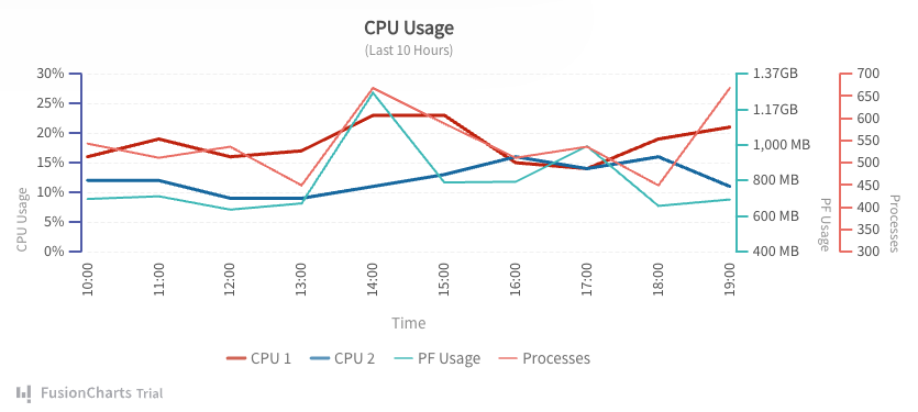
Finally, the library takes your data and configuration and renders the chart in the browser. Most JavaScript charting libraries use technologies like SVG (Scalable Vector Graphics), HTML5 Canvas, or WebGL to draw charts smoothly and efficiently.
- SVG (Scalable Vector Graphics) → Best for sharp, interactive charts with rich user interactions
- Canvas → Better suited for handling large datasets and performance-heavy visualizations
- WebGL → Used for highly complex or real-time graphics requiring GPU acceleration
Once rendered, the chart becomes a dynamic part of your web app. Now it’s ready to respond to user interactions like hovering, clicking, or zooming.
4. Interaction and Responsiveness
In addition to drawing, charting libraries add a layer to create interactive charts in JavaScript. It consists of the following components:
- Event Listeners: Detect mouse or touch interactions to show tooltips or highlight data points.
- Animations: Apply smooth transitions when data changes, such as bars growing or lines shifting to reflect updates.
- Responsive Design: Modern libraries automatically adjust and redraw charts to fit different screen sizes, ensuring a consistent experience across devices.
In short, a JavaScript charting library handles the heavy lifting behind the scenes, so you can focus on presenting data in a clear and meaningful way.
Explore more about creating a chart using FusionCharts JS Charting Library and how it works.
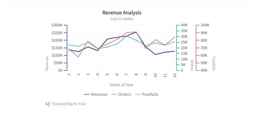
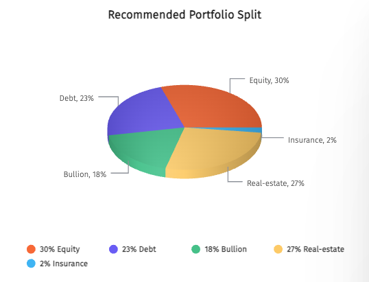
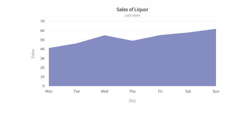
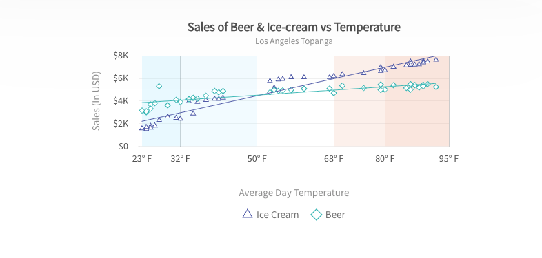
What Are the Common Types of Charts You Can Build with a JS Chart Library?
One of the biggest advantages of using a JavaScript charting library is the wide variety of chart types you can create. Each chart serves a different purpose, depending on the kind of data you want to present.
Here are some of the most commonly used chart types:
Bar Charts
Bar charts are ideal for comparing values across different categories. They make it easy to see which items are higher or lower at a glance.
Line Charts
Line charts are commonly used to visualize trends and changes over time, making it easy to identify patterns, growth, or fluctuations in data.
Pie Charts
Pie charts are used to display proportions or percentages. They show how individual parts contribute to a whole.
Area Charts
Area charts are similar to line charts but with filled areas, making them useful for visualizing cumulative data or overall volume.
Scatter Plots
Scatter Plots are great for identifying relationships between two variables. They help reveal patterns, correlations, or outliers in data.
Choosing the right chart type is key to making your data easy to understand and meaningful for your audience.
Explore more JavaScript charts and see how they bring your data to life.
What Features Should You Look for in a JavaScript Charting Library?
Not all the JS charting libraries are built the same. Some are great for simple visuals, while others are designed for complex, data-heavy applications. To choose the right one, it’s important to look beyond just the chart types. You should focus more on the features that actually impact development and user experience.
Here are the key features to look for in a JavaScript charting library:
Ease of Use (API Simplicity)
A good library should be easy to get started with. Clear APIs, simple configuration, and minimal setup can save you a lot of time, especially if you’re building under tight deadlines.
Customization Options
Every application has its own design and requirements. Look for a library that lets you customize colors, labels, layouts, and behaviors so your charts match your product’s look and feel.
Responsiveness
Your charts should work seamlessly across different devices and screen sizes. A responsive library ensures your visualizations look clean and readable on desktops, tablets, and mobile devices.
Performance (Large Datasets)
If you’re dealing with large or real-time data, performance becomes critical. The library should handle heavy datasets smoothly without slowing down your application.
Interactivity and User Experience
Features like tooltips, zooming, filtering, and drill-down capabilities allow users to explore data more deeply. This turns static charts into engaging, interactive experiences.
Integration and Development
Make sure the library supports your framework (such as React, Vue, or Angular) through official wrappers.
Consider the learning curve. Simpler tools like FusionCharts and Chart.js are easier to adopt while some options like D3.js require more time.
Keep bundle size in mind, especially for lightweight apps where smaller, modular libraries can help maintain performance.
Cross-Browser Compatibility
Your charts should work consistently across all major browsers. A reliable library ensures your visualizations look and behave the same, whether users are on Chrome, Safari, or Edge.
Documentation and Support
Strong documentation makes a huge difference. Look for libraries with clear guides, examples, and active support. So, you can quickly solve issues and implement features.
Accessibility and Compliance
The best JS chart libraries have accessibility features like ARIA support and keyboard navigation for disabled users.
Also, verify whether it’s open source or requires a commercial license.
It’s essential for charts to support exporting to common formats like PNG, PDF, JPG, or SVG.
Choosing a library with these features will help you build charts that are not only visually appealing but also reliable, scalable, and user-friendly.
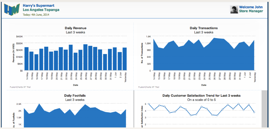
What Are the Popular Use Cases of JS Charting Libraries?
JavaScript charting libraries are widely used in different applications to visualize data quickly and clearly. These JS Charts play a key role when you are building a simple dashboard or a complex analytics platform. They make data more accessible and actionable.
Here are some of the most common use cases:
Dashboards (SaaS, Analytics Tools)
Charts are the backbone of modern dashboards. They help users monitor performance, track KPIs, and understand trends at a glance, making them essential for SaaS platforms and analytics tools.
Business Intelligence Tools
In BI applications, charts turn large volumes of data into meaningful insights. They help teams analyze performance, identify patterns, and make data-driven decisions more efficiently.
Financial Apps
From stock tracking to expense analysis, financial applications rely heavily on charts to display real-time data, historical trends, and comparisons in a clear and intuitive way.
Admin Panels
Admin dashboards often use charts to show system metrics, user activity, and operational data. This helps teams quickly understand what’s happening and take action when needed.
Reporting Tools
Charts make reports more engaging and easier to understand. Instead of reading through long tables, users can quickly grasp key insights through visual summaries.
Across all these use cases, the goal is the same: to transform raw data into insights that users can understand and act on quickly.
Why FusionCharts for JavaScript Charting?
When selecting a JavaScript charting library, you need a solution that balances ease of use with powerful capabilities. FusionCharts is designed to meet those needs across a wide range of applications.
It offers enterprise-ready performance, a rich variety of chart types, and built-in interactivity like tooltips and drill-downs. You also get reliable performance with large datasets and clear documentation that makes development smoother.
Overall, it’s a practical choice for teams looking to build scalable, interactive data visualizations without unnecessary complexity.
Conclusion
A JavaScript charting library helps turn raw data into clear, actionable insights. It improves user experience, simplifies analysis, and makes modern web apps more effective.
Choosing the right library can make a big difference in how your data is presented and understood. If you’re building data-driven applications, exploring solutions like FusionCharts is a great place to start.
Ready to turn your data into powerful visual insights?
Start your free FusionCharts trial and build interactive charts in minutes.
FAQs
What is a JavaScript charting library used for?
A JavaScript charting library is used to turn raw data into visual charts like bar, line, and pie charts, making it easier to understand and analyze data in web applications.
How do JavaScript charting libraries work?
They take data (usually in JSON or arrays), apply configuration settings, and render charts in the browser using technologies like SVG or Canvas.
Which JavaScript charting library should I choose?
It depends on your needs, such as data complexity, performance, and required features. Tools like FusionCharts are ideal for scalable, interactive, and enterprise-level applications.
Do JavaScript charting libraries require a license or cost money?
Some JavaScript charting libraries are free and open-source, while others require a commercial license for advanced features and business use. For example, Chart.js is open-source, whereas FusionCharts and Highcharts typically require a paid license for commercial projects.