
The best JavaScript library for data visualization is the library that makes you the most productive. But what is productivity in this context? Productivity in data visualization is the ability to create a robust solution or complete a project in the least amount of time while presenting your data in a way that brings out valuable insights.
It sounds simple, but finding the right library can be tricky. Some libraries have a lot of features but lack the productivity to deliver them quickly. While other libraries lack features but are very productive. What developers need are libraries and a good data visualization tool that have all the features you could ever need while still being productive to work with. One such library in the Javascript charting space is FusionCharts. FusionCharts has a massive amount of features. It is also easy to use.
In this article, we are going to talk about some of the best features of the FusionCharts offerings and how productive they are for data visualization.
Table of Contents
What Kind of JavaScript Data Visualization Charts Are Available?
FusionCharts has three main offerings. They are FusionCharts Suite XT, FusionTime, and FusionExport. The FusionCharts Suite is the main chart package and includes over 100+ charts, graphs, and gauges for creating striking data visualizations. FusionTime is a powerful time-series library for charting massive amounts of data points. FusionTime is ideal for applications such as IoT, stock market data, and cryptocurrency. Finally, FusionExport is a powerful add-on that lets you export single charts and entire dashboards to PDF and other formats. Best of all, FusionExport actually works with all JavaScript charting libraries (FusionCharts, HighCharts, d3, Chart.js, or others).
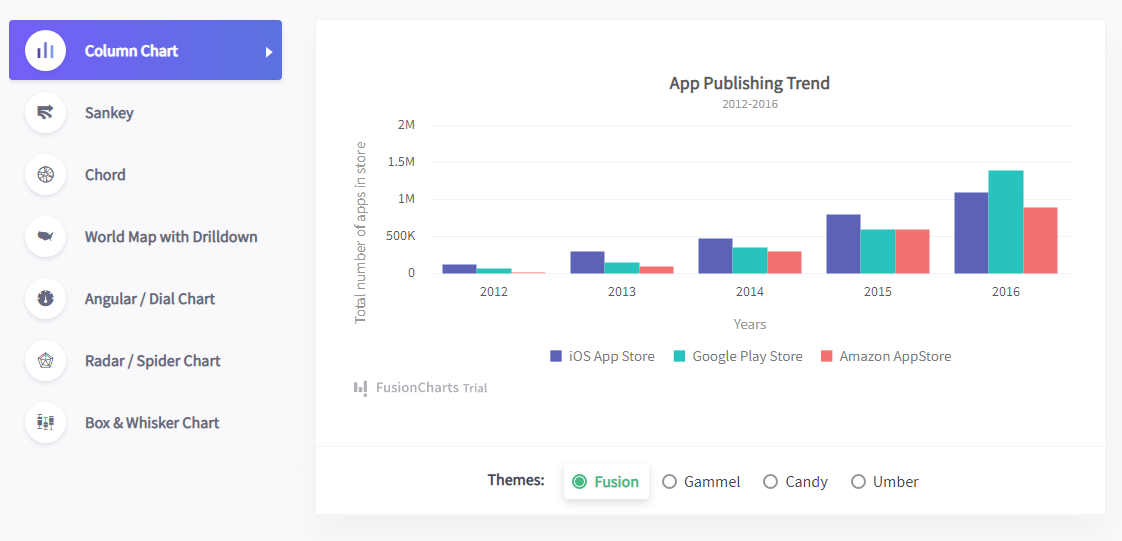
Inside FusionCharts Suite XT, the charting library is segmented into four different sections.
FusionCharts XT
With 50+ chart types, FusionCharts XT consists of the most commonly used charts like column, line, and pie for your reports and dashboards.
- Column & Bar Charts
- Line & Area Charts
- Pie & Donut Charts
- Stacked Charts
- Combination Charts
- Bubble & Scatter (XY) Charts
- Market Share Charts
- Pareto Charts
FusionWidgets XT
From Gauges and KPIs to funnel and pyramid charts, FusionWidgets XT makes your dashboards and monitors a lot more insightful.
- Gauges & KPIs
- Gantt / Project Charts
- Funnel & Pyramid Charts
- Bullet & Spark (Micro) Charts
- Self-updating (Real-time) charts
PowerCharts XT
With the inclusion of heat & treemaps, radar, and statistical charts, PowerCharts XT is a set of advanced charting widgets for domain-specific use.
- Heat & Tree Maps
- Radar (Spider Charts)
- Waterfall / Cascade Charts
- Visually Editable Charts (What-if analysis)
- Graph Visualization / Node diagrams
- Statistical Charts
- Stock Charts
- Sankey Diagram
- Sunburst Charts
- Chord Diagram
FusionMaps XT
Plot your crucial business data like revenue by regions with FusionMaps XT’s more than 2000 data-driven maps.
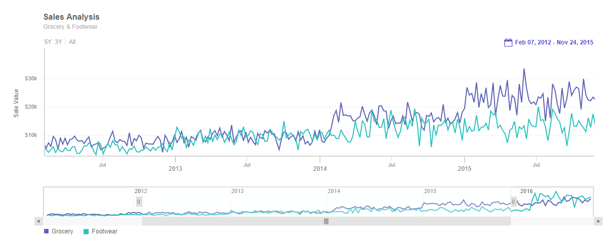
How Can I Create OHLC, Candlestick, and Other Massive Data Point Charts With FusionTime in the Browser?
FusionTime helps you visualize time-series and stock data in JavaScript with just a few lines of code. Whether it’s a simple time-series chart, stock chart, millions of data points in a chart, or even complex multivariate analysis, you can render all of them with the same ease of use.
With FusionTime, you get out-of-the-box interactivity like time navigator, date range selectors, tooltips with crosslines, interactive legends, and much more. In addition, you can plot your data as a column, line, area, candlestick, OHLC, or a variant like stacked column & area. You can also overlay them with event and data markers.
And the best part is the same chart runs across desktop, tablet, and mobile, through responsive layouts, on all modern browsers – without any additional effort on your side.
Find out more about FusionTime.
How Can I Create Dashboard Reports With FusionExport?
FusionExport lets you convert your live dashboards to PDF or images. It works with all JavaScript charting libraries (FusionCharts, HighCharts, d3, Chart.js, or others) and it’s easy to install. In addition, it includes SDKs for Java, Node.js, C#, Go, and many more.
Not only can you export a dashboard as-is, but you can also add new elements to the exported dashboard on the fly. These elements include your brand logo, colors, additional data in form of tables, or anything else that you want.
Find out more about FusionExport.
How Easy is It to Implement Interactive Javascript Data Visualization Charts?
FusionCharts covers all tech-stacks of your choice; be it Vue.js, Angular, or React. If JavaScript is not your cup of tea, our backend plugins for ASP.NET, Java, PHP will help you ship your projects faster. FusionCharts is created by developers for developers, so all our plugins are open-source projects!
For example, on the front end side of React, you can implement interactive charts with as little as 27 lines of code.
import React, { Component } from 'react';
import ReactDOM from 'react-dom';
import FusionCharts from 'fusioncharts';
import Charts from 'fusioncharts/fusioncharts.charts';
import ReactFC from 'react-fusioncharts';
import FusionTheme from 'fusioncharts/themes/fusioncharts.theme.fusion';

ReactFC.fcRoot(FusionCharts, Charts, FusionTheme);

const chartConfigs = {
  type: 'column2d',
  width: 600,
  height: 400,
  dataFormat: 'json',
  dataSource: {/* see data tab */ },
};

class Chart extends Component {
  render () {
    return <ReactFC {...chartConfigs} />;
  }
}

ReactDOM.render(
  <Chart />,
  document.getElementById('root'),
);
While in the Svelte framework it takes as little as 21 lines of code to implement interactive charts.
<script>
  import FusionCharts from 'fusioncharts';
  import Charts from 'fusioncharts/fusioncharts.charts';
  import FusionTheme from 'fusioncharts/themes/fusioncharts.theme.fusion';
  import SvelteFC, {fcRoot} from 'svelte-fusioncharts';
  import dataSource from './data.js';

  fcRoot(FusionCharts, Charts, FusionTheme);

  const chartConfigs = {
    type: 'column2d',
    width: '600',
    height: '400',
    dataFormat: 'json',
    dataSource
  };
</script>

<div id="container">
  <SvelteFC {...chartConfigs} />
</div>
If back-end development is more your style you can implement interactive Javascript charts in PHP with only 17 lines of code. In this case, you define the data for the visualization inline in the code which increases the lines.
<?php
include("includes/fusioncharts.php");

$columnChart = new FusionCharts("column2d", "ex1", "100%", 400, "chart-1", "json", '{
  "chart": {
    "caption": "Countries With Most Oil Reserves [2017-18]",
    "subcaption": "In MMbbl = One Million barrels",
    "xaxisname": "Country",
    "yaxisname": "Reserves (MMbbl)",
    "numbersuffix": "K",
    "theme": "fusion"
  },
  "data": [
    {
      "label": "Venezuela",
      "value": "290"
    },
    {
      "label": "Saudi",
      "value": "260"
    },
    {
      "label": "Canada",
      "value": "180"
    },
    {
      "label": "Iran",
      "value": "140"
    },
    {
      "label": "Russia",
      "value": "115"
    },
    {
      "label": "UAE",
      "value": "100"
    },
    {
      "label": "US",
      "value": "30"
    },
    {
      "label": "China",
      "value": "30"
    }
  ]
}');

$columnChart->render();
?>
As you can see in the code samples above, each implementation has a simple include and then a chart definition where you configure properties. The simple definition and configuration of interactive charts really increase your productivity when you are building data visualizations.
How Can I Add Interactive Data Visualizations to My Dashboards and Projects?
In this article, we have seen how easy it is to add interactive Javascript data visualizations to your own projects. We have also talked about the 100s of popular charts like Bar, Column, Line, Area, and Pie; or domain-specific charts like Treemaps, Heatmaps, Gantt Charts, Marimekko Charts, Gauges, Spider Charts, Waterfall Charts, and many more that are available in FusionCharts! In addition to charts, we also have over 2000+ choropleth maps which cover countries, counties and even cities! By far, FusionCharts is our favorite Javascript data visualization library.
Head over and get started developing stunning interactive data visualizations with Javascript today!


