Your charts are yours. That’s not exactly the best of ways to start off but then that’s exactly what we are going to talk about right now – branding your charts. So let’s get started..
Why should you brand your charts?
- You put in a lot of hard work to make the chart, so why wouldn’t you want people to know who the man behind the scenes is?
- You work for a company and putting in the company name and logo increases the “brand” visibility, or so they say.
- What the heck? The logo looks cool.
So what would you ideally like to do to brand a chart?
- Place the company logo in a prominent position.
- Place the company name in well, a prominent position.
- Lastly and most importantly as well, placing a link somewhere to the company website
Everything that you would like to do can be done with FusionCharts v3.1 now.
Here’s what a chart, company-stamped by FusionCharts v3.1 looks like:
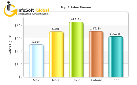
XML data source:
<chart yaxisname="”Sales" figure”="" caption="”Top" 5="" sales="" person”="" numberprefix="”$”" useroundedges="”1″" showborder="”0″" logourl="”../Images/InfosoftGlobal_logo.gif”" logoposition="”TL”" logolink="”https://www.infosoftglobal.com”">

…

</chart>
In case you are wondering why are we branding our charts, it’s 3) – “What the heck? The logo looks cool.”
You can customize your logo placement by choosing where it appears, adjusting its transparency and size, or even linking it directly to your website. When you design logos, you can select from five predefined positions for easy placement; the default option was simply chosen for convenience.
Want to still add more to the branding? How about having the company-name in the right-click menu with a link to the company website
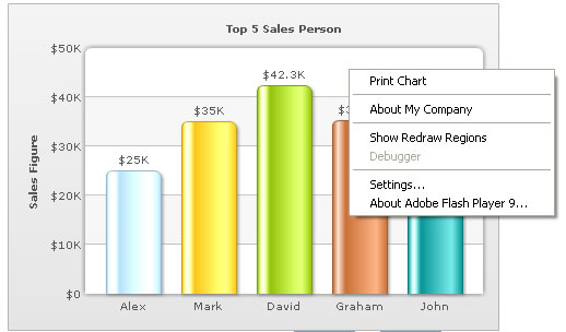
XML data source:
<chart yaxisname="”Sales" figure”="" caption="”Top" 5="" sales="" person”="" numberprefix="”$”" useroundedges="”1″" showborder="”0″" showaboutmenuitem="”1″" aboutmenuitemlabel="”About" my="" company”="" aboutmenuitemlink="”https://www.mycompany.com”">

…

</chart>
As you can see in the XML examples above, all of what you need to do to brand your charts is fuel some simple attributes in the XML data source. To see more details on how to add a logo to your charts, click here. And to see more details on how to add your company name to the right-click menu, click here.
So with all the marketing props required at your disposal, go ahead and let people know – your charts are yours.