Today’s businesses are adopting technology and digitization at an incredible rate. Because of this, it is increasingly important to keep track of your internal and external business goals. That is why many companies are adopting data analytics and visualization strategies to implement simple, easy-to-comprehend enterprise-level monitoring to stay ahead of the competition.
Operations drive an enterprise’s economy. For this reason, monitoring your business operations through business dashboards is a critical part of the business lifecycle. While you may also think that implementing visualization dashboards to monitor your business’s important metrics requires a large amount of overhead in terms of investment, time, and effort, the opposite is true. As a matter of fact, FusionCharts has got you covered.
As a development tool, FusionCharts provides your developers with everything they need. In order to start using it, all you need to do is download and plug it into your own projects.
Table of Contents
How do I Create a Business Operations Monitoring Dashboard with FusionCharts?
FusionCharts is one of the few charting tools that allow you to easily create beautiful and insightful data visualizations with ease and precision. With FusionCharts, you can quickly create business operations dashboards and keep track of important metrics such as target reach, monthly and annual revenues, and investment monitoring.
Here are some of the key features of an effective business operations monitoring dashboard.
- Track KPIs to improve profit margins.
- Make use of functional metrics to monitor the performance of different departments.
- Monitor financial investments.
- Keep track of new customers and keep an eye on the satisfaction rate of your existing customers.
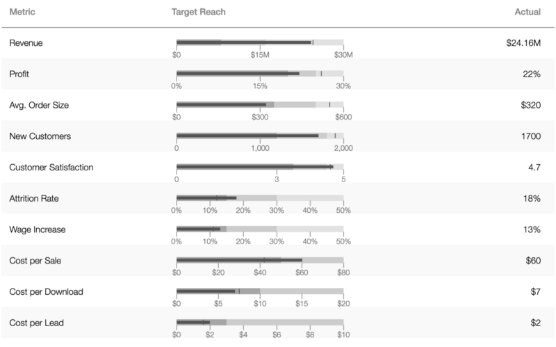
How Can I Track Target Reach Metrics in My Business Operations Monitoring Dashboard?
Your target reach metrics are valuable information that you can track on your operations monitoring dashboard. Monitoring your profit, average order size, customer satisfaction rate, and other similar kinds of metrics will help keep your business operations on track.
To help you integrate the target reach monitoring module in your dashboard, FusionCharts has a full suite of Bootstrap-based libraries and also support for JavaScript.
Here is how you make it happen.
JavaScript
var i, chart;
/**
* "companyMonitorData" should be defined in your data.js.
* Loop over companyMonitorData.targets for Target Reach section of
* Company Monitor to create hbullet type chart for each section.
*/
for (i = 0; i < companyMonitorData.targets.length; i++) {
    chart = companyMonitorData.targets[i];
    // The type of chart to render
    chart.type = "hbullet";
    chart.width = "256";
    chart.height = "26";
    chart.containerBackgroundOpacity = "0";
    chart.renderAt = chart.id + "Container";
    chart.showChartLoadingMessage = false;
    chart.showDataLoadingMessage = false;
    FusionCharts.render(chart);
}
HTML
<table id="companyMonitorTable" class="company-monitor-table"
    <thead>
        <tr>
            <th>Metric</th>
            <th class="target-reach">Target Reach</th
            <th>Actual</th>
        </tr>
    </thead>
    <tbody>
        <tr>
            <td>Revenue</td>
            <td class="chart-wrap">
                <div id="targetRevenueContainer"></div>
            </td>
            <td>$24.16M</td>
        </tr>
        <tr>
            <td>Profit</td>
            <td class="chart-wrap">
                <div id="targetProfitContainer"></div>
            </td>
            <td>22%</td>
        </tr>
        <tr>
            <td>Avg. Order Size</td>
            <td class="chart-wrap">
                <div id="targetOrderContainer"></div>
            </td>
            <td>$320</td>
        </tr>
        <tr>
            <td>New Customers</td>
            <td class="chart-wrap">
                <div id="targetNewcustomersContainer"></div>
            </td>
            <td>1700</td>
        </tr>
        <tr>
            <td>Customer Satisfaction</td>
            <td class="chart-wrap">
                <div id="targetCustomerSatContainer"></div>
            </td>
            <td>4.7</td>
        </tr>
        <tr>
            <td>Attrition Rate</td>
            <td class="chart-wrap">
                <div id="targetAttritionContainer"></div>
            </td>
            <td>18%</td>
        </tr>
        <tr>
            <td>Wage Increase</td>
            <td class="chart-wrap">
                <div id="targetWageContainer"></div>
            </td>
            <td>13%</td>
        </tr>
        <tr>
            <td>Cost per Sale</td>
            <td class="chart-wrap">
                <div id="targetSaleContainer"></div>
            </td>
            <td>$60</td>
        </tr>
        <tr>
            <td>Cost per Download</td>
            <td class="chart-wrap">
                <div id="targetDownloadContainer"></div>
            </td>
            <td>$7</td>
        </tr>
        <tr>
            <td>Cost per Lead</td>
            <td class="chart-wrap">
                <div id="targetLeadContainer"></div>
            </td>
            <td>$2</td>
        </tr>
    </tbody>
</table>
Here is how the target reach component in your dashboard looks.
How Can I Easily Add a Monthly Revenue Monitoring Component to My Dashboard?
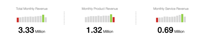
Adding a revenue monitoring mechanism is not as simple as it might seem. It involves lots of data, responsive and interactive visualizations, and, most importantly, accurate data reflection. If you develop them from scratch, all these elements can cause a wide range of problems and would require an enormous amount of effort.
Thankfully, FusionCharts provides you with a simple mechanism to integrate the monthly revenue monitoring component in your dashboard that involves just a few lines of JavaScript code. Once you plug it in, everything is handled internally by the FusionCharts library itself.
Take a look!
JavaScript
var i, chart;
/**
* "companyMonitorData" is defined in data.js.
* Loop over companyMonitorData.revenues for Revenue section of
* Company Monitor to create sparkcolumn type chart for each section.
*/
for (i = 0; i < companyMonitorData.revenues.length; i++) {
    chart = companyMonitorData.revenues[i];
    chart.type = "sparkcolumn";
    chart.width = "118";
    chart.height = "38";
    chart.containerBackgroundOpacity = "0";
    chart.renderAt = chart.id + "Container";
    chart.showChartLoadingMessage = false;
    FusionCharts.render(chart);
}
HTML
<table id="revenueMonitorTable">
<thead>
<th> </th>
</thead>
<tbody>
<tr>
<td>Total Monthly Revenue</td>
<td>Monthly Product Revenue</td>
<td>Monthly Service Revenue</td>
</tr>
<tr>
<td class="revenue-monitor-table-right-border-cell">
<div id="revenueTotalContainer"></div>
</td>
<td class="revenue-monitor-table-right-border-cell">
<div id="revenueProductContainer"></div>
</td>
<td>
<div id="revenueServiceContainer"></div>
</td>
</tr>
<tr>
<td>
<span class="revenue-monitor-table-number">3.33</span>
<span class="revenue-monitor-table-number-definition">Million</span>
</td>
<td>
<span class="revenue-monitor-table-number">1.32</span>
<span class="revenue-monitor-table-number-definition">Million</span>
</td>
<td>
<span class="revenue-monitor-table-number">0.69</span>
<span class="revenue-monitor-table-number-definition">Million</span>
</td>
</tr>
<tr>
<td> </td>
<td></td>
<td></td>
</tr>
</tbody>
</table>
Once you are done, your monthly revenue monitoring component dashboard looks like this.
What is an Easy Way to Monitor Recent Investments in My Dashboard?
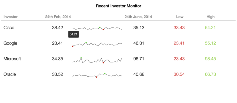
Companies, especially startups, often depend on huge investments to maintain credibility and presence in the market. Moreover, investments drive a business’s economy and contribute a great deal to its scalability. When dealing with such investments, having an investment monitoring component in your operations monitoring dashboard is essential.
In order to provide you with meaningful insights, FusionCharts offers a ready-to-use codebase that you can just plug into your business operations monitoring dashboard.
JavaScript
var i, chart;
/**
* "companyMonitorData" is defined in data.js.
* Loop over companyMonitorData.investors for Recent Investor section of
* Company Monitor to create sparkline type chart for each section.
*/
for (i = 0; i < companyMonitorData.investors.length; i++) {
    chart = companyMonitorData.investors[i];
    chart.type = "sparkline";
    chart.width = "168";
    chart.height = "28";
    chart.containerBackgroundOpacity = "0";
    chart.renderAt = chart.id + "Container";
    chart.showChartLoadingMessage = false;
    FusionCharts.render(chart);
}
HTML
<h2 class="recent-investor-monitor-heading">Recent Investor Monitor</h2>
<table id="investorMonitorTable">
    <thead></thead>
        <tbody>
            <tr>
                <td colspan="3">Investor</td>
                <td colspan="4">24th Feb, 2014</td>
                <td colspan="1"></td>
                <td colspan="5" class="investment-end-date">24th June, 2014</td>
                <td colspan="3">Low</td>
                <td colspan="3">High</td>
                <td colspan="2"></td>
            </tr>
            <tr>
                <td colspan="3">Cisco</td>
                <td colspan="3">38.42</td>
                <td colspan="3" class="investor-chart-container">
                    <div id="investorsCiscoContainer"></div>
                </td>
                <td colspan="2">35.13</td>
                <td class="investor-monitor-table-column-low" colspan="4">33.43</td>
                <td class="investor-monitor-table-column-high" colspan="3">54.21</td>
            </tr>
            <tr>
                <td colspan="3">Google</td>
                <td colspan="3">23.41</td>
                <td colspan="3" class="investor-chart-container">
                    <div id="investorsGoogleContainer"></div>
                </td>
                <td colspan="2">46.31</td>
                <td class="investor-monitor-table-column-low" colspan="4">23.41</td>
                <td class="investor-monitor-table-column-high" colspan="3">55.12</td>
            </tr>
            <tr>
                <td colspan="3">Microsoft</td>
                <td colspan="3">34.35</td>
                <td colspan="3" class="investor-chart-container">
                    <div id="investorsMicrosoftContainer"></div>
                </td>
                <td colspan="2">96.71</td>
                <td class="investor-monitor-table-column-low" colspan="4">23.43</td>
                <td class="investor-monitor-table-column-high" colspan="3">98.45</td>
            </tr>
            <tr>
                <td colspan="3">Oracle</td>
                <td colspan="3">33.52</td>
                <td colspan="3" class="investor-chart-container">
                    <div id="investorsOracleContainer"></div>
                </td>
                <td colspan="2">40.68</td>
                <td class="investor-monitor-table-column-low" colspan="4">30.54</td>
                <td class="investor-monitor-table-column-high" colspan="3">66.73</td>
            </tr>
    </tbody>
</table>
Here is an example of the FusionCharts recent investment monitoring dashboard:
How Does an All-in-One Company Monitor Look?
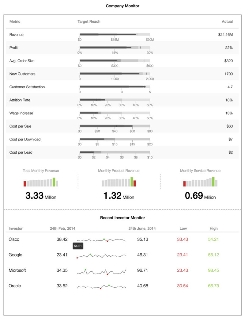
While all of the FusionCharts components you have seen here are useful in their own right, they are even more powerful displayed as a page. To build your all-in-one dashboard, just combine all of the code snippets here. This is the final result:
Source Code for Business Operation Monitoring Dashboard
Business Operation Monitoring Dashboard Demo
FusionCharts has made it extremely simple and effortless to design and develop a business operations monitoring dashboard. All you need to do is customize one for your use case. In addition, FusionCharts supports a wide variety of bindings out of the box for Javascript, Angular, React, jQuery, Vue.js, Ember, React Native, AngularJS, Svelte, ASP.NET, PHP, Java, Ruby on Rails, and also Django.
Let us know in the comment section below how you used FusionCharts to create an insightful operation monitoring dashboard for your business.
Download FusionCharts and get started today!


