Building interactive React charts from scratch can quickly become complicated. It becomes even more challenging when you need different chart types for different kinds of data. The good news is that modern React chart libraries make the process much simpler with reusable configurations and minimal code changes.
In this tutorial, you’ll learn how to create React charts using FusionCharts. First, we will build a simple column chart. Then we will transform it into a stacked column chart, a pie chart, an area chart, and a bubble chart.
This approach works with any React chart library, but FusionCharts makes it especially simple with minimal configuration.
Table of Contents
Key Takeaways
- Learn how to create interactive React charts using FusionCharts
- Set up FusionCharts quickly in a React application with minimal configuration
- Build a simple column chart using reusable chart configurations
- Transform the same React chart into stacked column, pie, area, and bubble charts
- Understand how different React chart types use different data structures
- Learn how to choose the right chart type for different visualization needs
How to Set up a React Project
First, set up a React project. In this tutorial, we will use create-react-app to set up the development environment for charts in Reactjs. Learn more about using create-react-app.
Use the following commands in the terminal:
npx create-react-app my-fusioncharts-project
cd my-fusioncharts-project
npm start
my-fusioncharts-project is your working directory. Check if this working directory contains a package.json. If not, create it manually with npm init -y command.
Now check whether your React app is working properly on this local server.
https://localhost:3000/

How to Install FusionCharts for React Charts
You can install the required FusionCharts packages for React with the following command:
npm install fusioncharts react-fusioncharts --save
Now, import the required modules into your React component. Replace the code in your src/App.js file with the code shown below. It will create your first chart.
// STEP 1 - Include Dependencies
// Include React
import React from "react";

// Include the react-fusioncharts component
import ReactFC from "react-fusioncharts";

// Include the FusionCharts library
import FusionCharts from "fusioncharts";

// Include the chart type
import Charts from "fusioncharts/fusioncharts.charts";

// Include the theme as fusion
import FusionTheme from "fusioncharts/themes/fusioncharts.theme.fusion";

// Adding the chart and theme as a dependency to the core FusionCharts
ReactFC.fcRoot(FusionCharts, Charts, FusionTheme);
That’s it. You’re ready to create interactive React charts with FusionCharts.
How to Prepare Data for Your React Chart
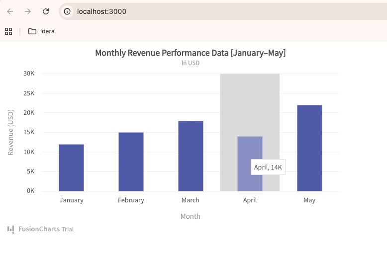
In this section, we’ll use the following sample monthly revenue data for our React column chart.
Monthly Revenue Data for the React Column Chart
| Month | Revenue |
|---|---|
| January | 12K |
| February | 15K |
| March | 18K |
| April | 14K |
| May | 22K |
We will create a 2D column chart with ‘Month’ as data labels on the x-axis and ‘Revenue’ as data values on the y-axis. Let’s prepare the data for a single-series chart in JSON format as shown below:
Add this code below the above code in your App.js file:
// Step 2 - Preparing the chart data
const chartData = [
  {
    label: "January",
    value: "12"
  },
  {
    label: "February",
    value: "15"
  },
  {
    label: "March",
    value: "18"
  },
  {
    label: "April",
    value: "14"
  },
  {
    label: "May",
    value: "22"
  }
];
How to Configure Your Chart
Now that your chart data is ready, let’s customize the styling, positioning, and chart settings to make your React chart more meaningful and visually appealing.
Add the following code below the data preparation in the App.js file:
// STEP 3 - Creating the JSON object to store the chart configurations
const chartConfigs = {
  type: "column2d", // The chart type
  width: "700", // Width of the chart
  height: "400", // Height of the chart
  dataFormat: "json", // Data type
  dataSource: {
    // Chart Configuration
    chart: {
      caption: "Monthly Revenue Performance Data [January–May]",    //Set the chart caption
      subCaption: "In USD",             //Set the chart subcaption
      xAxisName: "Month",           //Set the x-axis name
      yAxisName: "Revenue (USD)",  //Set the y-axis name
      numberSuffix: "K",
      theme: "fusion"                 //Set the theme for your chart
    },
    // Chart Data - from step 2
    data: chartData
  }
};
How to Render the Chart
Now, add the following code at the end of your App.js file to render the React chart in the browser:
// STEP 4 - Creating the DOM element to pass the react-fusioncharts component
class App extends React.Component {
  render() {
    return (<ReactFC {...chartConfigs} />);
  }
}

export default App;
Here is your complete code in the App.js file:
// STEP 1 - Include Dependencies
// Include react
import React from "react";
import ReactDOM from "react-dom";

// Include the react-fusioncharts component
import ReactFC from "react-fusioncharts";

// Include the fusioncharts library
import FusionCharts from "fusioncharts";

// Include the chart type
import Charts from "fusioncharts/fusioncharts.charts";

// Include the theme as fusion
import FusionTheme from "fusioncharts/themes/fusioncharts.theme.fusion";

// Adding the chart and theme as dependency to the core fusioncharts
ReactFC.fcRoot(FusionCharts, Charts, FusionTheme);

// STEP 2 - Chart Data
const chartData = [
  {
    label: "Venezuela",
    value: "290"
  },
  {
    label: "Saudi",
    value: "260"
  },
  {
    label: "Canada",
    value: "180"
  },
  {
    label: "Iran",
    value: "140"
  },
  {
    label: "Russia",
    value: "115"
  },
  {
    label: "UAE",
    value: "100"
  },
  {
    label: "US",
    value: "30"
  },
  {
    label: "China",
    value: "30"
  }
];

// STEP 3 - Creating the JSON object to store the chart configurations
const chartConfigs = {
  type: "column2d", // The chart type
  width: "700", // Width of the chart
  height: "400", // Height of the chart
  dataFormat: "json", // Data type
  dataSource: {
    // Chart Configuration
    chart: {
      //Set the chart caption
      caption: "Countries With Most Oil Reserves [2017-18]",
      //Set the chart subcaption
      subCaption: "In MMbbl = One Million barrels",
      //Set the x-axis name
      xAxisName: "Country",
      //Set the y-axis name
      yAxisName: "Reserves (MMbbl)",
      numberSuffix: "K",
      //Set the theme for your chart
      theme: "fusion"
    },
    // Chart Data
    data: chartData
  }
};

// STEP 4 - Creating the DOM element to pass the react-fusioncharts component
class App extends React.Component {
  render() {
    return (<ReactFC {...chartConfigs} />);
  }
}

export default App;
See Your Interactive Column Chart
You should now be able to see the chart below in your browser.
Explore more about creating React Charts.
Get the complete code from GitHub.
Transform React Charts into Multiple Chart Types with Minimal Code Changes
One of the biggest advantages of using React chart libraries is flexibility. Instead of rebuilding your chart from scratch, you can transform the same chart into different visualizations by simply changing the chart type and slightly adjusting the data structure.
In the following sections, you’ll convert the same React chart into a stacked bar chart, pie chart, area chart, and bubble chart using minimal code changes.
How to Transform the Bar Chart into a 3D Stacked Column Chart
You do not need to rewrite the entire chart. To create a 3D stacked column chart in React, you only need to:
- Change the chart type
- Replace the single data array with categories and a dataset
- Update the chart title and axis labels
Let’s create the stacked column chart for the data table below.
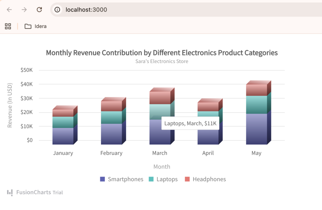
Monthly Revenue Contribution by Different Electronics Product Categories for the React Stacked Column Chart
| Month | Smartphones | Laptops | Headphones |
|---|---|---|---|
| January | 12000 | 8000 | 5000 |
| February | 15000 | 9000 | 7000 |
| March | 18000 | 11000 | 9000 |
| April | 14000 | 10000 | 6000 |
| May | 22000 | 13000 | 8000 |
Step 1: Change the Chart Type
Replace this line:
type: "column2d",
with:
type: "stackedcolumn3d",
This changes the simple bar chart into a 3D stacked column chart.
Step 2: Replace the Existing chartData
Delete the old chartData array and replace it with the following:
const categories = [
  {
    category: [
      { label: "January" },
      { label: "February" },
      { label: "March" },
      { label: "April" },
      { label: "May" }
    ]
  }
];

const dataset = [
  {
    seriesname: "Smartphones",
    data: [
      { value: "12000" },
      { value: "15000" },
      { value: "18000" },
      { value: "14000" },
      { value: "22000" }
    ]
  },
  {
    seriesname: "Laptops",
    data: [
      { value: "8000" },
      { value: "9000" },
      { value: "11000" },
      { value: "10000" },
      { value: "13000" }
    ]
  },
  {
    seriesname: "Headphones",
    data: [
      { value: "5000" },
      { value: "7000" },
      { value: "9000" },
      { value: "6000" },
      { value: "8000" }
    ]
  }
];
Unlike a simple column or bar chart, stacked charts use:
categoriesfor x-axis labelsdatasetfor multiple data series
Step 3: Update the dataSource
Replace the existing dataSource section with this:
dataSource: {
  chart: {
    caption: "Monthly Revenue Contribution by Different Electronics Product Categories",
    subCaption: "Sara's Electronics Store",
    xAxisName: "Month",
    yAxisName: "Revenue (In USD)",
    numberPrefix: "$",
    theme: "fusion"
  },
  categories: categories,
  dataset: dataset
}
Your React chart will now render as an interactive 3D stacked column chart using the same overall FusionCharts setup.
Get the complete code from GitHub.
Transforming the Chart into a Pie Chart
Pie charts are useful when you want to visualize proportions or percentage-based distributions. Unlike bar charts, pie charts focus on showing how individual categories contribute to the whole.
Instead of rebuilding the chart from scratch, you only need to:
- Change the chart type
- Replace the dataset structure
- Update the chart title
Let’s use this sample data table for our React pie chart.
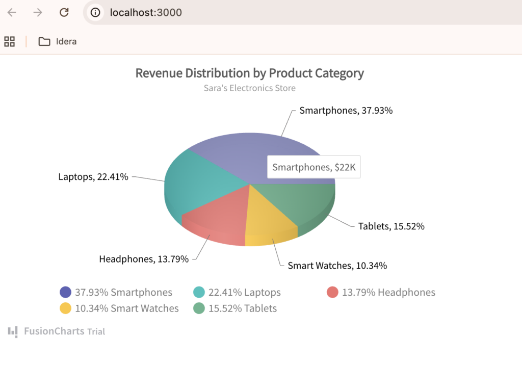
Revenue Distribution by Electronics Product Category for the React Pie Chart
| Product Category | Revenue |
|---|---|
| Smartphones | 22000 |
| Laptops | 13000 |
| Headphones | 8000 |
| Smart Watches | 6000 |
| Tablets | 9000 |
Step 1: Change the Chart Type
Replace this line:
type: "stackedcolumn3d",
with:
type: "pie3d",
Step 2: Replace the Existing Dataset
Pie charts use a much simpler data structure compared to stacked charts. Remove the existing categories and dataset variables and replace them with this:
const chartData = [
 {
   label: "Smartphones",
   value: "22000"
 },
 {
   label: "Laptops",
   value: "13000"
 },
 {
   label: "Headphones",
   value: "8000"
 },
 {
   label: "Smart Watches",
   value: "6000"
 },
 {
   label: "Tablets",
   value: "9000"
 }
];
Step 3: Update the dataSource
Replace the existing dataSource section with this:
dataSource: {
 chart: {
   caption: "Revenue Distribution by Product Category",
   subCaption: "Sara's Electronics Store",
   numberPrefix: "$",
   theme: "fusion"
 },
 data: chartData
}
Your React chart will now render as an interactive 3D pie chart. Notice that you are still using the same FusionCharts React setup — only the chart type and data structure changed.
Get the complete code from GitHub.
Transforming the Chart into an Area Chart
Area charts are useful for visualizing trends over time while also emphasizing the magnitude of change. They are commonly used in dashboards to show growth, revenue trends, traffic patterns, and performance metrics.
Just like the previous examples, you only need to:
- Change the chart type
- Update the dataset structure
- Modify the chart title and axis labels
Let’s use the data table below as the sample data for this React area chart example.
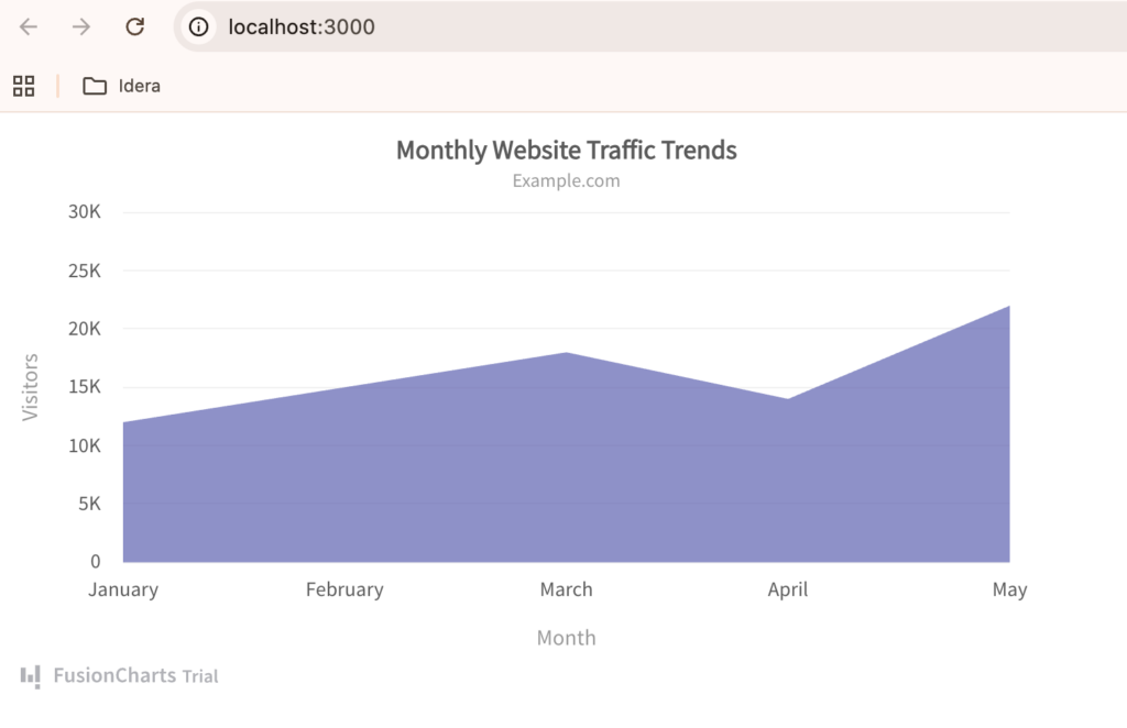
Monthly Website Traffic Trend Data for a React Area Chart
| Month | Website Traffic |
|---|---|
| January | 12000 |
| February | 15000 |
| March | 18000 |
| April | 14000 |
| May | 22000 |
Step 1: Change the Chart Type
Replace this line:
type: "pie3d",
with:
type: "area2d",
Step 2: Replace the Existing Dataset
Area charts use a simple data array, similar to that of basic bar charts. Replace the existing chart data with the following:
const chartData = [
 {
   label: "January",
   value: "12000"
 },
 {
   label: "February",
   value: "15000"
 },
 {
   label: "March",
   value: "18000"
 },
 {
   label: "April",
   value: "14000"
 },
 {
   label: "May",
   value: "22000"
 }
];
Step 3: Update the dataSource
Replace the existing dataSource section with this:
dataSource: {
 chart: {
   caption: "Monthly Website Traffic Trends",
   subCaption: "Example.com",
   xAxisName: "Month",
   yAxisName: "Visitors",
   theme: "fusion"
 },
 data: chartData
}
Your React chart will now render as an interactive area chart. Notice that the overall FusionCharts React setup remains exactly the same — only the chart type and data structure were updated.
Get the complete code from GitHub.
Transforming the Chart into a Bubble Chart
Bubble charts are useful for visualizing multi-dimensional data. Unlike bar or pie charts, bubble charts can display relationships between multiple variables at the same time using:
- X-axis values
- Y-axis values
- Bubble size
They are commonly used for market analysis, product comparisons, and performance visualization.
To transform the existing React chart into a bubble chart, you only need to:
- Change the chart type
- Update the dataset structure
- Configure x-axis and y-axis values
We will use the sample data below for our bubble chart in React.
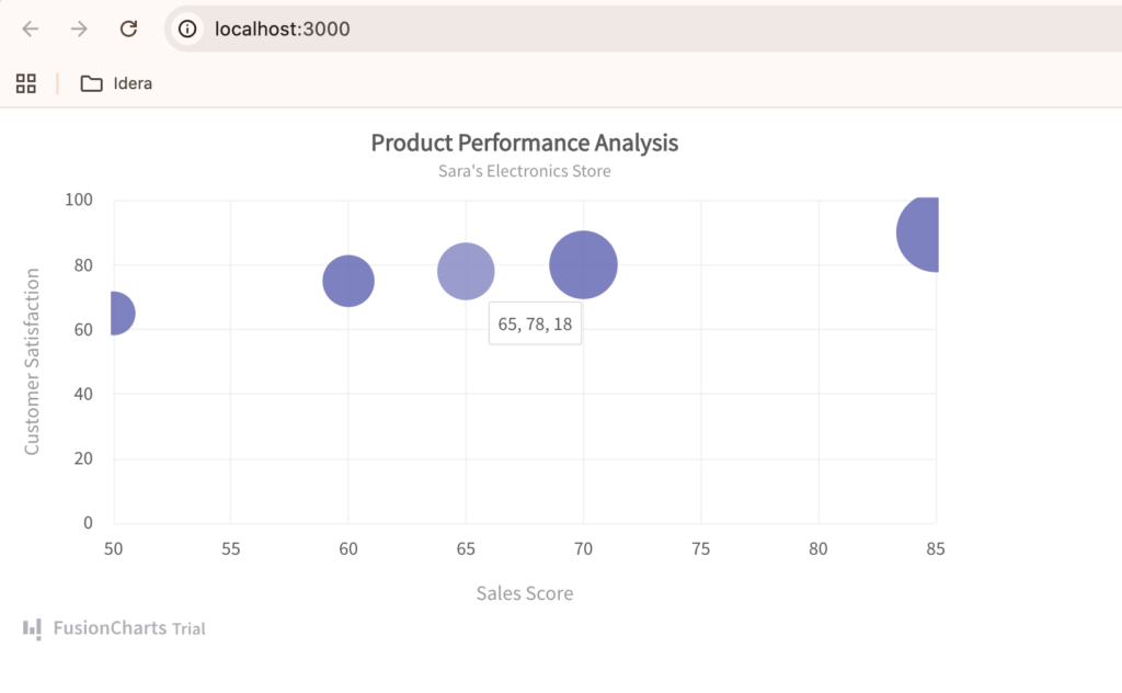
Product Performance Dataset for a React Bubble Chart Showing Sales, Customer Satisfaction, and Market Share
| Product | Sales | Customer Satisfaction | Market Share |
|---|---|---|---|
| Smartphones | 85 | 90 | 35 |
| Laptops | 70 | 80 | 25 |
| Headphones | 60 | 75 | 15 |
| Smart Watches | 50 | 65 | 10 |
| Tablets | 65 | 78 | 18 |
Step 1: Change the Chart Type
Replace this line:
type: "area2d",
with:
type: "bubble",
Step 2: Replace the Existing Dataset
Bubble charts use a different structure where:
- x represents one variable
- y represents another variable
- z controls the bubble size
Replace the existing dataset with this:
const chartData = [
 {
   label: "Smartphones",
   x: "85",
   y: "90",
   z: "35"
 },
 {
   label: "Laptops",
   x: "70",
   y: "80",
   z: "25"
 },
 {
   label: "Headphones",
   x: "60",
   y: "75",
   z: "15"
 },
 {
   label: "Smart Watches",
   x: "50",
   y: "65",
   z: "10"
 },
 {
   label: "Tablets",
   x: "65",
   y: "78",
   z: "18"
 }
];
Step 3: Update the dataSource
Replace the existing dataSource section with this:
dataSource: {
  chart: {
    caption: "Product Performance Analysis",
    subCaption: "Sara's Electronics Store",
    xAxisName: "Sales Score",
    yAxisName: "Customer Satisfaction",
    theme: "fusion"
  },

  dataset: [
    {
      data: chartData
    }
  ]
}
Your React chart will now render as an interactive bubble chart. Notice that the core FusionCharts React setup remains unchanged — you only modified the chart type and data structure to visualize multiple variables simultaneously.
Get the complete code from GitHub.
Choosing the Right React Chart Type for Your Data
Different chart types serve different purposes. Choosing the right visualization helps users understand data faster and makes your React charts more meaningful and effective.
| Chart Type | Primary Use Case |
|---|---|
| Bar Chart | Compare values across categories |
| Stacked Bar Chart | Compare category contributions |
| Pie Chart | Show proportions or distributions |
| Area Chart | Visualize trends over time |
| Bubble Chart | Analyze multiple variables simultaneously |
Common Mistakes When Creating React Charts
Even though modern React chart libraries simplify chart creation, a few common mistakes can still make charts difficult to understand or maintain.
Overcomplicating the Chart Setup
Many developers assume they need separate implementations for every chart type. In reality, libraries like FusionCharts let you reuse the same core setup and simply change the chart configuration and data structure as needed.
Learn more about the different chart types and configurations available in FusionCharts.
Choosing the Wrong Chart Type
Different charts serve different purposes. For example:
- Bar charts are better for comparing values
- Pie charts work best for proportions
- Area charts are ideal for trends over time
- Bubble charts help visualize multiple variables
Using the wrong chart type can make your data harder to understand.
Not Structuring Data Properly
Some chart types use different data structures. For example, a simple bar chart uses a data array, while stacked and bubble charts require dataset and categories configurations. Incorrect data formatting can cause charts to render incorrectly or display no data at all.
Conclusion
Creating interactive React charts does not need to be complicated. As you saw throughout this tutorial, the same FusionCharts setup can be transformed into multiple chart types simply by changing the chart configuration and slightly adjusting the data structure.
From bar charts and stacked bar charts to pie charts, area charts, and bubble charts, FusionCharts provides a fast and flexible way to build powerful data visualizations in React applications with minimal code changes.
Ready to build your own interactive React charts?
Try FusionCharts and experiment with different chart types to find the best visualization for your data.
Learn more about FusionCharts frontend integrations.
FAQs
What is the best way to create charts in React?
One of the best ways to create charts in React is by using a React chart library like FusionCharts. It allows developers to build interactive charts with minimal configuration while supporting multiple chart types such as bar charts, pie charts, area charts, and bubble charts.
Can I use the same setup for different React chart types?
Yes. Modern React chart libraries allow you to reuse the same core chart setup and transform it into different chart types by changing the chart type and slightly adjusting the data structure. This makes it easier to create interactive React charts without rewriting large amounts of code.
Which React chart type should I use for my data?
The best React chart type depends on your data and visualization goals:
- Bar charts are ideal for comparing values
- Pie charts work well for proportions
- Area charts help visualize trends over time
- Bubble charts are useful for multi-variable analysis
- Stacked bar charts help compare category contributions across datasets