
Effective Test Management and intelligent Business Dashboards are great talks in the corporate world; Why so? As business leaders, we are constantly tasked with the challenge of driving existing projects and initiatives forward while devising innovative strategies.
Juggling these tasks alongside everything else on your plate can be overwhelming at times, especially streamlining complex test data management. Fortunately, modern technology has provided an essential tool to help keep track: business dashboards!
Dashboards can be an incredibly useful tool for any business. They provide quick and easy access to important metrics that can help inform decisions. Having a well-designed dashboard with the right information will give you the insights you need to maximize efficiency and stay ahead of the competition.
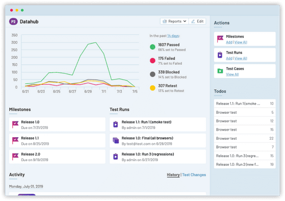
With FusionCharts’ suite of data visualization tools, it is possible to create intuitive dashboards that make it easy to measure performance while simplifying complex data into actionable tasks. TestRail– an effective test management platform, also plays a key role in ensuring that dashboards are properly configured and functioning correctly, making sure they deliver on their primary goal.
In this blog post, we explore how FusionCharts and effective test management work together to design high-quality business dashboards.

Table of Contents
What Are Business Dashboards?
Business dashboards compile and show important metrics and KPIs on a single screen, allowing users to monitor and assess business performance quickly. For end users of all skill levels, business intelligence dashboards extract and communicate high-level information such as anomalies, problems, and trends before they decide to examine data in more depth using sophisticated tools like contextual analytics.
How are dashboards useful in business?
Business dashboards are a key component of any organization as it enables us to:
- See the whole picture of a company’s health in one place.
- Analyze key metrics over time to assess the company’s performance.
- Save time and avoid data overload.
- Compare forecasts
Dashboard design: Common pitfalls to avoid
Even though a dashboard is the best visual display of key performance metrics for any business, its design can face some pitfalls that can make or break your company’s decisions. Some design projects result in poor visualization that does not fulfill its intended objectives.
Here are some of the dashboard design pitfalls that we should avoid in order to get the best and ideal results:
Overloading dashboard screen
Organizations often face confusion and difficulty when attempting to make sense of a myriad of data sources. A dashboard allows businesses to combine disparate pieces, creating one streamlined reporting solution for comprehensive insights.
However, an excess or lack of information on each individual dashboard can prove difficult for users.
To ensure the effective use of insight from all angles, structured dashboards will create clarity and drive successful results in any organization!
Dashboard metrics do not work directly with the company’s goal
Dashboards are the source of the most updated information for us whenever we need it. But here’s the trouble we always face. We can’t make data-driven decisions if the data on the dashboard does not directly impact the goal.
This usually happens when the dashboard design is not first considered with the metrics that matter the most for the company.
An amalgamation of other dashboarding design pitfalls
Dashboards are the perfect tool to keep your organization agile and responsive in a rapidly evolving market. By setting benchmarks, monitoring performance, and visualizing data, you’re able to ensure fast decisions based on hard facts.
But you’re still getting the same ad-hoc requests all the time.
This is the result of another dashboard design mistake. The lack of engagement leads directly away from maximum utilization by business stakeholders.
Dashboards must provide understandable insights tailored for users, or else they will ultimately be ineffective.
These pitfalls can be pretty exhausting and overwhelming. Involve software test procedure with FusionCharts at the design stage. By doing this, you will get quick integration, fast-to-implement charts, and easy integration with any accounting, EMR, and scheduling software.
How to design the best business dashboard with FusionCharts and test management tools?

FusionCharts helps you make sense of your data in a visually-appealing way! With just 15 minutes, you’ll have an eye-catching chart that provides meaningful insights into the complexities of your databases. Take advantage – it’s easier than ever to transform raw information into powerful visuals. By using FusionCharts at the design stage, companies can create a business dashboard that will have the following features:
- A beautiful selection of graphs and charts
- Convenience in creating custom reports at lightning speed from any device
- Easy integration into existing applications or software to access data-driven insights.
- A robust chart library can handle all ranges of data while tailoring according to your most complex business requirements for effective information display.
Introduction to graph and chart testing process
As we all know, dashboards depend on graphs and charts for their power to provide us with an in-depth understanding of past trends.
However, these powerful data visualizations are only reliable when they’re tested with the right test management tool to ensure they’re accurately representing information – something that’s essential when it comes to making informed decisions!
Here are some test cases checkpoints for while testing your business dashboard graphs and charts:
- Use dynamic and logical plotting ranges.
- Always check for font size and type consistency.
- Send an error message when the data is missing in your graph.
- Apply filters to test the functionality of graphs and charts.
- Test functionality features such as legends and scroll bars.
- Make sure to test every possible data variation and how it affects the chart or graph if it is not producing the desired outcomes.
By performing these testing process on the business dashboard, we can ensure that it is error-free when they are deployed.
Even though manual test management is fine, the testing team can make use of automated testing management tools as well. We can streamline processes by increasing software testing coverage through test planning automation; reducing bugs once released into production; shrinking time spent between QA stages during release cycles, as well as boosting deployment frequency, all while becoming more efficient along the way!
One such complete test management tool is Testrail.
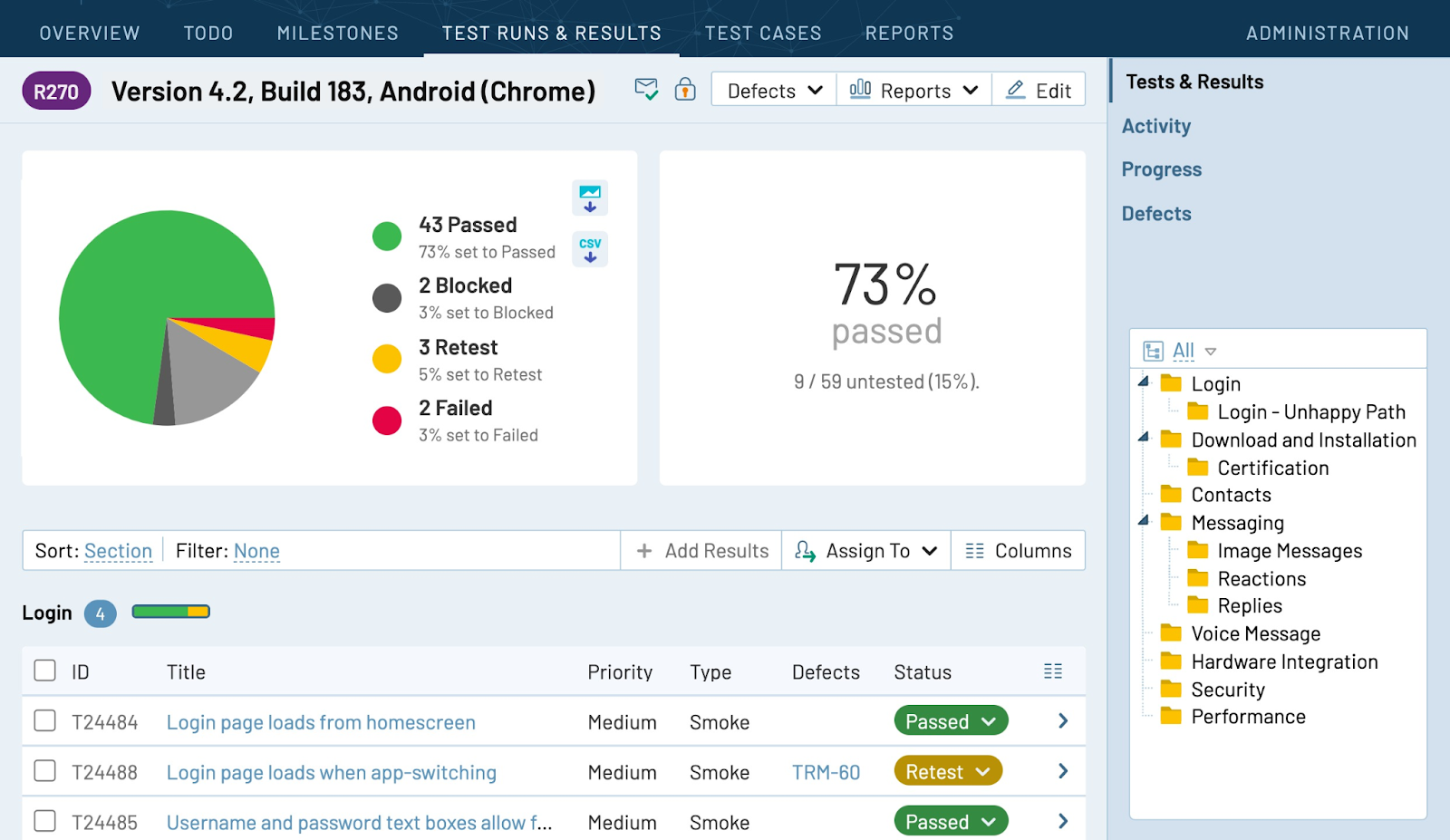
Testrail- Effective Test Management Tool for Testing Business Dashboard
With Testrail, we can revolutionize the test automation experience. Get more visibility into QA and ensure the highest quality of product with increased test monitoring and progress.
With real-time insights into progress and integration with issue trackers as well as test automation tools, every step is a breeze up to release day! It offers advanced features like top-level security that take it even further beyond what’s expected. Moreover, the test manager can schedule, forward, share and manage test metrics and results.
Plus, they are available 24/7 to answer any queries related to test management.
Why is Testrail the right test management tool for your business dashboard?
TestRail streamlines your entire testing process from design to execution and reporting. Plus, TestRail has a built-in ability to sync with other tools for an even more comprehensive management experience – no programming needed! With Testrail by your side, you can:
- Easily organize and structure reusable test cases in folders to create agile plans, then track progress quickly with an easy-to-use interface built just for test management!
- Quickly create test cases, measure their coverage, and trace them to requirements or defects in various popular tools like Jira, GitHub Issues, and GitLab. Faster testing means quicker results: get real-time visibility into your team’s progress with instant report generation!
- Keep tight control of your test projects with one cohesive platform to foster cooperation, minimize risk, and unleash superior-quality software.
- Integrate with any automation tool or framework for effortless execution of automated tests, and gain full transparency in test progress by centralizing both manual and automated reports. Analyze test data faster than ever before!
The Bottom Line
Taking proactive steps toward future success requires keeping an eye out for unexpected surprises that can only be seen by looking ahead instead of staying stuck behind what’s already happened.
By combining FusionCharts With Effective Test Management, we can create a high-quality business dashboard that will offer clear insight into our business’s past, present, and future data. In this way, we can make informed decisions for the company. Test execution is a must for ensuring that your dashboard is up to the mark.
Learn more about Testrail and utilize the ease of automated tests on the business dashboard.
FAQs
What is a test management process?
A test management process where testing activities are managed to ensure that the dashboard is of high quality and provides efficient results.
What is test management used for?
Test management is used to analyze the business dashboard. It involves the right metrics, graphs, and charts so that the business can make informed decisions.
What is a business dashboard?
A business dashboard presents key performance indicators (KPIs) or other important data items visually. It provides leaders with quick views of complicated data sets so they can see how their teams are performing and decide what steps to take.
What should you include in a business dashboard?
Sales revenue, churn rate, size of gross margin, monthly profit and loss, customer loyalty, and retention are some of the things that you should include in a business dashboard.


