No matter what your industry or business focus is, there are specific must-have tools that you can exploit to give you a competitive edge. This is especially true today – collecting data is standard practice, and everyone has mechanisms to amass information covering almost every aspect of our businesses. Modern businesses have access to everything from customer and market data to data that describes the processes they use to create or manufacture the products they sell.
With this wealth of information at hand, data visualization is critically important as an analytical tool. Effective data visualization enables businesses to present and organize their data in a way that allows anyone, especially decision-makers, to identify and understand patterns and trends in the big picture as they emerge. Depending on the nature of the data, you can display data with several tools, including charts, gauges, maps, plots, and so on. Because of this, a data visualization tool helps businesses develop informed marketing plans, promote sales, and make proactive decisions for the future.
Table of Contents
How do I Using FusionCharts to Achieve Our Data Visualization Goals?
That is where FusionCharts enters the frame. FusionCharts is an extensive library of over 100 charts and graphs, as well as over 2000 maps. It is a complete suite of data visualization tools that makes it simple to integrate various data visualization techniques into your online and mobile apps. FusionCharts takes your apps to the next level with beautiful visuals. In addition, you can get it up and running in no time using SvelteJS directives.
Continue reading to learn how to use simple SvelteJS directives to add charts, gauges, and maps to your applications. Learn more about svelte-fusioncharts bindings that allow you to integrate FusionCharts components into your programs.
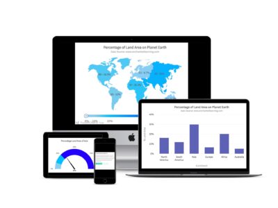
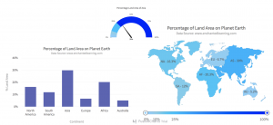
Below are four simple steps that you need to follow to build a Svelte app with a chart, gauge, and map. We’ll display the percentage of land area for each continent, taking the data from enchantedlearning.com. As an example, the chart, gauge, and map appear as seen below. They are displayed one after the other within the rendered app.
Prerequisites
Your development environment needs the latest npm package manager and node.js 10.9.0 or later. Once you have that setup, you are ready to build your Svelte project integrated with FusionCharts.
Step 1: Create a Svelte Project
Create a folder for your svelte project by typing the following at the command line:
npx degit sveltejs/template svelte-fusionchart-demoThis will create a project folder called svelte-fusionchart-demo with the following directory structure:
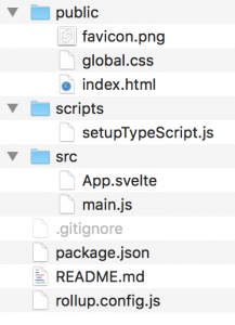
Your directory contains public, scripts, and src folders. To get moving, you only need to change the code in the App. svelte and main.js files located in the src folder.
To do this, type the following at the command line:
cd my-first-svelte-project
npm install
npm install svelte-fusioncharts fusioncharts --save
This installs the required node_modules into your project directory.
Step 2: Add Code to App.svelte
Now we’ll begin adding code for our app. If you don’t need one of the components in this example, you can omit it.
A. Add Imports
In the <script> section of the app.svelte file add the following imports.
// General imports for all fusion charts
import FusionCharts from "fusioncharts";
import FusionTheme from "fusioncharts/themes/fusioncharts.theme.fusion";

// Required for charts
import Charts from "fusioncharts/fusioncharts.charts";

// Required for gauges
import Widgets from "fusioncharts/fusioncharts.widgets";

// Required for maps
import Maps from "fusioncharts/fusioncharts.maps";
import World from "fusioncharts/maps/fusioncharts.world";

// Required for all types
import SvelteFC, { fcRoot } from "svelte-fusioncharts";

// FusionCharts should always be first parameter. You can omit
// what is not required
fcRoot(FusionCharts, Charts, Maps, World, Widgets, FusionTheme);
B. Add Data
Add the data of the percentage of the land area of continents from enchantedlearning.com as follows. This will go in the <script> tag.
// Add data of continents from www.enchantedlearning.com
// Needed for chart and map
const continentData = [
    {
      id: "NA",
      label: "North America",
      value: "16.3",
      showLabel: "1"

    },
    {
      id: "SA",
      label: "South America",
      value: "12.0",
      showLabel: "1"
    },
    {
      id: "AS",
      label: "Asia",
      value: "30.0",
      showLabel: "1"
    },
    {
      id: "EU",
      label: "Europe",
      value: "6.7",
      showLabel: "1"
    },
    {
      id: "AF",
      label: "Africa",
      value: "20.3",
      showLabel: "1"
    },
    {
      id: "AU",
      label: "Australia",
      value: "5.2",
      showLabel: "1"
    }
  ];
Also, add the const for captions and sub-captions.
// For captions and subcaptions
const caption = "Percentage of Land Area on Planet Earth";
const subcaption = "Data Source: www.enchantedlearning.com";
C. Add Color Ranges
In the code below, there are four color ranges. You can choose to add more for the slider and the gauge. This will also be placed in the <script> tag.
// Add color ranges for map and guage
const colorRange = {
    minvalue: "0",
    code: "#87CEFA",
    gradient: "1",
    color: [
      {
        minvalue: "0.0",
        maxvalue: "5.0",
        color: "#87CEFA"
      },
      {
        minvalue: "5.0",
        maxvalue: "10.0",
        color: "#87CEEB"
      },
      {
        minvalue: "10.0",
        maxvalue: "25.0",
        color: "#00BFFF"
      },
      {
        minvalue: "25.0",
        maxvalue: "100.0",
        color: "#0000FF"
      }
    ]
};
D. Add a Chart Configuration
Below is the JSON object required for rendering a chart (again in the <script> tag):
// Add chart configuration
const chartConfigs = {
    type: "column2d",
    height: 400,
    width: 600,
    dataFormat: "json",
    renderAt: "chart-container",
    dataSource: {
      chart: {
       caption: caption,
       subCaption: subcaption,
       xAxisName: "Continent",
       yAxisName: "% Land Area",
       numberSuffix: "%",
       theme: "fusion"
      },
      //Include chartData from STEP 2
      data: continentData
    }
  };
E. Add a Gauge Configuration
You can add the configuration for rendering a gauge that uses the color range that we described earlier. In the <script> tag, add the following:
// Add gauge configuration
const guageConfigs = {
    type: "angulargauge",
    width: "450",
    height: "200",
    dataFormat: "json",
    renderAt: "guage-container",
    dataSource: {
     chart: {
      caption: "Percentage Land Area of Asia",
      lowerLimit: "0",
      upperLimit: "100",
      showValue: "1",
      numberSuffix: "%",
      theme: "fusion"
    },
    // Chart Data
    colorRange: colorRange,
    dials: {dial: [{value: "30"} ]}
  }
};
F. Add a Map Configuration
The map configuration uses both the continent data and the color ranges we defined earlier. The <script> tag should also include this.
// Add map configuration
const mapConfigs = {
    type: "world", // Map type
    width: "600", // Width of the chart
    height: "400", // Height of the chart
    dataFormat: "json", // Data Type
    renderAt: "map-container",
    dataSource: {
      // Map Configuration
      chart: {
        caption: caption,
        subcaption: subcaption,
        numbersuffix: "%",
        includevalueinlabels: "1",
        labelsepchar: " - ",
        entityFillHoverColor: "#FFF9C4",
        theme: "fusion"
      },
      colorrange: colorRange,
      data: continentData
    }
  };
G. Render Everything
To render the chart, gauge, and map on the same page, add the following after the <script> tag.
<SvelteFC {...chartConfigs}/>
<SvelteFC {...guageConfigs}/>
<SvelteFC {...mapConfigs} />
Step 3: Add Code to main.js
Open the main.js file in the src folder and add the following to it:
import App from "./App.svelte";
var app = new App({
  target: document.body
});

export default app;
Step 4: Run the App
Now you are ready to run the app by typing the following at the console:
npm run devYou can use localhost in your browser to see the running app. The port for localhost shows on the console when you run the command.
Are There More Options for Data Visualization?
As you can see from this example, FusionCharts opens up a world of visualization options and presentation ideas that you can add to a Svelte project. Explore the Fusion Charts Gallery for more impressive and stunning interactive charts, gauges, and maps that you can customize and integrate into your project. You can also build beautiful and practical dashboards for exploratory data analysis or data visualization.
If you want to run the code in this tutorial, you can download it here.
Download FusionCharts now and accelerate to building successful apps!


