
Whether you are a small business or a large enterprise, data analytics and data visualizations are important elements to help you develop effective marketing strategies and encouraging sales growth. Elements such as charts, graphs, histograms, maps, and illustrations all make to interpreting complex data easier. These elements also help managers recognize information relevant to correctly scaling and improving their business processes and strategies.
If you are looking for a datavisualzation suite, FusionCharts can help. Because of its large library of robust and beautiful data visualization components, FusionCharts makes it simple for your developers to implement beautiful and responsive chart components, often in minutes.
Read on to find out how you can use FusionCharts and Svelte to design mesmerizing visualizations, create responsive dashboards, and, by the same token, quickly and easily author focused visual information pages.
The best part about the FusionCharts solution is that it makes its full source code available to developers. You only need to download it, plug it into your own projects, and start using it!
Table of Contents
How can I create a simple chart with Svelte components for FusionCharts?
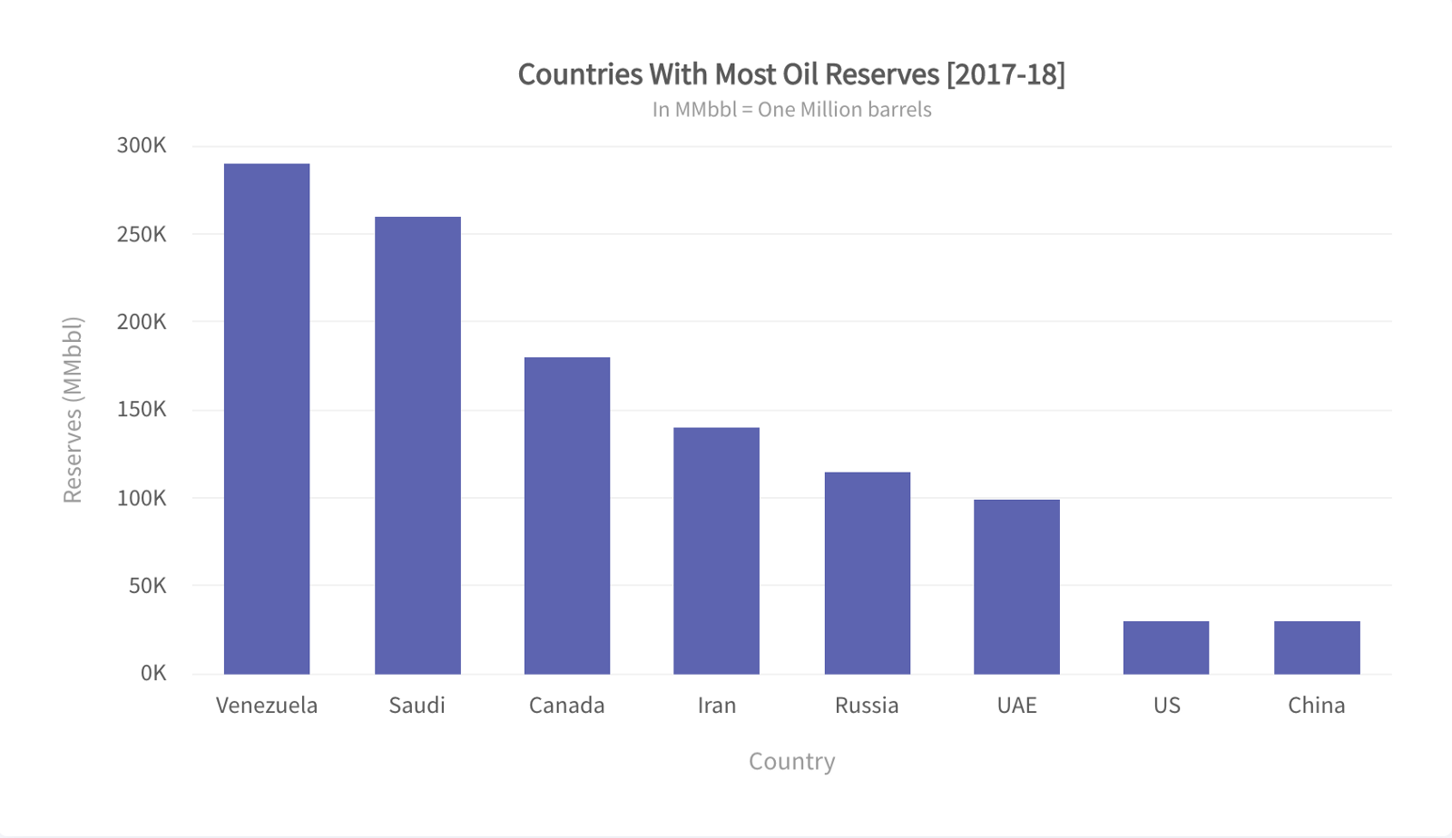
Simple bar charts are probably the most commonly used way to interpret large volumes of data. When it comes to comparing sets of data, they are plain, straightforward, and easy to read. Specifically, the Svelte component for FusionCharts allows you to create these simple and responsive bar charts with just a few lines of code.
<script>
  import FusionCharts from 'fusioncharts';
  import Charts from 'fusioncharts/fusioncharts.charts';
  import FusionTheme from 'fusioncharts/themes/fusioncharts.theme.fusion';
  import SvelteFC, {fcRoot} from 'svelte-fusioncharts';
  import dataSource from './data.js';
fcRoot(FusionCharts, Charts, FusionTheme);
const chartConfigs = {
    type: 'column2d',
    width: '600',
    height: '400',
    dataFormat: 'json',
    dataSource
  };
</script>
<div id="container">
  <SvelteFC {...chartConfigs} />
</div>
How can I create a simple time series with Svelte components for FusionCharts?
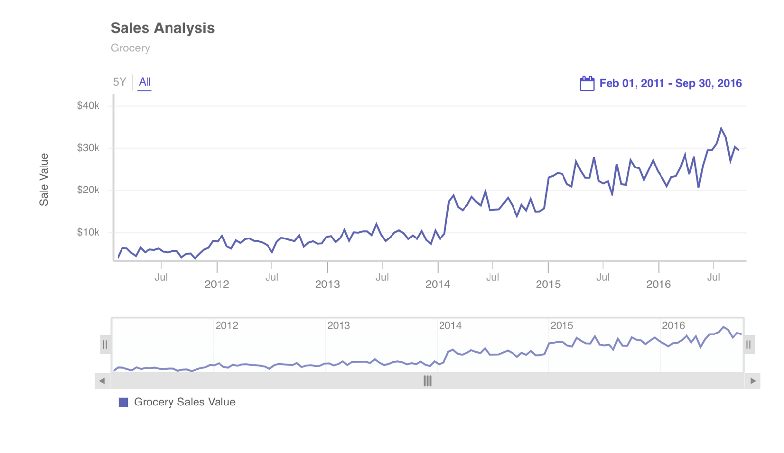
If you look at the most business flows, the majority of the data enterprises generate is time-dependent. For instance, an enterprise’s sales data can be easily mapped against a time frame to study sales trends over time.
As a result, a necessary part of business planning and analys is accurately representing these elements as data visualizations. To facilitate enhanced sales analysis and predictions, FusionCharts, in addition to the Svelte chart components, give you the tools you require to quickly build clear, accurate, and visually striking time series components. For instance, take a look at the example below:
<script>
  import FusionCharts from 'fusioncharts';
  import Timeseries from 'fusioncharts/fusioncharts.timeseries';
  import SvelteFC, { fcRoot } from 'svelte-fusioncharts';
fcRoot(FusionCharts, Timeseries);
let promise,
    jsonify = res => res.json(),
    dataFetch = fetch(
      'https://s3.eu-central-1.amazonaws.com/fusion.store/ft/data/line-chart-with-time-axis-data.json'
    ).then(jsonify),
    schemaFetch = fetch(
      'https://s3.eu-central-1.amazonaws.com/fusion.store/ft/schema/line-chart-with-time-axis-schema.json'
    ).then(jsonify);
promise = Promise.all([dataFetch, schemaFetch]);
const getChartConfig = ([data, schema]) => {
    const fusionDataStore = new FusionCharts.DataStore(),
      fusionTable = fusionDataStore.createDataTable(data, schema);
return {
      type: 'timeseries',
      width: '100%',
      height: 450,
      renderAt: 'chart-container',
      dataSource: {
        data: fusionTable,
        caption: {
          text: 'Sales Analysis'
        },
        subcaption: {
          text: 'Grocery'
        },
        yAxis: [
          {
            plot: {
              value: 'Grocery Sales Value',
              type: 'line'
            },
            format: {
              prefix: '$'
            },
            title: 'Sale Value'
          }
        ]
      }
    };
  };
</script>
<div id="chart-container" >
  {#await promise}
    <p>Fetching data and schema...</p>
  {:then value}
    <SvelteFC
      {...getChartConfig(value)}
    />
  {:catch error}
    <p>Something went wrong: {error.message}</p>
  {/await}
</div>
How can I create 3D pie data visualizations with Svelte components for FusionCharts?
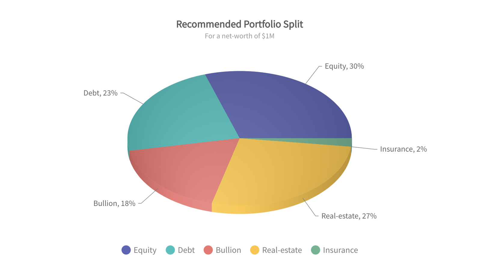
As you know, pie charts are often used in situations where you have a defined goal and you need to measure the contribution of various actors, events, and parameters towards a goal. For example, your enterprise has an annual growth revenue of $300 million and you need to identify how much each department contributed to that total. In this use case, a pie chart explains everything at a glance.
That is why 3D pie charts are a key component of the Svelte FusionCharts toolset. With FusionCharts, you can create effective and responsive pie chart data visualizations easily.
<script>
  import FusionCharts from 'fusioncharts';
  import Charts from 'fusioncharts/fusioncharts.charts';
  import FusionTheme from 'fusioncharts/themes/fusioncharts.theme.fusion';
  import SvelteFC, { fcRoot } from 'svelte-fusioncharts';
  import dataSource from './data.js';
fcRoot(FusionCharts, Charts, FusionTheme);
let chartConfig = {
    type: 'pie3d',
    width: '600',
    height: '400',
    renderAt: 'chart-container',
    dataSource
  };
</script>
<div id="chart-container" >
  <SvelteFC {...chartConfig} />
</div>
How can I build Gauge-based data visualizations with Svelte components for FusionCharts?
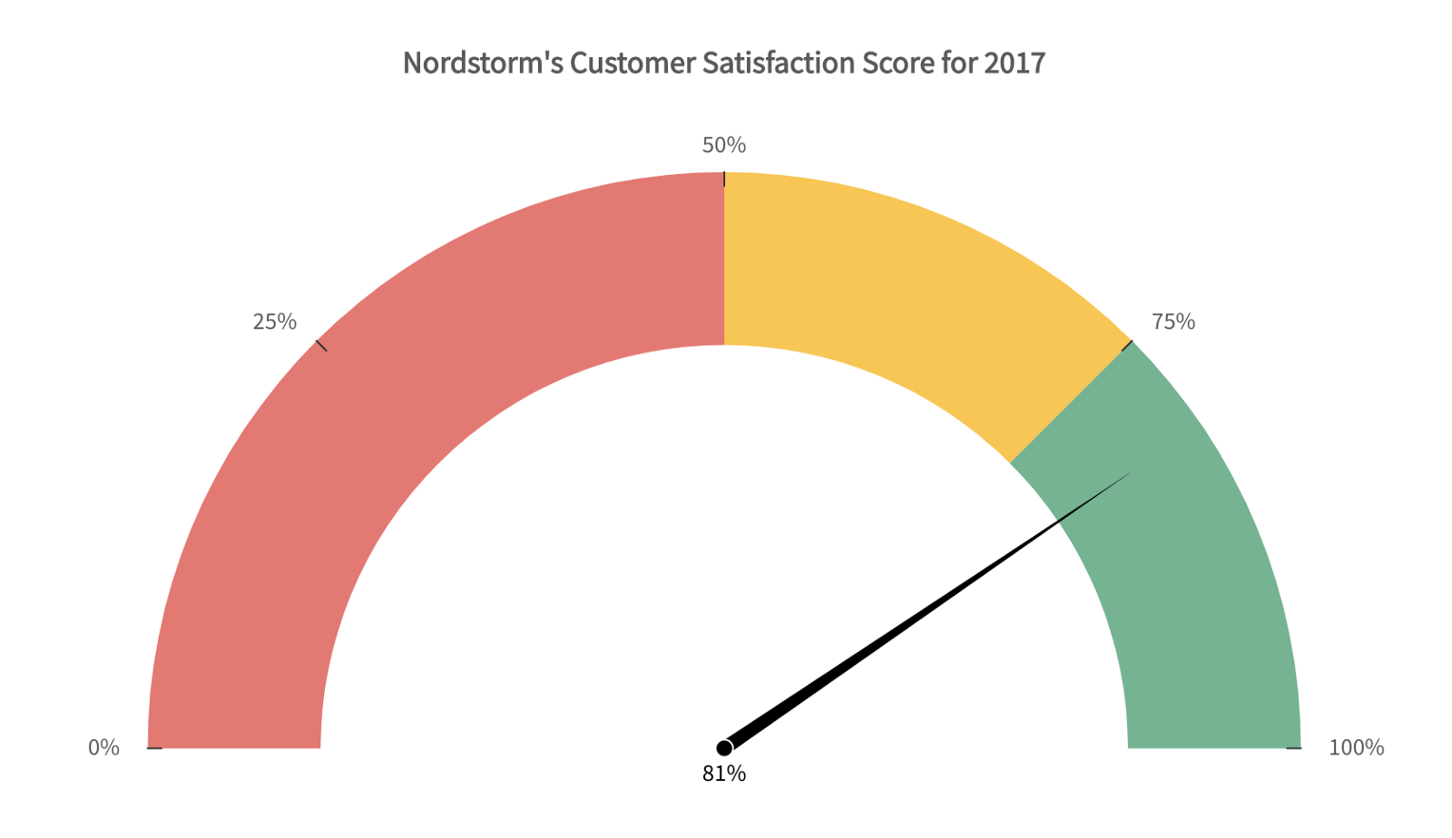
Gauge-based visualizations are a less common but equally useful data visualization component. They are especially relevant in scenarios that involve a live data feed. Gauge-based visualizations help you understand and make decisions based on real-time information. By way of an example, a common use-case of gauge-based visualization is in IoT applications where multiple data points require assessment as they occur.
Whatever niche your use case occupies, FusionCharts and Svelte components have a suitable gauge-based visualization for you.
<script>
  import FusionCharts from 'fusioncharts';
  import Widgets from 'fusioncharts/fusioncharts.widgets';
  import FusionTheme from 'fusioncharts/themes/fusioncharts.theme.fusion';
  import SvelteFC, { fcRoot } from 'svelte-fusioncharts';
  import dataSource from './data.js';
fcRoot(FusionCharts, Widgets, FusionTheme);
let dataSource,
    chartConfig = {
      type: 'angulargauge',
      width: '600',
      height: '400',
      renderAt: 'chart-container',
      dataSource
    };
</script>
<div id="chart-container" >
  <SvelteFC {...chartConfig} />
</div>
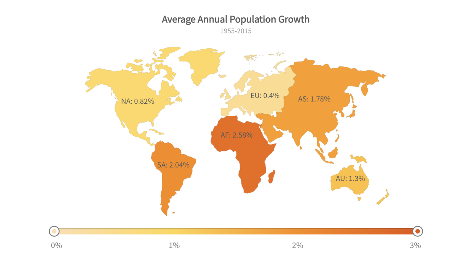
What is an easy way to show data trends across multiple regions?
For growing businesses, it is as important to understand where your sales are coming from as it to know how much you are actually selling. This is especially true of businesses that are international or multi-regional. For this reason, you need a regional visualization metric for monitoring sales and growth across regions. FusionCharts Svelte components provide a beautiful and ready-to-use global map for exactly this purpose.
<script>
  import FusionCharts from 'fusioncharts';
  import Maps from 'fusioncharts/fusioncharts.maps';
  import World from 'fusioncharts/maps/fusioncharts.world';
  import FusionTheme from 'fusioncharts/themes/fusioncharts.theme.fusion';
  import SvelteFC, { fcRoot } from 'svelte-fusioncharts';
  import dataSource from './data.js';
fcRoot(FusionCharts, Maps, World, FusionTheme);
let chartConfig = {
    type: 'world',
    renderAt: 'chart-container',
    width: '600',
    height: '400',
    dataSource
  };
</script>
<div id="chart-container" >
  <SvelteFC {...chartConfig} />
</div>
Source Code for FusionCharts + Svelte Components and Demo
As you can see from these use cases, FusionCharts and Svelte make it extremely simple to design and develop charts and other data visualization components on multiple levels. In addition, FusionCharts accepts a wide variety of bindings out of the box. It also supports Javascript, Angular, React, jQuery, Vue.js, Ember, React Native, AngularJS, Svelte, ASP.NET, PHP, Java, Ruby on Rails, and Django.
Let us know in the comment section below how you use FusionCharts Svelte components to create amazing visuals in your project.
Download FusionCharts and get started today!


