
As web applications become increasingly data-intensive, it stands to reason that the amount of data they generate increases. In addition to that, analyzing the increased data load data requires a more excellent performance from your analysis tools. There is little room for sluggish or underperforming charts. That is why you need a high-performance chart library that will turbocharge your web applications. The solution is simple – with FusionCharts, you can easily add super-fast and responsive charts to your JavaScript apps. In this post, you will find all the details or check out our financial dashboard.
Table of Contents
How can I Implement Finance Charts into My JavaScript Web Application Using FusionCharts?
FusionCharts contains over 100 charts that you can quickly implement into your web app. Let’s take a look at three of our most helpful and popular finance charts to get you started.

How Can I Implement a Sparkline Chart in My React App?
Sparkline helps you quickly and efficiently display important KPIs on your executive dashboard. At first glance, it looks pretty similar to a line chart. How it differs is that it is presented in a smaller graphic format and includes inline text. Here is an example:

To create this chart, follow these steps:
1. First, you have to create a constant, called dataSource. It will have different fields for the chart, including caption and theme. Also, it will contain the categories and dataset. You can find everything in the source code.
2. Next, you have to render the Sparkline chart using this code:
FusionCharts.ready(function() {

  var myChart = new FusionCharts({

    type: "marimekko",

    renderAt: "chart-container",

    width: "100%",

    height: "100%",

    dataFormat: "json",

    dataSource

  }).render();

});
Source Code
You can view the source code right here.
How Can I Implement a Candlestick Chart in My React App?
Candlestick charts help you visualize the movement of current and future asset prices. The charts display an asset’s open, close, high, and low price information via a boxed representation. Here is an example:
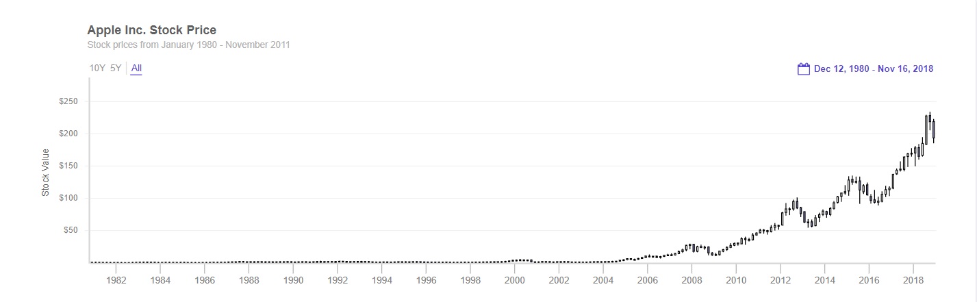
To create the Candlestick chart shown above, follow these steps:
1. You have to load data by creating a Promise.all() method.
Promise.all([

  loadData(

    "https://s3.eu-central-1.amazonaws.com/fusion.store/ft/data/candlestick-chart-data.json"

  ),

  loadData(

    "https://s3.eu-central-1.amazonaws.com/fusion.store/ft/schema/candlestick-chart-schema.json"

  )

])
2. Then you have to pass the data to the .then handler. You also have to create two constants, called datastore and dataSource.
.then(function(res) {

  const data = res[0];

  const schema = res[1];


  const dataStore = new FusionCharts.DataStore();

  const dataSource = {

    chart: {},

    caption: {

      text: "Apple Inc. Stock Price"

    },
3. Next, you have to define the subcaption and y-axis values:
subcaption: {

      text: "Stock prices from January 1980 - November 2011"

    },

    yaxis: [

      {

        plot: {

          value: {

            open: "Open",

            high: "High",

            low: "Low",

            close: "Close"

          },

          type: "candlestick"

        },

        format: {

          prefix: "$"

        },

        title: "Stock Value"

      }

    ]

  };
4. After that, create a new object called dataSource.data.
dataSource.data = dataStore.createDataTable(data, schema);5. Now, you can render the Candlestick chart:
new FusionCharts({

    type: "timeseries",

    renderAt: "chart-container",

    width: "100%",

    height: "500",

    dataSource: dataSource

  }).render();

});
Source Code
You can find the source code here.
How Can I Implement Box and Whisker Charts in My React App?
Box and whisker charts conveniently display medians, quartiles, and deviations of large data sets. Here is an example that visualizes employee distribution across different companies in ascending order by median age:
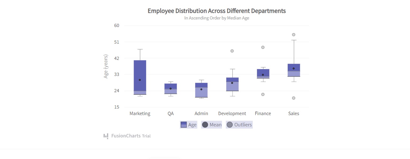
To create this chart, you have to follow these steps:
1. Create a constant, called dataSource, which will have all the required fields for the chart. It also will have the category and dataset. Check the source code for detailed information.
2. Use this code to render the chart:
FusionCharts.ready(function() {

  var myChart = new FusionCharts({

    type: "boxandwhisker2d",

    renderAt: "chart-container",

    width: "100%",

    height: "100%",

    dataFormat: "json",

    dataSource

  }).render();

});
Source Code
You can view the source code here.
Can FusionCharts Help You Turbocharge Your JavaScript Apps?
FusionCharts is a high-performance JavaScript charting library. It performs very well and helps you visualize your data down to the millisecond. With that level of responsiveness, it can help you turbocharge your financial web applications.