
Companies collect lots of different types of data to improve their products/services, find solutions to problems, make informed decisions, and more. However, to make sense of this raw data, it’s essential to visualize it. This is where you need an efficient graph maker.
A graph maker is essentially a data visualization tool that helps you plot raw data points on different charts and graphs. This helps you understand what your data actually means so that you can make critical strategic decisions. Whether you want to plot a few data points or you’re looking to visualize millions of numbers, you can effectively render any graph or chart with a good graph maker.
While there are many graph makers in the market, not every data visualization tool/library is efficient enough to meet all your expectations. For example, some graph makers only come with a limited number of charts and graphs, can’t handle large data points, and are difficult to use. However, there are also powerful data visualization libraries/graph makers like FusionCharts that offer all the features you need.
In this article, we’ll discuss some of the key points that you should keep in mind while choosing a graph maker in order to understand whether it meets your requirements. We’ll also show you why FusionCharts is the best tool for your next project.
Table of Contents
Which Charts And Graphs Does Your Graph Maker Support?
Companies collect different types of data, and they need different types of graphs and charts to visualize that data. For example, if you want to compare numeric values like profits and sales, column charts are the best option. When you want to understand the relation between two variables, however, a scatter graph is the right choice. Naturally, users want a graph maker that offers all the different types of charts and graphs, but not every graph maker offers this. With FusionCharts, however, you can create a wide range of charts and graphs (100+). FusionCharts also comes with more than 2000 choropleth maps (covering countries and cities) to help you make insightful reports.
Some of the most commonly used graphs and charts offered by FusionCharts include:
Line and Area Charts
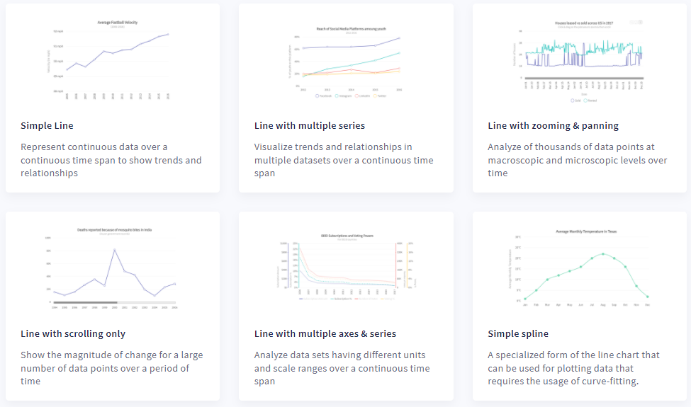
Line charts are great for depicting continuous data over time. Their use cases include representing fluctuations in hourly temperature, daily earnings, and changing foreign currency rates. Area charts, on the other hand, are useful for understanding trends and performances over time.
Pie and Donut Charts
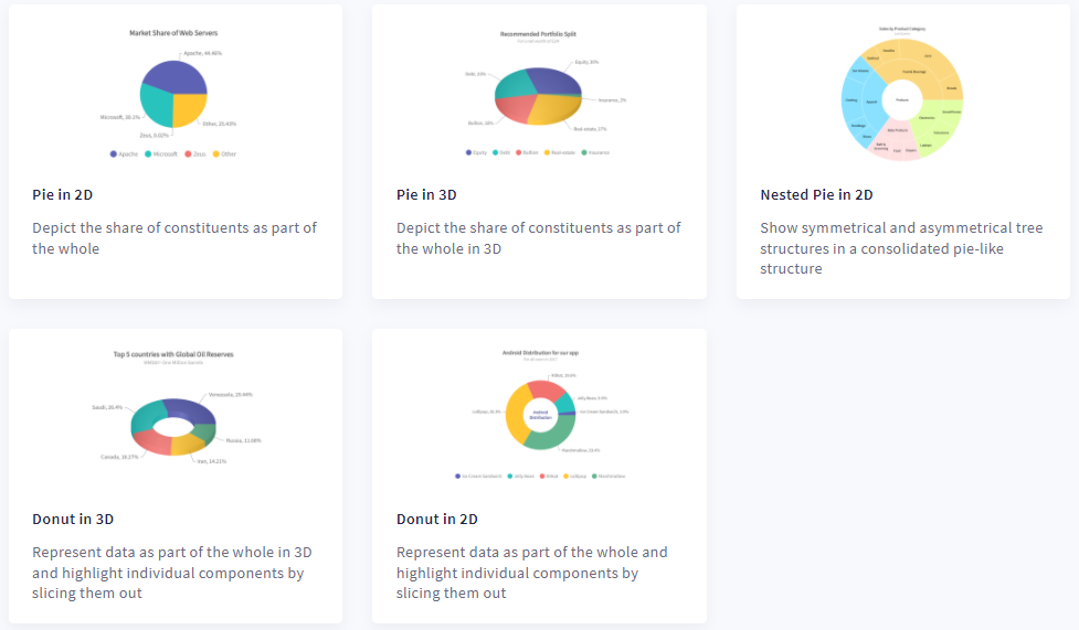
A pie chart is helpful when you want to show percentages of a whole. A Donut chart is similar to a pie chart, but it has a blank space at the center for displaying key information related to the data.
Column and Bar Charts
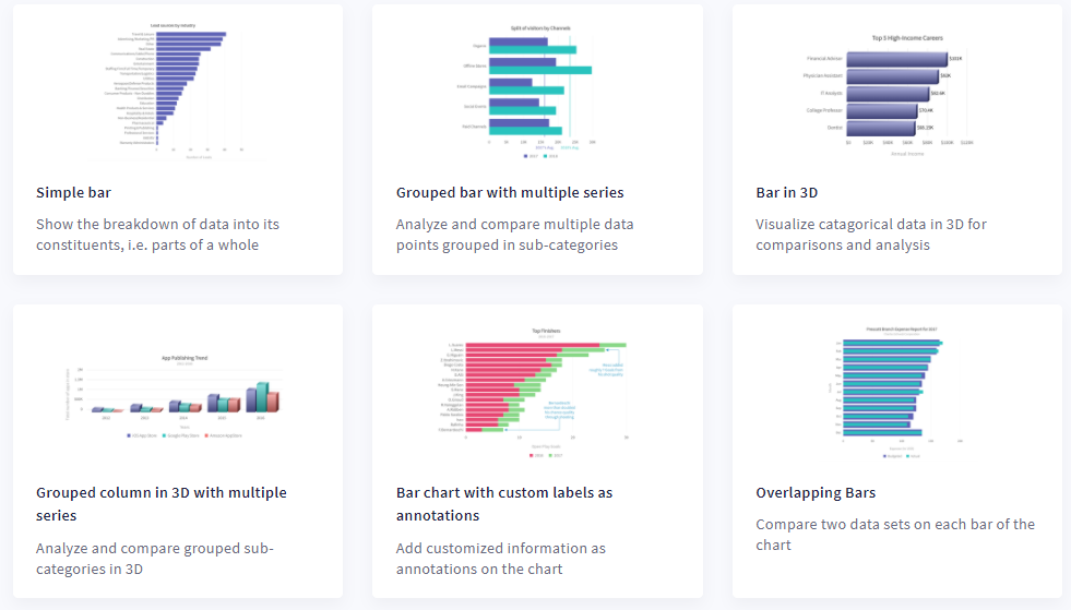
Next, column charts are useful for comparing numeric values/data over time. Bar charts consist of horizontal bars of equal widths, and they are best for representing quantitative information.
Domain-Specific Charts
FusionCharts also supports domain-specific charts like Heatmaps, Marimekko Charts, Gantt Charts, Treemaps, Gauges, Waterfall Charts, and Spider Charts.
Which Dashboards Can I Build With A Graph Maker?
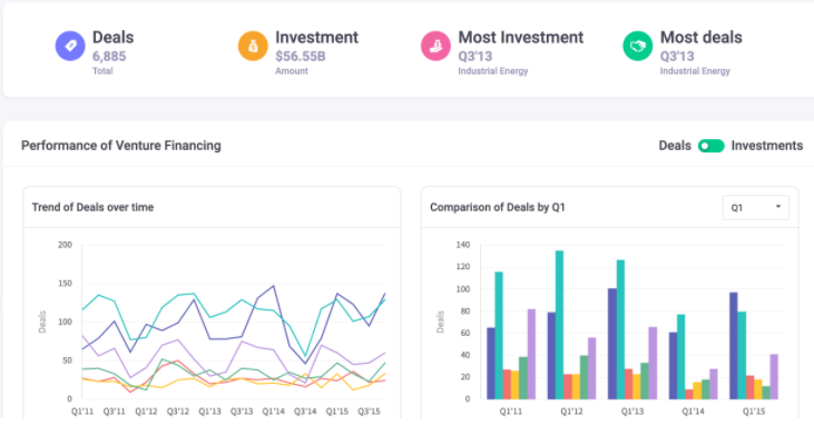
Business dashboards allow businesses to track different metrics and KPIs, like conversion rates and annual sales. They help users analyze trends and make key strategic decisions. Dashboards usually consist of multiple data visualizations, each representing different metrics. Businesses need different types of dashboards for different use cases. For example, a wealth management dashboard helps you interpret your financial status, while a sales management dashboard allows you to analyze important sales stats.
Dashboard creation can be a complex process. If you’re using FusionCharts, however, building interactive dashboards is significantly easier. FusionCharts comes with a wide range of pre-built dashboards. These include a wealth management dashboard, sales management dashboard, SaaS dashboard, investment portfolio dashboard, and more. FusionCharts also offers a collaboration dashboard that lets multiple viewers/users add comments on the visualizations without leaving the dashboard.
Does Your Graph Maker Allow You To Export Dashboards?
While many graph makers aren’t capable of exporting full dashboards, FusionCharts offers this feature through FusionExport. With FusionExport, you can easily export full live dashboards in different formats, such as PDF and image. You can also quickly add new elements such as colors, logos, and tables to your exported dashboards. You can also generate your dashboards automatically on the server in an email-friendly format or send a live snapshot of your dashboard straight to a user’s inbox.
Does Your Graph Maker Support Time-Series Visualizations?
A time-series graph or chart displays a series of data points at successive time intervals. These graphs are great for visualizing trends in numerical values over a specific period. While many graph makers don’t support time-series visualizations, FusionCharts lets you create high-performance time-series charts and graphs quickly and easily using FusionTime.
From simple time-series charts and stock charts to millions of data points in a graph or chart or complex multivariate analysis, you can create any type of chart with FusionTime. The best part is that you can plot a wide range of chart and graph types. In addition, your charts will work seamlessly, without any additional effort, on any device, be it a desktop, tablet, or smartphone. Finally, with FusionCharts, you get interactive features, like date range selectors, interactive legends, tooltips, a time navigator, and much more.
Does Your Graph Maker Allow You To Tell Data Stories?
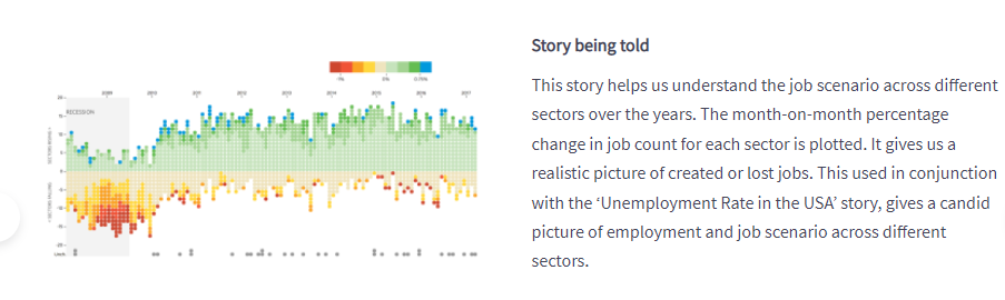
Data narratives and stories are a great way to make your data memorable. They also make it easy to summarize data. Not every graph maker, however, allows you to communicate your narratives. With FusionCharts products, you can effectively tell compelling stories using linked visualizations. This helps engage users and compels them to dig deeper into your data.
Does Your Graph Maker Allow You To Customize Visualizations?
Customizing your visualizations with titles, labels, and legends makes them easy to understand and interpret. Unfortunately, most graph makers come with limited customization options. FusionCharts, on the other hand, offers a wide range of customization options to make your visualizations more meaningful. These include labels, titles, axis labels, annotation, legends, trend lines to highlight important landmarks within the data, and more.
Can You Create Interactive Graphs And Charts With A Graph Maker?
It depends on which graph maker you are using – most graph makers only produce image-based charts or static images of charts. However, FusionCharts supports a wide range of user interactions.
With FusionCharts, you can:
- Allow users to switch between values on a graph or chart
- Show and hide data series in column charts,
- Create drag-able charts
- Zoom in and out
- Drill down to endless levels and much more
Are Graph Makers Easy To Use?
While most graph makers are difficult to use and require a lot of time and effort, FusionCharts has almost no learning curve. FusionCharts doesn’t require any special coding skills, allowing you can create your first chart in less than 15 minutes. Finally, FusionCharts comes with a consistent API, extensive documentation, and lots of live examples.


