Every day, more than two billion people in more than 190 countries use products made by Unilever. With long-established brand names like Dove, Sunlight and Pond’s in its kitty, Unilever’s range of consumer products and brands is as diverse as its worldwide consumer base.
![]()
In 2010, the company set itself the target of doubling its revenues in a decade or less – without doubling its costs. According to Greg Swimer, Vice President for Business Intelligence at Unilever, information management was to play a crucial role in achieving this goal. To help its employees make better decisions, the company sought to embed data into its business processes and make effective use of data visualization and analytics.
Table of Contents
The Global Enterprise Data Warehouse
In Forrester’s European Business Technology Forum held in London in June 2013, Swimer spoke about what went inside building this information management system. They wanted to build an analytics powerhouse to give their 20,000 internal users insight to drive decision- making, unleashing the power of big data and injecting it into their business processes. The base of this powerhouse was a global enterprise data warehouse (EDW). Earlier data at Unilever existed in silos and it was difficult to combine the data. The EDW was to replace around 40 departmental data warehouses and data marts spread across 5,000 servers around the world. Moving to an EDW in one project required a careful balance of business priorities and technical requirements.

On top of the EDW, Unilever built two further layers. The first is a document repository to store standard company reports. The second layer was a global business intelligence suit supporting multiple applications including sales reporting, sales analytics, supply chain analytics and procurement analytics. This business intelligence layer used data visualization extensively to allow employees to find the answers to their questions as they arise.
How data visualization helps Unilever employees make better decisions?
Earlier complex mathematical modeling was involved to process data and find relevant patterns in them. With data visualization, people all around the company could become more analytically minded without needing expert statistical skills.
 Data visualization has enabled global managers at Unilever to drill down into the level of detail they need to for effective decision-making.
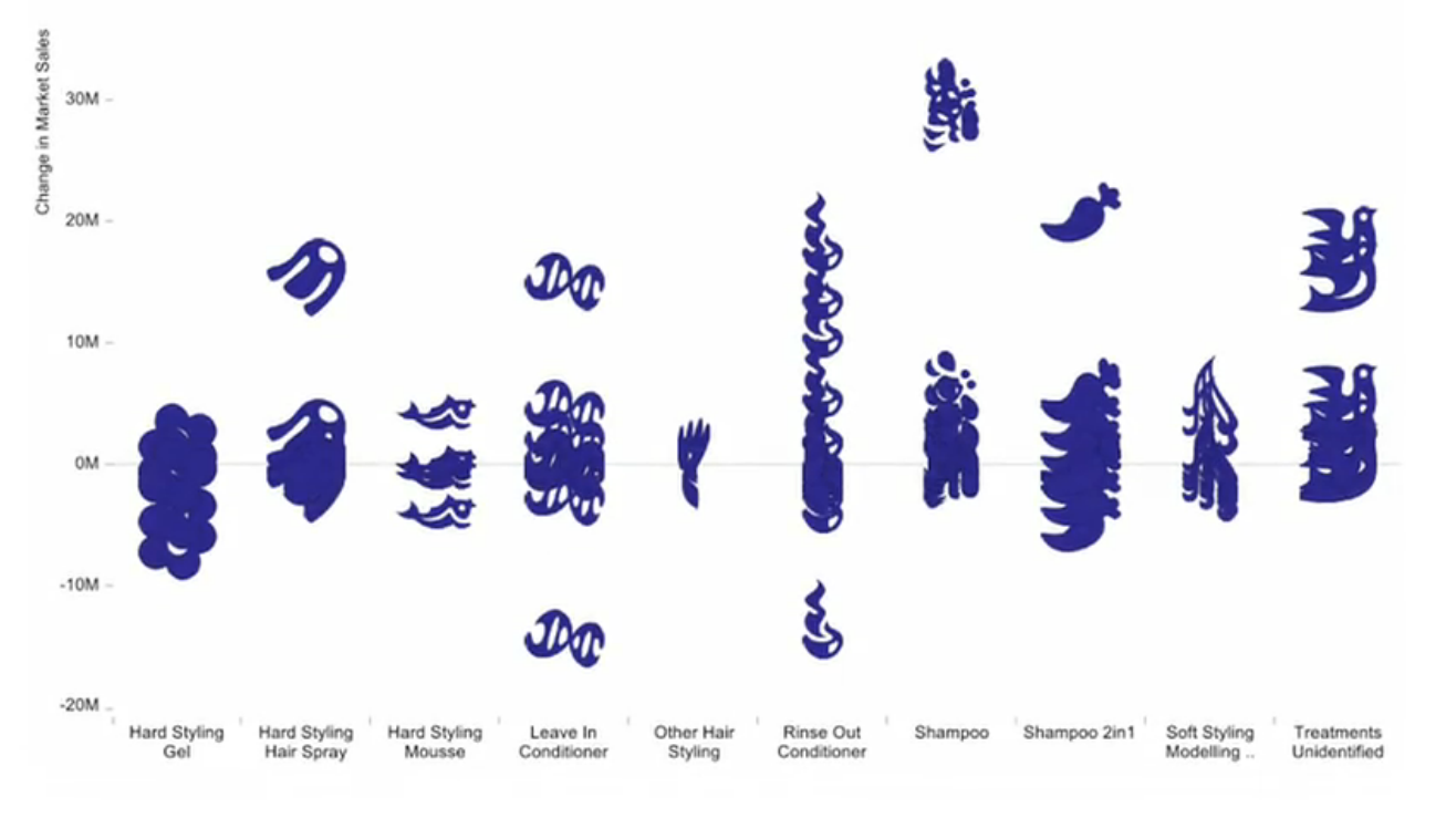
Managers use data visualizations to group products or competitors as they see fit, understand the momentum in the business in terms of its tiny constituent parts and get a better understanding into consumer behavior and buying trends. It has bridged the gap between the global perspective and the local perspective by helping connect the local, small, consumer-based trend to a global sort of momentum-defining trend for the business.
Data visualization has helped Unilever employees comprehend vast amounts of information that would have been otherwise unmanageable if it were in an Excel sheet.
The results so far
According to a ComputerWeekly case study, the project was launched in the third quarter of 2011 and has gone live in 45 operating units, with 6,000 commonly used reports. Eighty-five per cent of business users now say they have improved access to reporting and information. Meanwhile, the analytics side of the EDW is also claiming successes. Ten of the planned 17 capabilities are now live, and it is on track to finish on time during 2014. One capability, which harvests retail point of sale data, has lowered costs and also improved business performance. Their customer teams are coming back and saying that with the insight they have got through these tools they have been able to drive revenue with retailers.
The way forward
As Swimer puts it in this interview “Striving for better information is a journey in itself rather than a specific destination. Needs will continue to evolve, but at the same time, technology will allow us to continue to develop better ways to process data and drive insights; this continuous evolution and development has the potential to enhance our relationships with consumers and customers all over the world.
The frontiers of insight and simplification are expanding all the time. So what we look for is measurable success for each phase of the journey — markers that can help us quickly understand what works and what doesn’t and which allow us to react quickly. And of course, we also place a strong emphasis on feedback from our users — because in the end, creating solutions for them is at the heart of what we do.”
If you liked reading this, you may also like:
- How Nestlé uses Data Visualization for social media monitoring and engagement?
- How P&G uses Data Visualization to uncover new opportunities for growth?
- Towards Effective Decision-Making Through Data Visualization: Six World-Class Enterprises Show The Way [White paper]
References
- Data Tells Consumer Stories at Unilever
- Q&A With Greg Swimer, VP IT, Business Intelligence, Unilever
- Unilever enterprise data warehouse locked to business programmes
- Unilever uses SAP HANA to Enhance its Supply Chain Decision Making