
Business dashboards allow you to track the important metrics of your organization. They help you uncover key insights and make effective data-driven decisions. But how can you easily create a business dashboard? Is there a way to quickly visualize your data using beautiful charts? In this post, you will find all the details.
Table of Contents
What is a business dashboard?
A business dashboard is an information management tool. Dashboards track the KPIs, metrics, and key data points of your organization. They help you discover key insights you can use to grow your business.
Why do I need a business dashboard?
- Simplify data analysis to uncover key insights
- Save time and avoid data overload
- Track critical metrics efficiently for making better business decisions
- Make business goals clearly visible to keep everyone on the same page
- Compare your forecasts to actual results
How can I make a business dashboard easily?
You can easily create a business dashboard with FusionCharts. It is the most comprehensive JavaScript library for creating responsive and interactive charts. It is powerful and very easy to use.
How FusionCharts can help me to make business dashboards?
FusionCharts allows you to add different types of charts with just a few lines of code. As a result, you can build a business dashboard in no time. FusionCharts also offers comprehensive documentation and live code examples to further accelerate the process. Take a look at this example:
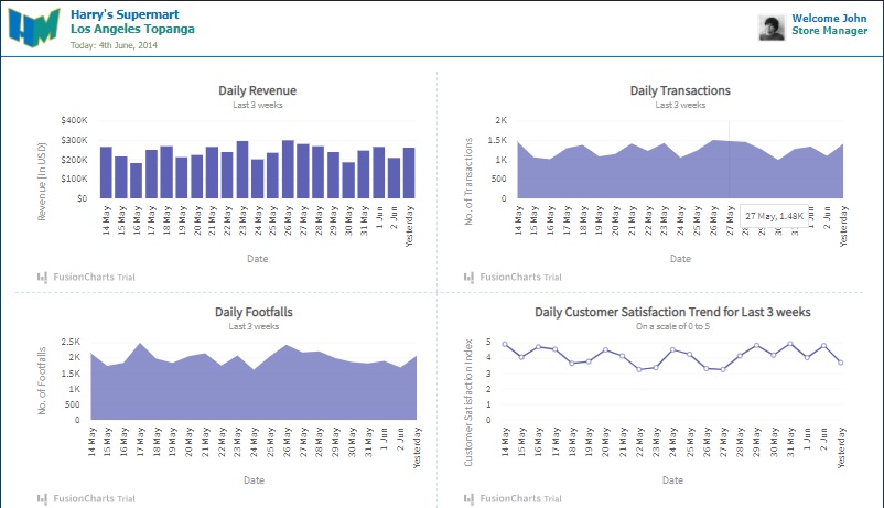
This is a JavaScript and FusionCharts business dashboard used by a large store, called Harry’s Supermart. It provides key insights into several important metrics, including Daily Revenue, Daily Transactions, Daily Footfalls, and the Daily Customer Satisfaction Trend. Using this data, the company can analyze its business and make data-driven decisions.
How can I make the business dashboard with JavaScript and FusionCharts?
With FusionCharts, you can create a business dashboard by following these steps.
Add Code to Your HTML File
Go to your HTML file and add these lines:
<div id='container'>

  <div id='header'>
    <div id='logoContainer'>
      <img src="https://static.fusioncharts.com/sampledata/images/Logo-HM-72x72.png" alt='Logo' />
      <div>
        <h2>Harry's Supermart</h2>
        <h4>Los Angeles Topanga</h4>
        <p>Today: 4th June, 2014</p>
      </div>
    </div>
    <div id='userDetail'>
      <img src="https://static.fusioncharts.com/sampledata/images/user_image.jpg" alt='Logo' />
      <div>
        <p>Welcome John</p>
        <p>Store Manager</p>
      </div>
    </div>
    <div></div>
  </div>

  <div class='border-bottom' id='content'>
    <div class='border-bottom'>
      <div class='chartCont border-right' id='sales-chart-container'>FusionCharts will load here.</div>
      <div class='chartCont' id='trans-chart-container'>FusionCharts will load here.</div>
    </div>
    <div>
      <div class='chartCont border-right' id='footfall-chart-container'>FusionCharts will load here.</div>
      <div class='chartCont' id='cs-chart-container'>FusionCharts will load here.</div>
    </div>
  </div>

  <div id='footer'>
    <p>This application was built using <a href="https://www.fusioncharts.com" target="_blank" title="FusionCharts - Data to delight... in minutes"><b>FusionCharts Suite XT</b></a>
    </p>
  </div>

</div>
Apply Styles Using Your CSS File
Now, you have to go to your CSS file and insert this code to apply styles to the elements of the HTML page.
body {
  margin: 0;
  padding: 0;
  width: 100%;
  background-color: #00406A;
  font-family: Tahoma, Helvetica, Arial, sans-serif;
}

h1,
h2,
h3,
h4,
h5 {
  margin: 0;
  padding: 0;
  font-weight: bold;
}

.chartCont {
  padding: 0px 12px;
}

.border-bottom {
  border-bottom: 1px dashed rgba(0, 117, 194, 0.2);
}

.border-right {
  border-right: 1px dashed rgba(0, 117, 194, 0.2);
}

#container {
  width: 1200px;
  margin: 0 auto;
  position: relative;
}

#container>div {
  width: 100%;
  background-color: #ffffff;
}


#logoContainer {
  float: left;
}

#logoContainer img {
  padding: 0 10px;
}

#logoContainer div {
  position: absolute;
  top: 8px;
  left: 95px;
}

#logoContainer div h2 {
  color: #0075c2;
}

#logoContainer div h4 {
  color: #0e948c;
}

#logoContainer div p {
  color: #719146;
  font-size: 12px;
  padding: 5px 0;
}

#userDetail {
  float: right;
}

#userDetail img {
  position: absolute;
  top: 16px;
  right: 130px;
}

#userDetail div {
  position: absolute;
  top: 15px;
  right: 20px;
  font-size: 14px;
  font-weight: bold;
  color: #0075c2;
}

#userDetail div p {
  margin: 0;
}

#userDetail div p:nth-child(2) {
  color: #0e948c;
}

#header div:nth-child(3) {
  clear: both;
  border-bottom: 1px solid #0075c2;
}

#content div {
  display: inline-block;
}

#content>div {
  margin: 0px 20px;
}

#content>div:nth-child(1)>div {
  margin: 20px 0 0;
}

#content>div:nth-child(2)>div {
  margin: 0 0 20px;
}

#footer p {
  margin: 0;
  font-size: 9pt;
  color: black;
  padding: 5px 0;
  text-align: center;
}
Utilize FusionCharts on Your JavaScript File
Now, you have to go to your JavaScript file and add the FusionCharts code. The process is very simple. Simply follow these steps:
1. First, you have to create FusionCharts.ready() function.
FusionCharts.ready(function() {
  var chartWidth = '550',
    chartHeight = '300',
    dataType = 'json';
2. Then you have to make the Daily Revenue chart. Create a variable, called salesRevChart. Then insert these lines:
var salesRevChart = new FusionCharts({
    type: 'column2d',
    renderAt: 'sales-chart-container',
    width: chartWidth,
    height: chartHeight,
    dataFormat: dataType,
    dataSource: {
      "chart": {
        "caption": "Daily Revenue",
        "subcaption": "Last 3 weeks",
        "xaxisname": "Date",
        "yaxisname": "Revenue (In USD)",
        "numberprefix": "$",
        "showvalues": "0",
        "theme": "fusion"
      },
      "data": [{
          "label": "14 May",
          "value": "267111"
        },
        {
          "label": "15 May",
          "value": "217207"
        },
        {
          "label": "16 May",
          "value": "185836"
        },
        {
          "label": "17 May",
          "value": "251074"
        },
        {
          "label": "18 May",
          "value": "273374"
        },
        {
          "label": "19 May",
          "value": "215724"
        },

        {
          "label": "20 May",
          "value": "227219"
        },
        {
          "label": "21 May",
          "value": "268160"
        },
        {
          "label": "22 May",
          "value": "239446"
        },
        {
          "label": "23 May",
          "value": "297084"
        },
        {
          "label": "24 May",
          "value": '204399'
        },
        {
          "label": "25 May",
          "value": "236195"
        },
        {
          "label": "26 May",
          "value": "302120"
        },
        {
          "label": "27 May",
          "value": "282909"
        },
        {
          "label": "28 May",
          "value": "272096"
        },
        {
          "label": "29 May",
          "value": "241639"
        },
        {
          "label": "30 May",
          "value": "189526"
        },
        {
          "label": "31 May",
          "value": "248034"
        },
        {
          "label": "1 Jun",
          "value": "266247"
        },
        {
          "label": "2 Jun",
          "value": "212719"
        },
        {
          "label": "Yesterday",
          "value": "264416"
        }
      ]
    }
  }).render();
3. To create the Daily Transactions chart, you have to add this code:
  var dailyTransChart = new FusionCharts({
    type: 'area2d',
    renderAt: 'trans-chart-container',
    width: chartWidth,
    height: chartHeight,
    dataFormat: dataType,
    dataSource: {
      "chart": {
        "caption": "Daily Transactions",
        "subcaption": "Last 3 weeks",
        "xaxisname": "Date",
        "yaxisname": "No. of Transactions",
        "showvalues": "0",
        "theme": "fusion"
      },
      "data": [{
          "label": "14 May",
          "value": "1464"
        },
        {
          "label": "15 May",
          "value": "1062"
        },
        {
          "label": "16 May",
          "value": "1014"
        },
        {
          "label": "17 May",
          "value": "1294"
        },
        {
          "label": "18 May",
          "value": "1382"
        },
        {
          "label": "19 May",
          "value": "1085"
        },
        {
          "label": "20 May",
          "value": "1150"
        },
        {
          "label": "21 May",
          "value": "1420"
        },
        {
          "label": "22 May",
          "value": "1228"
        },
        {
          "label": "23 May",
          "value": "1435"
        },
        {
          "label": "24 May",
          "value": "1051"
        },
        {
          "label": "25 May",
          "value": "1231"
        },
        {
          "label": "26 May",
          "value": "1509"
        },
        {
          "label": "27 May",
          "value": "1480"
        },
        {
          "label": "28 May",
          "value": "1461"
        },
        {
          "label": "29 May",
          "value": "1258"
        },
        {
          "label": "30 May",
          "value": "991"
        },
        {
          "label": "31 May",
          "value": "1275"
        },
        {
          "label": "1 Jun",
          "value": "1336"
        },
        {
          "label": "2 Jun",
          "value": "1097"
        },
        {
          "label": "Yesterday",
          "value": "1411"
        }
      ]
    }
  }).render();
4. Next, you have to create the Daily Footfalls chart. Create the dailyFootfallChart variable and insert these lines:
  var dailyFootfallChart = new FusionCharts({
    type: 'area2d',
    renderAt: 'footfall-chart-container',
    width: chartWidth,
    height: chartHeight,
    dataFormat: dataType,
    dataSource: {
      "chart": {
        "caption": "Daily Footfalls",
        "subcaption": "Last 3 weeks",
        "xaxisname": "Date",
        "yaxisname": "No. of Footfalls",
        "showvalues": "0",
        "theme": "fusion"
      },
      "data": [{
          "label": "14 May",
          "value": "2154"
        },
        {
          "label": "15 May",
          "value": "1742"
        },
        {
          "label": "16 May",
          "value": "1845"
        },
        {
          "label": "17 May",
          "value": "2490"
        },
        {
          "label": "18 May",
          "value": "1975"
        },
        {
          "label": "19 May",
          "value": "1840"
        },
        {
          "label": "20 May",
          "value": "2054"
        },
        {
          "label": "21 May",
          "value": "2153"
        },
        {
          "label": "22 May",
          "value": "1755"
        },
        {
          "label": "23 May",
          "value": "2080"
        },
        {
          "label": "24 May",
          "value": "1617"
        },
        {
          "label": "25 May",
          "value": "2053"
        },
        {
          "label": "26 May",
          "value": "2435"
        },
        {
          "label": "27 May",
          "value": "2177"
        },
        {
          "label": "28 May",
          "value": "2214"
        },
        {
          "label": "29 May",
          "value": "1998"
        },
        {
          "label": "30 May",
          "value": "1871"
        },
        {
          "label": "31 May",
          "value": "1822"
        },
        {
          "label": "1 Jun",
          "value": "1909"
        },
        {
          "label": "2 Jun",
          "value": "1689"
        },
        {
          "label": "Yesterday",
          "value": "2076"
        }
      ]
    }
  }).render();
5. Finally, you have to build the chart for the Daily Customer Satisfaction Trend. Simply add this code:
  var dailyCSatChart = new FusionCharts({
    type: 'line',
    renderAt: 'cs-chart-container',
    width: chartWidth,
    height: chartHeight,
    dataFormat: dataType,
    dataSource: {
      "chart": {
        "caption": "Daily Customer Satisfaction Trend for Last 3 weeks",
        "subcaption": "On a scale of 0 to 5",
        "xaxisname": "Date",
        "yaxisname": "Customer Satisfaction Index",
        "yaxismaxvalue": "5",
        "showvalues": "0",
        "theme": "fusion"
      },
      "data": [{
          "label": "14 May",
          "value": "4.90"
        },
        {
          "label": "15 May",
          "value": "4.05"
        },
        {
          "label": "16 May",
          "value": "4.72"
        },
        {
          "label": "17 May",
          "value": "4.56"
        },
        {
          "label": "18 May",
          "value": "3.65"
        },
        {
          "label": "19 May",
          "value": "3.77"
        },
        {
          "label": "20 May",
          "value": "4.52"
        },
        {
          "label": "21 May",
          "value": "4.13"
        },
        {
          "label": "22 May",
          "value": "3.25"
        },
        {
          "label": "23 May",
          "value": "3.38"
        },
        {
          "label": "24 May",
          "value": "4.53"
        },
        {
          "label": "25 May",
          "value": "4.24"
        },
        {
          "label": "26 May",
          "value": "3.31"
        },
        {
          "label": "27 May",
          "value": "3.25"
        },
        {
          "label": "28 May",
          "value": "4.14"
        },
        {
          "label": "29 May",
          "value": "4.82"
        },
        {
          "label": "30 May",
          "value": "4.19"
        },
        {
          "label": "31 May",
          "value": "4.94"
        },
        {
          "label": "1 Jun",
          "value": "4.02"
        },
        {
          "label": "2 Jun",
          "value": "4.80"
        },
        {
          "label": "Yesterday",
          "value": "3.70"
        }
      ]
    }
  }).render();
})
Source Code:
You can find the source code right here [1].
That’s it! You have created a business dashboard with JavaScript and FusionCharts. As you can see, the process is quick and simple. There is no complexity.
Should I use FusionCharts for making business dashboards?
FusionCharts allows you to create beautiful charts. It’s very easy to use. You just need to write a few lines of code. Also, it offers comprehensive documentation, which explains everything in detail. Besides, FusionCharts offers live code examples for a wide range of dashboards, like business operation dashboards, venture capital dashboards, and sales management dashboards. They can save you a lot of time. So, you should definitely consider using FusionCharts for your charting needs. There are special licenses available for non-profit entities, schools, and universities.
[1] https://jsfiddle.net/fusioncharts/TumnU/