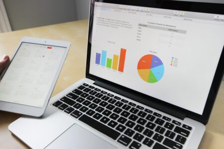
Data visualization is the process of representing data in a graphical or pictorial format. It allows us to better understand, analyze, and communicate complex data. There are various techniques, tools, and rules that can be used to visualize data effectively. A data visualization tool is a software or platform that helps create visualizations of data. There are several tools available that cater to different needs and requirements. To understand how to visualize data, it is essential to follow certain rules.
This article goes through techniques, tools, and rules useful for data visualization.
Table of Contents
What Are Data Visualization Tools?
Data visualization tools are software or platforms that help create visual representations of data. These tools allow users to transform raw data into meaningful and interactive visualizations that can be easily understood and analyzed. Some popular data visualization tools include:
Tableau: A cloud-based data visualization tool that allows users to create interactive dashboards, charts, and maps.
Google Charts: A free, web-based data visualization tool that provides a wide range of chart types such as line charts and customization options.
D3.js: An open-source data visualization library that allows users to create custom visualizations using JavaScript.
There are many other data visualization tools available that cater to different needs and requirements. The right tool for you will depend on your specific requirements and the type of data you want to visualize.
Data Visualization Techniques
Data visualization techniques are methods useful to represent data in a graphical or pictorial format. These techniques allow us to better understand, analyze, and communicate complex data. A line chart, scatterplot, bar chart, pie chart, network graph, and geographic map are some of the common data visualization techniques.
There are many other data visualization techniques available. The right technique for you will depend on the type of data you are working with and the message you want to convey.
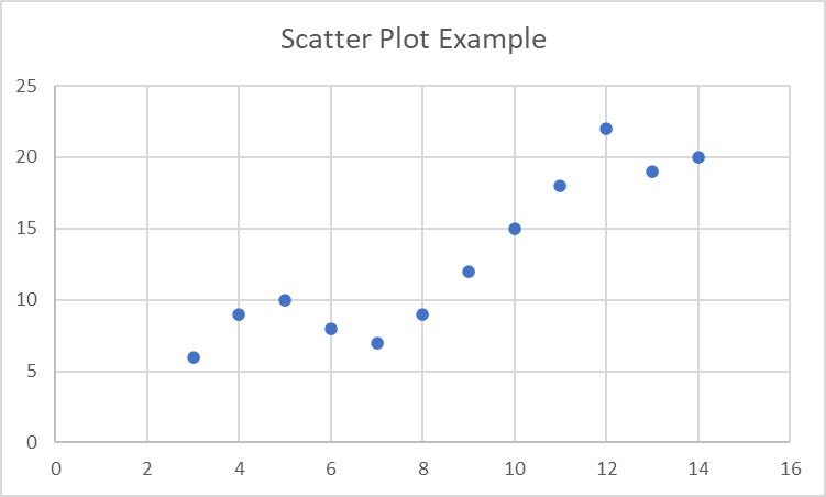
Scatterplots
A scatterplot is a type of data visualization that shows the relationship between two variables. It plots the data point on a graph, with the horizontal axis representing one variable and the vertical axis representing the other. Scatterplots are useful for showing patterns and trends in data, as well as for identifying outliers.
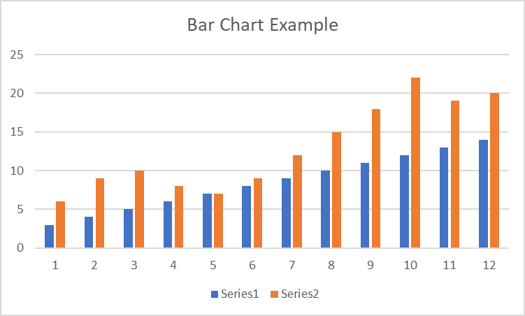
Bar Charts
A bar chart or column chart is a type of data visualization that will compare values of different categories or groups. It consists of a set of horizontal or vertical bars. The length of each bar represents the value of the corresponding category. Bar charts are useful for comparing the relative sizes of different categories or groups and can display data trends over time.
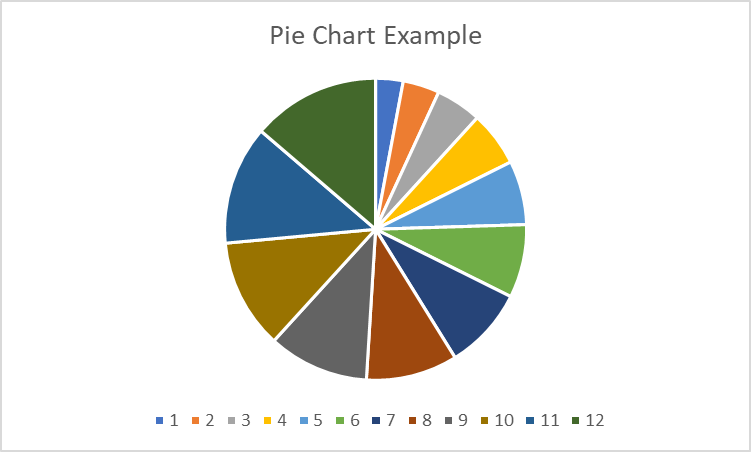
Pie Charts
A pie chart is a statistical graphic that divides into sectors to describe numerical proportions. In a pie chart, the arc length of each sector is proportional to the quantity it represents. Pie charts are useful for presenting data with proportions of different categories or groups and are often useful to compare the parts of a whole. You can often see them in fields such as business, finance, and social sciences to analyze data and make informed decisions with sales data.
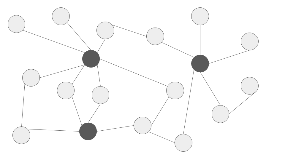
Network Graphs
Network graphs, also known as network diagrams or node-link diagrams, are data visualizations that show connections or relationships between nodes. Nodes represent entities, such as people or organizations, and links represent the relationships between them. Network graphs are commonly useful for visualizing data such as social networks, supply chains, and other systems with interconnected components. They are useful to show the flow of information or resources between different nodes and identify patterns and trends in data.
Geographical or Area Maps
Geographical or area maps are data visualizations that show the geographical distribution of data. Area maps are useful to represent data on a variety of scales, from global to local. Area maps are usually seen in geography, demography, and environmental science to analyze and understand spatial patterns and trends in data. They can be static or interactive and can be created using various data visualization tools.
Top Data Visualization Tools
When choosing a tool, it’s important to consider your objectives in terms of the visualizations you want to create as well as your level of technical expertise. This is because some programs require programming skills, while others are probably more suitable for non-technical users.
In this section, we’ll briefly go over a couple of the most popular data visualization tools.
FusionCharts
FusionCharts is the best tool for data visualization if you’re looking for one that makes it simple and effective data visualization. It is the most comprehensive JavaScript charting package, featuring more than 100 charts and 2000 maps. You may create JavaScript charts for your web and enterprise apps using server-side programming languages and the well-known Js framework.
YellowFin
Yellowfin is a business intelligence and data visualization tool that allows users to create interactive dashboards, data reports, and charts. They allow users to connect to various data sources, such as databases, spreadsheets, and cloud applications. It provides collaboration features. This includes the ability to share and comment on reports and dashboards. Furthermore, we can schedule automatic report distribution.
D3.js
D3.js (short for Data-Driven Documents) is an open-source data visualization library that allows users to create custom visualizations using JavaScript. It provides a wide range of features and functionalities. This includes support for a variety of chart types, data manipulation and transformation, and interactive visualizations. You can use D3.js to create complex, dynamic visualizations. It is commonly used in fields such as finance, media, and marketing. It is also often used in conjunction with other libraries, such as React and Angular, to build web applications.
Tableau
Tableau is a data visualization and business intelligence tool that allows users to create interactive dashboards, charts, and maps. It provides a range of features and functionalities, including data visualization, data discovery, and reporting. Tableau allows users to connect to various data sources. For example, databases, spreadsheets, and cloud applications. They also can visualize and analyze data using a variety of chart types. It also provides collaboration features, such as the ability to share and comment on dashboards and reports.
Plotly
Plotly is a data visualization and analytics platform that allows users to create a variety of static, animated, and interactive plots and charts. It provides a range of features and functionalities, including support for multiple programming languages, data manipulation and transformation, and real-time streaming. You can use Plotly to create a wide range of visualizations, including scientific, financial, and geographical plots. It is commonly used in fields such as data science, finance, and marketing.
Data Visualization Rules
Following are some useful data visualization rules that could come in handy:
Keep it Straightforward or simple
“Keep it straightforward or simple” (KISS) is a rule of thumb in data visualization that suggests that visualizations should be as simple and easy to understand as possible. The idea behind this rule is complex visualizations can be difficult to interpret and may distract from the main message of the data. By keeping visualizations simple and straightforward, you can effectively communicate the key points to visualize your data and avoid overwhelming your audience.
Add White Space
To follow the “add white space” rule, you should aim to use margins and padding appropriately to create a sense of balance and hierarchy in your visualizations. You should also consider using grid lines and data labels sparingly to avoid clutter. By adding white space, you can help your audience focus on the key points of your data and improve the overall aesthetic of your visualizations.
Use Deliberate Design Concepts
A rule of thumb in data visualization is to use deliberate design concepts in order to effectively communicate the key data points of the dataset. When you use deliberate design concepts, you create visualizations that are clear, concise, and visually appealing.
Focus On Three Elements
This rule suggests that visualizations should focus on a maximum of three elements to avoid overwhelming the audience. By limiting the number of elements in a visualization, you can help your audience focus on the most important aspects of the data and avoid clutter.
Integrate Data Sources
In data visualization, this suggests that visualizations should integrate data from multiple sources to provide a more complete and accurate picture of the data. By integrating data from multiple sources, you can create a more comprehensive and nuanced understanding of the data and draw more accurate conclusions.
Check out the Types Of Data Visualization And Their Best Practices to learn more about this.
Conclusion
In conclusion, the visualization of data is a crucial aspect of data analysis. This can help to effectively communicate findings and insights. There are various techniques, tools, and rules that can be followed to create clear and effective visualizations. It is important to choose the appropriate visualization technique and tool for the specific data and message being conveyed and to follow good design principles to create an effective and engaging visualization.
Explore FusionCharts Suite XT and download your free trial today.
FAQs
What are some common techniques for how to visualize data?
There are many different techniques for visualizing data, including bar graphs, line graphs, scatter plots, pie charts, and maps.
What tools are available for creating data visualizations?
There are a wide range of tools available for creating data visualizations, including spreadsheet software such as Excel, specialized visualization software such as FusionCharts.
What are some important rules to follow when visualizing data?
Some important rules to follow when visualizing data include choosing an appropriate visualization technique for the data and message being conveyed, using good design principles, and accurately and honestly representing the data.
Can data visualization be used for any type of data?
Data visualization can be used to represent and analyze almost any type of data, including quantitative, qualitative, and categorical data.


