Quick Answer
To integrate interactive Vue charts into a Vue 3 application, first create a Vue project with Vite, then install a Vue-compatible chart library such as FusionCharts. Next, import the required packages, prepare your data source, configure the chart type and options, and render the chart inside a Vue component. This approach lets you build responsive, interactive charts for dashboards, reports, analytics, and real-time applications while taking advantage of Vue 3’s modern component architecture and reactivity.
Interactive charts help users understand complex data faster by transforming numbers into clear, engaging visualizations. From business dashboards and analytics platforms to financial reports and real-time monitoring tools, Vue charts make it easier to identify trends, compare values, and make data-driven decisions.
In this step-by-step guide, you’ll learn how to integrate interactive charts into a Vue 3 application using FusionCharts. We’ll also compare popular Vue chart libraries, share best practices for building responsive data visualizations, and point you to useful resources for templates, examples, and documentation.
Table of Contents
Why Use Charts in Vue Applications?
Modern applications generate large amounts of data, but raw numbers alone are difficult to interpret. Integrating Vue charts transforms that data into interactive visualizations that help users identify trends, compare values, and make informed decisions. Whether you’re building a dashboard, analytics platform, or reporting tool, charts in Vue make information easier to understand and more engaging.
Vue 3’s reactive architecture makes it easy to build dynamic, responsive charts that update automatically as data changes. Combined with a powerful Vue chart library like FusionCharts, you can create interactive dashboards, business reports, analytics, and real-time monitoring applications with minimal effort.
Common use cases for charts with Vue include:
- Business dashboards and KPI tracking
- Analytics and reporting applications
- Financial data visualization
- Real-time monitoring dashboards
- Project management with Gantt charts
How Do You Integrate a Data Visualization Library into a Vue 3 Project?
Integrating Vue charts into a Vue 3 application is straightforward with the right charting library. The general process involves:
- Creating a Vue project
- Installing the required packages
- Preparing your data
- Configuring the chart
- Rendering the chart inside a Vue component
In this tutorial, we’ll use FusionCharts with Vite to build a responsive, interactive chart step by step. The same workflow can be applied to many other Vue chart libraries with minor changes to the installation and configuration.
Step 1: Create a Vue 3 Project with Vite
Before creating the project, make sure that Node.js and npm are installed on your computer. Then open a terminal and run the following command:
npm create vue@latest
This launches create-vue, the official Vue project scaffolding tool, and creates a Vite-powered Vue application.
When prompted, enter a project name such as:
vue-charts-demo
For this tutorial, you can select No for optional features such as TypeScript, JSX, Vue Router, Pinia, testing, ESLint, and Prettier. You can also choose the option to start with a blank Vue project when it is available.
Once the project has been created, move into its directory and install the dependencies:
cd vue-charts-demo
npm install
Start the development server to confirm that the application works:
npm run dev
Vite will display a local development URL in the terminal. Open it in your browser to view the Vue application.
Step 2: Install FusionCharts and the Vue Wrapper
Next, install the FusionCharts JavaScript library and its official Vue component:
npm install fusioncharts vue-fusioncharts
The fusioncharts package provides the charting library, while vue-fusioncharts supplies the Vue 3 component used to render FusionCharts inside your application. The official FusionCharts installation guide also lists both packages as the required dependencies for adding charts to a Vue project.
After installation, both packages will appear under dependencies in your project’s package.json file.
Step 3: Register FusionCharts in the Vue Application
Open the src/main.js file and replace its contents with the following code:
import { createApp } from 'vue';
import App from './App.vue';

import VueFusionCharts from 'vue-fusioncharts';
import FusionCharts from 'fusioncharts';
import Charts from 'fusioncharts/fusioncharts.charts';
import FusionTheme from 'fusioncharts/themes/fusioncharts.theme.fusion';

const app = createApp(App);

app.use(
  VueFusionCharts,
  FusionCharts,
  Charts,
  FusionTheme
);

app.mount('#app');
This code performs four important tasks:
VueFusionChartsprovides the Vue component wrapper.FusionChartsloads the core FusionCharts library.Chartsloads the standard chart types, including column, bar, line, area, and pie charts.FusionThemeloads the Fusion theme used to style the chart.
The app.use() method registers the FusionCharts plugin globally. As a result, you can use the <fusioncharts> component anywhere in the application without importing it separately into every Vue component. Global plugin registration with createApp() and app.use() is the Vue 3 setup documented by the official vue-fusioncharts repository.
Your Vue 3 project is now configured to render FusionCharts. In the next step, you will prepare the chart data and configuration that the component will use.
Step 4: Prepare the Chart Data
For this example, we will create a column chart showing the monthly revenue of an online store from January to June.
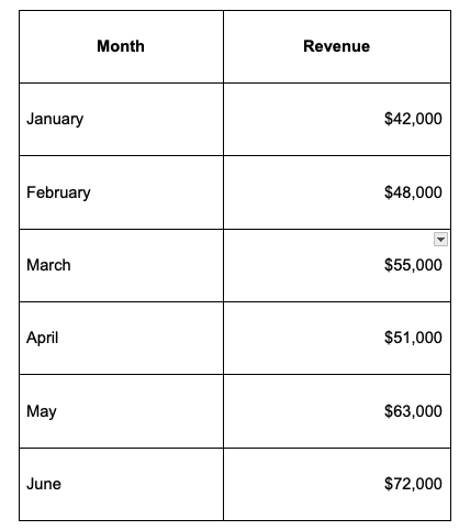
Open src/App.vue and add the chart configuration inside a <script setup> block:
<script setup>
const chartData = [
  { label: 'January', value: '42000' },
  { label: 'February', value: '48000' },
  { label: 'March', value: '55000' },
  { label: 'April', value: '51000' },
  { label: 'May', value: '63000' },
  { label: 'June', value: '72000' }
];

const dataSource = {
  chart: {
    caption: 'Monthly Online Store Revenue',
    subCaption: 'January to June 2026',
    xAxisName: 'Month',
    yAxisName: 'Revenue',
    numberPrefix: '$',
    theme: 'fusion',
    showValues: '1',
    usePlotGradientColor: '0'
  },
  data: chartData
};
</script>
The chartData array contains the labels and values displayed by the chart. The dataSource object contains both the chart configuration and the dataset.
Inside the chart object:
captiondefines the chart title.subCaptionadds supporting information below the title.xAxisNameandyAxisNamelabel the chart axes.numberPrefixdisplays a dollar sign before each value.themeapplies the Fusion theme.showValuesdisplays the revenue value above each column.
FusionCharts commonly accepts chart values as strings, so each revenue value is written inside quotation marks.
Step 5: Render Your First Vue Chart
Next, add a <template> block below the script in src/App.vue:
<template>
  <main class="chart-page">
    <h1>Vue Charts Demo</h1>

    <div class="chart-container">
      <fusioncharts
        type="column2d"
        width="100%"
        height="400"
        dataFormat="json"
        :dataSource="dataSource"
      />
    </div>
  </main>
</template>
The <fusioncharts> component renders the visualization using the following properties:
type="column2d"creates a two-dimensional column chart.width="100%"allows the chart to fill its parent container.height="400"sets the chart height to 400 pixels.dataFormat="json"tells FusionCharts that the data source uses JSON.- :
dataSource="dataSource"binds the chart to the configuration created in the script.
The colon before dataSource tells Vue to treat it as a JavaScript value instead of a plain text string.
At this point, the complete src/App.vue file should look like this:
<script setup>
const chartData = [
  { label: 'January', value: '42000' },
  { label: 'February', value: '48000' },
  { label: 'March', value: '55000' },
  { label: 'April', value: '51000' },
  { label: 'May', value: '63000' },
  { label: 'June', value: '72000' }
];

const dataSource = {
  chart: {
    caption: 'Monthly Online Store Revenue',
    subCaption: 'January to June 2026',
    xAxisName: 'Month',
    yAxisName: 'Revenue',
    numberPrefix: '$',
    theme: 'fusion',
    showValues: '1',
    usePlotGradientColor: '0'
  },
  data: chartData
};
</script>

<template>
  <main class="chart-page">
    <h1>Vue Charts Demo</h1>

    <div class="chart-container">
      <fusioncharts
        type="column2d"
        width="100%"
        height="400"
        dataFormat="json"
        :dataSource="dataSource"
      />
    </div>
  </main>
</template>
Because the FusionCharts plugin was registered globally in src/main.js, you do not need to import the <fusioncharts> component again inside App.vue.
Step 6: Make the Chart Responsive
Although the chart width is already set to 100%, its parent container also needs responsive styling. Add the following <style scoped> block to the bottom of src/App.vue:
<style scoped>
.chart-page {
  width: 100%;
  padding: 32px 20px;
  box-sizing: border-box;
}

.chart-page h1 {
  margin-bottom: 24px;
  text-align: center;
}

.chart-container {
  width: 100%;
  max-width: 1000px;
  margin: 0 auto;
}
</style>
The chart will now expand or shrink with the width of its container while remaining limited to a maximum width of 1,000 pixels on larger screens.
Using a percentage-based width is generally more flexible than setting a fixed width such as 700 pixels. It helps the visualization fit desktop, tablet, and mobile layouts without overflowing the page.
For more complex dashboards, you can also place Vue charts inside CSS Grid or Flexbox layouts and adjust the chart height with media queries when necessary.
Final Output
Save your changes and make sure the development server is running:
npm run dev
Open the local URL displayed by Vite in your browser. You should see an interactive column chart titled Monthly Online Store Revenue, with one column for each month from January to June.
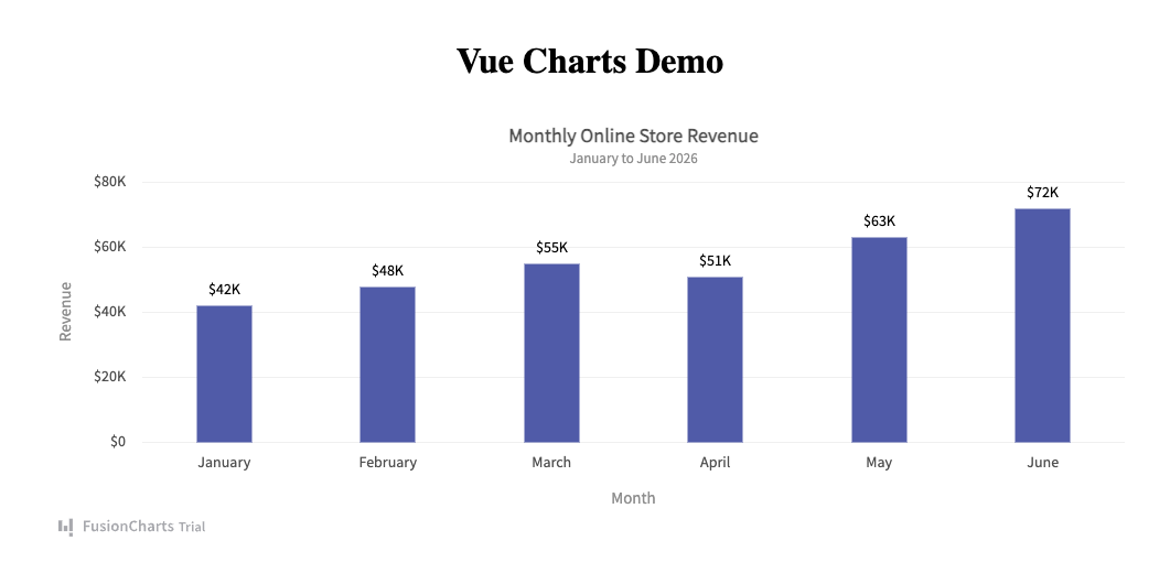
Users can hover over the columns to view revenue details. The chart will also resize horizontally when the browser window or its parent container becomes narrower.
You have now completed the main steps required to integrate interactive charts into a Vue 3 project:
- Created a Vue 3 application with Vite.
- Installed FusionCharts and its Vue wrapper.
- Registered the FusionCharts plugin.
- Prepared the chart data and configuration.
- Rendered the chart inside a Vue component.
- Added responsive styling.
You can reuse the same integration pattern to create other Vue charts by changing the chart type, data, and configuration properties. For example, replace column2d with line, bar2d, pie2d, or another chart type supported by FusionCharts.

Which Vue Chart Library Should You Use?
The best Vue chart library depends on the type of application you’re building. If you need interactive dashboards, enterprise-grade visualizations, and a wide range of chart types, FusionCharts is a strong choice. For lightweight projects, Chart.js offers a simple API, while Apache ECharts excels at handling large datasets. Highcharts is popular for enterprise applications, ApexCharts is well suited for modern dashboards, and D3.js provides maximum flexibility for building highly customized visualizations.
The table below compares some of the most popular libraries for creating Vue charts.
| Library | Vue 3 Support | Interactivity | Best For |
|---|---|---|---|
| FusionCharts | ✓ | Excellent | Dashboards, enterprise applications, business intelligence |
| Chart.js | ✓ | Good | Simple charts and lightweight projects |
| Apache ECharts | ✓ | Excellent | Large datasets and advanced visualizations |
| Highcharts | ✓ | Excellent | Enterprise reporting and commercial applications |
| ApexCharts | ✓ | Good | Dashboards and SaaS applications |
| D3.js | ✓ | Maximum | Highly customized data visualizations |
For a detailed feature-by-feature comparison, pricing information, licensing, and recommendations based on different use cases, see our complete guide to the best Vue chart libraries.
Where Can You Find Vue Chart Templates and Examples?
Whether you’re building your first chart or a production-ready dashboard, using ready-made examples can significantly speed up development. Most Vue chart libraries provide documentation, sample projects, and interactive demos that you can customize for your own application.
Some of the best places to find Vue chart templates and examples include:
- Official documentation – The best starting point for installation guides, API references, and framework-specific tutorials.
- GitHub repositories – Many chart libraries publish complete sample projects that demonstrate common use cases and recommended project structures.
- CodeSandbox – Explore interactive Vue chart examples directly in your browser without setting up a local development environment.
- StackBlitz – Run and modify Vue 3 projects online to quickly experiment with different chart configurations.
- FusionCharts demos – Browse hundreds of interactive examples covering column, bar, line, pie, area, scatter, Gantt, maps, gauges, and other chart types that you can adapt for your own projects.
- Vue example galleries – Many libraries maintain galleries showcasing dashboards, analytics applications, financial reports, and real-world implementations.
When evaluating examples, look for projects that use the latest version of Vue 3, follow modern development practices, and include clear documentation. This makes it easier to understand how the chart is configured, customize its appearance, connect it to your own data, and integrate it into a larger Vue application.
What Are the Best Practices for Building Interactive Vue Charts?
Following a few best practices can help you build Vue charts that are faster, easier to maintain, and provide a better user experience.
Make Charts Responsive
Use percentage-based widths and responsive containers so charts automatically adapt to different screen sizes. This ensures your dashboards work well on desktops, tablets, and mobile devices.
Load Charts Only When Needed
If your application contains multiple dashboards or reports, consider lazy loading chart components. This reduces the initial bundle size and improves page load times.
Optimize for Real-Time Data
When displaying live data, update only the dataset instead of recreating the entire chart. This results in smoother animations and better performance.
Handle Large Datasets Efficiently
Large datasets can affect rendering performance. Aggregate data where appropriate, paginate large reports, or use libraries optimized for high-volume visualizations.
Build Accessible Visualizations
Choose readable color palettes, provide meaningful chart titles and axis labels, and include tooltips or alternative data views to make charts easier to understand for all users.
Use Modern Vue Features
Vue 3’s Composition API and TypeScript improve code organization and maintainability, especially in larger applications. Combining them with code splitting helps keep your project modular and performant.
By following these practices, you can build interactive Vue charts that remain responsive, scalable, and easy to maintain as your application grows.
What Are the Common Mistakes When Adding Charts to Vue Applications?
Even experienced developers can run into performance or maintenance issues when integrating charts. Avoiding these common mistakes will help you build more reliable applications.
Re-rendering the Entire Chart
Recreating a chart whenever data changes is unnecessary and can hurt performance. Instead, update the chart’s data source whenever possible.
Ignoring Responsiveness
Using fixed widths and heights may cause charts to overflow or appear too small on different devices. Always test your charts across multiple screen sizes.
Rendering Large Datasets Without Optimization
Displaying thousands of data points at once can slow down rendering and reduce readability. Consider filtering, aggregation, or pagination for better performance.
Loading Every Chart Up Front
Loading every chart during the initial page load increases bundle size and delays rendering. Lazy loading dashboard components can significantly improve user experience.
Hardcoding Data
Keeping chart data directly inside components makes applications difficult to maintain. Whenever possible, fetch data from APIs or external data sources so your charts remain dynamic.
Not Cleaning Up Chart Instances
If charts are created and destroyed frequently, ensure they are properly cleaned up when components are unmounted to avoid unnecessary memory usage.
Avoiding these issues will make your Vue applications faster, more scalable, and easier to maintain.
How Can You Purchase Premium Vue Chart Components with Support?
Open-source chart libraries are an excellent choice for many projects, but commercial applications often require additional features, long-term maintenance, and professional support. If you’re building enterprise dashboards, SaaS products, or customer-facing analytics platforms, choosing a premium Vue chart library can provide significant advantages.
When evaluating commercial chart components, consider the following factors:
- Enterprise licensing that matches your deployment model and team size.
- Technical support to help resolve implementation issues quickly.
- Regular updates that ensure compatibility with the latest Vue releases and browser versions.
- Long-term maintenance with bug fixes, security patches, and new features.
- Service Level Agreements (SLAs) for organizations that require guaranteed response times.
- OEM and redistribution licensing if you’re embedding charts into commercial software or white-label products.
FusionCharts is a popular choice for enterprise applications because it combines a large collection of interactive charts with professional support, regular product updates, comprehensive documentation, and flexible commercial licensing options. These features make it well suited for business dashboards, reporting platforms, and other mission-critical applications where reliability and long-term support are important considerations.
Before purchasing any commercial chart library, review its licensing terms, support options, documentation quality, and product roadmap to ensure it meets your project’s technical and business requirements.
Frequently Asked Questions
What is the best Vue charts library?
The best Vue charts library depends on your project requirements. FusionCharts is a strong choice for enterprise dashboards, business intelligence, and interactive reporting because it offers a wide range of chart types, maps, Gantt charts, and professional support. For lightweight projects, Chart.js is a popular option, while Apache ECharts and D3.js are better suited for advanced visualizations and large datasets.
How do I add charts in Vue 3?
To add charts in Vue 3, create a project with Vite, install a Vue-compatible chart library such as FusionCharts, register the library in your application, prepare your data, and render the chart inside a Vue component. Most modern Vue chart libraries provide official wrappers that simplify the integration process.
Does Vue support Chart.js?
Yes. Although Vue does not include built-in charting components, Chart.js can be integrated into Vue applications using community-maintained wrappers or by working directly with the Chart.js API. Other popular options include FusionCharts, Apache ECharts, Highcharts, ApexCharts, and D3.js.
Which Vue chart library supports real-time updates?
Several libraries support real-time data visualization, including FusionCharts, Apache ECharts, Highcharts, and ApexCharts. FusionCharts provides built-in features for creating interactive dashboards and live data visualizations, making it a popular choice for monitoring and analytics applications.
Can I use Vue charts with TypeScript?
Yes. Most modern Vue chart libraries, including FusionCharts, Chart.js, Apache ECharts, Highcharts, and ApexCharts, are compatible with TypeScript and can be integrated into Vue 3 projects using the Composition API.
Which Vue chart library is best for enterprise dashboards?
FusionCharts is one of the best choices for enterprise dashboards because it includes more than 100 chart types, interactive features, maps, Gantt charts, responsive rendering, and commercial support. Highcharts is another strong option for enterprise reporting, while Apache ECharts is well suited for applications that process large datasets.
What are the best Vue charting tools with free and paid options?
The most popular free and open-source options include Chart.js, Apache ECharts, and D3.js. If you need enterprise features, commercial support, and advanced visualizations, premium solutions such as FusionCharts, Highcharts, AnyChart, and amCharts are excellent choices. The right option depends on your project’s complexity, licensing requirements, and long-term maintenance needs.
Conclusion
Integrating Vue charts into a Vue 3 application is easier than ever thanks to modern tools like Vite and mature chart libraries. By following the steps in this guide, you can quickly create responsive, interactive charts for dashboards, analytics platforms, reporting systems, and other data-driven applications.
If you’re looking for a feature-rich solution that combines extensive chart types, responsive rendering, real-time capabilities, comprehensive documentation, and enterprise support, FusionCharts is an excellent choice for both small projects and large-scale business applications.
To continue learning, explore our related guides on the best Vue chart library, JavaScript chart libraries, React charts, and Angular charts to compare technologies and find the right solution for your next data visualization project.
Ready to Build Better Vue Charts?
You’ve learned how to integrate interactive charts into a Vue 3 application. Now take the next step with FusionCharts and start building responsive dashboards, business reports, and real-time data visualizations using 100+ interactive chart types.